Setting overflow: scroll on a table with display: flex
According to the HTML spec, browsers must wrap the <tr> elements inside a <tbody> element if there isn't any:

The height of that <tbody> will be the height of all rows. However, the height of the <table> can be smaller. That wouldn't be a problem in a table layout, because the height of the table would be treated as a minimum height.
However, the <table> now participates in a flex layout, not a table layout. Since the <tbody> is a table-row-group element whose parent is neither a table nor inline-table (it's a flex), an anonymous table parent is generated.
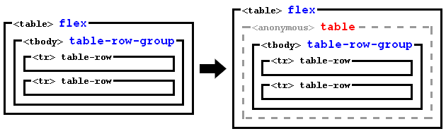
So now we have a <table> which is a flex container with a single flex line, and which contains a single flex item (the anonymous table).
The height of the flex line will be the height of the flex container (spec):
If the flex container is single-line and has a definite cross
size, the cross size of the flex line is the flex container’s inner
cross size.
And then you use align-items: center. That will align vertically the anonymous table (together with the <tbody>) at the middle of the flex line, even if it overflows above or below.
The problem is that scrollbars allow scrolling to see the content that overflows below, but not the content that overflows above.
Therefore, instead of align-items: center, I suggest aligning with auto margins:
Prior to alignment via
justify-contentandalign-self,
any positive free space is distributed to auto margins in that
dimension.
Note the difference: auto margins only distribute positive free space, not negative one.
Therefore, we only have to style the flex item with
margin: auto 0; /* Push to the center (vertically) */
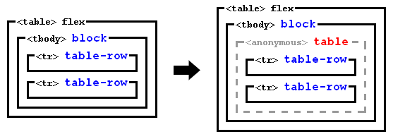
But there is a problem: as explained above, the flex item is an anonymous generated element, so we can't select it with CSS selectors.
To solve that, we can add display: block to the <tbody>. Then, it won't be wrapped in any anonymous table element, so it will be a flex item and the alignment will work.
Note this won't break the table, because the bunch of <tr>s, which are table-rows, will generate an anonymous table parent, but now inside the <tbody>:
So you can use this code:
tbody {
  display: block; /* Disable tabular layout, and make <tbody> a flex item */
  margin: auto 0; /* Push to the center (vertically) */
}
#container {

  height: 180px;

  display: flex;

  flex-flow: row;

  align-items: stretch;

  border: 1px dashed gray;

}

table {

  display: flex;

  flex-flow: row;

  margin: 10px;

  overflow: scroll;

  border: 1px dashed blue;

}

tbody {

  display: block; /* Disable tabular layout, and make <tbody> a flex item */

  margin: auto 0; /* Push to the center (vertically) */

}

td {

  height: 10px;

  width: 100px;

  border: 1px solid red;

}

#container div {

  flex: 1;

  margin: 10px;

  border: 1px dashed red;

}
<div id="container">
<table>
<tbody>
<tr><td>A</td></tr>
<tr><td>B</td></tr>
<tr><td>C</td></tr>
<tr><td>D</td></tr>
<tr><td>E</td></tr>
<tr><td>F</td></tr>
<tr><td>G</td></tr>
<tr><td>H</td></tr>
<tr><td>I</td></tr>
<tr><td>J</td></tr>
<tr><td>K</td></tr>
<tr><td>L</td></tr>
<tr><td>M</td></tr>
<tr><td>N</td></tr>
<tr><td>O</td></tr>
<tr><td>P</td></tr>
<tr><td>Q</td></tr>
<tr><td>R</td></tr>
<tr><td>S</td></tr>
<tr><td>T</td></tr>
<tr><td>U</td></tr>
<tr><td>V</td></tr>
<tr><td>W</td></tr>
<tr><td>X</td></tr>
<tr><td>Y</td></tr>
<tr><td>Z</td></tr>
</tbody>
</table>
<table>
<tbody>
<tr><td>A</td></tr>
<tr><td>B</td></tr>
<tr><td>C</td></tr>
</tbody>
</table>
<div></div>
</div>Why does putting a table inside a flex container with align-items: center mess up scrolling on overflow?
When you add align-items: center, you are removing the default align-items: stretch. In a column nowrap flexbox, align-items: stretch is essentially the same as width:100% on each of the flex items.
To get the behavior you want on on the table after adding align-items: center you can add align-self: stretch or width:100% on the tablewrapper.
The reason scrolls stop happening is that without the stretch/width:100%, the body flexbox asked tablewrapper what width it wanted to be (its max-content), and the tabblewrapper made itself the exact width of its only child (the table) because that's roughly how max-content calculation works when you have one child. So because the tablewrapper and and table had exactly the same width, the tablewrapper never had overflow so never showed a scrollbar.
Now that I added width:100% to the tablewrapper, the flexbox always makes tablewrapper the same width as the flexbox. So when the table is wider than the flexbox/body/screen/tablewrapper, there is overflow and a scrollbar appears.
<!DOCTYPE html>
<html>
<head>
<meta name="viewport" content="width=device-width, initial-scale=1">
<style>

body {
  display: flex;
  flex-flow: column nowrap;
  align-items: center;
}

table {
  border-collapse: collapse;
  border-spacing: 0;
  border: 1px solid #ddd;
  width: 100%;
}

th, td {
  text-align: left;
  padding: 8px;
}

tr:nth-child(even){background-color: #f2f2f2}

</style>
</head>

<body>

<h2>Responsive Table</h2>
<p>If you have a table that is too wide, you can add a container element with overflow-x:auto around the table, and it will display a horizontal scroll bar when needed.</p>
<p>Resize the browser window to see the effect. Try to remove the div element and see what happens to the table.</p>

<div style="overflow-x:auto; width:100%;">
  <table>
    <tr>
      <th>First Name</th>
      <th>Last Name</th>
      <th>Points</th>
      <th>Points</th>
      <th>Points</th>
      <th>Points</th>
      <th>Points</th>
      <th>Points</th>
      <th>Points</th>
      <th>Points</th>
      <th>Points</th>
      <th>Points</th>
    </tr>
    <tr>
      <td>Jill</td>
      <td>Smith</td>
      <td>50</td>
      <td>50</td>
      <td>50</td>
      <td>50</td>
      <td>50</td>
      <td>50</td>
      <td>50</td>
      <td>50</td>
      <td>50</td>
      <td>50</td>
    </tr>
    <tr>
      <td>Eve</td>
      <td>Jackson</td>
      <td>94</td>
      <td>94</td>
      <td>94</td>
      <td>94</td>
      <td>94</td>
      <td>94</td>
      <td>94</td>
      <td>94</td>
      <td>94</td>
      <td>94</td>
    </tr>
    <tr>
      <td>Adam</td>
      <td>Johnson</td>
      <td>67</td>
      <td>67</td>
      <td>67</td>
      <td>67</td>
      <td>67</td>
      <td>67</td>
      <td>67</td>
      <td>67</td>
      <td>67</td>
      <td>67</td>
    </tr>
  </table>
</div>

</body>
</html>
How to make table scroll when using flex?
It is possible to add overflow-auto class to content to have scroll in the content area:
<div class="main flex-1 flex">
    <div class="nav-bar bg-gray-800 w-60 flex-none">navbar</div>
    <div class="content flex-1 overflow-auto">
       <!-- The other code is omitted for the brevity -->
    </div>
</div>
An example:
<link href="https://www.unpkg.com/tailwindcss@2.1.1/dist/tailwind.min.css" rel="stylesheet">

<div class="parent bg-gray-900 flex flex-col h-screen text-gray-100 w-screen">
    <header class="bg-gray-800 p-4 flex border-b border-solid border-gray-600">
      <span class="flex flex-1">
        <a href="#" class="text-gray-100 flex">
          Header 1
        </a>
        <span class="text-right flex-1 mr-4">
          Header 2
        </span>
      </span>
    </header>
    <div class="main flex-1 flex">
      <div class="nav-bar bg-gray-800 w-60 flex-none">navbar</div>
      <div class="content flex-1 overflow-auto">
                <div class="flex w-full h-full flex-col">
            <div class="header w-full flex bg-gray-700">
                <div class="w-full ml-6 flex flex-row">
                  <a href="#" class="py-4 pl-4 pr-4 text-gray-100 hover:text-gray-300 hover:bg-gray-600" >
                    <div>
                      item title
                    </div>
                  </a>
                  <a href="#" class="py-4 pl-4 pr-4 text-gray-100 hover:text-gray-300 hover:bg-gray-600 border-solid border-blue-500 border-b-2 text-blue-500" >
                    <div>
                      item title
                    </div>
                  </a>
                </div>
            </div>
            <div className="content w-full flex-1 flex">
              <div class="flex-1 flex overflow-x-scroll">
                <div class="align-middle border-b border-gray-200 flex flex-1" style="">
                  <table class="divide-y divide-gray-200 min-w-full" role="table">
                    <thead class="">
                      <tr role="row">
                        <th class="px-6 py-3 bg-gray-50 text-left text-xs leading-4 font-medium text-gray-500 uppercase tracking-wider"
                            colspan="1" role="columnheader">Col 1</th>
                        <th class="px-6 py-3 bg-gray-50 text-left text-xs leading-4 font-medium text-gray-500 uppercase tracking-wider"
                            colspan="1" role="columnheader">Col2</th>
                        <th class="px-6 py-3 bg-gray-50 text-left text-xs leading-4 font-medium text-gray-500 uppercase tracking-wider"
                            colspan="1" role="columnheader">ColXXX</th>
                        <th class="px-6 py-3 bg-gray-50 text-left text-xs leading-4 font-medium text-gray-500 uppercase tracking-wider"
                            colspan="1" role="columnheader">ColXXX</th>
                        <th class="px-6 py-3 bg-gray-50 text-left text-xs leading-4 font-medium text-gray-500 uppercase tracking-wider"
                            colspan="1" role="columnheader">ColXXX</th>
                        <th class="px-6 py-3 bg-gray-50 text-left text-xs leading-4 font-medium text-gray-500 uppercase tracking-wider"
                            colspan="1" role="columnheader">ColXXX</th>
                        <th class="px-6 py-3 bg-gray-50 text-left text-xs leading-4 font-medium text-gray-500 uppercase tracking-wider"
                            colspan="1" role="columnheader">ColXXX</th>
                        <th class="px-6 py-3 bg-gray-50 text-left text-xs leading-4 font-medium text-gray-500 uppercase tracking-wider"
                            colspan="1" role="columnheader">ColXXX</th>
                        <th class="px-6 py-3 bg-gray-50 text-left text-xs leading-4 font-medium text-gray-500 uppercase tracking-wider"
                            colspan="1" role="columnheader">ColXXX</th>
                      </tr>
                    </thead>
                    <tbody class="bg-white divide-y divide-gray-200" role="rowgroup">
                      <tr role="row">
                        <td class="px-6 py-4 whitespace-no-wrap text-sm leading-5 font-medium text-gray-900" role="cell">XXX
                        </td>
                        <td class="px-6 py-4 whitespace-no-wrap text-sm leading-5 font-medium text-gray-900" role="cell">
                          PERCENTAGE</td>
                        <td class="px-6 py-4 whitespace-no-wrap text-sm leading-5 font-medium text-gray-900" role="cell">10
                        </td>
                        <td class="px-6 py-4 whitespace-no-wrap text-sm leading-5 font-medium text-gray-900" role="cell">0
                        </td>
                        <td class="px-6 py-4 whitespace-no-wrap text-sm leading-5 font-medium text-gray-900" role="cell">0
                        </td>
                        <td class="px-6 py-4 whitespace-no-wrap text-sm leading-5 font-medium text-gray-900" role="cell">10
                        </td>
                        <td class="px-6 py-4 whitespace-no-wrap text-sm leading-5 font-medium text-gray-900" role="cell">10
                        </td>
                        <td class="px-6 py-4 whitespace-no-wrap text-sm leading-5 font-medium text-gray-900" role="cell">10
                        </td>
                        <td class="px-6 py-4 whitespace-no-wrap text-sm leading-5 font-medium text-gray-900" role="cell">5
                        </td>
                      </tr>
                    </tbody>
                  </table>
                </div>
              </div>
            </div>
          </div>
        </div>
      </div>
    </div>
</div>
Scrolling Flexbox Grid
You can try setting the dashboard element height to 100vh (or whatever size it needs to be), so the scroll actually knows how much real estate it has.
.dashboard {
  width: 1280px;
  height: 100vh;
  display: flex;
  flex-wrap: wrap;
  column-gap: 40px;
  row-gap: 20px;
  margin-left: 150px;
  overflow-y: auto;
}

.graph-box {
  width: 350px;
  height: 350px;
  border-radius: 20px 20px;
  background: #373737;
  color: white;
}

.graph {
  display: flex;
  justify-content: center;
  align-items: center;
  height: 400px;
}

.table-box {
  width: 740px;
  height: 350px;
  border-radius: 20px 20px;
  background: #373737;
  color: white;
}

.table {
  display: flex;
  justify-content: center;
  align-items: center;
  height: 125px;
}
<body>
<div id="app">
<div class="dashboard">
<div class="graph-box">
<div class="graph">
</div>
</div>
<div class="graph-box">
<div class="graph">
</div>
</div>
<div class="graph-box">
<div class="graph">
</div>
</div>
<div class="graph-box">
<div class="graph">
</div>
</div>
<div class="graph-box">
<div class="graph">
</div>
</div>
<div class="table-box">
<div class="table">
<table>
<tr>
<th>Col1</th>
<th>Col2</th>
<th>Col3</th>
</tr>
<tr>
<td>Alpha</td>
<td>Beta</td>
<td>Gamma</td>
</tr>
<tr>
<td>Delta</td>
<td>Epsilon</td>
<td>Zeta</td>
</tr>
</table>
</div>
</div>
<div class="graph-box">
<div class="graph">
</div>
</div>
</div>
</div>
</body>How to make a table in a flex layout scrolling?
You could maybe use less imbrication and start from a template and a few reusable class (easier to add /remove for testing minimal rules) , then fill the template.
body {margin:0}

.vh-100 {height:100vh}

.flex {display:flex;}

.flex-grow-1 {flex-grow:1;}

.column {flex-flow:column;}

.min-height-0 {min-height:0}

.overflow-A{overflow:auto; }

#test:hover {height:100vh;}

section {background:tomato}

header {background:gold}

aside {background:lightblue;}

footer {background:orange}

#test {background:lightgreen}

section section, header,aside,footer ,#test{padding:0.25em;}
<section class="vh-100 flex column">
<header>Section HEADER</header>
<main class="flex-grow-1 flex min-height-0">
<aside>
<nav>Section NAV</nav>
</aside>
<section class="flex column flex-grow-1">
<h1 >main header</h1>
<div class="overflow-A flex-grow-1"> content to scroll if needed
<div id="test">test div to hover</div>
</div>
</section>
</main>
<footer>Section FOOTER</footer>
</section>HTML CSS horizontal and vertical overflow scroll with flexbox gets cut off
After some try and error I searched for flexbox alternatives and found display table. With display table everything worked fine. Since I couldn't find a proper solution online, I decided to keep this question and post my solution here.
My Next-component-code:
import { NextPage } from 'next';
import styles from './Canvas.module.css';

const Canvas: NextPage = () => {

const x: number[] = Array.from(Array(49).keys());
const y: number[] = Array.from(Array(34).keys());

return (
    <div className={styles.canvasBoard}>
        <div className={styles.canvas}>
            <div className={styles.canvasLayout}>
                <div className={styles.canvasPixels}>
                    {y.map((number) =>
                        <div className={styles.tableRow}>
                            {x.map((number) =>
                                <div className={styles.tableCell}>
                                    <div key={number} className={styles.canvasPixel}></div>
                                </div>
                            )}
                        </div>
                    )}
                </div>
            </div>
        </div>
    </div>
);
}

export { Canvas };
My CSS-code:
.canvasBoard::-webkit-scrollbar {
  display: none;
}

.canvasBoard {
  background-color: #ffffff;
  width: 100%;
  height: 60vh;
  overflow: scroll;
  border: 8px solid #514e4e;
  outline: 2px solid #000000;
  box-shadow: 3px 8px 10px rgba(0, 0, 0, 0.25);
  -ms-overflow-style: none;
  scrollbar-width: none;
}

.canvas {
  display: table;
  width: 100%;
  height: 100%;
}

.canvasLayout {
  display: table-cell;
  vertical-align: middle;
}

.canvasPixels {
  width: 986px;
  min-width: 986px;
  height: 700px;
  min-height: 700px;
  border: 2px solid;
  border-color: #000000;
  display: table;
  margin: auto;
  padding-right: 2px;
  padding-bottom: 1.5px;
}

.tableRow {
  display: table-row;
}

.tableCell {
  display: table-cell;
}

.canvasPixel {
  margin: 0 !important;
  box-shadow: 2px 0 0 0 #87d13c, 0 2px 0 0 #87d13c, 2px 2px 0 0 #87d13c,
    2px 0 0 0 #87d13c inset, 0 2px 0 0 #87d13c inset;
  width: 20px;
  height: 20px;
}
flexbox width inside horizontally scrollable container
Consider the use of inline-flex instead of flex and define the width using width and not flex-basis
.table-wrapper {
  width: 500px;
  height: 300px;
  overflow-x: scroll;
  background: rgba(255, 255, 0, 0.2);
}

.table-container {
  display: inline-flex; /* UPDATED */
  flex-flow: column nowrap;
  min-width: 100%; /* UPDATED */
  height: 100%;
  background: rgba(0, 255, 0, 0.3);
}

.table-header {
  display: flex;
  flex-flow: row nowrap;
  width: 100%;
  flex: 0 0 auto;

  background: rgba(255, 100, 0, 0.3);
}

.table-cell {
  min-width: 100px;
  display: flex;
  flex: 1 1 auto;
  height: 30px;
  line-height: 30px;

  border: 1px solid blue;
}

.table-body {
  display: flex;
  flex: 1 1 auto;

  border: 1px solid red;
  background: rgba(255, 0, 0, 0.3);
}
<div class="table-wrapper">
<div class="table-container">
<div class="table-header">
<div class="table-cell" style="flex: 0 0 180px;width:180px;">header-cell 1</div>
<div class="table-cell">header-cell 2</div>
<div class="table-cell">header-cell 3</div>
<div class="table-cell">header-cell 4</div>
<div class="table-cell" style="flex: 0 0 200px;width:200px;">header-cell 5</div>
<div class="table-cell">header-cell 6</div>
<div class="table-cell">header-cell 7</div>
</div>
<div class="table-body">virtual table here</div>
</div>
</div>Flexbox table layout with custom scroll
You can try to set both scroll bars on table, and set .container position as absolute and tableHeader as sticky with top: 0;. For cells background, set background-color on tableCell and add class for header cell with another background-color :
#container {
  width: 400px;
  height: 200px;
  display: flex;
  flex-direction: column;
  position: absolute;
}

#header, #footer {
  background-color: #666;
}

#table {
  overflow-x: scroll;
  overflow-y: scroll;
  display: grid;
}

#tableHeader {
  display: flex;
  flex-direction: row;
  flex-wrap: nowrap;
  position: sticky;
  top: 0;
}
.head {
  background-color: #AAA !important;
}
#tableBody {
  display: flex;
  flex-direction: column;
}

.tableRow {
  display: flex;
  flex-direction: row;
  flex-wrap: nowrap;
  background-color: #DDD;
}
.tableRow:nth-child(odd) {
  background-color: #40E0D0;
}
.tableRow:nth-child(even) {
  background-color: violet;
}

.tableCell {
  padding: 4px;
  width: 300px;
  flex-shrink: 0;
  border: solid 1px black;
 /* background-color: #DDD;*/
}

.fixedSize {
  width: 40px;
  height: 40px;
  background-color: blue;
}
<div id="container">
<div id="header">Header</div>
<div id="table">
<div id="tableHeader">
<div class="tableCell head">Column1</div>
<div class="tableCell head">Column2</div>
<div class="tableCell head">Column3</div>
<div class="tableCell head">Column4</div>
</div>
<div id="tableBody">
<div class="tableRow">
<div class="tableCell">
<div class="fixedSize"></div>
</div>
<div class="tableCell"></div>
<div class="tableCell"></div>
<div class="tableCell"></div>
</div>
<div class="tableRow">
<div class="tableCell">
<div class="fixedSize"></div>
</div>
<div class="tableCell"></div>
<div class="tableCell"></div>
<div class="tableCell"></div>
</div>
<div class="tableRow">
<div class="tableCell">
<div class="fixedSize"></div>
</div>
<div class="tableCell"></div>
<div class="tableCell"></div>
<div class="tableCell"></div>
</div>
<div class="tableRow">
<div class="tableCell">
<div class="fixedSize"></div>
</div>
<div class="tableCell"></div>
<div class="tableCell"></div>
<div class="tableCell"></div>
</div>
<div class="tableRow">
<div class="tableCell">
<div class="fixedSize"></div>
</div>
<div class="tableCell"></div>
<div class="tableCell"></div>
<div class="tableCell"></div>
</div>
</div>
</div>
<div id="footer">Footer</div>
</div>Related Topics
How to Make Select Elements Shrink to Max-Width Percent Style Within Fieldset
Overlay on HTML5 Fullscreen Video
Prevent Tabstop on a Element (Anchor Link) in HTML
Table Row Won't Contain Elements with Position:Absolute
How to Change an Image on Click Using CSS Alone
CSS Selector for Empty or Whitespace
Ios7 Font Size Change When Create Nsattributedstring from HTML
Style and Script Tags in HTML Body... Why Not
Is There a Reason to Use a Instead of A:Link or A:Visited in My Stylesheet
Put Icon Inside Input Element in a Form (Not as Background Image!)
Foundation 5 Off-Canvas Full Height of Device
Font-Family Is Not Inherited to the Form Input Fields
Set Margin/Padding for Each Page to Print (Html/Css)
Why Won't Tabindex Work with Firefox