A true sticky footer with a fixed header?
One potential solution is to swap your content:after to content:before.
Working Demo
CSS:
/* .content:after {
     content: "";
     display: block;
} */

.content:before {
 content: "";
 display: block;
 height: 45px;
}
How create a TRUE sticky header/ footer using Tailwindcss (sticks to bottom even if scroll)?
In the examples you're sharing they all expect the main content area to be where the scroll happens. To do this you just add overflow-hidden and h-screen to the outermost div or body tag and overflow-y-scroll to the main content area and that section will get it's own set of scrollbars but if done right the page itself will not have scrollbars. Here's an example of that on Tailwind play https://play.tailwindcss.com/A5Hs7ZtGad
In the end Tailwind is just CSS so if you can make something with CSS you can recreate it with Tailwind's utility classes. Another solution to this problem is if you just want a footer (or any div) to stay at the bottom above all other content and you want the regular scrollbars than you can give the element fixed bottom-0 left-0 w-full and it will have a similar result but will also have the ability to cover content if your inner elements don't have enough padding or margin. Here's an example of that https://play.tailwindcss.com/nna2QkrxlK
sticky footer and fixed header
Questions: 1
Just put the <div class="footer"> into the <div class="wrapper">
Questions: 2
You use % at your margin and padding. e.g. margin: 0.5% 0 0 0;
And height: 6%; for the .header. This can cause some problems on window resize.
EDIT:
Maybe you want to use some html5?
There are the <header> and <footer> tags. So you don´t have to use a div for everything.
Watch out for IE8 and below. You need some fix to use html5 tags there.
Sticky header, sticky footer (variable height), fluid middle?
All other solutions here are out of date and either resort to JavaScript, or don't support a variable height footer.
With the advent of the CSS flex model, solving the variable-height sticky footer problem becomes very, very easy: while mostly known for laying out content in the horizontal direction, Flexbox actually works just as well for vertical layout problems. All you have to do is wrap the vertical sections in a flex container and choose which ones you want to expand. They'll automatically take up all the available space in their container.
Note how simple the markup and the CSS are. No table hacks or anything.
The flex model is supported by all major browsers as well as allegedly IE11+, though my IE doesn't render this snippet correctly yet.
html, body {  height: 100%;}
#headContainer {  background: yellow;  height: 100px;  /* can be variable as well */}
#wrapper {  display: flex;  /* use the flex model */  min-height: 100%;  flex-direction: column;  /* learn more: http://philipwalton.github.io/solved-by-flexbox/demos/sticky-footer/ */}
#bodyContainer {  flex: 1;  border: 1px solid orange;}
#footContainer {  background: lime;}
<div id="wrapper"> <div id="headContainer">Title</div> <div id="bodyContainer">Stuff goes here</div> <div id="footContainer"> Footer<br/> of<br/> variable<br/> height<br/> </div></div>Fixed header needs to stay at top, fixed footer needs to stay at bottom, remaining amount of space fills main div with content
Different Header And Footer Styles
There are four different code snippets in this answer, each of which demonstrate different Header and Footer behavior as listed below:
- Sticky Header & Sticky Footer
- Sticky Header & Fixed Footer
- Fixed Header & Sticky Footer
- Fixed Header & Fixed Footer
You can click on the cards to delete them, so that you can see the behavior when there are less cards. You can also visualize this by toggling the window width.
Sticky Header & Sticky Footer
const nav = document.querySelector("nav");
const footer = document.querySelector("footer");

const container = document.querySelector(".card-container");

for (let i = 0; i < 20; i++) {
    const card = document.createElement("div");
    card.className = "card";
    card.innerText = "Click Me!!";
    container.appendChild(card);
}

const cards = document.querySelectorAll(".card");

cards.forEach((card) => {
    card.addEventListener("click", () => {
        card.style.display = "none";
    });
});
body {
margin: 0;
min-height: 100vh;
display: flex;
flex-direction: column;
color: whitesmoke;
font-family: cursive;
}
header {
position: fixed;
top: 0;
/*Expanding to take full width*/
right: 0;
left: 0;
}
footer {
position: fixed;
bottom: 0;
/*Expanding to take full width*/
right: 0;
left: 0;
}
header,
footer {
background: slateblue;
padding: 1em;
}
.card-container {
display: grid;
grid-template-columns: repeat(auto-fit, 150px);
place-content: center;
gap: 10px;
padding: 5em 1em; /* Top Padding Is Required */
}
.card {
display: grid;
place-items: center;
width: 100%;
height: 100px;
background: coral;
border-radius: 5px;
cursor: pointer;
}<header>Sticky Header & Sticky Footer</header>
<div class="card-container"></div>
<footer>Sticky Footer</footer>sticky header and footer with scalable div
Is this kind of what you're going for? http://jsfiddle.net/RiderSargent/sjUBQ/4/
Try changing the height of that lower right pane to see if it behaves the way you want. I think the key (if I understand what you're trying to do correctly) is using position: fixed; for your header and footer. You will also probably want to set the top and bottom margins of the main div to the same dimensions you set for the heights of the header and footer respectively.
EDIT: I put the "BEGIN" and "END" in the lorum ipsum to make sure all of it was showing.
EDIT #2: Updated jsFiddle: http://jsfiddle.net/RiderSargent/sjUBQ/5/
EDIT #3: In short, I think this is the jQuery you need:
var headerHeight = $('#head').height(),
    footerOffset = $('#footer').offset().top,
    desiredHeight = footerOffset - headerHeight;

$('.yui3-u-3-5').css('height', desiredHeight);
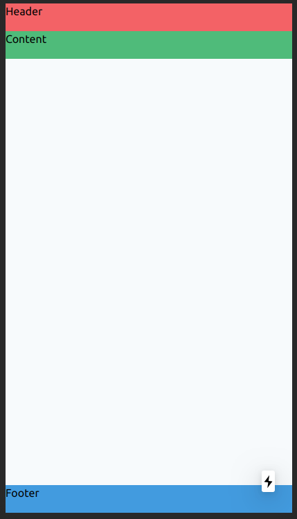
Tailwindcss: fixed/sticky footer on the bottom
<div class="flex flex-col h-screen justify-between">
  <header class="h-10 bg-red-500">Header</header>
  <main class="mb-auto h-10 bg-green-500">Content</main>
  <footer class="h-10 bg-blue-500">Footer</footer>
</div>
Class justify-between is not required, but I would leave him (for other case).
So, play with h-screen and mb-auto classes.
And you get this UI:
sticky footer bottom margin with conditional fixed position bottom nav bar
Setting height: 100% on html and body (as opposed to min-height) prevents the document height from exceeding the viewport height, so your additional content is overflowing scrollable area.
You could remove body from the 100%, leaving it on html, or add overflow: auto to the html/body rule so that the body element can scroll (as opposed to scrolling the window).
Edit: removing 100% height from body allows the footer to move off the bottom of the window. Updated accordingly.
html, body {
  /* IE 10-11 didn't like using min-height */
  height: 100%;
  overflow: auto;
}
You also have a typo in your .conditionalNav rule:
hight:25px;
Related Topics
Word-Wrap Break-Word Does Not Work in This Example
How to Put a Space Character Before Option Text in a HTML Select Element
How to Make a 45 Degree Responsive Ribbon with Folded Corner
Create Tree View with Horizontal and Vertical Lines Showing The Connectivity Using CSS
How to Make HTML Open a Hyperlink in Another Window or Tab
Text Wrapping Around an Absolute Positioned Div
Create a Basic Mailchimp Signup Form Using Their API
Put Search Icon Near Textbox Using Bootstrap
How to Replace The File Browse Button in HTML
CSS 100% Height with Absolute Positioning Top 0 Bottom 0
How to Align a Label to The "Bottom" of a Div in CSS
A True Sticky Footer with a Fixed Header
How to Make an <Audio> File Play Continuously on All Pages
How to Implement a Navbar Dropdown Hover in Bootstrap V4
Changing Image Src Depending on Screen Size