How can I make a 45 degree responsive ribbon with folded corner?
You can try like below:
.container {
  width: 200px;
  height: 150px;
  position: relative;
  display:inline-block;
  margin: 10px;
  background: lightblue;
}

.stack-top {
  /* adjust the below to control the shape */
  --d:5px;
  --g:16px;
  --c:#333;
  /**/

  position: absolute;
  top: 0;
  right: 0;
  transform: translate(29.29%, -100%) rotate(45deg); /* 29.29% = 100%*(1 - cos(45deg)) */
  color: #fff;
  text-align: center;
  width: 100px;
  transform-origin: bottom left;
  padding:5px 0 calc(var(--d) + 5px);
  background:
    linear-gradient(135deg, transparent var(--g), var(--c) calc(var(--g) - 0.3px)) left,
    linear-gradient(-135deg,transparent var(--g), var(--c) calc(var(--g) - 0.3px)) right;
  background-size:51% 100%;
  background-repeat:no-repeat;
  clip-path:polygon(0 0,100% 0,100% 100%, calc(100% - var(--d)) calc(100% - var(--d)), var(--d) calc(100% - var(--d)),0 100%)
}
<div class="container">
<div class="stack-top">1Month</div>
</div>
<div class="container">
<div class="stack-top" style="--d:0px;--g:19px;width:120px;--c:blue">1Month</div>
</div>
<div class="container">
<div class="stack-top" style="--d:8px;--g:17px;width:80px;--c:red">XX</div>
</div>
<div class="container">
<div class="stack-top" style="--d:10px;--g:20px;width:200px;--c:green">1Month</div>
</div>How can I make a diagonal div responsive?
Any particular reason that you set .box width to 90%? I changed .box width to 100% in your codepen and it looks ok.
Badge like figure on top-left of HTML DIV Box shape
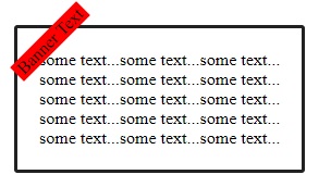
This should work for you - try varying top & left pixel sizes to fit your needs:
<style>
    #content {
        position: relative;
    }

    #content p {
        position: absolute;
        top: 10px;
        left: 10px;
    }

.rotated {
  transform: rotate(-45deg); /* Equal to rotateZ(45deg) */
  background-color: red;
}

#my-box {
    padding: 20px;
    margin: 20px;
    border: #212121 3px solid;
    border-radius: 6px;
    display: inline-block;
    text-align: center;
    border-radius: 3px;
}
</style>

<div id="content">
    <p class="rotated"> Banner Text </p>
    <div id="my-box">some text...some text...some text...<br>some text...some text...some text...</div>
</div>
Cut Corners using CSS
If the parent element has a solid color background, you can use pseudo-elements to create the effect:
div {    height: 300px;    background: red;    position: relative;}
div:before { content: ''; position: absolute; top: 0; right: 0; border-top: 80px solid white; border-left: 80px solid red; width: 0;}<div></div>Create a CSS tag over a score card in div
.project-card {
  height: 350px;
  width: 300px;
  background-color: blue;
  position: relative;
  overflow: hidden;
}
.achievement-label {
  position: absolute;
  background-color: red;
  padding: 0.3rem 3rem;
  transform: rotateZ(-45deg) translateY(5rem);
  /* clip-path: polygon(25% 0, 75% 0, 100% 100%, 0 100%); */
  left: -30%;
  top: -8%;
}
<div class="project-card">
<div class="achievement-label">hello hi</div>
</div>Related Topics
Why Does Perspective Changes Fixed Position in CSS
Emulate Ie7 for Ie8 But Not for Ie9 Using "X-Ua-Compatible"
Why Using Absolute Position Causes The Div to Be on Top
<H1>, <H2>, <H3>... Tags, Inline Within Paragraphs (<P>)
Disable Chrome Translation Bar on My Website
Button Type "Button" VS. "Submit"
Setting Max-Height for Table Cell Contents
Force Ie9 to Emulate Ie8. Possible
HTML - Why Boolean Attributes Do Not Have Boolean Value
How Does Justify-Items Work on Display:Block Elements
Why Isn't Textarea an Input[Type="Textarea"]
Redirect Mobile Devices to Alternate Version of My Site
How to Anti-Alias Clip() Edges in HTML5 Canvas Under Chrome Windows