Zoom Vs. Scale in CSS3
Transform is more predictable than zoom across browsers.
Zoom affects positioning differently in different browsers.
example:position:absolute; left:50px; zoom: 50%;
- Chrome will effectively compute the
leftvalue to50px * 50%, that is25px...but this is not reflected in DevTools Computed Values. - IE will not change the
leftvalue at all.
Transform is handled the same way in all browsers (as far as I can tell).
example:position:absolute; left:50px; transform: scale(0.5)
leftwould effectively be set to25pxin both Chrome and IE. (DevTools Computed Values will not reflect this - it will display the source code only)- To avoid changing the
leftvalue, simply usetransform-origin: 0 0. That will ensure left is still 50px.
Demo: http://jsfiddle.net/4z728fmk/ shows 2 boxes where the small one is zoomed or scaled to 50%. Looks like this:
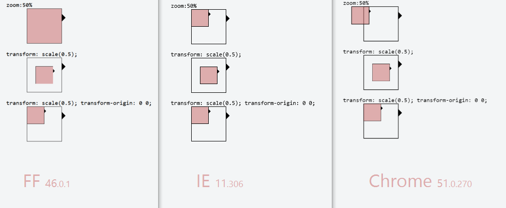
EDIT: Added Firefox in 2016. At the time it was the most problematic browser out of the three, as zoom:50% had no effect at all. And with transform: scale(0.5) the borders around the inner box have different thickness... but that could be a subpixel issue
Zooming or scaling with d3.js
Ok i figured it out. You can scale and translate with the zoom function. A good example is the zoom to bounding box example, but that example is based on d3.geo without x and y scaling functions.
With x and y lineair scaled objects you could do this:
.on('click', function (d) {
    d3.selectAll('rect').classed('selected-rect', false);
    d3.select(this).classed('selected-rect', true);

    zoom.translate([0, 0]).scale(1).event;

    var dx = xScale(d.width),
        dy = yScale(d.height),
        x = xScale(d.x) + xScale(d.width/2),
        y = yScale(d.y) + yScale(d.height/2),
        scale = .85 / Math.max(dx / pixelWidth, dy / pixelHeight),
      translate = [pixelWidth / 2 - scale * x,
                   pixelHeight / 2 - scale * y];

    svg.transition()
        .duration(750)
        .call(zoom.translate(translate).scale(scale).event);
});
First off: you have to reset the translate and scale before doing any xScale and yScale calculations. I just do this by this statement:
zoom.translate([0, 0]).scale(1).event;
dx and dy are the scaled width/height of the objects. To get to the middle of the object, one needs to take the scaled x and y value and add half of the width and height to it. Else it will not center properly ofcourse (i say ofcourse now because i've been fiddling with it).
The scale is calculated by taking the max width or height of the object and devide have 0.85 devided by it to get a little margin around it.
Here's a jsFiddle
How do websites make an element scale the same on all devices and scale on zoom?
The browser zooming (using "Ctrl and +/-") actually changes the value that font-size: 100%; (which is equivalent to font-size: 1em;) corresponds to. That is why the text inside your input element is scaled when using this zooming feature. But because the input element size does not change (see explanation below), it looks like the latter gets smaller... whereas in fact it is its inner text that becomes bigger.
As far as I understand, the idea was to give a chance to the visitor to read text (while possibly breaking the page layout), if for some reason they have difficulties with the text size the website designer had chosen.
In the case of the size of your input element, because you define it relatively to the size of its containers (using percentages), up to the body which has 100% of the view port, you are not giving it any chance to be scaled by this feature, but instead you make it dependent on the view port size. So if you do resize your view port (i.e. browser window), you will see your element size changing, but not its inner text. It may sound as what you were looking for at the beginning (rendering with the exact same proportions on different devices, actually on different view port sizes), but what today's websites do is actually a totally different technique.
What they do is called "Responsive Design", i.e. the CSS uses "media queries" that can detect the type of device, screen size (actually view port size), etc. These media queries act as conditional blocks for CSS rules. The typical use case is to render a big menu on a side when the screen is wide enough, but only a menu button when the screen is narrow.
You can also notice that they do not actually render in the exact same proportions depending on the view port size (which was what you wanted to do by using only percentage-based sizes). Most of the time, there is an empty space (on both sides in the case of StackOverflow) that fills the gap, while the content has the same size in pixels, until the view port size changes so much that it triggers a media query, which then applies a different set of CSS rules, possibly changing completely the page layout.
Another good practice is to use as much as possible sizes (but not necessarily positioning) in em units, which refer to the current font size. That way, when the visitor uses the browser zooming feature, these sizes will scale accordingly, not only the text. For your case, you could have defined the height of your input element as 1.5em for example, so that it is always 50% bigger than its inner text.
Finally, I encourage you to use the DOM and Style inspectors of Development Tools featured by most browsers (turn the Development Tools on by hitting F12). They usually also provide element pickers, which allow you to pinpoint an element on the page for which you want to see the exact DOM and applied styling rules. It is a very instructive and ludic way to learn how others design their websites.
What exactly changes in the css rendering, when desktop browsers zoom in or out on a website?
Zooming as implemented in modern browsers consists of nothing more
than “stretching up” pixels. That is, the width of the element is not
changed from 128 to 256 pixels; instead the actual pixels are doubled
in size. Formally, the element still has a width of 128 CSS pixels,
even though it happens to take the space of 256 device pixels.In other words, zooming to 200% makes one CSS pixel grow to four times
the size of one device pixels. (Two times the width, two times the
height, yields four times in total).
Source:
Concept of device pixels and CSS pixels
Stop one element from scaling proportionally with browser zoom?
Add height to the navbar in percent, like this:
.navbar{
  display: flex;
  justify-content: center;
  align-items: center;
  background: DodgerBlue;
  position: fixed;
  top: 20px;
  left: 5%;
  width: 90%;
  height: 15%;
}
Complete example
    <!DOCTYPE html>
    <html>
    <head>
        <title></title>
        <meta charset="utf-8" />
        <style>
            body {
                font-size: 26px;
            }
            .navBar {
                position: fixed;
                top: 1%;
                left: 3%;
                right: 3%;
                height: 5%;
                background-color: greenyellow;
                font-size: 100%;
            }
            .content {
                width: 600px;
                margin: 100px auto 100px auto;
                text-align: justify;
            }

        </style>
    </head>
    <body>
        <div class="navBar"></div>
        <div class="content">
            <p>I'm baby snackwave ugh williamsburg raclette lomo put a bird on it synth tousled cornhole taiyaki chartreuse stumptown aesthetic VHS. Bicycle rights af cardigan tilde vice DIY. Kinfolk banh mi bushwick aesthetic narwhal cornhole helvetica swag shoreditch venmo small batch pour-over. Distillery meh plaid lyft enamel pin jianbing banh mi tote bag seitan palo santo migas green juice offal viral. Shaman offal woke, actually health goth tousled franzen tacos before they sold out.</p>
            <p>Cronut lyft offal yuccie next level pabst mustache selfies. Woke ugh tote bag everyday carry hoodie synth. Keffiyeh stumptown offal, taiyaki kinfolk chillwave dreamcatcher single-origin coffee. Meggings snackwave bicycle rights, authentic butcher tilde art party man braid hell of. Wolf disrupt everyday carry vice, viral tofu knausgaard squid etsy celiac shoreditch edison bulb. Cray locavore mustache plaid pork belly blog dreamcatcher godard mixtape. Jean shorts heirloom biodiesel butcher blog vice, crucifix gastropub authentic bitters meh intelligentsia dreamcatcher.</p>
        </div>
    </body>
    </html>
Set mobile page scale/zoom in CSS
There is @viewport, it might help you with that. But the support is very little. Have a look at this link http://dev.opera.com/articles/view/an-introduction-to-meta-viewport-and-viewport/
Related Topics
HTMLpurifier with Borderradius
Blurry Text on Chrome When Using CSS -Webkit-Transform
Vertically Align Text to The Bottom of The Box
Why Does Ie10 Require The Presence of a P:Hover {} Rule for Transitions to Work on a Pseudo Element
Changing Background Colors of Grid Rows Dynamically in Extjs 4.2.2
CSS3 Box-Shadow for Overlapping-Like Divs
Sass 3.2 Media Queries and Internet Explorer Support
Gray Out a Section of an Image with CSS
How Automatically Adjust Div's Width Using CSS
How to Override Background Image Defined in CSS with Another CSS
Wp_Enqueue_Style and Rel Other Than Stylesheet
Is There a Way (Or a Plugin) to Make Vim Generate a Code Outline for CSS
CSS Triangle + "After" Implementation
Flex-Flow: Column Wrap. How to Set Container's Width Equal to Content