How to make rounded tabs with css?
Here's a proof of concept example with pure CSS. It uses pseudo-elements and rotate. It's pretty close to your source image and could get closer with some work.
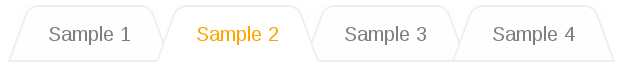
Demo: http://jsfiddle.net/csDP9/9/
HTML:
/* Reset ul styles */
body { font-family: sans-serif; }
ul {
    list-style: none;
    margin: 0;
    padding: 0;
}

ul {
    padding-left: 20px;
    z-index: 5;
}
ul li {
    color: grey;
    background: #fefefe;
    padding: 14px 24px 10px;
    margin: 0px -6px 0 10px;
    position: relative;
    float: left;
    text-align: center;
    z-index: 1;
}
ul li::before {
    content: '';
    display: block;
    position: absolute;
    top: 0; left: 0;
    width: 70%;
    height: 100%;
    border-style: solid;
    border-color: #eee;
    border-width: 2px 0 2px 2px;
    border-radius: 8px 0 0 0;
    -webkit-transform: skewX(-20deg);
       -moz-transform: skewX(-20deg);
         -o-transform: skewX(-20deg);
            transform: skewX(-20deg);
    background-color: inherit;
    z-index: -1;
}
ul li::after {
    content: '';
    display: block;
    position: absolute;
    top: 0; right: 0;
    width: 70%;
    height: 100%;
    border-style: solid;
    border-color: #eee;
    border-width: 2px 2px 2px 0;
    border-radius: 0 8px 0 0;
    -webkit-transform: skewX(20deg);
       -moz-transform: skewX(20deg);
         -o-transform: skewX(20deg);
            transform: skewX(20deg);
    background-color: inherit;
    z-index: -1;
}
ul li.active {
    color: orange;
    z-index: 10;
}
ul li.active::before,
ul li.active::after {
    background-color: #fff;
    border-bottom-color: #fff;
}
ul li:not([class='active']):hover::before,
ul li:not([class='active']):hover::after {
    background-color: #efefef;
}
<ul>
<li>Sample 1</li>
<li class="active">Sample 2</li>
<li>Sample 3</li>
<li>Sample 4</li>
</ul>Rounded Curve Tabs | Css
You could use css only, if your browser supports it:
-webkit-border-radius: 1px;
-moz-border-radius: 1px;
border-radius: 1px;
Radius generator: http://border-radius.com/
Compatibility list: http://caniuse.com/border-radius
Alternatively you could use a sprite image: http://css-tricks.com/css-sprites/
How to create Curved & Overlapping Menu Tabs in CSS
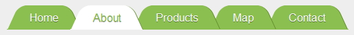
- Skew the
:beforeand:afterpseudo elements, - set pseudos to some
-offset - add left-top
border-radiusto:beforeand right-top to:after - if needed (to remove the top hard edge) add top border radius to the A element
- add
z-index:1;to the:after - add
z-index:1;to the .active's:beforeelement.
nav li {  display: inline-block;  border-bottom: 1px solid #8BBF50;  margin-left: -20px;}
nav a {  text-decoration: none;  color: #fff;  background: #8BBF50;  position: relative;  display: inline-block;  margin: 0 22px;  padding: 8px 11px;  text-shadow: 0 1px 0 rgba(0, 2, 0, 0.4);  border-radius: 7px 7px 0 0; /* just to smooth the top edges */}
nav a:before,nav a:after {  content: " ";  position: absolute;  top: 0;  width: 23px;  height: 100%;  background-color: inherit;}
nav a:before {  border-radius: 12px 0 0 0;  transform: skew(-24deg);  left: -13px; /* play with this one to give the LI border ~2px extrusion */}
nav a:after {  border-radius: 0 12px 0 0;  transform: skew(24deg);  right: -13px; /* play with this one to give the LI border ~2px extrusion */  border-right: 1px solid #628E2F;  z-index: 1; /* overlap next element */}

/* LI ACTIVE  */
nav li.active {  border-bottom: 1px solid #fff;}
nav li.active a {  color: #8BBF50;  background: #fff;}
nav li.active a:before {  z-index: 1; /* overlap prev element */}
nav li.active a:after {  border-bottom: 1px solid #fff;}
<nav> <ul> <li><a>Home</a></li> <li class="active"><a>About</a></li> <li><a>Products</a></li> <li><a>Map</a></li> <li><a>Contact</a></li> </ul></nav>Tab like structure in CSS with rounded corners
You can use the :before selector to create what you're asking for.
Here's a quick implementation to give you an idea on how to use it:
<div class="foo"></div>

.foo {
    width: 200px;
    height: 100px;
    border: 4px solid #000;
    margin-top: 24px;
    position: relative;
    -webkit-border-radius: 5px;
    -webkit-border-radius: 5px;
    -moz-border-radius: 5px;
    border-radius: 5px;
}
.foo:before {
    display: block;
    height: 20px;
    width: 30px;
    border: 4px solid #000;
    border-bottom-width: 0;
    content: " ";
    position: absolute;
    left: 0;
    top: -24px;
    background: #fff;
    -webkit-border-top-left-radius: 5px;
    -webkit-border-top-right-radius: 5px;
    -moz-border-radius-topleft: 5px;
    -moz-border-radius-topright: 5px;
    border-top-left-radius: 5px;
    border-top-right-radius: 5px;
}
Pure CSS Angled/Rounded Tab
"I'm looking to achieve this shape of a "tab" in the best way possible" - Use svg.
<svg width="100%" height="84" viewBox="0 0 700 84" preserveAspectRatio="none"> <path d="M0,0 h700 v30 h-280 c-60,0 -60,15 -100,30 c-10,4 -15,5 -35,6 h-285" fill="#008882" /></svg>How to create slanted tabs with a border in CSS?
You can try this approach: jsFiddle
Instead of using the borders to create the slanted effect, I'm using an :after pseudo element to create it. This allows me to set borders around it. Then I'm using a :before pseudo element to hide the borders which I don't want to see. The recurring 2px in the CSS is derived from the border width value.
CSS
.tab:before {
    height: 50px;
    width: 10px;
    display: block;
    content:" ";
    background-color: #FFF;
    position: absolute;
    right: -2px;
    top: -2px;
    border-top: 2px solid blue;
    border-bottom: 2px solid blue;
}
.tab {
    height: 50px;
    width: 150px;
    border-radius: 10px 10px 0px 0px;
    background-color: #FFF;
    position: relative;
    border: 2px solid blue;
}
.tab:after {
    display: block;
    content:" ";
    width: 100px;
    height: 50px;
    top: -2px;
    background-color: #FFF;
    position: absolute;
    right: -29px;
    transform:skewX(45deg);
    -ms-transform:skewX(45deg);
    -webkit-transform:skewX(45deg);
    border: 2px solid blue;
    z-index: -1;
}
Rounded CSS tabs
Couple of things:
Fix the problem by taking the padding off the <li> and putting it back on the child <a> - the space they occupy needs to be the same to get the hovers to align.
Now you have a different problem, the left corner doesn't show. Fix this by making the background colour for the a and a:hover equal to transparent instead of the colours - now the <li> can show through.
Finally, I suggest you change the behaviour from being another image entirely, to the same image with a different background-position, so the rollover loads invisibly.
edit: css rollover without image swap described here
CSS Tab Menu Keep Rounded Corners when tab is closed
$(document).ready(function() {
  $("#myaccountSettings").accordion({    heightStyle: "content"  });  $(".headers").click(function() {    current_head = this;    //$(current_head).css("border-radius","0px");    $(current_head).css("border-top-left-radius", "5px");    $(current_head).css("border-top-right-radius", "5px");    $(current_head).css("border-bottom-right-radius", "0px");    $(current_head).css("border-bottom-left-radius", "0px");    //$(current_head).css("border-top-right-radius","0px");    $(".headers").each(function() {      if (!$(this).hasClass("ui-state-active") && this != current_head) {        $(this).css("border-radius", "10px");        console.log(this.innerHTML)      }    })
  })  //trigger a click on first header when window onload to initiate the styling $(".headers")[0].click()});
#myaccountSettings h3 { color: #a2a2a2; background-color: #222222; margin: 0; margin-left: 3px; margin-right: 3px; padding: 8px; border-radius: 4px 4px 0 0; outline: none;}
#myaccountSettings h3:hover { cursor: pointer; color: #C33917;}
#myaccountSettings h3:not(:first-child) { margin-top: 10px;}
.accountTabContentWrapper { margin: 0; margin-left: 3px; margin-right: 3px; padding: 8px; background-color: #676464; border-radius: 0 0 4px 4px; color: #d6cbc9;}
.accountTabContentWrapper h1 { margin-top: 0;}<script src="https://ajax.googleapis.com/ajax/libs/jquery/1.11.1/jquery.min.js"></script><script src="https://code.jquery.com/ui/1.12.1/jquery-ui.js"></script>
<div id="myaccountSettings">
<h3 class="headers">General</h3> <div class="accountTabContentWrapper">
<h1>Hello, @username</h1>
</div>
<h3 class="headers">Email & Password</h3> <div class="accountTabContentWrapper">
</div>
<h3 class="headers">Delete My Account</h3> <div class="accountTabContentWrapper">
</div>
<!--<h3>Section 3</h3> <div class="accountTabContentWrapper">
</div>-->
</div>CSS for inverted curved tabs
EDIT added example with hover state.
I created a demo how I would do it:
jsBin demo
- We set the brown color to the whole ul element
- a 25x52 sprite image .png of the curve : (will change bg-position on hover)
http://img401.imageshack.us/img401/258/bg2d.png that we will set to thelielement but with no bg color. - The most importsnt here is to setup a higher z-index to the
lielements, decreasing it onhover - Take care to set to the
aelements left padding and respective -left margin to allow the anchor to 'hide' below the previous element image.
Done that you can have wide and wider links and your template will do the work!
and this CSS:
  ul#nav{
    height:26px;
    background:#A15049;
    border-bottom:1px solid #fff;
  }
  ul#nav li{
    position:relative;
    background:transparent url(http://img401.imageshack.us/img401/258/bg2d.png) no-repeat right top;
    height:26px;
    display:inline;
    float:left;
    padding:0 25px 0 5px;
    z-index:1;
  }
  ul#nav li a{
    padding-left:24px;
    margin-left:-24px;
    height:26px;
    display:block;
    color:#fff;
  }

  ul#nav li:hover{
    z-index:0;
    background: url(http://img401.imageshack.us/img401/258/bg2d.png) no-repeat right -26px;
  }
  ul#nav li:hover a{
    background:#CE392C;
  }
Related Topics
Tab Box CSS for Shinydashboard
CSS Zoom Not Blurry But Pixelated
How to Override Background Image Defined in CSS with Another CSS
Loading Global SASS Files in Multiple Compass Projects
Trigger Animation on Element Click in Pure CSS
How to Gzip @Font-Face Example
CSS Color Rendering Different in Safari
How to Render a Border to a Div Without Occupying Any Extra Space
CSS - Advantages of Single Image File Vs Multiple Files
Large Iconfont Icon Cut Off on The Right Side
How to Specify a Div's Position as Absolute and Relative at The Same Time
Editing Angular Material's Table Cell Padding
How to Style a Text Input to Fill The Width of It's Parent
Absolute Element Inheriting Relative Parent Div's Width
How to Use CSS to Justify Text with Hyphenating Words at The End of a Line