What does 14px/26px font size in css do?
According to the CSS 2.1 Specifications for the font shorthand property:
15.8 Shorthand font property: the 'font' property
'font'
Value: [ [ <'font-style'> || <'font-variant'> || <'font-weight'> ]? <'font-size'> [ / <'line-height'> ]? <'font-family'> ] | caption | icon | menu | message-box | small-caption | status-bar | inherit
The first value is the font-size value, and the second value is the line-height value.
So font: 14px/26px ... means:
font-size: 14px;
line-height: 26px;
font-family: ...
What does this size mean in css {font: 14px/24px Arial, Helvetica, sans-serif}
It's the shorthand for the different font related properties. It means:
font-size: 14px;
line-height: 24px;

font-family: Arial, Helvetica, sans-serif
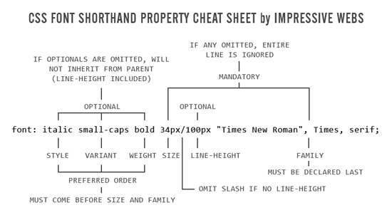
See: http://www.impressivewebs.com/css-font-shorthand-property-cheat-sheet/
Can I have 12.5px font size?
A fractional px font size is perfectly valid.
Modern browsers perform layout with device-independent floating-point values, and there are few-to-no differences between running on a high resolution (2x, 1.25x, etc.) display and setting the zoom level in a browser.
You should be aware that certain values are rounded to whole pixels, such as borders, and this difference might manifest in subtle ways.
As an illustration, Firefox reports 1px for the computed border width of all these, while Chrome does not. A box made purely of border width might layout differently in Firefox and Chrome — there's a tradeoff at play here.
Also as an illustration, do a Find in Page for "px" and look at the ragged border of the highlight — it smoothly moves to the right rather than jumping at a certain point.
Edit: And Safari (on Mac) is indeed the odd one out, apparently rounding the font size to a whole number for display (but the computed value is still fractional).
document.querySelectorAll('span').forEach(span => { const {width, height} = span.getBoundingClientRect(); span.textContent += `\t${width}x${height}`; const {borderTopWidth} = getComputedStyle(span); span.textContent += `\t${borderTopWidth}`;});span { border: 0.08em solid silver; white-space: pre-wrap;}<div style="font-size:12.0px"><span>font-size:12.0px</span></div><div style="font-size:12.1px"><span>font-size:12.1px</span></div><div style="font-size:12.2px"><span>font-size:12.2px</span></div><div style="font-size:12.3px"><span>font-size:12.3px</span></div><div style="font-size:12.4px"><span>font-size:12.4px</span></div><div style="font-size:12.5px"><span>font-size:12.5px</span></div><div style="font-size:12.6px"><span>font-size:12.6px</span></div><div style="font-size:12.7px"><span>font-size:12.7px</span></div><div style="font-size:12.8px"><span>font-size:12.8px</span></div><div style="font-size:12.9px"><span>font-size:12.9px</span></div><div style="font-size:13.0px"><span>font-size:13.0px</span></div><div> </div>What does 'normal normal medium 45px/61px Oswald' mean in a css font rule?
Shorthand syntax for the font property translates to:
font: font-style font-variant font-weight font-size/line-height font-family;
So that generated code is equivalent to:
/* font: normal normal medium 45px/61px Oswald; */

font-style: normal;
font-variant: normal;
font-weight: medium;
font-size: 45px;
line-height: 61px;
font-family: Oswald;
The invalid property here is font-weight, which can't accept "medium" as a value. "Medium" is an OpenType value that roughly corresponds to font-weight: 500, but isn't a valid CSS value.
This is a useful debugging technique for future reference: if you ever run into the invalid property value error when using CSS shorthand, it's helpful to rewrite the shorthand property as individual properties, which then lets the browser's devtools point out exactly which property has an invalid value.
What are the default font sizes (in pixels) for the html heading tags (h1, h2, h3, etc.)?
I think it is as follows:
h1 is 2 em
h2 is 1.5 em
h3 is 1.3 em
h4 is 1 em
h5 is 0.8 em
h6 is 0.7 em
An em is not the same as a pixel. It is a relative way of looking at sizes. With that said I think most browsers default to 16px (or 1em).
Is sizing fonts using em still relevant?
Do not specify the font-size in absolute length units for screen stylesheets. They render inconsistently across platforms and can't be resized by the User Agent (e.g browser). Keep the usage of such units for styling on media with fixed and known physical properties (e.g print)
If you will use this method, no need to calculate
You can set the font-size of the body to 62.5%(that is 62.5% of the default of 16px), which equates to 10px, or 0.625EMs. Now you can set your font-size in EMs with an easy to remember conversion, divide the px by 10.
* 12px = 1.2EMs
* 13px = 1.3EMs
* 16px = 1.6EMs
* 8px = 0.8EMs
* etc…
This makes everything SUPER easy to remember and eliminates the need for conversion tables. Of course, you will still need to use a conversion table for nested elements when using EMs, if you are not being specific in your CSS, which is a whole separate issue.
But 76% is much better and you can use this to calculate http://pxtoem.com/
Yes it's still relevant:
IE6 is still widely used and is unable to resize the fonts defined in px. => Usability issues. That alone is a no-no.
and
IE 7 and 8 don't resize text sized with pixels either, actually. They do have page zoom, but some people prefer to incease text size only.
Here's a summary of what's good and bad about font sizing in general.
Font size in css http://easycaptures.com/fs/uploaded/213/2470522253.png
I personally like ems. Others, like Chris Coyier over at CSS-Tricks.com likes pixels. (Chris has an excellent article on the different font units).
It really comes down to personal preference.
Almost similar or related questions on SO
Should we still use em and % for defining the font-size of the website elements?
Is there really any point to using relative font sizing in CSS?
Why em instead of px?
Font size in CSS - % or em?
CSS font size: relative vs. absolute values. Which to use?
Problem with EM
Using relative instead of fixed size in CSS
Helpful online tool for px to em
http://pxtoem.com/
http://riddle.pl/emcalc/
http://convert-to.com/pixels-px-to-em-conversion.html
Convert entire site from px to em (This tool is still in development)
http://converter.elementagency.com/
EM Calculator AIR application (will work on all os)
http://jameswhittaker.com/journal/em-based-layouts-vertical-rhythm-calculator/
http://jameswhittaker.com/projects/apps/em-calculator-air-application/
Windows apps
http://www.thebrightlines.com/2009/11/16/pixem-pixel-to-em-converter/
http://www.storkas.com/Projects.aspx(go at bottom)
Pixels to Ems Conversion Table for CSS
http://jontangerine.com/silo/css/pixels-to-ems/
http://reeddesign.co.uk/test/points-pixels.html
emchart
http://aloestudios.com/tools/emchart/
http://aloestudios.com/code/emchart/
Some more articles on this issue
http://www.d.umn.edu/itss/support/Training/Online/webdesign/type.html
What would font-size:30; be equivalent to in px?
It will be invalid.
Here's a tip. Use your Developer Tools of your browser to test on your current website you are creating.
e.g: Google Chrome:
Go to Settings tab > More Tools > Developers Tool or Ctrl+Shift+I
The developer tools will help you as a guide to your workaround.
The DevTools provide web developers deep access into the internals of the browser and their web application.
jQuery font size wrong result
Your solution is flawed because your code is going to adjust every element that is nested since you are using * as a selector. Below is a simple example showing how nesting will cause each layer to increase.
$('.main *').each((index, item) => {
    let current = parseInt($(item).css('font-size'));
    let increased = current * 1.2;

    $(item).css({
        fontSize: increased + 'px'
    });

})
<script src="https://cdnjs.cloudflare.com/ajax/libs/jquery/3.3.1/jquery.min.js"></script>
<div class="main">
<p>One</p>
<div>
<p>Two</p>
</div>
<div>
<div>
<p>Three</p>
</div>
</div>
<div>
<div>
<div>
<p>Four</p>
</div>
</div>
</div>
<div>
<div>
<div>
<div>
<p>Five</p>
</div>
</div>
</div>
</div>Related Topics
Css/Js Bundle in Single File in MVC When Publish with Release Option
React Js: How to Animate Conditionally Rendered Components
How to Float Paragraph Next to Image Without Wrapping the Image
Is There a Trick to Show Arial Black in Firefox
Align an Element to the Bottom of Window
Make a Pause During Infinite CSS3 Animation
CSS Border Shorthand When Each Border Has a Different Width
Angular Mat-Select Text Color Doesn't Change
What Does 14Px/26Px Font Size in CSS Do
How to Find "Emulate CSS Media" in Google Chrome
How to Put Text in the Upper Right, or Lower Right Corner of a "Box" Using CSS
CSS Performance Between Class and Attribute Selectors
Can You Add New CSS Properties in Chrome Inspector
Bootstrap Collapse Menu Disappears When Resizing Screen
Z-Index When Using ::After Under Element