Why `float:left` doesn't work with a fixed width?
It seems to me that it is the simple rule that blocks, unless floated, always start a new line. w3.org/TR/CSS2/visuren.html#block-formatting section 9.4.1 –
float:left not working after specifying width
Without knowing the width of your pictures, this is my best "guess" of what your issue is. see fiddle https://jsfiddle.net/ujg77o3r/3/
The top 2 images have width's that are equal to (or can be less then) the width of the container once the 2 images combined are bigger then the 100px the image will go bellow, you can see the second example in the fiddle.
If this is your issue, set the widths of the combined image widths to less then the width of the container.
HTML
<div class="container">
  <div class="unit">
    <img src="http://lorempixel.com/50/50/" />
  </div>
  <div class="unit">
    <img src="http://lorempixel.com/50/50/" />
  </div>
</div>
CSS
.container {
  width: 100px;
  text-align: center;
}
.container .unit {
  position: relative;
  float: left;
}
Why does float: left fix this margin issue?
The reason for all this relates to vertical margins collapsing under certain circumstances.
This is what is happening here:
case 1 - parent is floating:
When the parent element is floating the vertical margins of each child element get recognized as being inside the parent element - kind of if you would set a padding on the parent element instead. Since the parent has no background-color and both children have the very same margin top it appears that there is no margin-top at all.
If you set a background color for the parent you will see that the top-margin is being applied for both children and you see an offset to the top border of the parent element.
case 2 - parent is not floating
When the parent is not floating, the vertical margin of each child that is within document flow (in this case the one <p> not floating) gets pushed outside of their parent element. The margin of the floating child elements (<p class="menu-header-box">) however is treated the same way as if the parent was floating itself - it is being recognized as being inside the parent container (see case1 above). This is where your "weird margin" is coming from. You can check this easily when looking at this in the developer tools in your browser or by applying a background-color to the parent element. Since there are only two child elements and the first one is floating, only the second one determins the height of the parent. Because of this you will only see the parents background-color appear on the left and right but not on the top and bottom as you saw in case 1.
Why does CSS float not change the width of the following div?
This is an expected behavior of float positioning.
When an element is floated to the left (in your case the .inline div), the following content flows down the right side of that element, line boxes get shortened BUT the width of the containing block which is established by the following element (in your case the .yellow div) is reserved.
This is documented in the spec:
9.5 Floats
Since a float is not in the flow, non-positioned block boxes created
before and after the float box flow vertically as if the float did not
exist.
However, the current and subsequent line boxes created next to
the float are shortened as necessary to make room for the margin box
of the float.
Which means block level elements (such as <div>, <p>, ...)—That are not positioned—ignore the float, whereas line boxes flow along its side.
An example given by W3C:
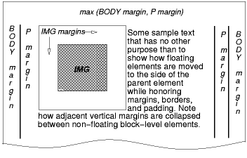 [D]
[D]
The IMG box is floated to the left. The content that follows is
formatted to the right of the float, starting on the same line as the
float. The line boxes to the right of the float are shortened due to
the float's presence, but resume their "normal" width (that of the
containing block established by the P element) after the float.
Hence if you give the .yellow element a background, you'll see that it spans the container and continues through the floated element.
The solution
From CSS level 2.1 spec:
The border box of a table, a block-level replaced element, or an
element in the normal flow that establishes a new block formatting
context (such as an element with 'overflow' other than 'visible') must
not overlap the margin box of any floats in the same block formatting
context as the element itself.
Hence if you add an overflow property with value other than visible to the .yellow div, it prevents the div from overlapping the floated element:
EXAMPLE HERE
.yellow {
    overflow: hidden;
}
Overlapping makes sense specially in situations where the length of the following content is large enough to continue normally after the floated element.
If it was restricted by default, the content wouldn't be continued under the floated element.
Fixed position and float not working correctly
The problem is you are declaring a float: right; AND a position:fixed; on div.right_wrapper. The layout issues you're describing make complete sense.
First some background information on CSS absolute and fixed positions:
There can in fact be no less than seven layers in one stacking context, and any number of elements in those layers, but don't worry—you are unlikely to have to deal with seven layers in a stacking context. The order in which the elements (all elements, not only the positioned ones) within one stacking context are rendered, from back to front is as follows:
- The background and borders of the elements that form the stacking context
- Positioned descendants with negative stack levels
- Block-level descendants in the normal flow
- Floated descendants
- Inline-level descendants in the normal flow
- Positioned descendants with the stack level set as auto or (zero)
- Positioned descendants with positive stack levels
The highlighted entries are the elements whose stack level we can change using the z-index property.
(Taken from http://www.w3.org/wiki/CSS_absolute_and_fixed_positioning)
The reason you're having these issues is because you're assigning a fixed position to an object. This takes it out of the normal object flow. When you remove the fixed position, this leaves only the float: right declaration, which puts it at the right of the main column.
Instead of float: right, position the item using declarations such as right: 0;.
To help illustrate what I'm talking about, below is an example.
#wrapper { position: relative; width: 90% margin: 1em auto; /* Background color to help illustrate areas*/ background-color: red;}#content { position: relative; width: 70%; padding: 1em; background-color: white;}#menu { position: fixed; padding: 10px; top: 30px; left: calc(70% + 30px); background-color: white;}<div id="wrapper"> <div id="content"> <h1><span class="mw-headline" id="The_third_dimension.E2.80.94z-index">The third dimension—z-index</span></h1> <p>It’s natural to regard a web page as two-dimensional. Technology hasn’t evolved far enough that 3D displays are commonplace, so we have to be content with width and height and fake 3D effects. But CSS rendering actually happens in three dimensions! That doesn’t mean you can make an element hover in front of the monitor—yet—but you can do some other useful things with positioned elements. </p> <p>The two main axes in a web page are the horizontal X axis and the vertical Y axis. The origin of this co-ordinate system is in the upper left-hand corner of the viewport, ie where both the X and Y values are 0. But there is also a Z axis, which we can imagine as running perpendicular to the monitor’s surface (or to the paper, when printing). Higher Z values indicate a position “in front of” lower Z values. Z values can also be negative, which indicate a position “behind” some point of reference (I’ll explain this point of reference in a minute). </p> <p>Before we continue, I should warn you that this is one of the most complicated topics within CSS, so don’t get disheartened if you don't understand it on your first read. </p> <p>Positioned elements (including relatively positioned elements) are rendered within something known as a stacking context. Elements within a stacking context have the same point of reference along the Z axis. I’ll explain more about this below. You can change the Z position (also called the stack level) of a positioned element using the <code>z-index</code> property. The value can be an integer number (which may be negative) or one of the keywords <code>auto</code> or <code>inherit</code>. The default value is <code>auto</code>, which means the element has the same stack level as its parent. </p> <p>You should note that you can only specify an <i>index</i> position along the Z axis. You can’t make one element appear 19 pixels behind or 5 centimetres in front of another. Think of it like a deck of cards: you can stack the cards and decide that the ace of spades should be on top of the three of diamonds—each card has its stack level, or Z index. </p> <p>If you specify the <code>z-index</code> as a positive integer, you assign it a stack level “in front of” other elements within the same stacking context that have a lower stack level. A <code>z-index</code> of 0 (zero) means the same as <code>auto</code>, but there is a difference to which I will come back in a minute. A negative integer value for <code>z-index</code> assigns a stack level “behind” the parent’s stack level. </p> <p>When two elements in the same stacking context have the same stack level, the one that occurs later in the source code will appear on top of its preceding siblings. </p> <p>There can in fact be no less than seven layers in one stacking context, and any number of elements in those layers, but don't worry—you are unlikely to have to deal with seven layers in a stacking context. The order in which the elements (all elements, not only the positioned ones) within one stacking context are rendered, from back to front is as follows: </p> <ol> <li>The background and borders of the elements that form the stacking context </li> <li> <b>Positioned descendants with negative stack levels</b> </li> <li>Block-level descendants in the normal flow </li> <li>Floated descendants </li> <li>Inline-level descendants in the normal flow </li> <li> <b>Positioned descendants with the stack level set as <code>auto</code> or (zero)</b> </li> <li> <b>Positioned descendants with positive stack levels</b> </li> </ol> <p>The highlighted entries are the elements whose stack level we can change using the <code>z-index</code> property. </p> </div> <div id="menu"> <h3>This is a fixed menu.</h3> <ul> <li><a href="#">Link 1</a> </li> <li><a href="#">Link 2</a> </li> <li><a href="#">Link 3</a> </li> <li><a href="#">Link 4</a> </li> <li><a href="#">Link 5</a> </li> </ul>
</div></div>can't float inside div with position fixed
Floating wont work inside fixed or absolute divs unless you specify width.
You cannot use position:fixed to position inside the bootstrap grid. Fixed positioned divs are relative to the browser. You need to use absolute positioning.
max-width doesn't work with float
Use defined width percentages and float: http://jsfiddle.net/dEEW5/3/
div{
    height: 100px;
    display:block;
    float:left;
}
.color1{
    background-color: #6AC1FF;
    width: 80%;
    max-width:400px;
}
.color2{
    background-color: #BDBCF4;
    width: 20%;
    max-width:100px;
}
Use defined width percentages with inline-block: http://jsfiddle.net/dEEW5/4/
body{font-size:0}
div{
    height: 100px;
    display:inline-block;
    font-size:16px;
}
.color1{
    background-color: #6AC1FF;
    width: 80%;
    max-width:400px;
}
.color2{
    background-color: #BDBCF4;
    width:20%;
    max-width:100px;
}
Inline-block where the 2nd block drops when it can no longer fit within the container instead of shrinking: http://jsfiddle.net/dEEW5/5/
body{font-size:0}
div{
    height: 100px;
    display:inline-block;
    font-size:16px;
}
.color1{
    background-color: #6AC1FF;
    width: 100%;
    max-width:400px;
}
.color2{
    background-color: #BDBCF4;
    width:100%;
    max-width:100px;
}
Why doesn't a fixed-width element take up the space beside a floated element?
Making the <article> semitransparent reveals what is actually happening when the width of the <aside> is auto:
section {  width: 800px;}
article {  float: left;  width: 500px;  background: #ffffcc;  opacity: 0.5;}
aside {/*   width: 50px; */  background: #ccffcc;}
<body> <section> <article>[[Text]]</article> <aside>[[Text]]</aside> </section></body>How to fix width of DIV that contains floated elements?
If I understand you correctly, what you could do is to get rid of the floats, and lay out using display:inline-block. That way, as long as you ensure there are no spaces or newlines between the inner-divs it will be treated as a single word by the layout engine, and will stay on a single line (thus enlarging the containing <div> and/or overflowing if needed. You can use min-width and text-align:center for some stylistic improvements. Spacing between the elements can be created by using margin attributes on the inner <div>s.
Related Topics
Convert Arabic Ttf/Otf Fonts to Woff, Eof
Input Background Colour Destroys Styling
How to Put Custom Content Like a Linebreak Inside P:Column Header
In CSS Grid Layout, Do We Count the Span Even Starting on Implicit Grid Lines
/ (Forward Slash) in CSS Style Declarations
Fixed Position Relative to Parent Element
Create a W3C Validated Anchor Link with Target="_Blank"
Unicode Character-Specific CSS - a Thought
Image Height Inside Flexbox Not Working in Chrome
Rendering CSS3 Inset Shadow with an Image
How to Do a CSS @Supports Check on a @Media Rule
Ie CSS Bug: Table Border Showing Div with Visibility: Hidden, Position: Absolute
CSS Attr() Concatenation with Url Path
Css: Set Font Weight Depending on Fallback Font
Css: How to Target ::Slotted Siblings in Shadow Dom Root