Two ::after pseudo-elements
You can use a :before pseudo-element in addition to your :after - http://jsfiddle.net/BePSq/
Can I have multiple :before pseudo-elements for the same element?
In CSS2.1, an element can only have at most one of any kind of pseudo-element at any time. (This means an element can have both a :before and an :after pseudo-element — it just cannot have more than one of each kind.)
As a result, when you have multiple :before rules matching the same element, they will all cascade and apply to a single :before pseudo-element, as with a normal element. In your example, the end result looks like this:
.circle.now:before {
    content: "Now";
    font-size: 19px;
    color: black;
}
As you can see, only the content declaration that has highest precedence (as mentioned, the one that comes last) will take effect — the rest of the declarations are discarded, as is the case with any other CSS property.
This behavior is described in the Selectors section of CSS2.1:
Pseudo-elements behave just like real elements in CSS with the exceptions described below and elsewhere.
This implies that selectors with pseudo-elements work just like selectors for normal elements. It also means the cascade should work the same way. Strangely, CSS2.1 appears to be the only reference; neither css3-selectors nor css3-cascade mention this at all, and it remains to be seen whether it will be clarified in a future specification.
If an element can match more than one selector with the same pseudo-element, and you want all of them to apply somehow, you will need to create additional CSS rules with combined selectors so that you can specify exactly what the browser should do in those cases. I can't provide a complete example including the content property here, since it's not clear for instance whether the symbol or the text should come first. But the selector you need for this combined rule is either .circle.now:before or .now.circle:before — whichever selector you choose is personal preference as both selectors are equivalent, it's only the value of the content property that you will need to define yourself.
If you still need a concrete example, see my answer to this similar question.
The legacy css3-content specification contains a section on inserting multiple ::before and ::after pseudo-elements using a notation that's compatible with the CSS2.1 cascade, but note that that particular document is obsolete — it hasn't been updated since 2003, and no one has implemented that feature in the past decade. The good news is that the abandoned document is actively undergoing a rewrite in the guise of css-content-3 and css-pseudo-4. The bad news is that the multiple pseudo-elements feature is nowhere to be found in either specification, presumably owing, again, to lack of implementer interest.
Using 2 ::before and 2 ::after pseudo element for 1 class
In the same element you can not.
It is not the same item but you can get something similar.
.transx{  position:absolute;  top: 0;  left: 0;  width: 100%;  height: 100%;}.classOne {    text-align: center;    position: absolute;    left: 50%;    width: 20%;    height: 55px;    border-radius: 0px;    box-shadow: 4px 8px 16px 0 rgba(0, 0, 0, 0.1);    outline: 3px solid gold;    overflow: hidden;    background: #ffbb00;        -webkit-font-smoothing: antialiased;    -moz-osx-font-smoothing: antialiased;    -webkit-text-shadow: rgba(0,0,0,.01) 0 0 1px;    text-shadow: rgba(0,0,0,.01) 0 0 1px;    margin-left:30.6%;    display: flex;    justify-content: center;    align-items: center;    cursor: pointer;       }a.classOneBtn{    color: white;    font-family: 'Chivo Black', sans-serif;    font-size: 18px;    font-weight: 500;}

.transy::before {  height: 100%;  width: 5px;  background: white;  content: "";  position: absolute;  left: 0;  top: 0;  -moz-transform: scaleY(0);  -ms-transform: scaleY(0);  -webkit-transform: scaleY(0);  transform: scaleY(0);  -moz-transition: 0.3s;  -o-transition: 0.3s;  -webkit-transition: 0.3s;  transition: 0.3s;}
.transy::after {  height: 100%;  width: 5px;  background: white;  content: "";  position: absolute;  right: 0;  top: 0;  -moz-transform: scaleY(0);  -ms-transform: scaleY(0);  -webkit-transform: scaleY(0);  transform: scaleY(0);  -moz-transition: 0.3s;  -o-transition: 0.3s;  -webkit-transition: 0.3s;}
.transx::before {  height: 5px;  width: 100%;  background: white;  content: "";  position: absolute;  left: 0;  top: 0;  -moz-transform: scaleX(0);  -ms-transform: scaleX(0);  -webkit-transform: scaleX(0);  transform: scaleX(0);  -moz-transition: 0.3s;  -o-transition: 0.3s;  -webkit-transition: 0.3s;  transition: 0.3s;}.transx::after {  height: 5px;  width: 100%;  background: white;  content: "";  position: absolute;  left: 0px;  bottom: 0;  -moz-transform: scaleX(0);  -ms-transform: scaleX(0);  -webkit-transform: scaleX(0);  transform: scaleX(0);  -moz-transition: 0.3s;  -o-transition: 0.3s;  -webkit-transition: 0.3s;  transition: 0.3s;}
.transx:hover::before, .transx:hover::after {  -moz-transform: scaleX(1);  -ms-transform: scaleX(1);  -webkit-transform: scaleX(1);  transform: scaleX(1);}
.transy:hover::before, .transy:hover::after {  -moz-transform: scaleY(1);  -ms-transform: scaleY(1);  -webkit-transform: scaleY(1);  transform: scaleY(1);}
<div class="classOne transy"> <div class="transx"></div> <div class="flex-row"> <a href="/" class="classOneBtn">Custome Text</a> </div></div>Two pseudo elements ::before with different properties
You seem to have only one pseudo element.
And that's here in the UI:
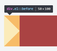
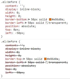
Your CSS cascades to:
.el:before {
  content: '';
  display: inline-block;
  width: 0;
  height: 0;
  border-top: 50px solid #e86d0a;
  border-left: 50px solid transparent;
  position: absolute;
  border-bottom: 50px solid #e86d0a;
  border-left: 50px solid transparent;
  top: 0;
  left: -50px;
}
See the way Chrome has treated your combined CSS:
After-Before pseudo in CSS3 for multiple classes
Consider this HTML structure, where you have a <div> which have children <span> and <p>. And another <span> and <p> as siblings.
<div>
  <span>abc</span>
  <p>xyz</p>
</div>
<span>123</span>
<p>456</p>
For example, if we need to change the colour of the children, we could write on your way,
div span, p{
  color: red;
}
This problem with this is that, it will change the colour of the sibling <p>456</p> too as the style is applied globally to all the paragraph tags.
And the solution is to follow specificity as we did with the <span> and write the selectors as
div span,
div p{
  color: red;
}
The same rule applies to pseudo-elements as well. Hence the solution is,
[class*="divclass-"]::before,
[class*="divclass-"]::after{
  border-radius: 50%;
  width: 30%;
  height : 30%;
  border: 3px solid red;
}
Note 1
If you are working on SASS, your syntax could be,
[class*="divclass-"]{
  &::before,
  &::after{
    border-radius: 50%;
    width: 30%;
    height : 30%;
    border: 3px solid red;
  }
}
Note 2
The before and after pesudo-elements require the content property.
Hope this helps.
Css pseudo-element ::before(2); :before and ::before
The CSS spec on content describes all three syntaxes.
:before-- outdated syntax for pseudo elements. Use if older browser support is needed such as IE8. IE9 supports the new syntax. It also seems like iOS Safari does not support the new syntax::before-- new pseudo element syntax. This is equivalent to::before(1)::before(n)-- used to create multiplebeforeelements that can be before other::befores. Details are in the same spec.- As far as I can tell, no browser supports this.
- http://jsfiddle.net/535Rf/
Is it ok to use multiple pseudo-elements in css?
Sure you can - http://jsfiddle.net/WQBxk/
p:before {
content: "BEFORE ";
display: block;
}
p:first-child:before {
content: "1ST";
display: block
}
The bad - it won't work in IE7 and below. Not because of the multiple pseudo selectors, but because of non-supported :before - http://kimblim.dk/css-tests/selectors/
Just tested in IE8 - works well.
Show pseudo element between elements
You could just use this:
outer .element + .element:before
{
    content:"";
    display:inline-block;
    background:url(images/test.png);
    width:4px;
    height:5px;
}
It's the adjacent sibling selector syntax.
Edit: swapped after for before pseudo class
Edit 2: demo
Add space between two words in a ::After Pseudo element CSS
You can use \00a0 instead of spaces in the content property. They don't get collapsed into a single space.
.c1::after{
    content: "SUB TITLE\00a0\00a0THE EXAMPLE";
}
Related Topics
Pseudo-Element After Not Showing
Pagespeed Caching CSS, Annoying to Develop
Styling of Select2 Dropdown Select Boxes
Firefox 3 Adds Spacing to Spans with Display:Inline-Block
Css: How to Set Container Size Equal to Background Image Size
How to Not Use <Div Class="Clear"> in Markup
How to Emulate CSS Scroll Snap Points in Chrome
Css: Background Position with Repeat
Translate VS Transform-Origin CSS3
How to Select First Img Tag in a Div with Many Img Tag
What Exactly Does the 'Only' Keyword Do in CSS Media Queries
CSS Transparent Border Problem in Firefox 4
Using CSS Sprites and Background Position
Why Does a Fixed Background-Image Move When Scrolling on Ie