Twitter Bootstrap - Making CSS Icons bigger
It's not going to look as nice as using FontAwesome (which is an actual font), but you can scale glyphicons using the background-size property. This will also entail scaling all the other values by an identical factor, which means you can't just do this generally, but will need to do this for a single icon at a time.
Example, doubling the flag icon would be:
.icon-flag.logo-icon {
  width: 28px;  // 14px * 2
  height: 28px; // 14px * 2
  background-size: 938px 318px;  // original dimensions * 2
  background-position: -624px -48px;  // original position * 2
}
If you do want to do this for arbitrary icons, you would be better off working with the LESS where you could probably generate this programatically. Personally, I think switching to FontAwesome is the better alternative.
Bootstrap how to make icon bigger
Just use the font-size property.
.square1:hover{ font-size:2em; }<link rel="stylesheet" href="https://maxcdn.bootstrapcdn.com/bootstrap/3.3.6/css/bootstrap.min.css"/><div class="square1"><a href="#"> <span class="glyphicon glyphicon-search"></span></a></div>Twitter Bootstrap and bigger than a standard icon in the button
Create a icon-perso class
<button type="submit" class="btn btn-primary">
  <i class="icon-school icon-perso"></i> text
</button>
Add the following css to override the default behaviour with:
- the url of your picture
- the width and height of the picture
- change the line-height to the picture height
- margins if required
.
.icon-perso {
  background-image: url("../img/glyphicons-perso.png");
  width: 20px;
  height: 16px
  line-height: 16px;
}
If you picture contain several icons like glyphicons-halflings.png you may have to change the background-position
.icon-school {
  background-position: 0px 0px;
}
You can have a look at bootstrap.css around from line 2143 if you are curious.
Increasing icon size mucks up bootstrap layout on large screens
You need to change the line-height for the icon, it's at line-height: 31.4286px; and your text is line-height: 20px;
See example Snippet.
.no-wrap-labels label { white-space: nowrap !important;}.t-22 { font-size: 22px; line-height: 22px;}<link href="https://maxcdn.bootstrapcdn.com/bootstrap/3.3.5/css/bootstrap.min.css" rel="stylesheet"/><link href="https://code.ionicframework.com/ionicons/2.0.1/css/ionicons.min.css" rel="stylesheet"/><div class="content-wrapper"> <div class="so-cat-top-bar"></div> <div class="container "> <div class="panel panel-default"> <div class="panel-heading"><span class="phone-only">Title</span>
<div class="panel-icons"></div> </div> <div class="panel-body" style="min-height:400px;"> <div class="panel-options"></div> <!-- /panel-options--> <div class="tab-content no-wrap-labels" id="category-tab-container"> <div class="tab-pane active" id="client"> <fieldset class="scheduler-border m-t-15"> <legend class="scheduler-border ">Start Time <a href="#" data-toggle="tooltip" data-placement="bottom" title="Clone this input group" class="preventDefault clone-icon"><i class="icon ion-social-buffer-outline t-22"></i></a>
</legend> <form class="form-horizontal" role="form"> <div class="row"> <div class="col-sm-6 col-lg-4 input-container"> <div class="form-group"> <div class="col-md-4 col-lg-5 "> <label for="inputPassword" class="control-label">Account Number <a href="#" data-toggle="tooltip" data-placement="bottom" title="Clone this input group" class="preventDefault clone-icon m-l-5"> <i class="icon ion-social-buffer-outline t-22"></i> </a>
</label> </div> <div class="col-md-8 col-lg-7"> <input type="text" class="form-control" id="inputPassword" value="4458-465-55811"> </div> </div> </div> <div class="col-sm-6 col-lg-4 input-container"> <div class="form-group"> <div class="col-md-4 col-lg-5 "> <label for="inputPassword" class="control-label"> <a href="#" data-toggle="tooltip" data-placement="bottom" title="Clone this input group" class="preventDefault clone-icon m-r-5"> <i class="icon ion-social-buffer-outline t-22"></i> </a>Account Number</label> </div> <div class="col-md-8 col-lg-7"> <input type="text" class="form-control" id="inputPassword" value="4458-465-55811"> </div> </div> </div> <div class="col-sm-6 col-lg-4 input-container"> <div class="form-group"> <div class="col-md-4 col-lg-5 "> <label for="inputPassword" class="control-label">Account Number</label> </div> <div class="col-md-8 col-lg-7"> <input type="text" class="form-control" id="inputPassword" value="4458-465-55811"> </div> </div> </div> <div class="col-sm-6 col-lg-4 input-container"> <div class="form-group"> <div class="col-md-4 col-lg-5 "> <label for="inputPassword" class="control-label">Account Number <a href="#" data-toggle="tooltip" data-placement="bottom" title="Clone this input group" class="preventDefault clone-icon m-l-5"> <i class="icon ion-social-buffer-outline t-22"></i> </a>
</label> </div> <div class="col-md-8 col-lg-7"> <input type="text" class="form-control" id="inputPassword" value="4458-465-55811"> </div> </div> </div> </form> </fieldset> </div> </div> <div class="row"> <div class="col-md-12"> <div class="btn-toolbar pull-right"> <div class="btn-group"> <button class="btn btn-default"><span class="glyphicon glyphicon-arrow-left" aria-hidden="true"></span> Last</button> <button class="btn btn-default">Next <span class="glyphicon glyphicon-arrow-right" aria-hidden="true"></span>
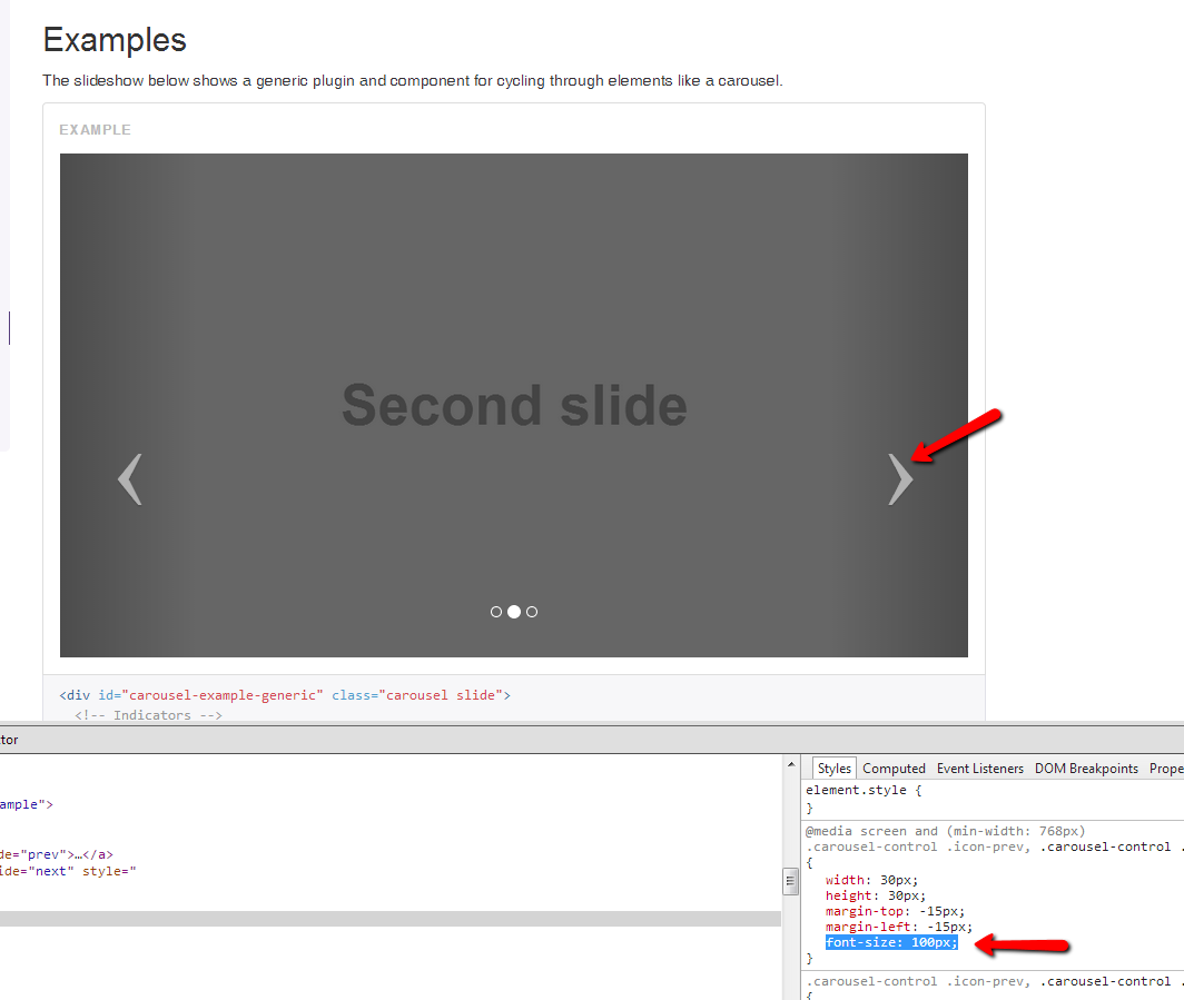
</button> </div> </div> </div> </div> </div> <!-- /tab content--> </div> <!-- /panel-body--> </div> <!-- /panel-default --> </div>How can I increase the size of twitter bootstrap carousel navigation arrows
it's a font so all you need to do is make it bigger
for example:
.carousel-control .icon-prev,
.carousel-control .icon-next {
    font-size: 100px;
}
then use margin-top to adjust the horizontal position, for example (in case of 100px in font-size) use margin-top: -70px;
Twitter bootstrap bigger glyphicons.
If it's Bootstrap 3, then try increasing the font-size if it applies to the element. Example below.
glyphicon.myclass {
    font-size: 1.4em;
}
How to make twitter bootstrap buttons bigger?
here are the sizes bootstrap offers right out of the box.
.btn-large
.btn-small
.btn-mini
read more about it here
it's under Button sizes
Edit:
or you could make your own:
.btn-xlarge {
    padding: 18px 28px;
    font-size: 22px; //change this to your desired size
    line-height: normal;
    -webkit-border-radius: 8px;
       -moz-border-radius: 8px;
            border-radius: 8px;
}
Source located here
Related Topics
How to Use a Stylus Variable in Calc
Lining Up Labels with Radio Buttons in Bootstrap
Canvas VS. Webgl VS. CSS 3D -> Which to Choose
Css: Display: Grid And/Or -Ms-Grid
Is Is Possible to Scale Inline Svg with CSS
How to Specify a CSS Shorthand for "All Elements Except the First/Last"
CSS White Space at Bottom of Page Despite Having Both Min-Height and Height Tag
CSS (Transition) After a Pseudo Element - How to Transition Content That Shows on Hover
How to Centre Absolutely Positioned Content of Unknown Width
How to Place an Image Over Another
Passwords Showing Up as White (Or Not at All) in Ie
Applying Border to a Checkbox in Chrome
Dynamically Change CSS Style of Cell in <H:Datatable> Column
Changes in CSS Files Are Not Reflected After Deployment