Styling of Select2 dropdown select boxes
Thanks for the suggestions in the comments. I made a bit of a dirty hack to get what I want without having to create my own image. With javascript I first hide the default tag that's being used for the down arrow, like so:
$('b[role="presentation"]').hide();
I then included font-awesome in my page and add my own down arrow, again with a line of javascript, to replace the default one:
$('.select2-arrow').append('<i class="fa fa-angle-down"></i>');
Then with CSS I style the select boxes. I set the height, change the background color of the arrow area to a gradient black, change the width, font-size and also the color of the down arrow to white:
.select2-container .select2-choice {
    padding: 5px 10px;
    height: 40px;
    width: 132px;
    font-size: 1.2em;
}

.select2-container .select2-choice .select2-arrow {
    background-image: -khtml-gradient(linear, left top, left bottom, from(#424242), to(#030303));
    background-image: -moz-linear-gradient(top, #424242, #030303);
    background-image: -ms-linear-gradient(top, #424242, #030303);
    background-image: -webkit-gradient(linear, left top, left bottom, color-stop(0%, #424242), color-stop(100%, #030303));
    background-image: -webkit-linear-gradient(top, #424242, #030303);
    background-image: -o-linear-gradient(top, #424242, #030303);
    background-image: linear-gradient(#424242, #030303);
    width: 40px;
    color: #fff;
    font-size: 1.3em;
    padding: 4px 12px;
}
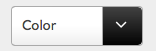
The result is the styling the way I want it:
Update 5/6/2015
As @Katie Lacy mentioned in the other answer the classnames have been changed in version 4 of Select2. The updated CSS with the new classnames should look like this:
.select2-container--default .select2-selection--single{
    padding:6px;
    height: 37px;
    width: 148px;
    font-size: 1.2em;
    position: relative;
}

.select2-container--default .select2-selection--single .select2-selection__arrow {
    background-image: -khtml-gradient(linear, left top, left bottom, from(#424242), to(#030303));
    background-image: -moz-linear-gradient(top, #424242, #030303);
    background-image: -ms-linear-gradient(top, #424242, #030303);
    background-image: -webkit-gradient(linear, left top, left bottom, color-stop(0%, #424242), color-stop(100%, #030303));
    background-image: -webkit-linear-gradient(top, #424242, #030303);
    background-image: -o-linear-gradient(top, #424242, #030303);
    background-image: linear-gradient(#424242, #030303);
    width: 40px;
    color: #fff;
    font-size: 1.3em;
    padding: 4px 12px;
    height: 27px;
    position: absolute;
    top: 0px;
    right: 0px;
    width: 20px;
}
JS:
$('b[role="presentation"]').hide();
$('.select2-selection__arrow').append('<i class="fa fa-angle-down"></i>');
select2 apply styles to select
Select2 hides selects and re-renders
Example fiddle here with red background
Css applied:
.select2-drop {
  background: red; /* !important not needed */
}
Fiddle with newer version of select2 (4.0.3)
Css applied:
.select2-dropdown {
  background: red;
}
Apply style to select2
I found the solution on my own:
$('#select2-'+myID+'-container').parent().css('background-color', 'red');
Styling a select using select2
It depends on what you want to style and how you pick the elements.
In this example i have style the border and input box height. Note this styling will apply for all your select2 boxes
http://jsfiddle.net/2tduypwx/
.select2-search__field{
  height:80px;
}

.select2-container--default .select2-selection--single{
  border:1px solid red;
  border-radius:0;
}
select2 multiple select changing style of selected values
You can override the given file css files with respect to the given file https://github.com/select2/select2-bootstrap-theme/blob/master/docs/css/select2-bootstrap.css
Select2 style attribute not picking up
I am adding another answer since I think my first answer is viable for your initial question and resolves the bug you had, and this answer does what you actually want. Your main issue is that you want to change the background color of your options, but the dropdown container is generated dynamically at the time it opens. This makes it tricky to alter the styles. However, you can somewhat hack the theme option in the select2 config. Normally, when you set the theme option it will add that string to your dropdown class prefixed by select2-container--. For example, if you set this config:
$('#example').select2({theme: 'bootstrap4'});
then whenever you open your dropdown, the main select2 container will have the class select2-container--bootstrap4. It simply appends whatever you set for theme to select2-container--, which means we can add our own class within the config like so:
$('#example').select2({theme: 'bootstrap4 my-custom-class'});
and then whenever you open your dropdown, the main select2 container will have the class select2-container--bootstrap4 as well as the class my-custom-class.
Knowing this, you can create whatever styles you want in advance for your list items:
#select2-fam-results li:nth-child(1),
.select2-container.bg-red li {
  background-color: red;
}

#select2-fam-results li:nth-child(2),
.select2-container.bg-yellow li {
  background-color: yellow;
}
EDIT NOTE:
Notice how I also have added matching styles for your family's list element such as #select2-fam-results li:nth-child(1) and #select2-fam-results li:nth-child(2). Since you gave an id of fam on your Family <select> element, the dynamically-generated <ul> list will always have the id corresponding id select2-fam-results. You have to be a bit careful here since you are hardcoding the nth-child index, but if you can be reasonably sure how the ordering of the Family options will appear then you can safely do this.
END EDIT NOTE
Now all you need to do is update your theme dynamically when Family is selected. Let's modify productOptions so that it contains both your data and the theme that you want:
const productOptions = {
  dataitems1: {data: dataitems1, theme: 'bg-red'},
  dataitems2: {data: dataitems2, theme: 'bg-yellow'},
};
Now in your #fam change event, all you have to do is add that theme to your existing theme:
$('#fam').on('change', function() {
  /* ... */
  const options = productOptions[selected];

  // get the new products config (products config + data options + theme)
  const newProductsConfig = Object.assign({}, productsConfig, {
    data: options.data,
    theme: `${productsConfig.theme} ${options.theme}`,
  });
  /* ... */
});
This gives you the flexibility of changing the background color for your products depending on which family you select.
Note: In your productsConfig definition you would then also have to change data: dataitems2 to data: dataitems2.data or remove the line altogether since it is not actually being used.
Select2 - can we set the dropdown menu to match the style of the rest of the page?
Ok so this is a work in progress as I'm sure you're going to ask me to style the dropdown next..!
https://codepen.io/doughballs/pen/zYGERzX
So first off, Select2 is forcing a 700px width on the select, which is making it wider than the materializecss inputs (which are always width: 100%). So we override it here. !important flag is needed unfortunately.
.select2 {
  width:100% !important;
}
Next up, the actual select field. As you know materializecss uses very minimal styling - just a border bottom in fact. So I looked at the base styles that are applied to all materializecss input fields, copied them into the codepen and then applied them to the following two elements. Select2 does real funky things, lots of nested divs (urgh) and it took a little while to figure out what the hell it is doing:
span.select2-selection.select2-selection--single,
span.select2-selection__rendered {
    // These are base materializecss input styles
    padding-left:0 !important;
    position: relative;
    cursor: pointer;
    background-color: transparent;
    border: none;
    border-bottom: 1px solid #9e9e9e;
    outline: none;
    height: 3rem;
    line-height: 3rem;
    width: 100%;
    font-size: 16px;
    margin: 0 0 8px 0;
    padding: 0;
    display: block;
    -webkit-user-select: none;
    -moz-user-select: none;
    -ms-user-select: none;
    user-select: none;
    z-index: 1;
    border-radius: 0;
}
As a final note - can I ask why you are using a 3rd party library for Selects? I don't know much about Select2, I did have a quick look at the docs and apparently they offer extended functionality to Select inputs. Materializecss can do the same without overriding styles and importing extra css.
If you are interested, I can show you a codepen that uses autocomplete to get similar functionality to your example. Here
Related Topics
Bootstrap3 .Visible-* .Hidden-* Display Inline
Flexbox Space-Between and Align Right
Svg @Font-Face Works in Svg But Not When Included in a Page
Does Angular Material Have a Grid System
Custom <Hr> with Image/Character in the Center
Full Height Sidebar and Full Height Content, Fluid Layout
Add Dropshadow Only to Border of Grid Pane Javafx 2.2
Angular2: How to Manually Add CSS Files by Condition to Index.Html
Viewport Units, Keeping Aspect Ratio
Bootstrap Scrollable Tab Panel Content
Angular Material - Global Color Variables
Why Does a Fixed Background-Image Move When Scrolling on Ie
Background Image Transparency with CSS3
Move R Shiny Shownotification to Center of Screen
CSS to Make Images Resize and Fit Any Screen the Same