Tint image using CSS without overlay
Eventually it will be, using shaders. See the W3C Docs on Filters.
At the moment, what is possible for instance is:
-webkit-filter: grayscale; /*sepia, hue-rotate, invert....*/
-webkit-filter: brightness(50%);
See
- David Walsh on CSS Filters
- Stackoverflow: apply a rose tint...:
- W3C Filter Effects 1.0 Docs - 38.2.5. Other uniform variables: the CSS shaders parameters
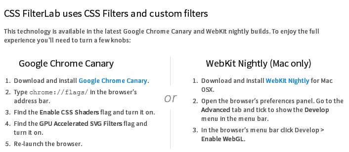
Update:
Adobe released its HTML5 based CSS Filter Labs with support for custom filters (Shaders) on supported browsers:
How can I tint a background image with CSS?
I think you need to create an overlay element (potentially div) which has the sought translucent background. Something like:
.overlay {
    z-index: 1;
    height: 100%;
    width: 100%;
    position: fixed;
    overflow: auto;
    top: 0px;
    left: 0px;
    background: rgba(0, 0, 0, 0.7); /*can be anything, of course*/
}
And of course, a little demo: little link.
How to overlay image with color in CSS?
You should use rgba for overlaying your element with photos.rgba is a way to declare a color in CSS that includes alpha transparency support. you can use .row as an overlayer like this:
#header {
    background: url(../img/bg.jpg) 0 0 no-repeat fixed;
    height: 100%;
    overflow: hidden;
    color: #FFFFFF
 }

.row{
    background: rgba(39,62,84,0.82);
    overflow: hidden;
    height: 100%;
    z-index: 2;
}
How to add a color overlay to a background image?
I see 2 easy options:
- multiple background with a translucent single gradient over image
- huge inset shadow
gradient option:
html {
  min-height:100%;
  background:linear-gradient(0deg, rgba(255, 0, 150, 0.3), rgba(255, 0, 150, 0.3)), url(http://lorempixel.com/800/600/nature/2);
  background-size:cover;
}
shadow option:
html {
  min-height:100%;
  background:url(http://lorempixel.com/800/600/nature/2);
  background-size:cover;
  box-shadow:inset 0 0 0 2000px rgba(255, 0, 150, 0.3);
}
an old codepen of mine with few examples
a third option
- with background-blen-mode :
The
background-blend-modeCSS property sets how an element's background images should blend with each other and with the element's background color.
html {
  min-height:100%;
  background:url(http://lorempixel.com/800/600/nature/2) rgba(255, 0, 150, 0.3);
  background-size:cover;
  background-blend-mode: multiply;
}
Black Tint on Image Without Overlay - Firefox
use
img { filter: grayscale(.5); filter: brightness(.5); }
in Firefox
for more examples see the Mozilla guide to filters
How to add overlay to background image
You could nest two blocks together, one with the background image, and the other with the overlay :
.background{  width: 500px;  height: 500px;  background: url('https://static1.squarespace.com/static/56be46d2a3360cae707270a0/t/5772ef9b20099e38818859b0/1467150245253/');  background-size: cover;}
.overlay{  width: 500px;  height: 500px;  background-color: rgba(0, 0, 0, 0.5);}
<div class="background"> <div class="overlay"> <!-- Content here --> </div></div>Change color of PNG image via CSS?
You can use filters with -webkit-filter and filter:
Filters are relatively new to browsers but supported in over 90% of browsers according to the following CanIUse table: https://caniuse.com/#feat=css-filters
You can change an image to grayscale, sepia and lot more (look at the example).
So you can now change the color of a PNG file with filters.
body {
    background-color:#03030a;
    min-width: 800px;
    min-height: 400px
}
img {
    width:20%;
    float:left;
     margin:0;
}
/*Filter styles*/
.saturate { filter: saturate(3); }
.grayscale { filter: grayscale(100%); }
.contrast { filter: contrast(160%); }
.brightness { filter: brightness(0.25); }
.blur { filter: blur(3px); }
.invert { filter: invert(100%); }
.sepia { filter: sepia(100%); }
.huerotate { filter: hue-rotate(180deg); }
.rss.opacity { filter: opacity(50%); }
<!--- img src http://upload.wikimedia.org/wikipedia/commons/thumb/e/ec/Mona_Lisa%2C_by_Leonardo_da_Vinci%2C_from_C2RMF_retouched.jpg/500px-Mona_Lisa%2C_by_Leonardo_da_Vinci%2C_from_C2RMF_retouched.jpg -->
<img alt="Mona Lisa" src="https://images.pexels.com/photos/40997/mona-lisa-leonardo-da-vinci-la-gioconda-oil-painting-40997.jpeg?auto=compress&cs=tinysrgb&dpr=3&h=750&w=1260" title="original">
<img alt="Mona Lisa" src="https://images.pexels.com/photos/40997/mona-lisa-leonardo-da-vinci-la-gioconda-oil-painting-40997.jpeg?auto=compress&cs=tinysrgb&dpr=3&h=750&w=1260" title="saturate" class="saturate">
<img alt="Mona Lisa" src="https://images.pexels.com/photos/40997/mona-lisa-leonardo-da-vinci-la-gioconda-oil-painting-40997.jpeg?auto=compress&cs=tinysrgb&dpr=3&h=750&w=1260" title="grayscale" class="grayscale">
<img alt="Mona Lisa" src="https://images.pexels.com/photos/40997/mona-lisa-leonardo-da-vinci-la-gioconda-oil-painting-40997.jpeg?auto=compress&cs=tinysrgb&dpr=3&h=750&w=1260" title="contrast" class="contrast">
<img alt="Mona Lisa" src="https://images.pexels.com/photos/40997/mona-lisa-leonardo-da-vinci-la-gioconda-oil-painting-40997.jpeg?auto=compress&cs=tinysrgb&dpr=3&h=750&w=1260" title="brightness" class="brightness">
<img alt="Mona Lisa" src="https://images.pexels.com/photos/40997/mona-lisa-leonardo-da-vinci-la-gioconda-oil-painting-40997.jpeg?auto=compress&cs=tinysrgb&dpr=3&h=750&w=1260" title="blur" class="blur">
<img alt="Mona Lisa" src="https://images.pexels.com/photos/40997/mona-lisa-leonardo-da-vinci-la-gioconda-oil-painting-40997.jpeg?auto=compress&cs=tinysrgb&dpr=3&h=750&w=1260" title="invert" class="invert">
<img alt="Mona Lisa" src="https://images.pexels.com/photos/40997/mona-lisa-leonardo-da-vinci-la-gioconda-oil-painting-40997.jpeg?auto=compress&cs=tinysrgb&dpr=3&h=750&w=1260" title="sepia" class="sepia">
<img alt="Mona Lisa" src="https://images.pexels.com/photos/40997/mona-lisa-leonardo-da-vinci-la-gioconda-oil-painting-40997.jpeg?auto=compress&cs=tinysrgb&dpr=3&h=750&w=1260" title="huerotate" class="huerotate">
<img alt="Mona Lisa" src="https://images.pexels.com/photos/40997/mona-lisa-leonardo-da-vinci-la-gioconda-oil-painting-40997.jpeg?auto=compress&cs=tinysrgb&dpr=3&h=750&w=1260" title="opacity" class="rss opacity">Related Topics
Bootstrap - Removing Padding or Margin When Screen Size Is Smaller
CSS Grid Auto Fit with Max-Content
Rounded Side, Not Rounded Corners
CSS Class Repetition to Increase Specificity
Using Modulus in CSS Calc Function
Difference Between CSS3 Transitions' Ease-In and Ease-Out
How to Emulate Prefers-Color-Scheme Media Query in Chrome
Two Divs the Same Line, One Dynamic Width, One Fixed
How to Generate a Box-Shadow That Follows the Shape of a Clip-Path Polygon
How to Align Spans or Divs Horizontally
How to Fix Internet Explorer 7 Bug When Using Percentage Widths for Layout
Firefox @Font-Face with Local File - Downloadable Font: Download Failed
Are All CSS Font-Weight Property's Values Useful
IE9 + Richfaces Rendering Problem