Contain an image within a div?
Use max width and max height. It will keep the aspect ratio
#container img
{
 max-width: 250px;
 max-height: 250px;
}
http://jsfiddle.net/rV77g/
how to fit image inside a div?
To fit an image in a div, use the css object-fit property.
html code
<div>
    <img src="abidjan.jpg" alt="Abidjan" width="400" height="300">
<div>
NB : Note the width and height attributes of the img.
CSS code
img {
    width: 200px;
    height: 300px;
    object-fit: fill;
    /* You can also use cover instead of fill but they are different */
}
The image is squished to fit the container of 200x300 pixels (its original aspect ratio is destroyed)
More info here
How do I fit an image (img) inside a div and keep the aspect ratio?
You will need some JavaScript to prevent cropping if you don't know the dimension of the image at the time you're writing the css.
HTML & JavaScript
<div id="container">
    <img src="something.jpg" alt="Sample Image" />
</div>

<script type="text/javascript">
(function() {

var img = document.getElementById('container').firstChild;
img.onload = function() {
    if(img.height > img.width) {
        img.height = '100%';
        img.width = 'auto';
    }
};

}());
</script>
CSS
#container {
   width: 48px;
   height: 48px;
}

#container img {
   width: 100%;
}
If you use a JavaScript Library you might want to take advantage of it.
How do I auto-resize an image to fit a 'div' container?
Do not apply an explicit width or height to the image tag. Instead, give it:
max-width:100%;
max-height:100%;
Also, height: auto; if you want to specify a width only.
Example: http://jsfiddle.net/xwrvxser/1/
img {
    max-width: 100%;
    max-height: 100%;
}

.portrait {
    height: 80px;
    width: 30px;
}

.landscape {
    height: 30px;
    width: 80px;
}

.square {
    height: 75px;
    width: 75px;
}
Portrait Div
<div class="portrait">
<img src="http://i.stack.imgur.com/xkF9Q.jpg">
</div>
Landscape Div
<div class="landscape">
<img src="http://i.stack.imgur.com/xkF9Q.jpg">
</div>
Square Div
<div class="square">
<img src="http://i.stack.imgur.com/xkF9Q.jpg">
</div>Contain image size with parent div
You should set the width and height on the img in order to use it with object-fit. And it looks like object-fit: cover; might be what you're after.
img {
  width: 100%;
  height: 100%;
  object-fit: cover;
}
Full snippet:
.gallery {  width: 1000px;  height: 300px;  display: flex;}
.inner {  flex: 0 0 33.333333%;  /*or flex: 1; */  /*or width: 33.333333%; */  height: 100%;}
img {  width: 100%;  height: 100%;  object-fit: cover;}
<div class="gallery"> <div class="inner"><img src="https://picsum.photos/300/300"></div> <div class="inner"><img src="https://picsum.photos/400/600"></div> <div class="inner"><img src="https://picsum.photos/600/400"></div></div>Image inside div has extra space below the image
By default, an image is rendered inline, like a letter so it sits on the same line that a, b, c and d sit on.
There is space below that line for the descenders you find on letters like g, j, p and q.
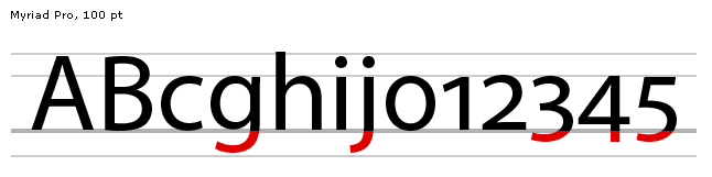
You can:
- adjust the
vertical-alignof the image to position it elsewhere (e.g. themiddle) or - change the
displayso it isn't inline.
div {  border: solid black 1px;  margin-bottom: 10px;}
#align-middle img {  vertical-align: middle;}
#align-base img {  vertical-align: bottom;}
#display img {  display: block;}
<div id="default"><h1>Default</h1> The quick brown fox jumps over the lazy dog <img src="https://upload.wikimedia.org/wikipedia/commons/thumb/f/f2/VangoghStarry-night2.jpg/300px-VangoghStarry-night2.jpg" alt="Sample Image"></div>
<div id="align-middle"><h1>vertical-align: middle</h1> The quick brown fox jumps over the lazy dog <img src="https://upload.wikimedia.org/wikipedia/commons/thumb/f/f2/VangoghStarry-night2.jpg/300px-VangoghStarry-night2.jpg" alt="Sample Image"> </div> <div id="align-base"><h1>vertical-align: bottom</h1> The quick brown fox jumps over the lazy dog <img src="https://upload.wikimedia.org/wikipedia/commons/thumb/f/f2/VangoghStarry-night2.jpg/300px-VangoghStarry-night2.jpg" alt="Sample Image"> </div>
<div id="display"><h1>display: block</h1> The quick brown fox jumps over the lazy dog <img src="https://upload.wikimedia.org/wikipedia/commons/thumb/f/f2/VangoghStarry-night2.jpg/300px-VangoghStarry-night2.jpg" alt="Sample Image"></div>Related Topics
Less and Bootstrap: How to Use a Span3 (Or Spanx [Any Number]) Class as a Mixin
How to Align Spans or Divs Horizontally
How to Use Images in CSS with Webpack
Table Border Color in CSS with Border Collapse
CSS Select Multiple Descendants of Another Element
Disable CSS Animation on Pseudo Element Inherited from Parent
How to Find Out When I Can Safely Drop Vendor Prefixes for a CSS3 Property
How to Use and How Works CSS' Will-Change Property
Is There a CSS Way to Add an Arrow If a Ul Has a Ul Child
In Outlook HTML Email, Float Does Not Work
CSS Layout, Use CSS to Reorder Divs
Import CSS/Scss File into a Class
CSS Reset That Sets Everything to Default Values
Bootstrap 4 - No Column Wrapping
Why Do All Browsers Download All CSS Files - Even for Media Types They Don't Support