Responsive Web Design and high resolution displays (iPhone 4/5)
Well either if you want to make the text smaller on mobile or bigger you would do
@media screen and (max-width: 480px) {
    font-size: 10px; /* Smaller */
}
or
@media screen and (max-width: 480px) {
    font-size: 20px; /*Larger*/
}
And make sure you have this in your <HEAD> tag:
<meta name="viewport" content="width=device-width, initial-scale=1">
Or you can also disable zooming like so:
<meta name="viewport" content="width=device-width, initial-scale=1, maximum-scale=1">
And for IE10 support, try:
@-ms-viewport{
    width:device-width
}
Is there any difference between iPhone 4 and iPhone 5 when I use media queries?
According to this site, the difference is with the max-device-width:
In iphone4 it's 480px
In iphone5 it's 568px
iphone4
@media only screen
and (min-device-width : 320px)
and (max-device-width : 480px) { /* STYLES GO HERE */}
iphone5:
@media only screen
and (min-device-width : 320px)
and (max-device-width : 568px) { /* STYLES GO HERE */ }
...and both have Device-pixel-ratio: 2 so
iphone4 has screen height= 960px (Actual Pixels) and
iphone5 has screen height= 1136px (Actual Pixels)
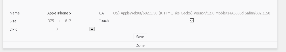
How can I add a high resolution device to Responsive Design Mode?
Since nobody else has answered, and I've found something myself:
Divide the real pixel size by the DPR and enter that as the 'Size'.
- 1125 / 3
- 2436 / 3
So for an iPhone X, if you want to cut and paste, you'd enter:
3758123Mozilla/5.0 (iPhone; CPU iPhone OS 11_0 like Mac OS X) AppleWebKit/604.1.38 (KHTML, like Gecko) Version/11.0 Mobile/15A356 Safari/604.1
This is odd, as you've already entered the DPR and would expect Firefox to calculate this for you, but that's how it works.
iOS Safari zooming in on high resolution background images
Wow, it seems Mobile Safari does not support background-attachment: fixed (or, at least doesn't support it well...)
If you remove that, background-size: cover behaves as you expect, but it breaks the expected behavior...
There are some work arounds for Mobile Safari involving fixed-positioned elements behind the content to mimic background-attachment: fixed, if desired.
Off topic, but love the design!
Related Topics
Why Does "Left: 50%, Transform: Translatex(-50%)" Horizontally Center an Element
Lining Up Labels with Radio Buttons in Bootstrap
Bootstrap Fluid Layout - Fixed Width of Sidebar
How to Change the Font Size with SASS in Bootstrap 4
Can't Get Angular-Material Md-Sidenav to Be 100% Height
Is There User-Select for Opera 10.62 and IE9
Angular Material - Global Color Variables
Angular2: How to Manually Add CSS Files by Condition to Index.Html
Top-Left and -Right Corner Rounded in Javafx/Css
D3.Js Map (<Svg>) Auto Fit into Parent Container and Resize with Window
Transition Color Fade on Hover
How to Add/Insert a Before or After Pseudo Element into Chrome's Inspector
Is There an Advantage in Grouping CSS Media Queries Together
Position:Sticky Is Not Working
How to Maintain Png Alpha Transparency When Using "-Ms-Filter" Property