Why does left: 50%, transform: translateX(-50%) horizontally center an element?
The CSS left property is based on the size of the parent element. The transform property is based on the size of the target element.
Name: transform
Percentages: refer to the size of bounding box [of the element to which the style is applied]
http://www.w3.org/TR/css3-transforms/#transform-property
'top'
Percentages: refer to height of containing block
http://www.w3.org/TR/CSS2/visuren.html#position-props
If the parent is 1000px wide and the child is 100px, The browser would interpret the rules in your question as:
Example 1:
.prompt-panel {
    left: 500px;
    transform: translateX(-50px);
}
Example 2:
.prompt-panel {
    left: -500px;
    transform: translateX(50px);
}
Transform: translate(-50%, -50%)
The reason why transform: translate(-50%, -50%) is required is because you want the center of the element to line up with the center of its parent. In simple terms, it can be boiled down to translateX(-50%) translateY(-50%), which means:
- move me leftwards by 50% of my width, along the x-axis, and
- move me upwards by 50% of my height, along the y-axis
This effectively moves the center of the element to its original top left corner. Remember than when you set left: 50%; top 50% on the element, you are moving its top left corner to the center of its parent (which means it is not visually centered at all). By moving the element back leftwards and upwards by half of its width and height respectively, you sure that its center now aligns with the parent's center, making it visually horizontally + vertically centered.
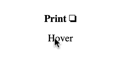
As a proof-of-concept, see the code snippet below: hover over the parent to cause the child element's "ghost" to reposition itself by means of transform: translate(-50%, -50%):
body {  margin: 0;  padding: p;}
.parent {  background-color: #ccc;  width: 100vw;  height: 100vh;  position: relative;}
.child {  background-color: rgba(0,0,255,0.5);  width: 50px;  height: 50px;  position: absolute;  top: 50%;  left: 50%;}
.child::before {  background-color: rgba(255, 0, 0, 0.5);  position: absolute;  top: 0;  left: 0;  width: 50px;  height: 50px;  content: '';  transition: all .5s ease-in-out;}
body:hover .child::before {  transform: translate(-50%, -50%);}
<div class="parent"> <div class="child"></div></div>Why is translateY(-50%) needed to center an element which is at top: 50%?
top:0 (default)
By default, your element is at the top of the page, and the top of the element is at 0:
--------Top of Page--------
{element}

------Middle of  Page------

------Bottom of  Page------
top:50%
When you move it down by 50% height (50% of the entire page), the top of the element is at the 50% mark, meaning the element starts at 50% and is not centered.
--------Top of Page--------

------Middle of  Page------
{element}

------Bottom of  Page------
top:50%; transform:translateY(-50%);
When the top of the element is at the halfway mark, we can move the element back up by half of its own height to center it with the whole page. That's exactly what transform:translateY(-50%); does:
--------Top of Page--------

{element}-Middle of Page---

------Bottom of  Page------
But why can't we just say top: 25% or something like that? I've made a quick snippet to show you the difference with that implementation:
body { margin: 0;}.row { display: flex; justify-content: space-between;}.container { display: inline-block; margin: 5px; width: 200px; height: 200px; background: tomato;}.inner { position: relative; margin: 0 auto; height: 50%; width: 50%; background: #FFC4BA;}.inner.small { width: 25%; height: 25%;}.inner.big { width: 75%; height: 75%;}.percent { top: 25%}.transform { top: 50%; transform: translateY(-50%);}<b>First row </b>looks alright, but that's because the gap works well with the 25%<div class="row"> <div class="container"> <div class="inner percent"></div> </div> <div class="container"> <div class="inner transform"></div> </div></div><b>Second row </b>made the center square a bit smaller, and the 25% now is too high as we'd expect the bottom of the element to reach 75%<div class="row"> <div class="container"> <div class="small inner percent"></div> </div> <div class="container"> <div class="small inner transform"></div> </div></div><b>Third row </b>now I've made the center box big and it ends lower than 75% making 25% start too late<div class="row"> <div class="container"> <div class="big inner percent"></div> </div> <div class="container"> <div class="big inner transform"></div> </div></div>Centering a position absolute element using translateX(-50%) doesn't center div
So I changed the code a little to see what it was doing.
The comments are correct, you must do a left: 50% and a transform: translateX(-50%);.
The left:50% will move the left side of your inner element to the middle of the parent element. And the transform: translateX(-50%); will move the inner element back by 50% of its width. This will center the object in the parent.
Part of the problem in your example was:
- The lack of a
position: relativeon the parent container. - Setting the parent container to 30px. For this to work well the parent should take 100% width.
- Forgetting the
left: 50%in the.eland.pprules.
.container {  height: 80px;  outline: 1px dashed red;  position: relative;}
.el {  background-color: pink;  border-radius: 100%;  height: 30px;  left: 50%;  outline: 1px dashed blue;  position: absolute;  transform: translateX(-50%);  width: 30px;}
.pp {  bottom: 0;  position: absolute;  left: 50%;  max-width: 300px;  background-color: yellow;}
.pp1 {  transform: translateX(-50%);}
.pp2 {  transform: translateX(-43%);}
Not centered when translateX is -50%<br /><br /><div class="container"> <div class="el"> elem </div> <div class="pp pp1"> <div style="width:10px; height: 10px; margin: 0 auto; background-color: red;"></div> popoverasdasd asjdjasd sdfsdfsdfsdf </div></div><br /><br /><br /><br />Expected result comes when translateX is -43%<br /><br /><div class="container"> <div class="el"> elem </div> <div class="pp pp2"> <div style="width:10px; height: 10px; margin: 0 auto; background-color: red;"></div> popoverasdasd asjdjasd sdfsdfsdfsdf </div></div>CSS Centering with Transform
Because translateX(-50%) moves something back to the left 50% (because of the - negative value), which means it pairs with left: 50%; to center something.
If you want to use right: 50%; then use that with translateX(50%) to center.
* {margin:0;}span {  position: absolute;  top: 50%; right: 50%;  transform: translate(50%,-50%);  background: black;  color: white;}
body:after, body:before {  content: '';  position: absolute;  background: red;}
body:after {  top: 50%;  left: 0; right: 0;  height: 1px;}body:before {  left: 50%;  top: 0; bottom: 0;  width: 1px;}
<span>center me</span>How to center an after pseudo-element above it's parent responsively?
The :after pseudo element is naturally left-aligned with its parent element, and since its width is wider than the <span> parent, it looks off center.
A quick fix is to make the :after pseudo element and <span> have the same width so that they're perfectly aligned:
<style lang="sass">
[data-tooltip]
  &:hover::after
    width: 100%
</style>
demo
CSS TranslateX(-50%) not working as expected
You have three options depending on what you want to achieve:
position: absolute;, center an element both vertically and horizontally without taking any space in the normal flow of the document.position: relativeanddisplay: inline-block;, center an element both vertically and horizontally taking space in the normal flow of the document as if it was in its normal spot.text-align: center;, center an inline element.
Absolute positioning:
body { margin: 0; height: 100vh;}.heading { position: absolute; top: 50%; left: 50%; -webkit-transform: translate(-50%, -50%); transform: translate(-50%, -50%); color: red;}<div class="heading"> Heading</div>Related Topics
Google Chrome "Failed Parsing Sourcemap":Css.Map (Web Essential)
Changing Comment Colour in Atom Editor
How to Make Double Lines Border in CSS, Each Line in Different Color, Without Using Background Image
Twitter Bootstrap - Fixed Layout with Scrollable Sidebar
How to Make Text Reverse Direction in HTML
How to Convert Table Based Layout with Bootstrap "Row" and "Col-*-*"
My CSS Gradient Doesn't Stretch, It Repeats
Why Is My Bounce Animation So Jumpy Instead of Smooth
CSS Grid: Content to Use Free Space But Scroll When Bigger
Is There Any Difference Between "Margin: 0 Auto;" and "Margin: Auto;"
Angular2 Styling Issues Caused by Dom Attributes _Ngcontent-* VS. _Nghost-*
Wrap a .Less CSS Definitions in a Namespace
IE8 Fix for Background-Size Property? Retina Image
Django Styling Login Forms and Adding Additional Spans
Convert Letter-Tracking Value Set in Photoshop to Equivalent Letter-Spacing in CSS