How do you create a rounded border with a semi transparent background for a button in JavaFX?
Background info
Have a look at the information in the css documentation on "looked-up colors"(scroll down a little, beyond the named color section).
The way these basically work, is that you can define a "looked up color" (i.e. a color-valued variable) and apply it to a node in the scene graph. The value is inherited by any node descended from that node in the scene graph.
Now have a browse through the default style sheet, modena.css. The way this works is that almost everything is defined in terms of a very short list of looked-up colors. The consequence is that you can readily "theme" your applications just by redefining those colors on the root of the scene. Try adding this stylesheet to your favorite JavaFX application:
.root {
    -fx-base: #c7dec7;
    -fx-accent: #00c996 ;
    -fx-default-button: #abedd8 ;
    -fx-focus-color: #03d39e;
    -fx-faint-focus-color: #03d39e22;
}
As you've observed, -fx-border is not used at all in the default stylesheet; instead borders are implemented by defining "nested" background colors which are essentially rectangular fills laid on top of each other. This is apparently more efficient (quite considerably so, by my understanding). So you are correct that making the inner of two backgrounds transparent will simply reveal the "outer" border color, not the color of the background.
How to achieve what you're looking for
The background of a pane defaults to the looked-up color -fx-background, which in turn defaults to a lighter version of -fx-base. So if you stick to changing the color of the pane containing the buttons by changing -fx-background or -fx-base, then you can make the button appear transparent by setting its background to
-fx-background-color: (some-border-color), -fx-background ;
The default borders for buttons contain three values; -fx-shadow-highlight, -fx-outer-border, and -fx-inner-border. You could override the values for these individually, or just redefine the background color as you need.
An approximation to what you want is in this example: you can mess with the exact values for the thickness of the border (from the second -fx-background-insets value) and the radius of the corners to get it as you need. If you want to get fancy with it, play with combinations of ladders and gradients.
import javafx.application.Application;
import javafx.scene.Scene;
import javafx.scene.control.Button;
import javafx.scene.layout.StackPane;
import javafx.stage.Stage;

public class StyledButtonExample extends Application {

    private int currentColorIndex = 0 ;
    private final String[] baseColors = new String[] {"#8ec919", "#bfe7ff", "#e6e6fa",
            "#ffcfaf", "#fff7f7", "#3f474f"};

    private StackPane root ;

    @Override
    public void start(Stage primaryStage) {

        root = new StackPane();
        Button button = new Button("Change colors");
        button.setOnAction(event -> changeColors());
        root.getChildren().add(button);
        Scene scene = new Scene(root,400,400);
        scene.getStylesheets().add(getClass().getResource("transparent-button.css").toExternalForm());
        root.setStyle("-fx-base: "+baseColors[0]+";");
        primaryStage.setScene(scene);
        primaryStage.show();
    }

    private void changeColors() {
        currentColorIndex = (currentColorIndex + 1) % baseColors.length ;
        root.setStyle("-fx-base: "+baseColors[currentColorIndex]+";");
    }

    public static void main(String[] args) {
        launch(args);
    }
}
transparent-button.css:
.button {
    -fx-background-color: derive(-fx-base, 60%), -fx-background ;
    -fx-background-insets: 0, 1px ;
    -fx-background-radius: 4px, 0 ;
}
 .button:hover {
    -fx-background-color: #fff, derive(-fx-background, -5%) ;
}
javafx rounded rectangle corners
I assume, the questioneer wants to finally hava a floating round VBox.
This can probably be achieved in many ways, without thinking to much about it, I would rather make use of a clipping Node instead of a pure CSS approach (which should be doable as well).
As he already wrote, you would also need to make the Scenes fill Color.TRANSPARENT (and probably the Stage as well).
My approach looks like this. First the FXML file:
<?import java.lang.*?>
<?import javafx.scene.control.Button?>
<?import javafx.scene.control.Label?>
<?import javafx.scene.control.TextField?>
<?import javafx.scene.layout.BorderPane?>
<?import javafx.scene.layout.VBox?>

<BorderPane xmlns:fx="http://javafx.com/fxml" fx:id="root" fx:controller="application.ClipExampleController" style="-fx-background-color: steelblue;">

    <center>
        <VBox fx:id="vbox" alignment="CENTER" spacing="5" maxWidth="150">
            <Label text="Bla"/>
            <TextField promptText="Blub"/>
            <Button text="Do it"/>
        </VBox>
    </center>
</BorderPane>
Then the Controller class:
package application;
import javafx.beans.binding.DoubleBinding;
import javafx.fxml.FXML;
import javafx.scene.layout.BorderPane;
import javafx.scene.layout.VBox;
import javafx.scene.paint.Color;
import javafx.scene.shape.Circle;

public class ClipExampleController {

    @FXML
    private BorderPane root;
    @FXML
    private VBox vbox;

    @FXML
    protected void initialize() {

        Circle clip = new Circle();
        clip.radiusProperty().bind(new DoubleBinding() {
            {
                bind(vbox.widthProperty());
            }

            @Override
            protected double computeValue() {
                return vbox.getWidth() / 2 + 25;
            }
        });
        clip.centerXProperty().bind(new DoubleBinding() {
            {
                bind(root.widthProperty());
            }

            @Override
            protected double computeValue() {
                return root.getWidth() / 2;
            }
        });
        clip.centerYProperty().bind(new DoubleBinding() {
            {
                bind(root.heightProperty());
            }

            @Override
            protected double computeValue() {
                return root.getHeight() / 2;
            }
        });
        root.setClip(clip);
    }
}
and finally the glue code - the main Application:
package application;
import javafx.application.Application;
import javafx.fxml.FXMLLoader;
import javafx.scene.Parent;
import javafx.scene.Scene;
import javafx.scene.paint.Color;
import javafx.stage.Stage;
import javafx.stage.StageStyle;

public class Main extends Application {
    @Override
    public void start(Stage stage) throws Exception {

        FXMLLoader loader = new FXMLLoader(getClass().getResource("ClipExample.fxml"));
        Parent root = loader.load();
        Scene scene = new Scene(root, 300, 300);

        scene.setFill(Color.TRANSPARENT);
        stage.initStyle(StageStyle.TRANSPARENT);

        stage.setScene(scene);
        stage.show();
    }

    public static void main(String[] args) {
        launch(args);
    }
}
So. Assuming, that I understand you correctly, this would be my solution.
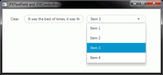
How to get the Round Corners in JFXTextField or TextField using CSS in JavaFX
The .css-files used by JFoenix can be found at JFoenix-master\jfoenix\src\main\resources\com\jfoenix\assets\css\controls. The .css-file belonging to JFXTextField is jfx-text-field.css and the .css-file belonging to JFXComboBox is jfx-combo-box.css.
The styles defined in these files have to be adapted in a user-defined .css-file according to the requirements, e.g.:
.jfx-text-field,
.jfx-combo-box {
    -fx-border-radius: 20px;
    -fx-border-color: #CCCCCC;
}

.jfx-text-field {
    -fx-padding: 0.333333em 1em 0.333333em 1em;
}

.jfx-combo-box {
    -fx-padding: 0em 1em 0em 1em;
}

.jfx-text-field > .input-line,
.jfx-combo-box > .input-line {
    -fx-background-color: transparent;
    -fx-pref-height: 0px;
    -fx-translate-y: 0px;
}

.jfx-text-field > .input-focused-line,
.jfx-combo-box > .input-focused-line {
    -fx-background-color: transparent;
    -fx-pref-height: 0px;
}
In the first block the border-radius and border-color are defined and in the following two blocks the padding. In the last two blocks the input line is disabled, which is still visible in the originally posted screenshot above. The result is:
The posted style is only an example and has to be adapted / optimized according to your requirements.
JavaFX: How not to fill background outside the rounded borders of a Label within a ScrollingPane
Thanks @sillyfly for pointing out -
I've forgotten to add -fx-background-radius: 15 in the CSS!
Child pane css style when parent pane has -fx-border-radius in JavaFX
I created the sample fxml considering your problem statement.
I haven't done anything special but it worked as expected
Please refer below fxml file for same.
<AnchorPane id="AnchorPane" prefHeight="400.0" prefWidth="600.0" xmlns:fx="http://javafx.com/fxml/1" xmlns="http://javafx.com/javafx/8">
   <children>
      <Pane layoutX="129.0" layoutY="72.0" prefHeight="300.0" prefWidth="300.0" style="-fx-border-width: 1; -fx-border-style: solid; -fx-border-radius: 4; -fx-background-color: derive(-fx-background, -35%); -fx-background-radius: 4;">
         <children>
            <Pane layoutX="1.0" layoutY="213.0" prefHeight="86.0" prefWidth="298.0" style="-fx-background-radius: 4; -fx-background-color: white;" />
         </children>
      </Pane>
   </children>
</AnchorPane>
Output :
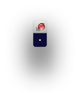
How to make a javafx button with circle shape of 3xp diameter?
Update: on close review of the resultant button, setting the shape like in José's answer seems to work better on very small buttons than setting the -fx-background-radius as used in this answer, (the resultant button looks a bit more circular when the shape is set). So the solution here is probably best for larger buttons (e.g. 10px or more), while setting the shape is probably best for an extremely small button of 3px (it's a pretty subtle difference though).
3px is a very small button. I'm not sure how you expect people to click on it.
You can make it using CSS.
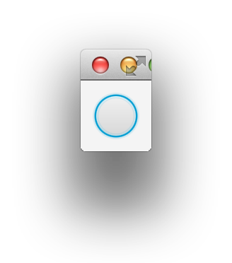
Here is a round button of 30px size:
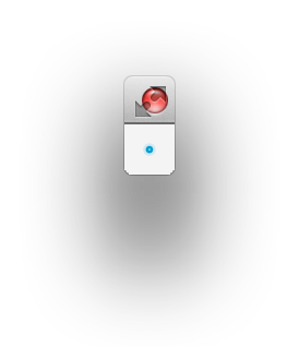
And your requested 3px size button:
The rounding is achieved by setting a large value to -fx-background-radius.
Screenshots were taken on a retina mac, so they are twice the size of the original.
import javafx.application.Application;
import javafx.geometry.Insets;
import javafx.scene.Scene;
import javafx.scene.control.Button;
import javafx.scene.layout.StackPane;
import javafx.stage.Stage;

public class Rounding extends Application {

    @Override
    public void start(Stage stage) throws Exception {
        Button roundButton = new Button();

        roundButton.setStyle(
                "-fx-background-radius: 5em; " +
                "-fx-min-width: 3px; " +
                "-fx-min-height: 3px; " +
                "-fx-max-width: 3px; " +
                "-fx-max-height: 3px;"
        );

        StackPane layout = new StackPane(
                roundButton
        );
        layout.setPadding(new Insets(10));
        stage.setScene(new Scene(layout));

        stage.show();
    }

    public static void main(String[] args) {
        launch(args);
    }
}
Note that a button is rendered with layers of backgrounds. The inner layer is the actual button and outside of that there is a focus ring and a slight glow. So together it may actually be slightly larger than 3px. If you want to get 3px exactly, you would need to get rid of the focus background insets. Something like below:
roundButton.setStyle(
        "-fx-background-radius: 5em; " +
        "-fx-min-width: 3px; " +
        "-fx-min-height: 3px; " +
        "-fx-max-width: 3px; " +
        "-fx-max-height: 3px; " +
        "-fx-background-color: -fx-body-color;" +
        "-fx-background-insets: 0px; " +
        "-fx-padding: 0px;"
);
The inline styles are just used here to allow the sample to be small and self-contained. In a real application, you would put the styles in a stylesheet.
The idea of using a -fx-background-radius to round the button came from the implementation of the rounded radio buttons in the default JavaFX modena.css stylesheet. You can find the stylesheet by looking inside the jfxrt.jar file which includes JavaFX code and resources.
By comparison, here is an image of a button created using the Circle shape solution as in José's answer:

why still need to setup minSize().....
Because JavaFX is trying to provide reasonable defaults. If there was no defaulted minimum size for an empty button, when you resized your scene smaller, some of the buttons would just disappear and the user would not be able to click on them - which would be a very bad user experience. So the minimum size defaults to about 1em, plus some padding (e.g. just larger than a character), even though no text is set on the button. However, it is just a default set by the Java system as it can't really know exactly what your app wants. When the defaults don't work for your situation, override them or provide additional hints such as explicitly setting the minimum size of the control.
What does "5em" stand for?
See the JavaFX 8 css reference guide:
em: the 'font-size' of the relevant font
So 5em means 5 times the font size. Most of the sizes for controls in the default JavaFX stylesheet are specified using em units. That way when you change the font or font size, then the UI scales gracefully to accommodate the larger or smaller font. In this particular case the choice of 5em was pretty arbitrary, I just wanted a large value so that the button would be completely round, otherwise the -fx-background-radius would create a rectangle with rounded corners, rather than a complete circle. By ensuring that the radius dimensions passed to -fx-background-radius are greater than half the size of the control, then the control takes on a round circle appearance.
I know this is somewhat confusing and non-intuitive. I just copied the concept from the default JavaFX stylesheet with the idea that, no matter how confusing it may be, it is probably the best practice for achieving these kinds of effects or it would not be used in the default stylesheet.
Mainly the advantage I can see of such an approach is that no code is required, all styling can be done directly in CSS (so you can change the look without modifying your Java code) and if you want, you can specify co-ordinates in em units, so that the control scales with your font size. So there is some reason behind the apparent madness.
JavaFX CSS being applied on all ScrollPanes
You can apply a CSS class to one of the ScrollPane and then write a different CSS style to that class.
Adding CSS class from FXML:
<ScrollPane styleClass="rounded-scroll-pane">
Adding CSS class from code:
someScrollPane.getStyleClass().add("rounded-scroll-pane");
And then apply to CSS file:
// General scroll style
.scroll-bar:horizontal .thumb,
.scroll-bar:vertical .thumb {
    -fx-background-color : #dddddd;
    -fx-background-insets : 2.0, 0.0, 0.0;
    -fx-background-radius : 0em;
}

.scroll-bar:horizontal .thumb:hover,
.scroll-bar:vertical .thumb:hover {
    -fx-background-color : #9e9e9e;
    -fx-background-insets : 2.0, 0.0, 0.0;
    -fx-background-radius : 0em;
}

// Custom ScrollPane style
.rounded-scroll-pane > .scroll-bar:horizontal .thumb,
.rounded-scroll-pane > .scroll-bar:vertical .thumb {
    -fx-background-color : #dddddd;
    -fx-background-insets : 2.0, 0.0, 0.0;
    -fx-background-radius : 2em;
}

.rounded-scroll-pane > .scroll-bar:horizontal .thumb:hover,
.rounded-scroll-pane > .scroll-bar:vertical .thumb:hover {
    -fx-background-color : #9e9e9e;
    -fx-background-insets : 2.0, 0.0, 0.0;
    -fx-background-radius : 2em;
}
Related Topics
Using Less, CSS3 Calc() Doesn't Work Correctly
Css: What's a Good Way to Create a Raised Box Effect
Difference Between Baseline of Empty and Non-Empty Inline Blocks
Do I Need to Generate a CSS File from Pygments for My Jekyll Blog, to Enable Colorful Code Snippet
(Css) Eliminating Browser's 'Selected' Lines Around a Hyperlinked Image
What Is the Use Case of :Host-Context Selector in Angular
How to Change the Play Icon of Embedded Youtube Videos
Css: How to Set Container Size Equal to Background Image Size
CSS :Root Variables and SASS Functions
Bootstrap 3 Responsive Desktop and Mobile Layout
How to Add Custom CSS in Wix Website
CSS 3 - Transition Prefixes - Which Ones to Use
How to Use Two-Column Layout with Reveal.Js