html/css hexagon with image inside
With CSS3 almost everything is possible: http://jsfiddle.net/kizu/bhGn4/
There I used different rotations with overflow: hidden, so you can get a cross-browser (well, modern cross-broser) masks that even can be coverable and clickable on the masked area.
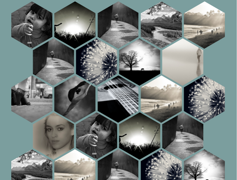
Making a Grid of Hexagons like in builtbybuffalo.com
This is essentially your standard columned layout with a modified row breaking element. (They're using br for this, but it could be any element with the right styling.) There are a few breakpoints and the styles of the classes on the cells and the breaking elements are changed depending on which breakpoint is used. Note that the breaking elements are at the spots where the rows need to break and the classes set on them control which breakpoint uses that breaking element.
They aren't grouping them into rows as you are; there's essentially a single row of elements with carefully placed breaking elements that are shown/hidden depending on which breakpoint is active.
Responsive grid of hexagons
Here is the demo and the repositery for the responsive grid of hexagons.
The code here isn't maintained. It was moved to github and improved so comments, issue reporting and contributions should be made there.
This technique uses :
- the
<img>tag - an unordered list : each hexagon is contained in a
<li>tag and an<a>tag - transform rotate and skew to make the hexagon shapes
overflow:hidden;nth-child()to space the hexagons in a regular pattern
And more to create the hexagon grid with the <img> tag.
Hexagon grid features :
- The grid is responsive as it relies on percent widths. The hexagons maintain their aspect ratio with the padding-bottom technique and the images resize to fit the hexagon shape.
- A hover effect over the hexagons : a text slides in with a transparent overlay over the image.
- Each hexagon maintains its boundaries : the hover effect (or click event) for each hexagon only triggered inside the actual shape.
Full code
The following snippet isn't the latest version of the grid. The GitHub repo is maintained and up to date. Issues and contributions can be made there.
* {    margin: 0;    padding: 0;}
body {    font-family: 'Open Sans', arial, sans-serif;    background: rgb(123, 158, 158);}
#hexGrid {    overflow: hidden;    width: 90%;    margin: 0 auto;    padding:0.707% 0;}
#hexGrid:after {    content: "";    display: block;    clear: both;}
.hex {    position: relative;    list-style-type: none;    float: left;    overflow: hidden;    visibility: hidden;    -webkit-transform: rotate(-60deg) skewY(30deg);        -ms-transform: rotate(-60deg) skewY(30deg);            transform: rotate(-60deg) skewY(30deg);}
.hex * {    position: absolute;    visibility: visible;}
.hexIn {    display:block;    width: 100%;    height: 100%;    text-align: center;    color: #fff;    overflow: hidden;    -webkit-transform: skewY(-30deg) rotate(60deg);        -ms-transform: skewY(-30deg) rotate(60deg);            transform: skewY(-30deg) rotate(60deg);    -webkit-backface-visibility: hidden;            backface-visibility: hidden;}

/* HEX CONTENT */
.hex img {    left: -100%;    right: -100%;    width: auto;    height: 100%;    margin: 0 auto;}
.hex h1, .hex p {    width: 90%;    padding: 0 5%;    background-color: #008080;    background-color: rgba(0, 128, 128, 0.8);    font-family: 'Raleway', sans-serif;    -webkit-transition: top .2s ease-out, bottom .2s ease-out, .2s padding .2s ease-out;            transition: top .2s ease-out, bottom .2s ease-out, .2s padding .2s ease-out;}
.hex h1 {    bottom: 110%;    font-style: italic;    font-weight: normal;    font-size: 1.5em;    padding-top: 100%;    padding-bottom: 100%;}
.hex h1:after {    content: '';    display: block;    position: absolute;    bottom: -1px;    left: 45%;    width: 10%;    text-align: center;    z-index: 1;    border-bottom: 2px solid #fff;}
.hex p {    padding-top: 50%;    top: 110%;    padding-bottom: 50%;}

/* HOVER EFFECT  */
.hexIn:hover h1 {    bottom: 50%;    padding-bottom: 10%;}
.hexIn:hover p {    top: 50%;    padding-top: 10%;}
/* SPACING AND SIZING */
@media (min-width:1201px) {    .hex {        width: 19.2%; /* = (100-4) / 5 */        padding-bottom: 22.170%; /* =  width / sin(60deg) */    }    .hex:nth-child(9n+6),    .hex:nth-child(9n+7),    .hex:nth-child(9n+8),    .hex:nth-child(9n+9) {        margin-top: -4.676%;        margin-bottom: -4.676%;        -webkit-transform: translateX(50%) rotate(-60deg) skewY(30deg);            -ms-transform: translateX(50%) rotate(-60deg) skewY(30deg);                transform: translateX(50%) rotate(-60deg) skewY(30deg);    }    .hex:nth-child(9n+6):last-child,    .hex:nth-child(9n+7):last-child,    .hex:nth-child(9n+8):last-child,    .hex:nth-child(9n+9):last-child {        margin-bottom: 0;    }    .hex:nth-child(9n+6) {        margin-left: 0.5%;        clear: left;    }    .hex:nth-child(9n+10) {        clear: left;    }    .hex:nth-child(9n+2),    .hex:nth-child(9n+ 7) {        margin-left: 1%;        margin-right: 1%;    }    .hex:nth-child(9n+3),    .hex:nth-child(9n+4),    .hex:nth-child(9n+8) {        margin-right: 1%;    }}
@media (max-width: 1200px) and (min-width:901px) {    .hex {        width: 24.25%; /* = (100-3) / 4 */        padding-bottom: 28.001%; /* =  width / sin(60deg) */    }    .hex:nth-child(7n+5),    .hex:nth-child(7n+6),    .hex:nth-child(7n+7) {        margin-top: -6.134%;        margin-bottom: -6.134%;        -webkit-transform: translateX(50%) rotate(-60deg) skewY(30deg);            -ms-transform: translateX(50%) rotate(-60deg) skewY(30deg);                transform: translateX(50%) rotate(-60deg) skewY(30deg);    }    .hex:nth-child(7n+5):last-child,    .hex:nth-child(7n+6):last-child,    .hex:nth-child(7n+7):last-child {        margin-bottom: 0;    }    .hex:nth-child(7n+2),    .hex:nth-child(7n+6) {        margin-left: 1%;        margin-right: 1%;    }    .hex:nth-child(7n+3) {        margin-right: 1%;    }    .hex:nth-child(7n+8) {        clear: left;    }    .hex:nth-child(7n+5) {        clear: left;        margin-left: 0.5%;    }}
@media (max-width: 900px) and (min-width:601px) {    .hex {        width: 32.666%; /* = (100-2) / 3 */        padding-bottom: 37.720%; /* =  width / sin(60) */    }    .hex:nth-child(5n+4),    .hex:nth-child(5n+5) {        margin-top: -8.564%;        margin-bottom: -8.564%;        -webkit-transform: translateX(50%) rotate(-60deg) skewY(30deg);            -ms-transform: translateX(50%) rotate(-60deg) skewY(30deg);                transform: translateX(50%) rotate(-60deg) skewY(30deg);    }    .hex:nth-child(5n+4):last-child,    .hex:nth-child(5n+5):last-child {        margin-bottom: 0;    }    .hex:nth-child(5n+4) {        margin-right: 1%;        margin-left: 0.5%;    }    .hex:nth-child(5n+2) {        margin-left: 1%;        margin-right: 1%;    }    .hex:nth-child(5n+6) {        clear: left;    }}
@media (max-width: 600px) {    .hex {        width: 49.5%; /* = (100-1) / 2 */        padding-bottom: 57.158%; /* =  width / sin(60) */    }    .hex:nth-child(3n+3) {        margin-top: -13.423%;        margin-bottom: -13.423%;        -webkit-transform: translateX(50%) rotate(-60deg) skewY(30deg);            -ms-transform: translateX(50%) rotate(-60deg) skewY(30deg);                transform: translateX(50%) rotate(-60deg) skewY(30deg);    }    .hex:nth-child(3n+3):last-child {        margin-bottom: 0;    }    .hex:nth-child(3n+3) {        margin-left: 0.5%;    }    .hex:nth-child(3n+2) {        margin-left: 1%;    }    .hex:nth-child(3n+4) {        clear: left;    }}
<link href='http://fonts.googleapis.com/css?family=Open+Sans:400italic,700italic,800italic,400,700,800' rel='stylesheet' type='text/css'><link href='http://fonts.googleapis.com/css?family=Raleway:400,700,300,200,100,900' rel='stylesheet' type='text/css'>
<ul id="hexGrid"> <li class="hex"> <a class="hexIn" href="#"> <img src="https://farm9.staticflickr.com/8461/8048823381_0fbc2d8efb.jpg" alt="Sample Image" /> <h1>This is a title</h1> <p>Some sample text about the article this hexagon leads to</p> </a> </li> <li class="hex"> <a class="hexIn" href="#"> <img src="https://farm5.staticflickr.com/4144/5053682635_b348b24698.jpg" alt="Sample Image" /> <h1>This is a title</h1> <p>Some sample text about the article this hexagon leads to</p> </a> </li> <li class="hex"> <a class="hexIn" href="#"> <img src="https://farm3.staticflickr.com/2827/10384422264_d9c7299146.jpg" alt="Sample Image" /> <h1>This is a title</h1> <p>Some sample text about the article this hexagon leads to</p> </a> </li> <li class="hex"> <a class="hexIn" href="#"> <img src="https://farm7.staticflickr.com/6217/6216951796_e50778255c.jpg" alt="Sample Image" /> <h1>This is a title</h1> <p>Some sample text about the article this hexagon leads to</p> </a> </li> <li class="hex"> <a class="hexIn" href="#"> <img src="https://farm7.staticflickr.com/6083/6055581292_d94c2d90e3.jpg" alt="Sample Image" /> <h1>This is a title</h1> <p>Some sample text about the article this hexagon leads to</p> </a> </li> <li class="hex"> <a class="hexIn" href="#"> <img src="https://farm3.staticflickr.com/2827/10384422264_d9c7299146.jpg" alt="Sample Image" /> <h1>This is a title</h1> <p>Some sample text about the article this hexagon leads to</p> </a> </li> <li class="hex"> <a class="hexIn" href="#"> <img src="https://farm8.staticflickr.com/7187/6895047173_d4b1a0d798.jpg" alt="Sample Image" /> <h1>This is a title</h1> <p>Some sample text about the article this hexagon leads to</p> </a> </li> <li class="hex"> <a class="hexIn" href="#"> <img src="https://farm4.staticflickr.com/3766/12953056854_b8cdf14f21.jpg" alt="Sample Image" /> <h1>This is a title</h1> <p>Some sample text about the article this hexagon leads to</p> </a> </li> <li class="hex"> <a class="hexIn" href="#"> <img src="https://farm7.staticflickr.com/6139/5986939269_10721b8017.jpg" alt="Sample Image" /> <h1>This is a title</h1> <p>Some sample text about the article this hexagon leads to</p> </a> </li> <li class="hex"> <a class="hexIn" href="#"> <img src="https://farm4.staticflickr.com/3165/5733278274_2626612c70.jpg" alt="Sample Image" /> <h1>This is a title</h1> <p>Some sample text about the article this hexagon leads to</p> </a> </li> <li class="hex"> <a class="hexIn" href="#"> <img src="https://farm8.staticflickr.com/7163/6822904141_50277565c3.jpg" alt="Sample Image" /> <h1>This is a title</h1> <p>Some sample text about the article this hexagon leads to</p> </a> </li> <li class="hex"> <a class="hexIn" href="#"> <img src="https://farm4.staticflickr.com/3771/13199704015_72aa535bd7.jpg" alt="Sample Image" /> <h1>This is a title</h1> <p>Some sample text about the article this hexagon leads to</p> </a> </li> <li class="hex"> <a class="hexIn" href="#"> <img src="https://farm7.staticflickr.com/6083/6055581292_d94c2d90e3.jpg" alt="Sample Image" /> <h1>This is a title</h1> <p>Some sample text about the article this hexagon leads to</p> </a> </li> <li class="hex"> <a class="hexIn" href="#"> <img src="https://farm8.staticflickr.com/7187/6895047173_d4b1a0d798.jpg" alt="Sample Image" /> <h1>This is a title</h1> <p>Some sample text about the article this hexagon leads to</p> </a> </li> <li class="hex"> <a class="hexIn" href="#"> <img src="https://farm3.staticflickr.com/2878/10944255073_973d2cd25c.jpg" alt="Sample Image" /> <h1>This is a title</h1> <p>Some sample text about the article this hexagon leads to</p> </a> </li> <li class="hex"> <a class="hexIn" href="#"> <img src="https://farm9.staticflickr.com/8461/8048823381_0fbc2d8efb.jpg" alt="Sample Image" /> <h1>This is a title</h1> <p>Some sample text about the article this hexagon leads to</p> </a> </li> <li class="hex"> <a class="hexIn" href="#"> <img src="https://farm5.staticflickr.com/4144/5053682635_b348b24698.jpg" alt="Sample Image" /> <h1>This is a title</h1> <p>Some sample text about the article this hexagon leads to</p> </a> </li> <li class="hex"> <a class="hexIn" href="#"> <img src="https://farm3.staticflickr.com/2827/10384422264_d9c7299146.jpg" alt="Sample Image" /> <h1>This is a title</h1> <p>Some sample text about the article this hexagon leads to</p> </a> </li> <li class="hex"> <a class="hexIn" href="#"> <img src="https://farm7.staticflickr.com/6217/6216951796_e50778255c.jpg" alt="Sample Image" /> <h1>This is a title</h1> <p>Some sample text about the article this hexagon leads to</p> </a> </li> <li class="hex"> <a class="hexIn" href="#"> <img src="https://farm7.staticflickr.com/6083/6055581292_d94c2d90e3.jpg" alt="Sample Image" /> <h1>This is a title</h1> <p>Some sample text about the article this hexagon leads to</p> </a> </li> <li class="hex"> <a class="hexIn" href="#"> <img src="https://farm3.staticflickr.com/2827/10384422264_d9c7299146.jpg" alt="Sample Image" /> <h1>This is a title</h1> <p>Some sample text about the article this hexagon leads to</p> </a> </li> <li class="hex"> <a class="hexIn" href="#"> <img src="https://farm8.staticflickr.com/7187/6895047173_d4b1a0d798.jpg" alt="Sample Image" /> <h1>This is a title</h1> <p>Some sample text about the article this hexagon leads to</p> </a> </li> <li class="hex"> <a class="hexIn" href="#"> <img src="https://farm4.staticflickr.com/3766/12953056854_b8cdf14f21.jpg" alt="Sample Image" /> <h1>This is a title</h1> <p>Some sample text about the article this hexagon leads to</p> </a> </li> <li class="hex"> <a class="hexIn" href="#"> <img src="https://farm3.staticflickr.com/2878/10944255073_973d2cd25c.jpg" alt="Sample Image" /> <h1>This is a title</h1> <p>Some sample text about the article this hexagon leads to</p> </a> </li> <li class="hex"> <a class="hexIn" href="#"> <img src="https://farm9.staticflickr.com/8461/8048823381_0fbc2d8efb.jpg" alt="Sample Image" /> <h1>This is a title</h1> <p>Some sample text about the article this hexagon leads to</p> </a> </li> <li class="hex"> <a class="hexIn" href="#"> <img src="https://farm5.staticflickr.com/4144/5053682635_b348b24698.jpg" alt="Sample Image" /> <h1>This is a title</h1> <p>Some sample text about the article this hexagon leads to</p> </a> </li> <li class="hex"> <a class="hexIn" href="#"> <img src="https://farm3.staticflickr.com/2827/10384422264_d9c7299146.jpg" alt="Sample Image" /> <h1>This is a title</h1> <p>Some sample text about the article this hexagon leads to</p> </a> </li> <li class="hex"> <a class="hexIn" href="#"> <img src="https://farm7.staticflickr.com/6217/6216951796_e50778255c.jpg" alt="Sample Image" /> <h1>This is a title</h1> <p>Some sample text about the article this hexagon leads to</p> </a> </li> <li class="hex"> <a class="hexIn" href="#"> <img src="https://farm7.staticflickr.com/6083/6055581292_d94c2d90e3.jpg" alt="Sample Image" /> <h1>This is a title</h1> <p>Some sample text about the article this hexagon leads to</p> </a> </li> <li class="hex"> <a class="hexIn" href="#"> <img src="https://farm3.staticflickr.com/2827/10384422264_d9c7299146.jpg" alt="Sample Image" /> <h1>This is a title</h1> <p>Some sample text about the article this hexagon leads to</p> </a> </li> <li class="hex"> <a class="hexIn" href="#"> <img src="https://farm8.staticflickr.com/7187/6895047173_d4b1a0d798.jpg" alt="Sample Image" /> <h1>This is a title</h1> <p>Some sample text about the article this hexagon leads to</p> </a> </li> <li class="hex"> <a class="hexIn" href="#"> <img src="https://farm4.staticflickr.com/3766/12953056854_b8cdf14f21.jpg" alt="Sample Image" /> <h1>This is a title</h1> <p>Some sample text about the article this hexagon leads to</p> </a> </li> <li class="hex"> <a class="hexIn" href="#"> <img src="https://farm7.staticflickr.com/6139/5986939269_10721b8017.jpg" alt="Sample Image" /> <h1>This is a title</h1> <p>Some sample text about the article this hexagon leads to</p> </a> </li> <li class="hex"> <a class="hexIn" href="#"> <img src="https://farm4.staticflickr.com/3165/5733278274_2626612c70.jpg" alt="Sample Image" /> <h1>This is a title</h1> <p>Some sample text about the article this hexagon leads to</p> </a> </li> <li class="hex"> <a class="hexIn" href="#"> <img src="https://farm8.staticflickr.com/7163/6822904141_50277565c3.jpg" alt="Sample Image" /> <h1>This is a title</h1> <p>Some sample text about the article this hexagon leads to</p> </a> </li> <li class="hex"> <a class="hexIn" href="#"> <img src="https://farm4.staticflickr.com/3771/13199704015_72aa535bd7.jpg" alt="Sample Image" /> <h1>This is a title</h1> <p>Some sample text about the article this hexagon leads to</p> </a> </li> <li class="hex"> <a class="hexIn" href="#"> <img src="https://farm7.staticflickr.com/6083/6055581292_d94c2d90e3.jpg" alt="Sample Image" /> <h1>This is a title</h1> <p>Some sample text about the article this hexagon leads to</p> </a> </li> <li class="hex"> <a class="hexIn" href="#"> <img src="https://farm8.staticflickr.com/7187/6895047173_d4b1a0d798.jpg" alt="Sample Image" /> <h1>This is a title</h1> <p>Some sample text about the article this hexagon leads to</p> </a> </li> <li class="hex"> <a class="hexIn" href="#"> <img src="https://farm7.staticflickr.com/6139/5986939269_10721b8017.jpg" alt="Sample Image" /> <h1>This is a title</h1> <p>Some sample text about the article this hexagon leads to</p> </a> </li> <li class="hex"> <a class="hexIn" href="#"> <img src="https://farm4.staticflickr.com/3165/5733278274_2626612c70.jpg" alt="Sample Image" /> <h1>This is a title</h1> <p>Some sample text about the article this hexagon leads to</p> </a> </li> <li class="hex"> <a class="hexIn" href="#"> <img src="https://farm8.staticflickr.com/7163/6822904141_50277565c3.jpg" alt="Sample Image" /> <h1>This is a title</h1> <p>Some sample text about the article this hexagon leads to</p> </a> </li> <li class="hex"> <a class="hexIn" href="#"> <img src="https://farm4.staticflickr.com/3771/13199704015_72aa535bd7.jpg" alt="Sample Image" /> <h1>This is a title</h1> <p>Some sample text about the article this hexagon leads to</p> </a> </li> <li class="hex"> <a class="hexIn" href="#"> <img src="https://farm7.staticflickr.com/6083/6055581292_d94c2d90e3.jpg" alt="Sample Image" /> <h1>This is a title</h1> <p>Some sample text about the article this hexagon leads to</p> </a> </li> <li class="hex"> <a class="hexIn" href="#"> <img src="https://farm8.staticflickr.com/7187/6895047173_d4b1a0d798.jpg" alt="Sample Image" /> <h1>This is a title</h1> <p>Some sample text about the article this hexagon leads to</p> </a> </li></ul>html/css: how to create a hexagonal image-placeholder
Important Note
Be informed that this solution does not work for those who want to create something similar supported by all browsers as for the time being IE does not support the clip-path-property used in this example!!
I've found a way to do it thanks to @SahilDhir although it's more of a workaround:
HTML
<div class="poligon">
  <img src="http://lorempixel.com/g/600/400/">
</div>
CSS
.poligon {
  display: inline-block;
  position: relative;
  width: 200px;
  height: 180px;
  background: red;
  box-sizing: border-box;
  -webkit-clip-path: polygon(0% 50%, 25% 0%, 75% 0%, 100% 50%, 75% 100%, 25% 100%);
  -moz-clip-path: polygon(0% 50%, 25% 0%, 75% 0%, 100% 50%, 75% 100%, 25% 100%);
}

.poligon img {
  position: absolute;
  top: 2px; /* equal to border thickness */
  left: 2px; /* equal to border thickness */
  width: 196px; /* container height - (border thickness * 2) */
  height: 176px; /* container height - (border thickness * 2) */
  -webkit-clip-path: polygon(0% 50%, 25% 0%, 75% 0%, 100% 50%, 75% 100%, 25% 100%);
  -moz-clip-path: polygon(0% 50%, 25% 0%, 75% 0%, 100% 50%, 75% 100%, 25% 100%);
}
Note that I did not calculate much here, but rather tried achieving a six-sided figure.
I will have the problem that my picture will have a transparent background, but I thought that I might produce a linear gradient to fill the background polygon. I will have to try that out first though ^^
I will not mark this as the final answer as my questions have not yet been answered truly. I still want to be able to create a hexagon as the one in the example I gave above where I would be able to adapt the heights and widths as well as the border thicknesses the way I want.
EDIT
As I did not find a better solution I have improved the one here and figured out the calculations needed:
HTML
<div class="poligon">
  <div class="hex-background">
    <img src="https://img.clipartfest.com/953d8641fe933437bbc41d48e6fc8492_yellow20stars20clipart-christmas-stars-clipart-without-background_532-506.png">
  </div>
</div>
CSS
.poligon {
  display: inline-block;
  position: relative;
  width: 120px;
  height: 103.92px; /* width * 0.866 */
  background: red;
  box-sizing: border-box;
  -webkit-clip-path: polygon(0% 50%, 25% 0%, 75% 0%, 100% 50%, 75% 100%, 25% 100%);
  -moz-clip-path: polygon(0% 50%, 25% 0%, 75% 0%, 100% 50%, 75% 100%, 25% 100%);
}

.hex-background {
  position: absolute;
  background-color: white;
  top: 2px; /* equal to border thickness */
  left: 2px; /* equal to border thickness */
  width: 116px; /* container width - (border thickness * 2) */
  height: 99.92px; /* container height - (border thickness * 2) */
  -webkit-clip-path: polygon(0% 50%, 25% 0%, 75% 0%, 100% 50%, 75% 100%, 25% 100%);
  -moz-clip-path: polygon(0% 50%, 25% 0%, 75% 0%, 100% 50%, 75% 100%, 25% 100%);
}

.poligon img {
  position: absolute;
  width: 116px; /* container width - (border thickness * 2) */
  height: 99.92px; /* container height - (border thickness * 2) */
  -webkit-clip-path: polygon(0% 50%, 25% 0%, 75% 0%, 100% 50%, 75% 100%, 25% 100%);
  -moz-clip-path: polygon(0% 50%, 25% 0%, 75% 0%, 100% 50%, 75% 100%, 25% 100%);
}
The clip-path part is correct if you want a same-sided hexagon.
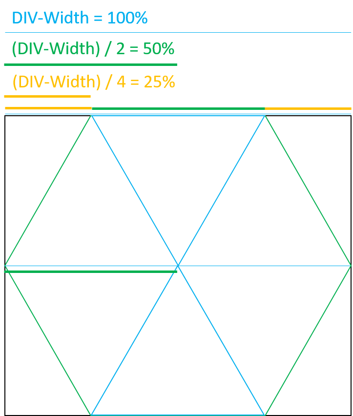
With the picture above you can see how I found those numbers ;) If you have further questions about this, don't hesitate to ask. I'll try to explain it the best I can.
Is there a way to generate Hexagons in a triangular/pyramid fashion in CSS/HTML/JS?
You can store the pattern into an array and then create the elements dynamically looping through that array.
Just create a container div and than create rows dynamically and put hexagons into rows and than append the row into container.
const container = document.querySelector('.container');
const hexagonPattern = [1, 2, 3, 4];

for (let i = 0; i < hexagonPattern.length; i++) {
    const row = document.createElement('div');
    row.classList.add('row');
     for (let j = 0; j < hexagonPattern[i]; j++) {
          const hexagon = document.createElement('div');
          hexagon.classList.add('hexagon');
          row.appendChild(hexagon);
      }
      container.appendChild(row);
}
.container {
display: flex;
flex-direction: column;
align-items: center;
}
.row {
margin-bottom: -30px;
}
.hexagon {
display: inline-block;
box-shadow: 10px 10px 5px #000;
width: 100px;
height: 100px;
background: grey;
-webkit-clip-path: polygon(50% 0%, 100% 25%, 100% 75%, 50% 100%, 0% 75%, 0% 25%);
transition: .7s;
margin: 2px;
}
.hexagon:hover {
background: red;
transform: rotateY(-180deg);
transition: .7s;
} <div class="container">
</div>Generate repeating hexagonal pattern with CSS3
(Though Ana's answer came in months after mine, probably using mine as a base to "think from", the fact that she was able to come up with a method using a single div is worth promoting, so check out her answer too--but note that content in the hex is more limited.)
This was a truly amazing question. Thank you for asking it. The great thing is the fact that:
This Fiddle Proves You Can Do It!
Original Fiddle Used (modified in later edit to fiddle link above)--it utilized imgur.com images, which were not seeming to be very reliable in loading, so the new fiddle is using photobucket.com (let me know if there are persistent image loading issues). I've kept the original link because the explanation code below goes with that (there are a few differences in background-size or position to the new fiddle).
The idea came to me almost instantly after reading your question, but took some time to implement. I originally tried getting a single "hex" with a single div and just pseudo elements, but as best I could tell, there was no way to just rotate the background-image (which I needed), so I had to add some extra div elements to get the right/left sides of the hex, so that I could then use the pseudo elements as a means of background-image rotation.
I tested in IE9, FF, and Chrome. Theoretically any browser supporting CSS3 transform it should work in.
First Main Update (added explanation)
I have some time now to post some code explanation, so here goes:
First, hexagons are defined by 30/60 degree relationships and trigonometry, so those will be the key angles involved. Second, we start with a "row" for the hex grid to reside in. The HTML is defined as (the extra div elements help build the hex):
<div class="hexrow">
    <div>
        <span>First Hex Text</span>
        <div></div>
        <div></div>
    </div>
    <div>
        <span>Second Hex Text</span>
        <div></div>
        <div></div>
    </div>
    <div>
        <span>Third Hex Text</span>
        <div></div>
        <div></div>
    </div>
</div>
We are going to use inline-block for the hexagon display, but we don't want them to accidentally wrap to the next line and ruin the grid, so white-space: nowrap solves that issue. The margin on this row is going to depend on how much space you want between hex's, and some experimentation may be needed to get what you want.
.hexrow {
    white-space: nowrap;
    /*right/left margin set at (( width of child div x sin(30) ) / 2)
    makes a fairly tight fit;
    a 3px bottom seems to match*/
    margin: 0 25px 3px;
}
Using the immediate children of the .hexrow which are just div elements, we form the basis for the hex shape. The width will drive the horizontal of the top of the hex, the height is derived from that number since all the sides are equal length on a regular hexagon. Again, margin is going to depend on spacing, but this is where the "overlap" of the individual hexagons is going to occur to make the grid look occur. The background-image is defined once, right here. The shift left on it is to accommodate at least the added width for the left side of the hex. Assuming you want centered text, the text-align handles the horizontal (of course) but the line-height that matches the height is going to allow for a vertical centering.
Related Topics
Dynamically Generate CSS File from Database in ASP.NET MVC
Can You Style the Google Translate Plugin
How to Change the Font Size with SASS in Bootstrap 4
Using Nth-Child in Tables Tr Td
Flexbox - Align-Self: Flex-End Horizontally
Less Immediate Parent Selector
Difference Between Baseline of Empty and Non-Empty Inline Blocks
In CSS How to Change Font Size of H1 and H2
Chrome Does Not Support "Writing-Mode" for Button Tag
How to Ignore Certain Less Files in Web Essentials Less Compiling? (Bootstrap)
What Does :Global (Colon Global) Do
How to Visually Indicate Current Page in ASP.NET MVC
Is There an Advantage in Grouping CSS Media Queries Together
How to Exclude a Tag from CSS Class
How to Align Input Field and Submit Button (Also Differences Between: Ie, Ffox, Chrome)