Flexbox IE10 width issues
I don't have IE10 available, but it seems like you should look at caniuse.com and the known issues. Or maybe this user moderated list on Github. Or maybe the comment section of the css-tricks guide.
The caniuse site mentions:
IE10 and IE11 default values for flex are
0 0 autorather than0 1 auto, as per the draft spec, as of September 2013.
and
In IE10 and IE11, containers with display: flex and flex-direction: column will not properly calculate their flexed childrens' sizes if the container has min-height but no explicit height property.
The Github site mentions:
When using align-items:center on a flex container in the column direction, the contents of flex item, if too big, will overflow their container in IE 10-11.
Workaround
Most of the time, this can be fixed by simply setting max-width:100% on the flex item. If the flex item has a padding or border set, you'll also need to make sure to use box-sizing:border-box to account for that space. If the flex item has a margin, using box-sizing alone will not work, so you may need to use a container element with padding instead.
This comment on css-tricks shows that where you would normally say flex: 1; you should say -ms-flex: 1 0 auto;
Also, you should change your code where it does something like this:
-webkit-flex-direction: column;
-moz-flex-direction: column;
flex-direction: column;
-ms-flex-direction: column;
to this:
-webkit-flex-direction: column;
-moz-flex-direction: column;
-ms-flex-direction: column;
flex-direction: column;
You always want the proper line of code—the one without flags— at the bottom of the prefix list.
IE10 Flexbox P element non-wrapping
It doesn't make any sense to me, but adding -ms-flex: 0 1 auto or -ms-flex: 1 1 auto to the paragraph and aside corrects it in IE10. By default, elements are supposed to have flex: 0 1 auto applied to them when they become flex items.
http://jsfiddle.net/pvJRK/3/
Workaround for IE 10/11 flex child overflow alignment
I figured it out. In IE 10/11 "justify-content" and "align-items" behave differently. If the child is larger than the container along the justify-content axis, then IE 10/11 will only ever use the "justify-content: flex-start" behavior. If the child is larger than the container along the "align-items" axis though, the content will be properly aligned according to the "align-items" value, even it the child overflows the container.
My solution was just to add "flex-direction: column" to the snippet below:
.wrap {  width: 100%;  height: 100%;}
.layer {  display: -ms-flexbox;  display: flex;  -ms-flex-direction: column;  flex-direction: column;  -ms-flex-pack: center;  justify-content: center;  -ms-flex-align: center;  align-items: center;  margin: 0 auto;  width: 100px;  height: 100px;  border: 1px solid blue;}
.layer-inner {  font-size: 20px;  width: auto;  white-space: nowrap;  line-height: 1em;}
<div class="wrap"> <div class="layer"> <span class="layer-inner"> This overlowing text should be centered </span> </div></div>Text not wrapping in flex IE10
Thanks for the answers. Fixed this issue this afternoon:
Changes on .c-message__item:
Add max-width: 90%; Remove min-width: 0%;.
Changes on .c-column--center:
Add min-width: 0%;
See the codepen for the updated version: codepen.io/csssavvy/pen/qOgjmN
display: flex not working on Internet Explorer
Internet Explorer doesn't fully support Flexbox due to:
Partial support is due to large amount of bugs present (see known
issues).
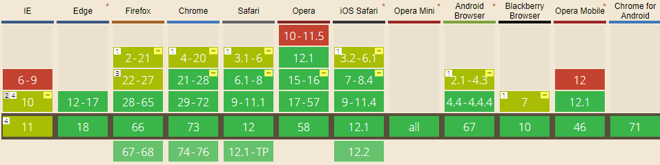
Screenshot and infos taken from caniuse.com
Notes
Internet Explorer before 10 doesn't support Flexbox, while IE 11 only supports the 2012 syntax.
Known issues
- IE 11 requires a unit to be added to the third argument, the flex-basis property see MSFT documentation.
- In IE10 and IE11, containers with
display: flexandflex-direction: columnwill not properly calculate their flexed childrens' sizes if the container hasmin-heightbut no explicitheightproperty. See bug. - In IE10 the default value for
flexis0 0 autorather than0 1 autoas defined in the latest spec. - IE 11 does not vertically align items correctly when
min-heightis used. See bug.
Workarounds
Flexbugs is a community-curated list of Flexbox issues and cross-browser workarounds for them. Here's a list of all the bugs with a workaround available and the browsers that affect.
- Minimum content sizing of flex items not honored
- Column flex items set to
align-items: centeroverflow their container min-heighton a flex container won't apply to its flex itemsflexshorthand declarations with unitlessflex-basisvalues are ignored- Column
flexitems don't always preserve intrinsic aspect ratios - The default flex value has changed
flex-basisdoesn't account forbox-sizing: border-boxflex-basisdoesn't supportcalc()- Some HTML elements can't be flex containers
align-items: baselinedoesn't work with nested flex containers- Min and max size declarations are ignored when wrapping flex items
- Inline elements are not treated as flex-items
- Importance is ignored on flex-basis when using flex shorthand
- Shrink-to-fit containers with
flex-flow: column wrapdo not contain their items - Column flex items ignore
margin: autoon the cross axis flex-basiscannot be animated- Flex items are not correctly justified when
max-widthis used
Related Topics
No Border-Spacing Before First Item and After Last Item
Flexbox Vertically Split Container in Half
Setting Up Auto Compile for Stylus
Overriding :Root CSS Variables from Inner Scopes
Set Color for Extra Page Parts Visible During Rubber Band Scroll
Preload CSS File Not Supported on Firefox and Safari MAC
Translate VS Transform-Origin CSS3
Less Immediate Parent Selector
Change Justify-Content Value When Flex Items Overflow Container
CSS Filter as a Color Modifier for One Image
Wrapping Text Around a Div with CSS
Hover One Element, and Change Another (Without Using JavaScript)
How to Set the CSS Content Property with a Google Material Icon
Why Is My CSS Not Updating in Web Browser