How to set the CSS content property with a Google Material Icon?
Update on 2018
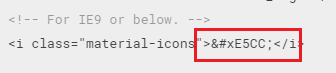
Google removed the codes which were displayed earlier for IE9 and below. To get the codes visit the codepoints file in the GitHub repository.
Link to codepoints in GitHub repository: https://github.com/google/material-design-icons/blob/master/font/MaterialIcons-Regular.codepoints
Step 1: Include the Material Icons Stylesheet.
<link href="https://fonts.googleapis.com/icon?family=Material+Icons" rel="stylesheet">
Step 2 :
CSS Code:
.bullet li a:before {
    font-family: "Material Icons";
    content: "\e5cc";
}
Explanation: The value e5cc is the code which you see for the chevron.
Add google material design icon in css pseudo :after content
Change your CSS to this:
a:hover::after {
  font-family: 'Material Icons';
  content: "link";
  -webkit-font-feature-settings: 'liga';
}
So you can change the content: "[whatever icon here]";
FIDDLE
Also the fiddle didn't correctly load the icon font so put I placed the link in the html.
How can I use a Material Design Icon as a CSS background-image value?
You can use the Material Design Icons' SVG code to set a background-image, like so, for example:
.selector {
  background-image: url('data:image/svg+xml;utf-8,<svg xmlns="http://www.w3.org/2000/svg" width="50" height="50" viewBox="0 0 24 24"><path fill="%232196F3" d="M 5,3L 19,3L 20.7359,6L 20.7304,6C 20.9018,6.29149 21,6.63428 21,7L 21,19C 21,20.1046 20.1046,21 19,21L 5,21C 3.89543,21 3,20.1046 3,19L 3,7C 3,6.638 3.09618,6.29846 3.26437,6L 3.26135,6L 5,3 Z M 5.57294,4L 5,5L 5,5L 19,5L 18.4303,4L 5.57294,4 Z M 7,12L 12,17L 17,12L 14,12L 14,10L 10,10L 10,12L 7,12 Z "></path></svg>');
}
A fiddle
Quirks I noticed / was reminded of while making the fiddle:
- It doesn't seem to work without the xmlns attribute
- A
#in the fill or elsewhere needs to be escaped with%23(or use the rgb(a) value instead) - You may need to adjust width and height and viewBox attributes depending on your needs (whether to fill the area, repeat or not (which you can also affect with
background-repeat), etc.)
Reactjs material icons in css
Material UI icons from @material-ui/icons@4.9.1 are exported as React components so you cannot use them in CSS.
But you have few options.
Include the material icons font and use that. More info here and here
Check the codepen
Once you have included the font in your page you can use it in CSS like this
p::after,
div::after {
  content: "face";
  color: blue;
}
- But I dont like importing the entire fonts file just to have a single icon. So this is what I used to do.
Get the svg of the icon. Inspect the icon from material ui icons page, get the svg code and create a new svg file with the copied html and place it in your project.

Once you have the svg file, in your CSS use it like this
.download:before {
  display: block;
  content: ' ';
  background-image: url('path-to-svg-folder/download.svg');
  background-size: 24px 24px;
  height: 24px;
  width: 24px;
}
NB: if you dont want to have a svg file you can use the data url method and include the entire svg in your CSS file.
how to use google material icons as class instead of i tag
Yes,you can add the material icons as classes using the after pseudo elements.check out the fiddle
 <span class="material-icons face"></span>

.face {
    position:relative;
    display:inline-block;
}

.face:after {
    content: "face";
}
Replace Google Material Icons with Own Icons, Keep Same Content Code or Create New One
Your best bet is to override the CSS.
(This is not hard. The C in CSS is, "cascading," which means the thing that comes afterwards gets used instead of the thing that came before. This is overriding.)
Create a CSS file:
.material-icons.mdc-icon-button__icon--companylogo {
  font-family: "Font From UX Team";
  /* whatever other styling you need, like sizes */
  content: \0000;
}
.material-icons.mdc-icon-button__icon--on {
  font-family: "Font From UX Team";
  /* whatever other styling you need, like sizes */
  content: \0000;
}
Make sure the font file from your UX team is included somewhere before this. Also make sure that this file it loaded after the other CSS, the one that Material Icons is using right now. Replace the content directives with the character code (ask the UX team) that matches the icon you want.
This should replace all the Material Icons content that you've selected with the ones you want instead.
If you find that what they're replacing is turning out to be too much to manage custom CSS for, generate it automatically or use a CSS preprocessor like SASS.
Updated
It seems that you're mixing SVG and font items, using the font from Google and SVG from your team. This complicates things. SVG is essentially HTML, while the definitions for entities (icons) you're using are purely CSS. The problem arises because CSS expects the HTML to already be there.
You can do a few things:
- Use all SVG. This means not using the font file from Material Icons and including their SVG instead. Given that you're probably working within some framework that made the original decision for you, this may be very difficult. Either way, it'll be costly from the perspective of HTML listing size, therefore page load time.
- Assemble the SVG from your team into a font file. This requires the most work on the back end but yields the most elegant solution. Your UX team may know how to do this or they may be willing to learn, thus saving you the trouble. There may also be a completely automated way to do this in your build process (VS, right?) that may save you the trouble.
- Include the SVG just for the items you're replacing and adding. You have the option to either include them on every page (HTML or CSS bloat) or somehow figure out where they're needed and include them selectively (code complexity).
I would highly recommend the middle option (#2). Maybe start by asking your UX team nicely if they're able to use the editing software they already have to output a font file (ODT, TTF, etc.) instead of SVG listings, which may already be an available function. Clicking in a different place may give you the result you need, then you just add some CSS.
Related Topics
How to Set the Size of an HTML Text Box
CSS H1 - Only as Wide as the Text
Why Is My CSS Not Updating in Web Browser
My CSS Gradient Doesn't Stretch, It Repeats
Changing Spacing Between Paragraphs and Inside of Paragraphs
Position:Sticky Is Not Working
Bootstrap - Some Kind of Margin on Mobile Devices (Only Right Side)
Change Justify-Content Value When Flex Items Overflow Container
Css: How to Set Container Size Equal to Background Image Size
Should We Put <Input> Inside <Label>
How to Create a Pulsing Glow Ring Animation in CSS
Create CSS to Enlarge Checkboxes