d3.js Map (svg) Auto Fit into Parent Container and Resize with Window
COMPLETE SOLUTION:
Here's the solution which will resize the map AFTER the user has released the edge of the window to resize it, and center it in the parent container.
<div id="mapContainer"></div>
function draw(ht) {
    $("#mapContainer").html("<svg id='map' xmlns='http://www.w3.org/2000/svg' width='100%' height='" + ht + "'></svg>");
    map = d3.select("svg");
    var width = $("svg").parent().width();
    var height = ht;

    // I discovered that the unscaled equirectangular map is 640x360. Thus, we
    // should scale our map accordingly. Depending on the width ratio of the new
    // container, the scale will be this ratio * 100. You could also use the height
    // instead. The aspect ratio of an equirectangular map is 2:1, so that's why
    // our height is half of our width.

    projection = d3.geo.equirectangular().scale((width/640)*100).translate([width/2, height/2]);
    var path = d3.geo.path().projection(projection);
    d3.json('plugins/maps/world.json', function(collection) {
        map.selectAll('path').data(collection.features).enter()
            .append('path')
            .attr('d', path)
            .attr("width", width)
            .attr("height", width/2);
    });
}
draw($("#mapContainer").width()/2);
$(window).resize(function() {
    if(this.resizeTO) clearTimeout(this.resizeTO);
    this.resizeTO = setTimeout(function() {
        $(this).trigger('resizeEnd');
    }, 500);
});

$(window).bind('resizeEnd', function() {
    var height = $("#mapContainer").width()/2;
    $("#mapContainer svg").css("height", height);
    draw(height);
});
D3 change SVG dimensions on resize window
There are different approaches to "responsivity" with SVG and in D3 in particular. Using viewBox is one way to handle it, listening for resize events and redrawing the svg is another. If you're going to listen for resize events and re-render, you'll want to make sure you're using the D3 general update pattern.
1. Behavior you're seeing is expected when using viewBox and preserveAspectRatio.
2. In your example Vue and D3 seem to be in conflict over who is in control of the DOM.
Here are some examples to dynamic resizing using different approaches. Run them in full-size windows and use the console to log out the viewport dimensions.
Sara Soueidan's article Understanding SVG Coordinate Systems is really good. Curran Kelleher's example here uses the general update pattern for something that's more idiomatic.
Really hope this helps and good luck with the project! If you find that this answers your question, please mark it as the accepted answer. /p>
Forcing D3 to recalculate the size of the rects and axes on resize events ("sticky" to size of container):
const margin = {top: 20, right: 20, bottom: 50, left: 20}
const width = document.body.clientWidth
const height = document.body.clientHeight
const innerWidth = width - margin.left - margin.right;
const innerHeight = height - margin.top - margin.bottom;
const minScale = 0,
maxScale = 35;
const xScale = d3.scaleBand()
.range([0, width])
.padding(0.3);;
const yScale = d3.scaleLinear()
.range([0, height]);
const xAxis = d3.axisBottom(xScale)
const yAxis = d3.axisLeft(yScale)
const svg = d3.select("#chart")
.attr("width", width + margin.left + margin.right)
.attr("height", height + margin.top + margin.bottom)
.append("g")
.attr("transform", "translate(" + margin.left + "," + margin.top + ")");
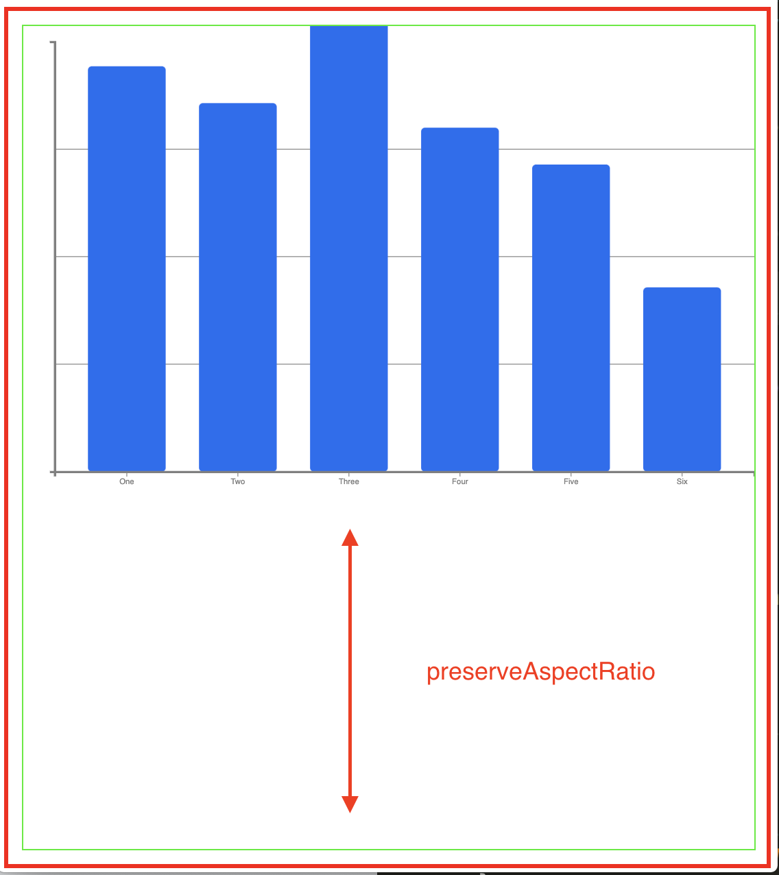
const data = [
{
key: 'One',
value: 33,
},
{
key: 'Two',
value: 30,
},
{
key: 'Three',
value: 37,
},
{
key: 'Four',
value: 28,
},
{
key: 'Five',
value: 25,
},
{
key: 'Six',
value: 15,
},
];
// format the data
data.forEach((d) => {
d.value = +d.value;
});
// Scale the range of the data in the domains
xScale.domain(data.map((d) => d.key));
yScale.domain([minScale, maxScale]);
svg.append("g")
.attr("class", "y axis")
.call(yAxis);
svg.append("g")
.attr("class", "x axis")
.call(xAxis)
.attr("transform", "translate(0," + height + ")")
.append("text")
.attr("class", "label")
.attr("transform", "translate(" + width / 2 + "," + margin.bottom / 1.5 + ")")
.style("text-anchor", "middle")
.text("X Axis");
svg.selectAll(".bar")
.data(data)
.enter().append("rect")
.attr("class", "bar")
.attr("width", xScale.bandwidth())
.attr('x', (d) => xScale(d.key))
.attr("y", d => yScale(d.value))
.attr('height', function (d) {
return height - yScale(d.value);
})
.attr('fill', '#206BF3')
.attr('rx', 5)
.attr('ry', 5);
// Define responsive behavior
function resize() {
var width = parseInt(d3.select("#chart").style("width")) - margin.left - margin.right,
height = parseInt(d3.select("#chart").style("height")) - margin.top - margin.bottom;
// Update the range of the scale with new width/height
xScale.rangeRound([0, width], 0.1);
yScale.range([height, 0]);
// Update the axis and text with the new scale
svg.select(".x.axis")
.call(xAxis)
.attr("transform", "translate(0," + height + ")")
.select(".label")
.attr("transform", "translate(" + width / 2 + "," + margin.bottom / 1.5 + ")");
svg.select(".y.axis")
.call(yAxis);
// Force D3 to recalculate and update the line
svg.selectAll(".bar")
.attr("width", xScale.bandwidth())
.attr('x', (d) => xScale(d.key))
.attr("y", d => yScale(d.value))
.attr('height', (d) => height - yScale(d.value));
};
// Call the resize function whenever a resize event occurs
d3.select(window).on('resize', resize);
// Call the resize function
resize();.bar {
fill: #206BF3;
}
.bar:hover {
fill: red;
cursor: pointer;
}
.axis {
font: 10px sans-serif;
}
.axis path,
.axis line {
fill: none;
stroke: #000;
shape-rendering: crispEdges;
}
#chart {
width: 100%;
height: 100%;
position: absolute;
}<!DOCTYPE html>
<meta charset="utf-8">
<head>
<link rel="stylesheet" type="text/css" href="./style.css" />
</head>
<body>
<svg id="chart"></svg>
<script src="https://d3js.org/d3.v6.js"></script>
<script src="./chart.js"></script>
</body>Resize svg when window is resized in d3.js
Look for 'responsive SVG' it is pretty simple to make a SVG responsive and you don't have to worry about sizes any more.
Here is how I did it:
d3.select("div#chartId") .append("div") // Container class to make it responsive. .classed("svg-container", true) .append("svg") // Responsive SVG needs these 2 attributes and no width and height attr. .attr("preserveAspectRatio", "xMinYMin meet") .attr("viewBox", "0 0 600 400") // Class to make it responsive. .classed("svg-content-responsive", true) // Fill with a rectangle for visualization. .append("rect") .classed("rect", true) .attr("width", 600) .attr("height", 400);.svg-container { display: inline-block; position: relative; width: 100%; padding-bottom: 100%; /* aspect ratio */ vertical-align: top; overflow: hidden;}.svg-content-responsive { display: inline-block; position: absolute; top: 10px; left: 0;}
svg .rect { fill: gold; stroke: steelblue; stroke-width: 5px;}<script src="https://cdnjs.cloudflare.com/ajax/libs/d3/5.7.0/d3.min.js"></script>
<div id="chartId"></div>What's the best way to make a d3.js visualisation layout responsive?
There's another way to do this that doesn't require redrawing the graph, and it involves modifying the viewBox and preserveAspectRatio attributes on the <svg> element:
<svg id="chart" viewBox="0 0 960 500"
  preserveAspectRatio="xMidYMid meet">
</svg>
Update 11/24/15: most modern browsers can infer the aspect ratio of SVG elements from the viewBox, so you may not need to keep the chart's size up to date. If you need to support older browsers, you can resize your element when the window resizes like so:
var aspect = width / height,
    chart = d3.select('#chart');
d3.select(window)
  .on("resize", function() {
    var targetWidth = chart.node().getBoundingClientRect().width;
    chart.attr("width", targetWidth);
    chart.attr("height", targetWidth / aspect);
  });
And the svg contents will be scaled automatically. You can see a working example of this (with some modifications) here: just resize the window or the bottom right pane to see how it reacts.
Fit D3 map in SVG
D3's geoIdentity exposes almost all the standard methods of a d3 projection (off the top of my head, only rotation is not possible as the identity assumes cartesian data). Most importantly here, it exposes the fitSize and fitExtent methods. These methods set translate and scale based on the coordinate extent of displayed geojson data and the pixel extent of the svg/canvas.
To scale your features with a geo identity you can use:
d3.geoIdentity().fitSize([width,height],geojsonObject)
Note that an array of geojson features won't work, but a geojson feature collection or any individual feature/geometry object works too. The width and height are of the svg/canvas.
If you want to apply a margin, you can use:
d3.geoIdentity().fitExtent([[margin,margin],[width-margin,height-margin]],geojsonObject)
The margin doesn't need to be uniform, the format is [[left,top],[right,bottom]],geojsonObject
If using fitSize or fitExtent there is no need to set center, translate or scale manually and setting these afterwards will recenter or rescale the map.
Making SVG container 100% width and height of parent container in D3 v4 (instead of by pixels)
The solution was to comment out/remove the width and height attribute values and instead add the following two lines:
//- .attr("width", width + margin.left + margin.right)
//- .attr("height", height + margin.top + margin.bottom)
.attr("preserveAspectRatio", "xMinYMin meet")
.attr("viewBox", "0 0 960 500")
Using ViewBox to resize svg depending on the window size
You are applying viewBox and preserveAspectRatio to the g element, they need to be applied to the svg element:
var svg = d3.select("#chart").append("svg")
  .attr("viewBox", "0 0 700 500")
  .attr("preserveAspectRatio", "xMinYMin meet")
     .append("g")
     .attr("transform", "translate(" + r + "," + r +") rotate(180) scale(-1, -1)");
Related Topics
How to Remember in CSS That Margin Is Outside the Border, and Padding Inside
Animate the CSS Transition Property Within :After/:Before Pseudo-Classes
Responsive Design - Media Query Not Working on Iphone
Using Ie Conditional Comments Inside a Stylesheet
Svg Height Incorrectly Calculated in Webkit Browsers
Why Does Transform-Origin-Z Distort on Safari, iOS
Changing Spacing Between Paragraphs and Inside of Paragraphs
Recording and Saving an Svg Animation as an Animated Gif
How to Fix Absolute Positioning in IE8
Smooth Scrolling with Just Pure CSS
Vertical Align Center Image in Fixed Size Div
Add Content to the Bottom of the Last Page
Django-Bower + Foundation 5 + SASS, How to Configure
Using Mixins in Bootstrap 3 to Avoid Unsemantic Markup for Layout Structure
Using CSS Sprites and Background Position
Validationsummary and Validationmessagefor with Custom CSS Shown When No Errors Present
What Does the Scalez() CSS Transform Function Do
Differencebetween Using 'Text-Align:Center' and 'Margin: 0 Auto' to Center an Element in CSS