Prevent 100vw from creating horizontal scroll
Basically the answer is no, if you have a vertical scrollbar there is no way to make 100vw equal the width of the visible viewport. Here are the solutions that I have found for this issue.
warning: I have not tested these solutions for browser support
tl;dr
If you need an element to be 100% width of the visible viewport(viewport minus scrollbar) you will need to set it to 100% of the body. You can't do it with vw units if there is a vertical scrollbar.
1. Set all ancestor elements to position static
If you make sure that all of .box's ancestors are set to position: static; then set .box to width: 100%; so it will be 100% of the body's width. This is not always possible though. Sometimes you need one of the ancestors to be position: absolute; or position: relative;.
Example
2. Move the element outside of non-static ancestors
If you can't set the ancestor elements to position: static; you will need to move .box outside of them. This will allow you to set the element to 100% of the body width.
Example
3. Remove Vertical Scrollbar
If you don't need vertical scrolling you can just remove the vertical scrollbar by setting the <html> element to overflow-y: hidden;.
Example
4. Remove Horizontal Scrollbar
This does not fix the problem, but may be suitable for some situations.
Setting the <html> element to overflow-y: scroll; overflow-x: hidden; will prevent the horizontal scrollbar from appearing, but the 100vw element will still overflow.
Example
Viewport-Percentage Lengths Spec
The viewport-percentage lengths are relative to the size of the
initial containing block. When the height or width of the initial
containing block is changed, they are scaled accordingly. However,
when the value of overflow on the root element is auto, any scroll
bars are assumed not to exist. Note that the initial containing
block’s size is affected by the presence of scrollbars on the
viewport.
It appears that there is a bug because vw units should only include the scrollbar width when overflow is set to auto on the root element. But I've tried setting the root element to overflow: scroll; and it did not change.
Example
Best solution to remove horizontal scrollbar with img width of 100vw?
The horizontal scroll had come up because this is only an issue on windows. On Mac or Android the scrollbars are placed on top of the content and disappear once you're done scrolling so they don't affect the view width.
If max-width: 100% is the width of the viewport without scrollbars, then you didn't need 100vw in the first place.
You could just have use width: 100% because the element doesn't have any positioned ancestor, so its reference is the body.
A simple solution in your case is by giving max-width: 100%.
HTML would be like:
<div class="box">
    .
    .
    .
</div>
Use this CSS:
html, body {
    margin: 0;
    padding: 0
}
    .box {
        width: 100vw;
        max-width:100%; // This is very Important.
        height: 100vh;
    }
100vw causing horizontal overflow, but only if more than one?
As already explained by wf4, the horizontal scroll is present because of the vertical scroll. which you can solve by giving max-width: 100%.
.box {
    width: 100vw;
    height: 100vh;
    max-width:100%;  /* added */
}
Working Fiddle
Why is there a horizontal scrollbar when my total width is 100vw?
This is due to the default margin in the browser stylesheet.
body { margin: 0;}<html>
<head></head>
<body style="width: 100vw"> <div style="float: left; width: 220px">a</div> <div style="float: left; width: calc(100vw - 220px)">b</div></body>
</html>horizontal scroll cutting items off
Answer is very simple. You can not scroll to the left past the beginning of the page. Y-axis scrolling begins at 0 and goes on to the end of the content, if you add more content it goes further, but if you move content up with lets say top: -5000px scrolling area will not be expanded, everything below 0 just gets cut off. Same with X-axis, everything on the left below 0 gets cut off.
Your main div has justify-content: center; style which puts your layout div always in the center, no matter how big it is. When main div is smaller then layout div, since layout has min-width: 1000px; it puts it to the center and as result everything on the left gets cut off.
Main div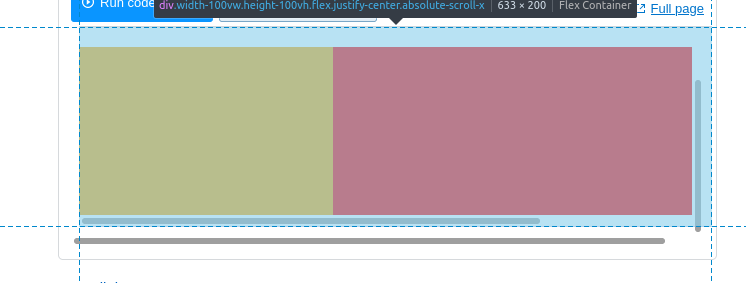
Layout div (centered)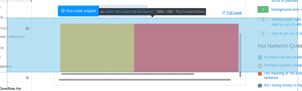
Bigger than Main div. Extends to the right and left, since it is centered, but everything to the left can not be reached with scrolling. Scrolling does not go below 0.
Left side element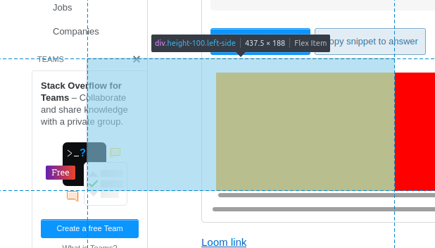
Is actually correct size, but looks smaller because can not be accessed via scrolling.
In your case everything can be fixed by just removing justify-center from main div.
Remove unwanted horizontal scroll (Where is the horizontal scroll coming from?)
the easiest answer is to put overflow-x:none in your App.css .
Related Topics
What Disadvantages Are There to the <Button> Tag
Which Are the Most Important Media Queries to Use in Creating Mobile Responsive Design
How to Change the Text Color of First Select Option
iPhone X/8/8 Plus CSS Media Queries
Animate CSS Background-Position with Smooth Results (Sub-Pixel Animation)
Input Height Differences in Firefox and Chrome
Why Doesn't Min-Content Work with Auto-Fill or Auto-Fit
Css: Using Raw Svg in the Url Parameter of a Background-Image in Ie
Django Forms and Bootstrap - CSS Classes and <Divs>
Chrome Renders Colours Differently from Safari and Firefox
Combining :Not() Selectors in CSS