rotate3d shorthand
rotateX(50deg) is equivalent to rotate3d(1, 0, 0, 50deg)
rotateY(20deg) is equivalent to rotate3d(0, 1, 0, 20deg)
rotateZ(15deg) is equivalent to rotate3d(0, 0, 1, 15deg)
So...
rotateX(50deg) rotateY(20deg) rotateZ(15deg)
is equivalent to
rotate3d(1, 0, 0, 50deg) rotate3d(0, 1, 0, 20deg) rotate3d(0, 0, 1, 15deg)
For a generic rotate3d(x, y, z, α), you have the matrix
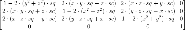
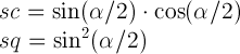
where
You now get the matrices for each of the 3 rotate3d transforms and you multiply them. And the resulting matrix is the matrix corresponding to the resulting single rotate3d. Not sure how to easy it is to extract the values for rotate3d out of it, but it's sure easy to extract those for a single matrix3d.
In the first case (rotateX(50deg) or rotate3d(1, 0, 0, 50deg)), you have:
x = 1, y = 0, z = 0, α = 50deg
So the first row of the matrix in this case is 1 0 0 0.
The second one is 0 cos(50deg) -sin(50deg) 0.
The third one 0 sin(50deg) cos(50deg) 0.
And the fourth one is obviously 0 0 0 1.
In the second case, you have x = 0, y = 1, z = 0, α = 20deg.
First row: cos(20deg) 0 sin(20deg) 0.
Second row: 0 1 0 0.
Third row: -sin(20) 0 cos(20deg) 0.
Fourth: 0 0 0 1
In the third case, you have x = 0, y = 0, z = 1, α = 15deg.
First row: cos(15deg) -sin(15deg) 0 0.
Second row sin(15deg) cos(15deg) 0 0.
And the third and the fourth row are 0 0 1 0 and 0 0 0 1 respectively.
Note: you may have noticed that the signs of the sin values for the rotateY transform are different than for the other two transforms. It's not a computation mistake. The reason for this is that, for the screen, you have the y-axis pointing down, not up.
So these are the three 4x4 matrices that you need to multiply in order to get the 4x4 matrix for the resulting single rotate3d transform. As I've said, I'm not sure how easy it can be to get the 4 values out, but the 16 elements in the 4x4 matrix are exactly the 16 parameters of the matrix3d equivalent of the chained transform.
EDIT:
Actually, it turns out it's pretty easy... You compute the trace (sum of diagonal elements) of the matrix for the rotate3d matrix.
4 - 2*2*(1 - cos(α))/2 = 4 - 2*(1 - cos(α)) = 2 + 2*cos(α)
You then compute the trace for the product of the three 4x4 matrices, you equate the result with 2 + 2*cos(α) you extract α. Then you compute x, y, z.
In this particular case, if I computed correctly, the trace of the matrix resulting from the product of the three 4x4 matrices is going to be:
T =
cos(20deg)*cos(15deg) +
cos(50deg)*cos(15deg) - sin(50deg)*sin(20deg)*cos(15deg) +
cos(50deg)*cos(20deg) +
1
So cos(α) = (T - 2)/2 = T/2 - 1, which means that α = acos(T/2 - 1).
Getting rotate3d values with Javascript / jQuery
I should have payed a bit more attention to it.
After a while I realized this can not be solved mathematically. Not if I want to get the exact absolute degrees and not the relative ones.
The matrix we get with a transformation of 370 degrees is exactly the same one we get with a transformation of 10 degrees.
Therefore it is impossible to get two different resulting values for alpha with the exact same input.
with transform: rotate3d(1, 0, 0, 10deg); we get:
matrix3d(1, 0, 0, 0, 0, 0.984808, 0.173648, 0, 0, -0.173648, 0.984808, 0, 0, 0, 0, 1)
And with transform: rotate3d(1, 0, 0, 370deg); the exact same one:
matrix3d(1, 0, 0, 0, 0, 0.984808, 0.173648, 0, 0, -0.173648, 0.984808, 0, 0, 0, 0, 1)
Reproduction online
Issue in transform property in CSS
Give x,y or z to rotate and add the value
body { background: #ccc}.box { width: 70%; height: 200px; background: #FFF; margin: 40px auto;}.effect2 { position: relative;}.box1 { transform: rotateZ(45deg); position: absolute; width: 20%; height: 20px; background-color: aqua;}<div class="box effect2"> <div class="box1"></div></div>CSS transition-property for rotate3d does not work on SVGs
You need to adjust the transform-origin then you can get rid of the translate and apply transition to transform that contains only rotate
.lock-animation {  width: 6em;  margin: 2em auto;  overflow: visible;}
.lock-animation svg {  overflow: visible;}
.lock-animation g#lock-top {  transition: transform 0.3s ease-in-out;  transform-origin: 90% 0;  transform-box: fill-box;}
.lock-animation:hover g#lock-top {  transform: rotate3d(0, 1, 0, -180deg);}
<div class="lock-animation"> <?xml version="1.0" encoding="utf-8"?> <!-- Generator: Adobe Illustrator 24.0.1, SVG Export Plug-In . SVG Version: 6.00 Build 0) --> <svg version="1.1" xmlns="http://www.w3.org/2000/svg" xmlns:xlink="http://www.w3.org/1999/xlink" x="0px" y="0px" viewBox="0 0 448 512" enable-background="new 0 0 448 512" xml:space="preserve"><g id="lock-bottom" focusable="false"> <g> <path fill="none" d="M224,48c-52.9,0-96,43.1-96,96v48h192v-48C320,91.1,276.9,48,224,48z"/> <path fill="none" d="M48,464h352V240H48V464z M196,320c0-15.5,12.5-28,28-28s28,12.5,28,28v64c0,15.5-12.5,28-28,28 s-28-12.5-28-28V320z"/> <path d="M224,412c15.5,0,28-12.5,28-28v-64c0-15.5-12.5-28-28-28s-28,12.5-28,28v64C196,399.5,208.5,412,224,412z"/> <path d="M400,192h-32h-48H128H80H48c-26.5,0-48,21.5-48,48v224c0,26.5,21.5,48,48,48h352c26.5,0,48-21.5,48-48V240 C448,213.5,426.5,192,400,192z M400,464H48V240h352V464z"/> </g></g><g id="lock-top"> <path d="M223.7,0C303.2-0.2,368,64.5,368,144v48h-48v-46.8c0-52.8-42.1-96.7-95-97.2c-53.4-0.6-97,42.7-97,96v56 c0,13.3-10.7,24-24,24s-24-10.7-24-24v-54.6C80,65.8,144,0.2,223.7,0z"/> </g></svg>
</div>Non-trapezoidal rotate3d video issue
You need to add the perspective property to the parent of the element that is rotated. In this case, the body:
body {
    perspective: 1000px;
}
Edit: Yeah it can also be applied to the element
.scene {
  width: 200px;
  height: 200px;
  border: 1px solid #CCC;
  margin: 40px;
}

.panel {
  width: 100%;
  height: 100%;
  background: red;
  /* perspective function in transform property */
  transform: perspective(600px) rotateY(45deg);
}
<div class="scene">
<div class="panel"></div>
</div>How to rotate a 3D object on axis three.js?
Here are the two functions I use. They are based on matrix rotations. and can rotate around arbitrary axes. To rotate using the world's axes you would want to use the second function rotateAroundWorldAxis().
// Rotate an object around an arbitrary axis in object space
var rotObjectMatrix;
function rotateAroundObjectAxis(object, axis, radians) {
    rotObjectMatrix = new THREE.Matrix4();
    rotObjectMatrix.makeRotationAxis(axis.normalize(), radians);

    // old code for Three.JS pre r54:
    // object.matrix.multiplySelf(rotObjectMatrix);      // post-multiply
    // new code for Three.JS r55+:
    object.matrix.multiply(rotObjectMatrix);

    // old code for Three.js pre r49:
    // object.rotation.getRotationFromMatrix(object.matrix, object.scale);
    // old code for Three.js r50-r58:
    // object.rotation.setEulerFromRotationMatrix(object.matrix);
    // new code for Three.js r59+:
    object.rotation.setFromRotationMatrix(object.matrix);
}

var rotWorldMatrix;
// Rotate an object around an arbitrary axis in world space
function rotateAroundWorldAxis(object, axis, radians) {
    rotWorldMatrix = new THREE.Matrix4();
    rotWorldMatrix.makeRotationAxis(axis.normalize(), radians);

    // old code for Three.JS pre r54:
    //  rotWorldMatrix.multiply(object.matrix);
    // new code for Three.JS r55+:
    rotWorldMatrix.multiply(object.matrix);                // pre-multiply

    object.matrix = rotWorldMatrix;

    // old code for Three.js pre r49:
    // object.rotation.getRotationFromMatrix(object.matrix, object.scale);
    // old code for Three.js pre r59:
    // object.rotation.setEulerFromRotationMatrix(object.matrix);
    // code for r59+:
    object.rotation.setFromRotationMatrix(object.matrix);
}
So you should call these functions within your anim function (requestAnimFrame callback), resulting in a rotation of 90 degrees on the x-axis:
var xAxis = new THREE.Vector3(1,0,0);
rotateAroundWorldAxis(mesh, xAxis, Math.PI / 180);
Related Topics
How to Get "Position:Fixed" CSS to Work in IE 7+ with Transitional Doctype
How to Make Borders Collapse (On a Div)
On Ie CSS Font-Face Works Only When Navigating Through Inner Links
Sass @Each Variable Interpolation
Bootstrap: Position of Dropdown Menu Relative to Navbar Item
How to Prevent CSS Gradient Banding
Css3 Combining Selectors with or Instead of And
What Does @-Moz-Document Url-Prefix() Do
Are There Any Good Reasons for Using Hex Over Decimal for Rgb Colour Values in CSS
(Really) Long Background Image Does Not Render on iPad Safari
::Before Pseudo-Element Stacking Order Issue
CSS Selector for <Input Type=""
CSS for Star Ratings via Fontawesome
How to Make a Column Span Full Width When a Second Column Is Not There? (CSS Grid)
How to Specify Table's Height Such That a Vertical Scroll Bar Appears