Div width in cm (inch)
You can simply use the cm unit in CSS:
#mydiv { width: 25cm; }
Note that, as others pointed out, the result still depends on the correct reading of the monitor size by the operating system.
See the spec for more information.
How to set physical dimensions (like actual inches) for elements?
In CSS, one inch does not equal one physical inch. It equals 96px.
This section of the spec may help you:
5.2. Absolute lengths: the cm, mm, q, in, pt, pc, px units
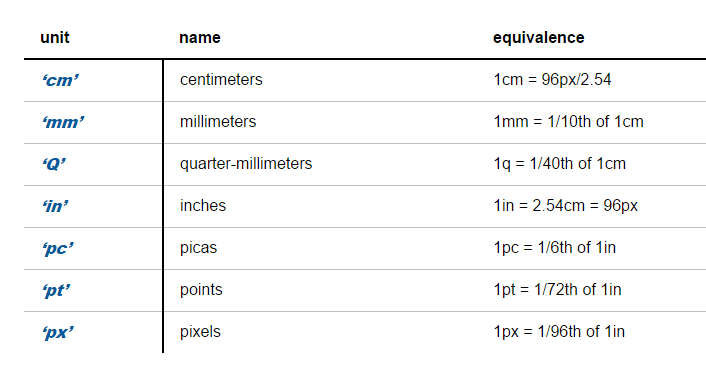
The absolute length units are fixed in relation to each other and
anchored to some physical measurement.If the anchor unit is the pixel unit, the physical units might not
match their physical measurements.Alternatively if the anchor unit is a physical unit, the pixel unit
might not map to a whole number of device pixels
Print page to div sizing
Not having an answer here is what I found out myself;
A4 @300 dpi is
21cm x 29.7cm
8.268 inches x 11.693 inches
Now my break through was to use inches for the page size as on screen we use DPI - Dots per Inch. Doing the conversion from a Metric page to a imperial DPI was confusing things even more (although its perfectly possible to convert the units)
So it’s simply;
72 dpi (screen resolution) X 8.268 inch (page width) = 595.296px
72 dpi (screen resolution) X 11.693 inch (page width) = 841.896px
To convert into a print ready print we need to scale up to 300 DPI as 72 goes into 300 4.166666666666667 times we need to multiply the original size by this number so;
595.296px x 4.166666666666667 = 2480.4px
841.896px x 4.166666666666667 = 3507.9px
In CSS I can use the transform CSS command to reduce the size of the div proportionately to fit in a 500px space and use this for a fluid layout design which will scale in both directions.
Using cm/mm on the CSS of a web app that replicates paper interaction is a good practice?
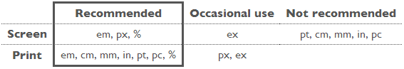
W3C has a great post on the subject of CSS units. In particular:
cm: Not recommended for screen / recommended for print
The so-called absolute units (cm, mm, in, pt and pc) mean the same in CSS as everywhere else. A length expressed in any of these will appear as exactly that size (within the precision of the hardware and software). They are not recommended for use on screen, because screen sizes vary so much. A big screen may be 60cm (24in), a small, portable screen is maybe only 8cm. And you don't look at them from the same distance.
The only place where you could use pt (or cm or in) for setting a font size is in style sheets for print, if you need to be sure the printed font is exactly a certain size. But even there using the default font size is usually better.
getting height of a div in centimeter using jquery?
1px = 0.02645833 cm;
or
1 cm = 37.795276px;
See these links:
How to access screen display’s DPI settings via javascript?
How to detect the screen DPI using JavaScript
Pixel to Centimeter?
CSS to set 21 cm width and 9.33 cm height paper size
1cm is equal to 37px. I've just google it for you.
How to give table width and height in millimeters in HTML
Yes, you can set widths in millimetres. However, setting a width on a <tr> element usually doesn't do anything. Instead, consider adding this style to the table: width:17mm; table-layout:fixed
Related Topics
Force Non-Monospace Font into Fixed Width Using CSS
How to Make This Header/Content/Footer Layout Using CSS
How to Zoom an HTML Element in Firefox and Opera
What Does .Container.\31 25\25 Mean in CSS
Css3 Transform Order Matters: Rightmost Operation First
Css-Only Sticky Table Headers in Chrome
Firefox Ignores Padding When Using Overflow:Scroll
Css3 - 3D Flip Animation - Ie10 Transform-Origin: Preserve-3D Workaround
Change Style of Pseudo Elements in Angular2
Animating Max-Height with CSS Transitions
Convert 8-Digit Hex Colors to Rgba Colors
How to Align Nav Items to the Right in Bootstrap 5
CSS Transitions with Calc() Do Not Work in Ie10+
How to Make Firefox Print a Background-Color Style
CSS Text Justify with Letter Spacing
How to Get the Nth Child of an Element Using CSS2 Selectors
How to Prevent Different Browsers Rendering Fonts Differently