Styling twitter bootstrap buttons
Basically, the buttons in Twitter Bootstrap are controlled in CSS by ".btn{}". What you have to do is go to the CSS file and find where it says "btn" and change the color settings. However, it's not as simple as just doing that since you also have to change what color the button changes into when you highlight it, etc. To do THAT, you have to look for other tags in CSS like ".btn:hover{}", etc.
Changing it requires changing of the CSS. Here is a quick link to that file:
https://github.com/twbs/bootstrap/blob/master/dist/css/bootstrap.css
Styling Twitter's Bootstrap 3.x Buttons
Add extra colors to your less files and recompile. Also see Twitter Bootstrap Customization Best Practices.
update
As mentioned by @ow3n since v3.0.3 use:
.btn-custom {
  .button-variant(@btn-default-color; @btn-default-bg; @btn-default-border);
}
Note in the above @btn-default-color sets the font color,@btn-default-bg the background color and @btn-default-border the color of the border. Colors for states like active, hover and disabled are calculated based on of these parameters.
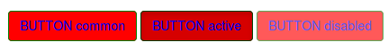
For example:
.btn-custom {
  .button-variant(blue; red; green);
}
will result in:
For who want to use the CSS direct, replace the colors in this code:
.btn-custom {
  color: #0000ff;
  background-color: #ff0000;
  border-color: #008000;
}
.btn-custom:hover,
.btn-custom:focus,
.btn-custom:active,
.btn-custom.active,
.open .dropdown-toggle.btn-custom {
  color: #0000ff;
  background-color: #d60000;
  border-color: #004300;
}
.btn-custom:active,
.btn-custom.active,
.open .dropdown-toggle.btn-custom {
  background-image: none;
}
.btn-custom.disabled,
.btn-custom[disabled],
fieldset[disabled] .btn-custom,
.btn-custom.disabled:hover,
.btn-custom[disabled]:hover,
fieldset[disabled] .btn-custom:hover,
.btn-custom.disabled:focus,
.btn-custom[disabled]:focus,
fieldset[disabled] .btn-custom:focus,
.btn-custom.disabled:active,
.btn-custom[disabled]:active,
fieldset[disabled] .btn-custom:active,
.btn-custom.disabled.active,
.btn-custom[disabled].active,
fieldset[disabled] .btn-custom.active {
  background-color: #ff0000;
  border-color: #008000;
}
.btn-custom .badge {
  color: #ff0000;
  background-color: #0000ff;
}
end update
To generate a custom button:
.btn-custom {
    .btn-pseudo-states(@yourColor, @yourColorDarker);
 }
The above will generate the following css:
.btn-custom {
  background-color: #1dcc00;
  border-color: #1dcc00;
}
.btn-custom:hover,
.btn-custom:focus,
.btn-custom:active,
.btn-custom.active {
  background-color: #19b300;
  border-color: #169900;
}
.btn-custom.disabled:hover,
.btn-custom.disabled:focus,
.btn-custom.disabled:active,
.btn-custom.disabled.active,
.btn-custom[disabled]:hover,
.btn-custom[disabled]:focus,
.btn-custom[disabled]:active,
.btn-custom[disabled].active,
fieldset[disabled] .btn-custom:hover,
fieldset[disabled] .btn-custom:focus,
fieldset[disabled] .btn-custom:active,
fieldset[disabled] .btn-custom.active {
  background-color: #1dcc00;
  border-color: #1dcc00;
}
In the above #1dcc00 will be your custom color and #19b300 your darker color. In stead of the less solution you also can add this css direct to your html files (after the bootstrap css).
Or get your css code direct from Twitter's Bootstrap 3 Button Generator
How do I style a twitter bootstrap button with a hexadecimal color in Rails 4.2.4
You can just add it to the application.css|css.scss
So if you added a class of btn btn-pink to the button. I recommend that you add btn class so you will inherit the basic styling.
.btn-pink{
  color: #FFFFFF; // whatever you want
  background-color: ##FF69B4; // whatever you want
}
All buttons hover styling in Twitter Bootstrap
The solution I found is not very elegant (you need to modify bootstrap file) but it works.
You need to go to mixins/_buttons.scss file and then change:
background-color: darken($background, 10%);
into
background-color: lighten($background, 10%);
It should do the job for all buttons.
How can I get my Twitter Bootstrap buttons to right align?
Insert pull-right into the class attribute and let bootstrap arrange the buttons.
For Bootstrap 2.3, see: http://getbootstrap.com/2.3.2/components.html#misc > Helper classes > .pull-right.
For Bootstrap 3, see: https://getbootstrap.com/docs/3.3/css/#helper-classes > Helper classes.
For Bootstrap 4, see: https://getbootstrap.com/docs/4.0/utilities/float/#responsive
The pull-right command was removed and replaced with float-right or in general to float-{sm,md,lg,xl}-{left,right,none}
For Boostrap 5, see: https://getbootstrap.com/docs/5.0/utilities/float/
The closest solution would be float-end.
Resizing buttons in Twitter-Bootstrap
Bootstrap is a great framework, but it doesn't cover everything. It knows that and using its OOCSS principle should be extended to your needs.
If I'm adapting Bootstrap components themselves, I generally create a bootstrap-extensions.css file which houses any extensions of base components, such as an extra large button.
Here's an example implementation of how one extension class adds a new family of buttons to the framework. This example also includes an example use of .btn-block, which is already included in the framework.
CSS:
/**
 * Extra large button extensions. Extends `.btn`.
 */
.btn-xlarge {
    padding: 18px 28px;
    font-size: 22px;
    line-height: normal;
    -webkit-border-radius: 8px;
       -moz-border-radius: 8px;
            border-radius: 8px;
    }
Demo: http://jsfiddle.net/Pspb9/
How to make Twitter-Bootstrap like buttons
Do not use a div, just style the link (a).
Currently you are styling both the link and the div, which is not necessary - this creates conflicts and, semantically, is useless.
You would want to use a div only if you needed to nest multiple elements within it and then position the div to position all the elements at once (just an example).
Twitter bootstrap, buttons hover style?
Twitter Bootstrap animates the background-position on hover with a transition (since background-gradients cant have a transition). What is happening in your case, is the background-gradient is getting shifted up with background-position: -15px, and you are seeing the background-color underneath.
To fix this set your background-color to the bottom color of your button gradient on hover:
.tour_btn {
    #gradient > .vertical(#F98C51, #a35b35);
    &:hover { background-color: #a35b35 }
}
Twitter-Bootstrap button color on-loading state
This one rather can't be done without using JavaScript.
First way, if you aren't afraid of JS: jsfiddle
HTML:
<button type="button" id="btn1" data-loading-text="Hm.." class="btn btn-primary">
  Loading state
</button>
CSS:
.btn-primary,
.btn-primary:hover,
.btn-primary:active {
    border: none;
    margin: 5px;
    background-color: #b2d025; /* here */
}
JS:
$("#btn1").click(function() {
    var $btn = $(this);
    $btn.button('loading');

    $(this).css('background-color','#b2d025'); /* and here */

    setTimeout(function () {
        $btn.button('reset');
    }, 1000);
});
Second way (less js, more css, using !important): jsfiddle
Twitter bootstrap .btn class: Button text color changes after being clicked on
To retain color after click you need to add following css:
.btn:focus, .btn-success:focus{
      background:#449D44;
    }
Find Bootply Demo HERE
Related Topics
CSS Sticky Footers with Unknown Height
Styling Elements with a Dot (.) in the Class Name
Differencebetween Block and Inline-Block with Width: 100%
Why Is Backface-Visibility Hidden Not Working in Ie10 When Perspective Is Applied to Parent Elements
What's a Querystring Doing in This Stylesheet's Href
Custom Cursor Image Doesn't Work in All Ies
Input Type="Image" Shows Unwanted Border in Chrome and Broken Link in IE7
Why Don't CSS Resets Use '*' to Cover All Elements
How to Reset a CSS-Counter to the Start-Attribute of the Given List
Icon Fonts Not Loading in Ie11
Pure CSS Animation Visibility with Delay
IE7, IE8 Support for CSS3 Media Query
Scrollbar Color Change in Firefox
CSS Property Value from Class Name