Absolute positioning ignoring padding of parent
First, let's see why this is happening.
The reason is that, surprisingly, when a box has position: absolute its containing box is the parent's padding box (that is, the box around its padding). This is surprising because usually (that is, when using static or relative positioning) the containing box is the parent's content box.
Here is the relevant part of the CSS specification:
In the case that the ancestor is an inline element, the containing block is the bounding box around the padding boxes of the first and the last inline boxes generated for that element.... Otherwise, the containing block is formed by the padding edge of the ancestor.
The simplest approach—as suggested in Winter's answer—is to use padding: inherit on the absolutely positioned div. It only works, though, if you don't want the absolutely positioned div to have any additional padding of its own. I think the most general-purpose solutions (in that both elements can have their own independent padding) are:
Add an extra relatively positioned
div(with no padding) around the absolutely positioneddiv. That newdivwill respect the padding of its parent, and the absolutely positioneddivwill then fill it.The downside, of course, is that you're messing with the HTML simply for presentational purposes.
Repeat the padding (or add to it) on the absolutely positioned element.
The downside here is that you have to repeat the values in your CSS, which is brittle if you're writing the CSS directly. However, if you're using a pre-processing tool like
SASSorLESSyou can avoid that problem by using a variable. This is the method I personally use.
Absolute positioning ignoring padding
Absolute positioning does not take padding into account. A possible solution would be to add another container inside .mcontainer, that also has position: relative. That way, the inner container would respect the padding, and the absolute positioned element would be at the bottom of the inner container.
Padding between relative and absolute positions
When an element is set to position:absolute, its containing box is the parent's padding box (the box around the padding). The result in your example is correct.
jsFiddle
You can probably do this to get the result you want, and width:calc(100% - 100px) on the parent doesn't seem to be necessary in your example.
#children:hover {
  position: absolute;
  top: 0;
  left: 0;
  right: 100px; /* the same value as parent's right padding */
  width: auto; /* reset to default, depending on 'left' and 'right' values */
}
EDIT
OP actually has two absolute divs inside, using calc() can help.
jsFiddle
#parent:hover .children {
  position: absolute;
  top: 0;
  left: 0;
  width: calc(50% - 50px);
}
#parent:hover .children:nth-child(2) {
  left: calc(50% - 50px);
}
But, the easiest way would be adding an additional container to the parent, and set the padding and background on it, rest of style unchanged.
jsFiddle
<div id="container">
  <div id="parent">
    <div class="children"></div>
    <div class="children"></div>
  </div>
</div>
#container {
  padding-right: 100px;
  background: pink;
}
#parent {
  height: 100vh;
  position: relative;
}
absolute ignoring parent padding
When you use position: absolute on an element then that element will be positioned within its closest 'non static' parent container's content area and padding box. You can refer to the Box Model for reference.
A simple solution would be to say right: 15px. This will offset the side-nav from the right to align with the rest of the container.
See this jsFiddle
EDIT:
Since the padding of the container is variable this may not be a viable solution.
You could instead add a wrapper div just inside the container
<div class="container">
    <div class="content-wrap">
        ...
    </div>
</div>
and position it relative.
 .content-wrap {
    position: relative;
 }
See updated jsFiddle
header with position: absolute ignoring paddings of container
You need to change the width: 100% property on .header__container down to a value below 100%. Although it has a max-width: 1200px value, once it goes below 1200px it will just then stay at 100% of the size of the parent container.
You could do width: 90% to add some space or a calculated value such as width: calc(100% - 2rem)
Codepen link https://codepen.io/thechewy/pen/zYRWmQr?editors=1100
What's the standard of width % for child positioned: absolute
This snippet shows the result of setting the second div to have position relative and then position absolute. You can see that the absolutely positioned element takes on the width of its parent including the padding.
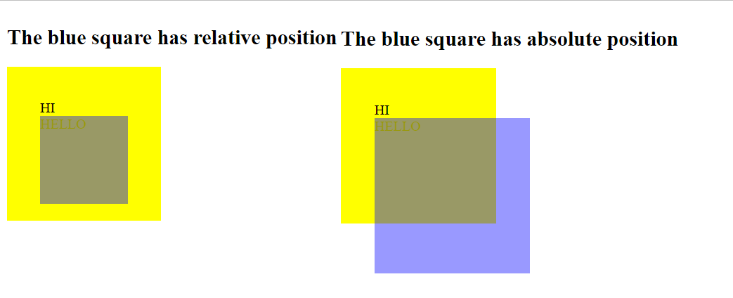
.first {
  background-color: yellow;
  width: 100px;
  height: 100px;
  padding: 10%;
  position: relative;
}

.second {
  background-color: blue;
  width: 100%;
  height: 100%;
  opacity: 40%;
}

.relative {
  position: relative;
}

.absolute {
  position: absolute;
}
<h2>The blue square has relative position</h2>
<div class="first">HI
<div class="second relative">
HELLO
</div>
</div>
<h2>The blue square has absolute position</h2>
<div class="first">HI
<div class="second absolute">
HELLO
</div>
</div>Related Topics
Nesting Pseudo-Elements Inside Pseudo-Elements
How to Remove Blue "Selected" Outline on Buttons
Less Lists as a Mixin Argument(S)
Combining :Not() Selectors in CSS
Select an Element with Empty Class Attribute (Class="") Using CSS
Remove Border Radius from Select Tag in Bootstrap 3
How to Code CSS Media Queries Targeting All Mobile Devices and Tablets
Select Odd Even Child Excluding the Hidden Child
Div with Cut Out Edges, Border and Transparent Background
How to Make a Column Span Full Width When a Second Column Is Not There? (CSS Grid)
How to Create Multiple Borders Around Existing Border of Circle
Placing Background Image in a Rhombus Shaped Container Is Causing the Container to Lose Its Shape