auto margin expansion not working inside flex box on IE11
It appears that my problem was coming from the fact that IE11 was not taking into account the min-height of .parent.
Fixed it by making .grandparent a flexbox.
Flexbox, min-height, margin auto and Internet Explorer
This is a bug in IE's flexbox implementation:
In all other browsers that support flexbox, a
flex-direction:columnbased flex container will honor the containersmin-heightto calculateflex-growlengths. In IE10 & 11-preview it only seems to work with an explicitheightvalue.
Bug report - (https://connect.microsoft.com/IE/feedback/details/802625/min-height-and-flexbox-flex-direction-column-dont-work-together-in-ie-10-11-preview#tabs)
It appears that this is on Microsoft's radar and will be fixed some point in the future:
Unfortunately, we are not able to address this feedback in our upcoming release. We will consider your feedback for a future release. We will keep this connect feedback bug active to track this request.
Reply from Microsoft - (https://connect.microsoft.com/IE/feedback/details/802625/min-height-and-flexbox-flex-direction-column-dont-work-together-in-ie-10-11-preview#tabs)
For now the simple solution is to use height:
.wrapper { border: 1px solid grey; box-sizing: border-box; display: flex; flex-direction: column; height: 300px; padding: 5px;}.element { border: 1px solid grey; height: 35px; margin: 5px;}.element:last-child { margin-top: auto;}<div class="wrapper"> <div class="element"></div> <div class="element"></div> <div class="element"></div> <div class="element"></div></div>CSS flex basis not working on IE
Simply remove justify-content: flex-end; from the &__items rule.
The reason is that IE does not like when one combine justify-content and auto margins, so by removing it, it works fine cross browsers.
Updated codepen
Stack snippet
.o-container {  width: 90%;  margin-right: auto;  margin-left: auto;}
.nav-bar {  background-color: lightgreen;  padding: 16px 0;  width: 100%;}.nav-bar__items {  align-items: center;  display: flex;  flex-wrap: wrap;  /* justify-content: flex-end;             removed  */  min-height: 40px;}.nav-bar__items-linkOne {  margin-right: auto;}.nav-bar__items-linkThree, .nav-bar__items-linkTwo {  padding-left: 8px;}.nav-bar__items-linkTwo {  padding-right: 8px;  margin-left: 20px;}.nav-bar__items-select {  display: block;  flex-basis: 100%;  margin-top: 20px;}.nav-bar__items-select select {  width: 100%;}
@media (min-width: 1366px) {  .o-container {    max-width: 1366px;  }}@media (min-width: 918px) {  .nav-bar {    order: 1;    padding: 10px 0;  }  .nav-bar__items {    order: 1;  }  .nav-bar__items-linkThree, .nav-bar__items-linkTwo {    order: 3;  }  .nav-bar__items-linkTwo {    order: 3;  }  .nav-bar__items-linkThree {    order: 4;  }  .nav-bar__items-select {    flex-basis: auto;    order: 2;    margin-top: 0;  }  .nav-bar__items-select select {    width: 350px;  }}
<section class="nav-bar">
<div class='o-container '> <div class='nav-bar__items'>
<div class="nav-bar__items-linkOne"> <div class=""> <span>Link One</span> </div> </div>
<div class="nav-bar__items-linkTwo"> <span>Link Two</span> </div>
<div class="nav-bar__items-linkThree"> <span class="o-svg-text__text-left">Link Three</span> </div>
<div class="nav-bar__items-select"> <div> <span>Select: </span> <select> <option>Select Option here</option> <option>Select Option here</option> <option>Select Option here</option> <option>Select Option here</option> <option>Select Option here</option> <option>Select Option here</option> <option>Select Option here</option> </select> </div> </div>
</div>
</div>
</section>Margin auto fails IE11
it doesn't work because the max-width;
Try this:
.bg-content {
    width: 605px;
    height: 149px;
    position: absolute;
    top: 62px;
    font-family: sans-serif;
    margin-left: auto;
    margin-right: auto;
    left: 0;
    right: 0;
}
Vertically centered text using bootstrap's flex utils not working in IE11
You have encount the bug that min-height property is ignored on Internet Explorer 11 with use Flexbox. This bug is listed GitHub's Flexbugs repository.
Flexbug #3
min-heighton a flex container won't apply to its flex itemsIn order for flex items to size and position themselves, they need to know how big their containers are. For example, if a flex item is supposed to be vertically centered, it needs to know how tall its parent is. The same is true when flex items are told to grow to fill the remaining empty space.
In IE 10-11,
min-heightdeclarations on flex containers work to size the containers themselves, but their flex item children do not seem to know the size of their parents. They act as if no height has been set at all.
This bug's one of the workaround is wrap the flex container other flex container.
- jsFiddle for result check in IE11
.quote-container{
    min-height:600px;
    background:salmon;
}

.quotes {
    color:
    #FFA300;
}

/*Generic Styles*/
.extra-large-heading {
    font-size: 2rem;
}

.italic{
    font-style:italic;
}

.bold-weight {
    font-weight: 700;
}
<script src="https://cdnjs.cloudflare.com/ajax/libs/font-awesome/5.12.1/js/all.min.js"></script>
<script src="https://code.jquery.com/jquery-3.4.1.slim.min.js"></script>
<link href="https://stackpath.bootstrapcdn.com/bootstrap/4.4.1/css/bootstrap.min.css" rel="stylesheet"/>
<div class="container pt-5 pb-5">
<div class="d-flex flex-column"><!-- Add wrapper flex container -->
<div class="quote-container d-flex flex-column justify-content-center">
<p class="bold-weight extra-large-heading italic text-center">
<i class="fas fa-quote-left quotes mr-2" aria-hidden="true"></i>
Facts are meaningless. You could use facts to prove anything that's even remotely true.
<i class="fas fa-quote-right quotes ml-2" aria-hidden="true"></i>
</p>
<p class="text-muted text-center">– Homer Simpson</p>
</div>
</div>
</div>display: flex not working on Internet Explorer
Internet Explorer doesn't fully support Flexbox due to:
Partial support is due to large amount of bugs present (see known
issues).
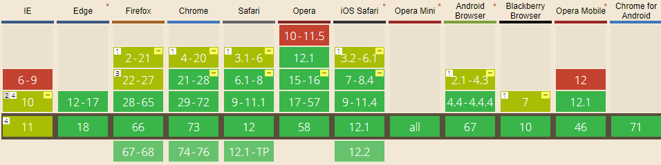
Screenshot and infos taken from caniuse.com
Notes
Internet Explorer before 10 doesn't support Flexbox, while IE 11 only supports the 2012 syntax.
Known issues
- IE 11 requires a unit to be added to the third argument, the flex-basis property see MSFT documentation.
- In IE10 and IE11, containers with
display: flexandflex-direction: columnwill not properly calculate their flexed childrens' sizes if the container hasmin-heightbut no explicitheightproperty. See bug. - In IE10 the default value for
flexis0 0 autorather than0 1 autoas defined in the latest spec. - IE 11 does not vertically align items correctly when
min-heightis used. See bug.
Workarounds
Flexbugs is a community-curated list of Flexbox issues and cross-browser workarounds for them. Here's a list of all the bugs with a workaround available and the browsers that affect.
- Minimum content sizing of flex items not honored
- Column flex items set to
align-items: centeroverflow their container min-heighton a flex container won't apply to its flex itemsflexshorthand declarations with unitlessflex-basisvalues are ignored- Column
flexitems don't always preserve intrinsic aspect ratios - The default flex value has changed
flex-basisdoesn't account forbox-sizing: border-boxflex-basisdoesn't supportcalc()- Some HTML elements can't be flex containers
align-items: baselinedoesn't work with nested flex containers- Min and max size declarations are ignored when wrapping flex items
- Inline elements are not treated as flex-items
- Importance is ignored on flex-basis when using flex shorthand
- Shrink-to-fit containers with
flex-flow: column wrapdo not contain their items - Column flex items ignore
margin: autoon the cross axis flex-basiscannot be animated- Flex items are not correctly justified when
max-widthis used
Flexbox not working in Internet Explorer 11
According to Flexbugs:
In IE 10-11,
min-heightdeclarations on flex containers work to size the containers themselves, but their flex item children do not seem to know the size of their parents. They act as if no height has been set at all.
Here are a couple of workarounds:
1. Always fill the viewport + scrollable <aside> and <section>:
html {
  height: 100%;
}

body {
  display: flex;
  flex-direction: column;
  height: 100%;
  margin: 0;
}

header,
footer {
  background: #7092bf;
}

main {
  min-height: 0; /* added 2021*/
  flex: 1;
  display: flex;
}

aside, section {
  overflow: auto;
}

aside {
  flex: 0 0 150px;
  background: #3e48cc;
}

section {
  flex: 1;
  background: #9ad9ea;
}
<header>
<p>header</p>
</header>
<main>
<aside>
<p>aside</p>
</aside>
<section>
<p>content</p>
<p>content</p>
<p>content</p>
<p>content</p>
<p>content</p>
<p>content</p>
<p>content</p>
<p>content</p>
<p>content</p>
<p>content</p>
</section>
</main>
<footer>
<p>footer</p>
</footer>Related Topics
Suggestions for Debugging Print Stylesheets
Multiple Image Cross Fading in CSS - Without (Java) Script
Vertically Centering Content of :Before/:After Pseudo-Elements
Why Is Backface-Visibility Hidden Not Working in Ie10 When Perspective Is Applied to Parent Elements
Webkit Support for Gradient Transitions
Styling Twitter Bootstrap Buttons
Animate CSS Background-Position with Smooth Results (Sub-Pixel Animation)
Transparent Rounded Corners on Google Map
Webfont Smoothing and Antialiasing in Firefox and Opera
What's the Maximum Pixel Value of CSS Width and Height Properties
Why Put in Front of the File Name "_" or "_" in SCSS/Css
Add Ellipses to Overflowing Text in Svg