What's the maximum pixel value of CSS width and height properties?
Using the CSS inspector that comes with certain browsers on an element with 10000000000px width and height:
Firefox: 33554400px
Chrome:  33554428px
Opera:   33554428px
IE 9:    21474836.47px
Maximum value for CSS position
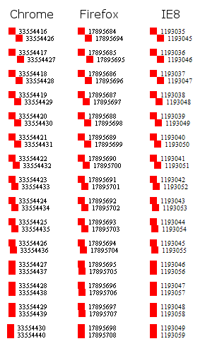
According to the test below, all Firefox, Chrome and IE8 have the same problem, but at different values.
The serious problem starts more or less at
- Chrome:
33554430 - Firefox:
17895700 - IE8:
1193050
But, on Firefox and Chrome, much before that number, some elements are shifted one or two pixels to the left or to the right. I didn't see that on IE8.
Moreover, on Chrome, the inputs can stop working around 33553900.
var num = document.getElementById('num'), init = document.getElementById('init'), render = document.getElementById('render'), result = document.getElementById('result');render.onclick = function() { result.innerHTML = ''; var from = +init.value, to = from + +num.value; for(var i=from; i<to; ++i) { var wrapper = document.createElement('div'); wrapper.className = 'wrapper'; wrapper.style.marginLeft = -i + 'px'; var first = document.createElement('div'); first.style.left = i + 'px'; first.setAttribute('data-num', i); var last = document.createElement('div'); last.style.left = i+10 + 'px'; last.setAttribute('data-num', i+10); wrapper.appendChild(first); wrapper.appendChild(last); result.appendChild(wrapper); }}.wrapper { margin: 10px 0;}.wrapper > div { position: relative; width: 10px; height: 10px; background: red;}.wrapper > div:after { content: attr(data-num); font-size: 10px; line-height: 10px; float: left; margin-left: 15px;}Render <input type="number" id="num" value="100" /> elementsstarting with <input type="number" id="init" value="0" /><input type="button" id="render" value="Render" /><div id="result"></div>Maximum value for tag width in html
I guess it depends on browser. Just give it a very big value and then inspect in dev-tools. My chrome gives 37282700 pixels for an element with style="width: 999999999999999999999px;"
CSS width 100% OR max-width in pixels
That's in fact the intended use of max-width. If the computed (actual) width of an element exceeds max-width, it will be constrained to the max value instead of going beyond it. Percentage versus pixels isn't relevant.
Declare both in the same rule like this (no need for the calc() function):
#somediv {
    width: 100%;
    max-width: 512px;
}
How to set a max-width as percent AND pixels?
width:20%;
max-width:100px;
This sets the width to 20% but caps it at 100 px.
How using pixel values in height property differs from the percentage one?
Percentage values are based on the height of the parent (in this case section). Since you don't have anything set for the height of section, CSS doesn't know what you mean when you say 100%.
100% of what?
You can fix this by specifying a height for the section. This can be a finite value (like 400px) or a percentage, but this problem is recursive, so if you use a percentage value for the height of the section, its parent then needs a defined height. This can carry up the DOM chain all the way to the <html> element which uses the window height as its relative height for percentage values.
section
{
    height: 400px;
}
<!DOCTYPE html>
<html lang="en">
<head>
    <title>CSS Template</title>
    <meta charset="utf-8">
    <meta name="viewport" content="width=device-width, initial-scale=1">
    <style>
        * {
            box-sizing: border-box;
        }

        body {
            font-family: Arial, Helvetica, sans-serif;
        }

        section
        {
          height: 400px;
        }

        /* Style the header */
        header {
            background-color: #666;
            padding: 1px;
            text-align: center;
            font-size: 35px;
            color: white;
        }

        /* Create two columns/boxes that floats next to each other */
        nav {
            float: left;
            width: 30%;
            height: 100%; /*works if absolute pixel values given*/
            background: #ccc;
            padding: 20px;
        }

            /* Style the list inside the menu */
            nav ul {
                list-style-type: none;
                padding: 0;
            }

        article {
            float: left;
            padding: 20px;
            width: 70%;
            background-color: #f1f1f1;
            height: 100%; /*works if absolute pixel values given*/
        }

        /* Style the footer */
        footer {
            background-color: #777;
            padding: 10px;
            text-align: center;
            color: white;
        }
    </style>
</head>
<body>

    <header>
        <h2>Cities</h2>
    </header>

    <section>
        <nav>
            <ul>
                <li><a href="#">London</a></li>
                <li><a href="#">Paris</a></li>
                <li><a href="#">Tokyo</a></li>
            </ul>
        </nav>

        <article>
            <h1>London</h1>
            <p>London is the capital city of England. It is the most populous city in the  United Kingdom, with a metropolitan area of over 13 million inhabitants.</p>
        </article>
    </section>

    <footer>
        <p>Footer</p>
    </footer>

</body>
</html>
Adjusting height and width style; pixel values come out as strings
Basically it's because style.height returns a string not an int so if you add any number to it it's going to cause an error.
You can use offsetHeight instead to grab the height of the element (minus the margins but including padding)
https://www.w3schools.com/jsref/prop_element_offsetheight.asp
(It's offsetWidth for the width, same logic though)
https://www.w3schools.com/jsref/prop_element_offsetwidth.asp
So your code would be:
var el = document.getElementById("box");
var height = el.offsetHeight;
var newHeight = height + 200;
el.style.height = newHeight + 'px';
Get element's resolved height CSS property value; recognize 100%
No, there is no specification or functionality that supports or enables this method. There are plenty of ways to go the other direction, including...
- getBoundingClientRect()
- offsetHeight
- getComputedStyle
... but none that will retrieve the exact percentage specified in the CSS, unfortunately.
You can try, as I've done below.
RegEx
If your height is specified as an inline style, you could RegEx it out of the attribute like so1:
let elem = document.getElementsByTagName("div")[0];
let re = /(?<=\height:\s+?)[^\;]+/i;
console.log(re.exec(elem.getAttribute("style"))[0]);
<div style="color: black; height: 100%; background: white;"></div>What is calculated value for font-size
Your question is a little confusing, but I'll try to cover the details off as I think you're asking.
First, I think you mean the "Computed" value rather than the "Calculated" value. You also ask in a comment about the "Used" value, and to get a full picture we also need to cover some other values, the "Specified" value, the "Resolved" value and the "Actual" value.
Now taking the font-size first, we have for the .myspan element
- Specified value = 220%
- Computed value = 18px * 220% = 39.6px
- Resolved value = 39.6px
(The resolved value forfont-sizeis the computed value) - Used value = 39.6px
(Always the same as the computed value forfont-size) - Actual value = about 39-40px
(The CSS pixels will be converted to device pixels. some other approximations may be made based on the available fonts and the closest renderable number on the device is used)
For the width, things work slightly differently
- Specified value = 50%
- Computed value = 50%
(The pixel length is not known at computed value time because the layout hasn't happened at this step) - Used value = 200px * 50% = 100px
(The layout is done and the pixel value is determined) - Resolved value = 100px
(The resolved value forwidthis the used value) - Actual value = about 100px
(As with font-size, the CSS pixels will be converted to device pixels and the closest renderable number on the device is used)
Now, what causes confusion is that when you use getComputedStyle() in JavaScript, or inspect the "Computed Values" tab in the browsers' developer tools, you don't get the "Computed" values for the element - You get the "Resolved" values for the element.
For getComputedStyle(), this is just an historical anomaly that exists for backward compatibility reasons. Why the developer tools also report the Resolved value, I don't know.
Related Topics
Replace Input Type=File by an Image
How to Vertically Center an Image Inside of a Div Element in HTML Using CSS
Is There Any Pros and Cons If I Use Always CSS Class Instead CSS Id for Everything
CSS Selector Involving Pseudo Class First-Child and Dropcap
How Do Browsers Read and Interpret CSS
Css: Clean Solution to the Margin Collapse Issue When Floating an Element
Is Box Sizing Inherited If Declared Inside Universal Selector
Animated Cursor Support in Web Applications
How to Make This Header/Content/Footer Layout Using CSS
CSS Text Justify with Letter Spacing
How to Detect If the Os Is in Dark Mode in Browsers
Select Odd Even Child Excluding the Hidden Child
Bootstrap Change Div Order with Pull-Right, Pull-Left on 3 Columns