How to make 3-corner-rounded triangle in CSS
My best attempt: http://dabblet.com/gist/4592062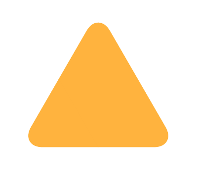
Pixel perfection at any size, uses simpler math than Ana's original solution, and is more intuitive in my opinion :)
.triangle {

 position: relative;

 background-color: orange;

 text-align: left;

}

.triangle:before,

.triangle:after {

 content: '';

 position: absolute;

 background-color: inherit;

}

.triangle,

.triangle:before,

.triangle:after {

 width:  10em;

 height: 10em;

 border-top-right-radius: 30%;

}

.triangle {

 transform: rotate(-60deg) skewX(-30deg) scale(1,.866);

}

.triangle:before {

 transform: rotate(-135deg) skewX(-45deg) scale(1.414,.707) translate(0,-50%);

}

.triangle:after {

 transform: rotate(135deg) skewY(-45deg) scale(.707,1.414) translate(50%);

}
<div class="triangle"></div>Drawing rounded triangle with CSS
div {
    transform: rotate(45deg);
    -ms-transform: rotate(45deg); /* IE 9 */
    -webkit-transform: rotate(45deg); /* Safari and Chrome */
    -o-transform: rotate(45deg); /* Opera */
    -moz-transform: rotate(45deg); /* Firefox */
    background-color:green;
    width:100px;
    height:100px;
    position:absolute;
    top:20px;
    left:-50px;
    -webkit-border-radius: 0 20px 0 0;
    -moz-border-radius: 0 20px 0 0;
    border-radius: 0 20px 0 0;
}
and the fiddle.
If you want the div with rounded corners to be shown correctly also in older browsers without CSS3 suppport, use this:
grab the screen with PrintScreen key, paste it to Paint program, shrink the borders and save, open in IrfanView and Save as (convert it to) transparent PNG, then convert it to Base64 image e.g. here, grab your result and your CSS is done. The result here:
div.image {
    position: absolute;
    width: 62px;
    height: 141px;
    background-image:url('data:image/png;base64,iVBORw0KGgoAAAANSUhEUgAAAD4AAACNCAIAAABg/V7IAAAABnRSTlMA/wD/AP83WBt9AAADSElEQVR42tXdz0sbQRQH8LejhNYExIisWFtDxR4KJhdDFMUfBU8KVqkXtfkj/E+8CxK96KlexARzTw/SXgu1Xirx3hSEpsn2sKWipNnd2fnxvt/jnj48Zt48GJZxPM8jzPQk3yRnx2Yh6ReZi/5E/8zzGTw6LVLlujLwZGB6dBqPTkTlb+XBvsHCswIenYjOr86x9Pd0OP0Duq9PP00XRgt4dCIqX5Uh9B3oKPrOdF/vptz8SB6PTkRnX88467vRmesD6Jz1wXS2+lB0nvqwdIb6CHRu+mh0VvrIdD56GToTvSSdg16ebl0fi25XH5duUa+Abkuvhu7rh1PDUyNTeHTzepV0w3rFdJN69XRjei10Mz1HF92AXiNdt14vXateO12f3gRdk94QXYfeHF253ihdrd40XaHeAl3VpGCHrkRvjR5fb5MeU2+ZHkdvny6tZ0GX03OhS+gZ0aPqedEj6dnRw+s50kPqmdLD6PnSA/Ws6d313Om+fjw9nnNzj74LQkjxQ/H0yykknYg2TjYu65eQdI+8teO1u993SGv9Xxq/Gs12c/nlMljV/ex93Lv9eYtXdSJqea1kIrmUWcKrOhHtf9pveS1Ier1Rr32vQdKJqHpdRaXXbmp429RPs93Mj+Qhq37z4wZ1wbS9Niod8jSFp6cSKVT6RHoClZ51s3Mv5iDpC5kFyKr3it7VV6uQ9Pmx+aG+IUj67swuZHPMubmViRU8eo/TU3lfwTuShCOqxaqbdMHowhHH744XM4tgg4BwxNH60ebrTbAZRjjiYO1ga3KrQ4Nn7i69Le1kd8Amx+5uvvRAN1N6GDdHekg3O3p4Ny96JDcjelQ3F7qEmwVdzm2fLu22TI/jtkmP6bZGj++2Q1fitkBX5TZNV+g2SlfrNkdX7jZE1+E2Qdfk1k7X59ZL1+rWSNft1kU34NZCN+NWTzfmVkw36VZJN+xWRjfvVkO34lZAt+WOS7fojkW365anW3dL0jm4ZehM3BT1Gkw44nD9cHtymxhEgLoj0Lm5w9IZukPRebqD6WzdAXTO7m505u7/0vm7O9Mh3B3oKO7HdCD3AzqW+54O5/5LR3QTkfDnbzg3EVHpc8nDjIP7EAvwbyZ/AAASPZZ53XMTAAAAAElFTkSuQmCC');
    z-index:-1;
}
and the fiddle
Is it possible to make a rounded triangle with just CSS?
To actually answer your question (and provide the first answer without border-radius): If you want a CSS only solution, you will have to use border-radius.
Nevertheless I would highly recommend to use SVG for creating shapes, as simple shapes like this are easy to create manually, it's responsive, it's widely supported now and (as @chharvey mentioned in the comments) semantically more appropriate.
<svg viewbox="0 0 50 50" height="56px">

  <path d="M1 50 V10 Q1 1 10 1 H50z" fill="#ff4369" />

</svg>
Drawing a triangle with rounded bottom in CSS?
So we create a circle and place it on top to make it look like how you want it, you get something like this:
CSS:
.triangle{
    width: 0px;
    height: 0px;
    border-style: solid;
    border-width: 0 200px 200px 0;
    border-color: transparent #48a665 transparent transparent;
}
.triangle:after {
    content: "";
    display: block;
    width: 400px;
    height: 400px;
    background: #fff;
    border-radius: 200px;
    left: -190px;
    position: absolute;
}
You need to set the background color (currently #fff ) to match the background it is placed on.
DEMO HERE
Triangle with one rounded corner
I know this is a little hacky, but I don't think there is an easy way to do this with a single class.
All I've done is rotated a box 45 degrees with border-radius:10px and then contained it in another div with width set to the desired width of your arrow and overflow:hidden so that everything that spills over is invisible.
.arrow-left {

  position: absolute;

  width: 100px;

  height: 100px;

  left: 20px;

  background: black;

  -webkit-transform: rotate(45deg);

  transform: rotate(45deg);

  border-radius: 10px;

}

.cover {

  position: absolute;

  height: 100px;

  width: 40px;

  overflow: hidden;

}
<div class="cover">
<div class="arrow-left"></div>
</div>css rounded corner of right angled triangle
Here is an idea where you can rely on 2 pseudo element and some background coloration to approximate it. You simply need to find the correct value to have the perfect overlap between both pseudo elements.
h1 {

  padding-left:1em;

  position:relative;

}

h1:before {

  content: "";

  position:absolute;

  left: 0;

  top: calc(50% - 0.35em);

  width: 0.7em;

  height: 0.7em;

  background: linear-gradient(to bottom left, #34495e 50%, transparent 50%);

  border-radius: 0.1em;

}

h1:after {

  content: "";

    position: absolute;

    left: 3.8px;

    top: -0.1px;

    width: 0.92em;

    height: 0.8em;

    margin-right: 10px;

    background: linear-gradient(to top,#34495e 3.5px,transparent 5px);

    border-radius: 0.1em;

    transform: rotate(45deg);

    z-index: -1;

}<h1>Heading</h1>How to create a triangle in CSS3 using border-radius
Demo
#player {

  margin: 32px;

  position: relative;

  width: 400px;

  height: 250px;

  background-color: #222;

}

#inner {

  transform: rotate(45deg);

  background-color: silver;

  width: 100px;

  height: 100px;

  top: 20px;

  left: -50px;

  position: relative;

  border-radius: 20px;

}

#outer {

  position: absolute;

  top: 50px;

  left: 165px;

  width: 70px;

  height: 140px;

  overflow: hidden;

}
<div id="player">
<div id="outer">
<div id="inner"></div>
</div>
</div>Related Topics
How to Use CSS to Replace or Change Text
Absolute Position Affects Width
@ Sign and Variables in CSS Keyframes Using Less CSS
How to Style Button Inputs to Be Identical in Chrome and Firefox
How to Have Brand and Navbar on Separate Lines
How to Position a Div in the Middle of the Screen When the Page Is Bigger Than the Screen
How to Convert a Hexadecimal Color to Rgba with the Less Compiler
Css3 Columns - Force Non Breaking/Splitting Element
CSS 62.5% Why Do Developers Use It
Keep Footer with Variable Height on Bottom
Consistent Font-Size Across Browsers (Web Development)
Google Webfont Conflict with Local Font
What Is the Purpose of Flex-Start and Flex-End on Justify-Items and Justify-Self
Why Do Chrome and Firefox Show Different Flex Layout Results
Limit the Width of a Column to the Width of a Particular Grid Item
How to Send an Inner <Div> to the Bottom of Its Parent <Div>
Css: How to Get Scrollbars for Div Inside Container of Fixed Height