How can I have Brand and Navbar on separate lines?
Use flex-column to make the navbar items stack in 2 rows (lines).
- group the logo & toggler together in 1 flexbox div (
d-flex w-100) - use
mx-md-auto(auto-margins) to center the logo on larger widths - use
text-centerto center items in thenavbar-nav
https://www.codeply.com/go/W9HQcd3Pyw
<nav class="mainNav navbar navbar-expand-md navbar-light flex-column">
    <div class="w-100 d-flex">
        <a class="navbar-brand mx-md-auto" href="#">
            <img src="img/logo.png" alt="Logo" height="80px" width="auto">
        </a>
        <button class="navbar-toggler ml-auto" type="button" data-toggle="collapse" data-target=".navbar-collapse">
            <span class="navbar-toggler-icon"></span>
        </button>
    </div>
    <div class="collapse navbar-collapse">
        <ul class="navbar-nav text-center">
            <li class="nav-item">
                <a class="nav-link" href="#">Home</a>
            </li>
            <li class="nav-item">
                <a class="nav-link" href="#">About</a>
            </li>
            <li class="nav-item">
                <a class="nav-link" href="#">Contact</a>
            </li>
        </ul>
    </div>
</nav>
Read more about the Navbar and Utility classes in the Bootstrap 4 docs.
Related questions
How to centre navbar logo in Boostrap 4 with nav-links below
Bootstrap 4: Navbar with logo and 2 rows
Bootstrap 4 navbar with 2 rows and inline form
Put navbar-brand and nav-items on different rows in Bootstrap 4 navbar
To achieve the desired effect, do this:
Add the
flex-columnto the navbar like shown in the code snippet below. (This turns the navbar into a flex-column which is what enables the desired stacking behavior in this case.)If you don't want the items centered and want them left-aligned instead, add the
align-items-startclass to that as well.To align the navbar-brand with the items (in this case), add the
ml-2class (margin-left: 2 units) to the navbar-brand.To ensure that things behave "normally" (= in the usual way) when the navbar is collapsed, you need to modify 2 classes from above. So, if you have
navbar-expand-lgas in the example below, you need to changeflex-columntoflex-lg-columnto ensure that the switch to flex-column only happens when the screen is large (lg) or larger. And then change theml-2class toml-lg-2to ensure that the left margin on the navbar-brand only gets modified for those larger screens and is set to default for smaller screens.
Click "run code snippet" below and expand to full page:
<link rel="stylesheet" href="https://maxcdn.bootstrapcdn.com/bootstrap/4.0.0/css/bootstrap.min.css" integrity="sha384-Gn5384xqQ1aoWXA+058RXPxPg6fy4IWvTNh0E263XmFcJlSAwiGgFAW/dAiS6JXm" crossorigin="anonymous">

<script src="https://code.jquery.com/jquery-3.2.1.slim.min.js" integrity="sha384-KJ3o2DKtIkvYIK3UENzmM7KCkRr/rE9/Qpg6aAZGJwFDMVNA/GpGFF93hXpG5KkN" crossorigin="anonymous"></script>

<script src="https://cdnjs.cloudflare.com/ajax/libs/popper.js/1.12.9/umd/popper.min.js" integrity="sha384-ApNbgh9B+Y1QKtv3Rn7W3mgPxhU9K/ScQsAP7hUibX39j7fakFPskvXusvfa0b4Q" crossorigin="anonymous"></script>

<script src="https://maxcdn.bootstrapcdn.com/bootstrap/4.0.0/js/bootstrap.min.js" integrity="sha384-JZR6Spejh4U02d8jOt6vLEHfe/JQGiRRSQQxSfFWpi1MquVdAyjUar5+76PVCmYl" crossorigin="anonymous"></script>

<nav class="navbar flex-lg-column align-items-start navbar-expand-lg navbar-light bg-light">

    <a class="navbar-brand ml-lg-2" href="#">Navbar</a>

    <button class="navbar-toggler" type="button" data-toggle="collapse" data-target="#navbarNav" aria-controls="navbarNav" aria-expanded="false" aria-label="Toggle navigation">

        <span class="navbar-toggler-icon"></span>

    </button>

    <div class="collapse navbar-collapse" id="navbarNav">

        <ul class="navbar-nav">

            <li class="nav-item active">

                <a class="nav-link" href="#">Home <span class="sr-only">(current)</span></a>

            </li>

            <li class="nav-item">

                <a class="nav-link" href="#">Features</a>

            </li>

            <li class="nav-item">

                <a class="nav-link" href="#">Pricing</a>

            </li>

            <li class="nav-item">

                <a class="nav-link disabled" href="#">Disabled</a>

            </li>

        </ul>

    </div>

</nav>
How to align two line text inside navbar-brand with image
Set the padding-left on the link to create an area for the log, and use a background image (I've used a gradient) to display, and place the logo:
.brand {

  display: inline-block;

  text-decoration: none;

  color: black;

  font-family: Montserrat;

  font-weight: bold;

  padding-left: 42px;

  background: radial-gradient(circle, darkorange, darkorange 50%, transparent 50%) no-repeat 0 50%;

  background-size: 42px 42px;

}

.name {

  color: darkorange;

}
<a class="brand" href="#">
<div class="inl">COMPANY</div>
<div class="name">NAME</div>
</a>Navbar brand and mobile dropdown on same line bootstrap 4
Wrap the brand and toggler in another flexbox div (d-flex) and use flex-nowrap to prevent the wrapping...
   <div class="d-flex flex-nowrap w-100">
          <a class="navbar-brand" href="index.html"><img class="img-fluid logo" src="https://s22.postimg.cc/tf57x6fq9/pristinelogo.png" alt="Sample Image"></a>
          <button class="navbar-toggler ml-auto" type="button" data-toggle="collapse" data-target="#navbarCollapse" aria-controls="navbarCollapse" aria-expanded="false" aria-label="Toggle navigation">
                <span class="navbar-toggler-icon"></span>
          </button>
   </div>
Demo: https://www.codeply.com/go/sVHjLoAyIu
How move 'nav' element under 'navbar-brand' in my Navbar
To right align the login, you'd use ml-auto to auto fill the left side, which will push the links to the right.
Option 1:
Then adjust the min-height of the navbar. Use align-items-end to push the links to the bottom, and align the brand on top as desired. This will give the appearance of 2 Navbar rows.
@media (min-width: 567px) {
.navbar-brand
{
position: absolute;
top: 5px;
left: 50%;
transform: translateX(-50%);
}
.navbar {
min-height: 90px;
}
}
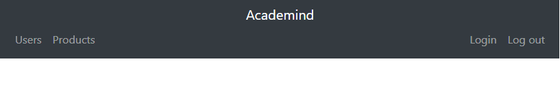
<nav class="navbar navbar-expand-sm navbar-dark bg-dark">
<a href="#" class="navbar-brand">Academind</a>
<button class="navbar-toggler" data-toggle="collapse" data-target="#navbarMenu">
<span class="navbar-toggler-icon"></span>
</button>
<div class="collapse navbar-collapse align-self-end" id="navbarMenu">
<ul class="navbar-nav">
<li class="nav-item">
<a href="#" class="nav-link">Users</a>
</li>
<li class="nav-item">
<a href="#" class="nav-link">Products</a>
</li>
</ul>
<ul class="navbar-nav ml-auto">
<li class="nav-item ">
<a href="#" class="nav-link">Login</a>
</li>
<li class="nav-item">
<a href="#" class="nav-link">Log out</a>
</li>
</ul>
</div>
</nav>
https://www.codeply.com/go/07ibCvkQJi
Option 2: (remove extra CSS)
Simply apply flex-column to the navbar, and wrap the brand and toggler together in one flexbox div. Use the auto margin utils to center the brand.
<nav class="navbar navbar-expand-sm navbar-dark bg-dark flex-column align-items-stretch">
    <div class="d-flex">
        <a href="#" class="navbar-brand mx-sm-auto mr-auto">Academind</a>
        <button class="navbar-toggler" data-toggle="collapse" data-target="#navbarMenu">
            <span class="navbar-toggler-icon"></span>
        </button>
    </div>
    <div class="collapse navbar-collapse w-100" id="navbarMenu">
        <ul class="navbar-nav">
            <li class="nav-item">
                <a href="#" class="nav-link">Users</a>
            </li>
            <li class="nav-item">
                <a href="#" class="nav-link">Products</a>
            </li>
        </ul>
        <ul class="navbar-nav ml-auto">
            <li class="nav-item">
                <a href="#" class="nav-link">Login</a>
            </li>
            <li class="nav-item">
                <a href="#" class="nav-link">Logout</a>
            </li>
        </ul>
    </div>
</nav>
https://www.codeply.com/go/qVJPhAy6fS
Related:
How can I have Brand and Navbar on separate lines?
Displaying left and right navbar links on separate lines on collapse
Use a media query to contain the rules so they only apply under 768px and use inline-block against the li items and set the navbar-navs width to 100% while removing any margin so they are actually centered.
Working example Snippet.
@media (max-width: 767px) {

  .navbar.navbar-default .navbar-nav {

    width: 100%;

    text-align: center;

    margin: 0;

  }

  .navbar.navbar-default .navbar-right > li,

  .navbar.navbar-default .navbar-left > li {

    display: inline-block;

  }

}
<script src="https://ajax.googleapis.com/ajax/libs/jquery/1.11.1/jquery.min.js"></script>
<script src="https://maxcdn.bootstrapcdn.com/bootstrap/3.3.6/js/bootstrap.min.js"></script>
<link href="https://maxcdn.bootstrapcdn.com/bootstrap/3.3.6/css/bootstrap.min.css" rel="stylesheet" />
<div class="container">
<nav class="navbar navbar-default">
<div class="navbar-header">
<button type="button" class="navbar-toggle" data-toggle="collapse" data-target="#navbar">
<span class="sr-only">Toggle navigation</span>
<span class="icon-bar"></span>
<span class="icon-bar"></span>
<span class="icon-bar"></span>
</button>
<a class="navbar-brand" href="#">Brand</a>
</div>
<div class="collapse navbar-collapse" id="navbar">
<ul class="nav navbar-nav navbar-left">
<li><a href="#">Link 1</a>
</li>
<li><a href="#">Link 2</a>
</li>
<li><a href="#">Link 3</a>
</li>
</ul>
<ul class="nav navbar-nav navbar-right">
<li><a href="#">Link 3</a>
</li>
<li><a href="#">Link 4</a>
</li>
<li><a href="#">Link 5</a>
</li>
</ul>
</div>
</nav>
</div>Unable to move the brand to its own line above navigation in Bootstrap 3 navbar
on line 3820 of you code in your media query for min-width: 768px you need to add:
.navbar-nav {
    clear: left;
}
since you have a responsive site, you may need to make other adjustments as well
once you declare a float, the elements following it will continue from there. if you float:left, everything after will continue flowing to the right until your width is filled. to stop this you need to clear the float. if the preceding element is float:left you need to clear:left and vice versa. you can simply use clear:both when you don't know which float is preceding
Navbar elements not going on separate lines
1
 #branding {
    float: left;
    background: yellow;
    height: 100%;
    width: auto;
    display: flex;
    flex-direction: column; //Add Flex-Direction
    justify-content: center;
    align-items: center;
};
- Add Margin: 0 to your button. Safari must have some default property;
Related Topics
How to Use CSS to Replace or Change Text
Consistent Font-Size Across Browsers (Web Development)
Safari and Ie Can't Read Ttf and Eot Fonts
Converting "Long Shadow" SASS Mixin to Less
Why Is the Use of '!Important' Discouraged
Unordered List That Acts Like Grid-Auto-Flow Dense
Finding "Equivalent" Color with Opacity
Any Way to Use CSS Variables in SASS Functions
Styling the New Twitter Widget (Embedded Timeline)
How to Hide Element Label by Element Id in CSS
Keep Footer with Variable Height on Bottom
How to Combine and Use Multiple Next.Js Plugins
Use Linear Gradient in CSS to Split Div in 2 Colors But Not in Equal Halves
How to Create Curved Line with Rounded Edges
Foundation 5 Build Isn't Complete