Nested rows with bootstrap grid system?
Bootstrap Version 3.x
As always, read Bootstrap's great documentation:
3.x Docs: https://getbootstrap.com/docs/3.3/css/#grid-nesting
Make sure the parent level row is inside of a .container element. Whenever you'd like to nest rows, just open up a new .row inside of your column.
Here's a simple layout to work from:
<div class="container">
    <div class="row">
        <div class="col-xs-6">
            <div class="big-box">image</div>
        </div>
        <div class="col-xs-6">
            <div class="row">
                <div class="col-xs-6"><div class="mini-box">1</div></div>
                <div class="col-xs-6"><div class="mini-box">2</div></div>
                <div class="col-xs-6"><div class="mini-box">3</div></div>
                <div class="col-xs-6"><div class="mini-box">4</div></div>
            </div>
        </div>
    </div>
</div>
Bootstrap Version 4.0
4.0 Docs: http://getbootstrap.com/docs/4.0/layout/grid/#nesting
Here's an updated version for 4.0, but you should really read the entire docs section on the grid so you understand how to leverage this powerful feature
<div class="container">
  <div class="row">
    <div class="col big-box">
      image
    </div>

    <div class="col">
      <div class="row">
        <div class="col mini-box">1</div>
        <div class="col mini-box">2</div>
      </div>
      <div class="row">
        <div class="col mini-box">3</div>
        <div class="col mini-box">4</div>
      </div>
    </div>

  </div>
</div>
Demo in Fiddle jsFiddle 3.x | jsFiddle 4.0
Which will look like this (with a little bit of added styling):
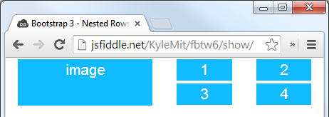
Bootstrap layout with nested rows and columns
I think the small-box class is applied to the wrong element.
In order to apply it to each left hand container, you should move it down a level like:
<div class="col-md-4">
  <div class = "row small-box">
    <h1>box1</h1>
  </div>
  <div class = "row small-box">
    <h1>box2</h1>
  </div>
</div>
To get the height of the left side to match the content box, you can set it in the css:
.small-box {
  background-color: gray;
  border: 1px solid black;
  height: 50%;
}
Here is a forked version of the codepen.
Bootstrap 3 grid system. Nested rows and columns
It seems your HTML code has wrong format for bootstrap row and col.
You should always put "..-col-.." class in the row class not in other "..-col-..".
<head>

<link rel="stylesheet" href="https://maxcdn.bootstrapcdn.com/bootstrap/3.3.7/css/bootstrap.min.css">

</head>

<body>

<div class=row>

<div class="col-xs-12 col-sm-12 col-md-6 col-lg-6">

    <div class="row">

      <div class="col-xs-6 col-sm-6 col-md-6 col-lg-6">

        <label for="image" class="control-label">Imagen de la Unidad</label>

      </div>

    </div>

      <div class="row row-no-padding">

        <div class="col-xs-2 col-sm-2 col-md-2 col-lg-2 form-group">

            <div style="WIDTH:120PX;HEIGHT:120PX;BORDER: 1PX SOLID; background-color:black" class="dropzone admin-dropzone" id="imageDropzone"></div>

        </div>

        <div class="col-xs-6 col-sm-6 col-md-6 col-lg-6 form-group">

            Tamaño recomendado: 135 x 135 px<br>

            Peso recomendado: menor a 100 kb<br>

            Formato recomendado: PNG

        </div>

      </div>

      </div>

</div>

</body>
Nested rows in Bootstrap 3 fail to respect the grid?
1) Pick the proportions
Nested row also uses a 12-columns grid. So you asked Bootstrap to take 5/12 from 10 parent columns. But this is a fractional number. Because of this column boundaries do not coincide with each other.
Pick the proportions between the columns. For example:
4/12from9 parent columnsis exactly3 parent columns3/12from8 parent columnsis exactly2 parent columns
div {

  outline: 1px solid gray;

}
<link href="https://maxcdn.bootstrapcdn.com/bootstrap/3.3.7/css/bootstrap.min.css" rel="stylesheet"/>
<div class="container">
<div class="row">
<div class="col-xs-1">col</div><div class="col-xs-1">col</div><div class="col-xs-1">col</div><div class="col-xs-1">col</div><div class="col-xs-1">col</div><div class="col-xs-1">col</div><div class="col-xs-1">col</div><div class="col-xs-1">col</div><div class="col-xs-1">col</div><div class="col-xs-1">col</div><div class="col-xs-1">col</div><div class="col-xs-1">col</div>
</div>
<div class="row">
<div class="col-xs-1">col</div>
<div class="col-xs-1">col</div>
<div class="col-xs-1">col</div>
<div class="col-xs-8">
<div class="row">
<div class="col-xs-3">nested 4</div>
<div class="col-xs-9">nested 8</div>
</div>
</div>
<div class="col-xs-1">col</div>
</div>
<div class="row">
<div class="col-xs-1">col</div>
<div class="col-xs-1">col</div>
<div class="col-xs-9">
<div class="row">
<div class="col-xs-4">nested 3</div>
<div class="col-xs-8">nested 9</div>
</div>
</div>
<div class="col-xs-1">col</div>
</div>
</div>Bootstrap4 grid system, nesting rows
You can use nested grid system as in the example
.b{

  border: 1px black solid;

  height: 50px;

  margin: 5px;

 }

.a{

  border: 1px black solid;

  height: 170px;

  padding:5px;

  margin:5px;

 }
<link href="https://stackpath.bootstrapcdn.com/bootstrap/4.1.1/css/bootstrap.min.css" rel="stylesheet" integrity="sha384-WskhaSGFgHYWDcbwN70/dfYBj47jz9qbsMId/iRN3ewGhXQFZCSftd1LZCfmhktB" crossorigin="anonymous">
<div class="row">
<div class="col-md-4 col-sm-4">
<div class="a"></div>
</div>
<div class="col-md-8 col-sm-8">
<div class="row">
<div class="col-md-12 col-sm-12">
<div class="b"></div>
</div>
<div class="col-md-4 col-sm-4">
<div class="b"></div>
</div>
<div class="col-md-4 col-sm-4">
<div class="b"></div>
</div>
<div class="col-md-4 col-sm-4">
<div class="b"></div>
</div>
<div class="col-md-4 col-sm-4">
<div class="b"></div>
</div>
<div class="col-md-4 col-sm-4">
<div class="b"></div>
</div>
<div class="col-md-4 col-sm-4">
<div class="b"></div>
</div>
</div>
</div>
</div>Bootstrap Nested Grid Systems Best Practices
Your code for the nesting is exactly what Bootstrap recommends: http://getbootstrap.com/css/#grid-nesting
and
https://getbootstrap.com/docs/4.4/layout/grid/#nesting (for Bootstrap 4)
Unless you have a specific need for the show-grid and bs-docs-grid classes, there's no need to include them. They aren't part of the base bootstrap CSS.
If you can achieve the layout you need using nested grids, I would certainly use them. They will save you time and reduce potential browser compatibility issues.
Good luck!
How to setup breakpoints on nested rows Bootstrap
The simplest way (no extra CSS or duplicate markup) to get this layout would be to disable flexbox for the larger screen width and use the float utils:
https://www.codeply.com/go/snVOquHz1k
<div class="container">
    <div class="row d-md-block">
        <div class="col-6 col-md-8 float-left border border-danger c1">
        c1
        </div>
        <div class="col-6 col-md-4 float-left border border-success">
        c2
        </div>
        <div class="col-12 col-md-4 float-left  border border-warning">
        c3
        </div>
    </div>
</div>
Similar questions have been answered before:
Rearranging responsive Bootstrap 4 grid layout
Bootstrap with different order on mobile version
One tall div next to two shorter divs on Desktop and stacked on Mobile with Bootstrap 4
Bootstrap 4 - Stack 2 columns with 1 large column on the right
Vertically align nested rows using Bootstrap 4
Having the align-items-* classes for the rows will only affect their content, but not their own position. To achieve the desired effect, the parent of the two rows (the .col-sm-8 element) needs to have three classes:
d-flex: make the column itself a flexbox (by default, only rows havedisplay: flexboxin Bootstrap 4)flex-column: show children from top to bottom instead of left to rightjustify-content-between: make the children have space in between- This might seem wrong, as normally
justify-content-betweenis applied to the X / main axis, but as we have already applied theflex-columnclass, the effect of this class will be inversed as well, affecting the Y axis instead
- This might seem wrong, as normally
Inserting these three classes to the column and removing the unnecessary ones from the rows will achieve your desired layout.
Your updated snippet:
<link rel="stylesheet" href="https://maxcdn.bootstrapcdn.com/bootstrap/4.0.0-alpha.6/css/bootstrap.min.css" integrity="sha384-rwoIResjU2yc3z8GV/NPeZWAv56rSmLldC3R/AZzGRnGxQQKnKkoFVhFQhNUwEyJ" crossorigin="anonymous">

<div class="container-fluid">

  <div class="row justify-content-around align-items-stretch">

    <div class="col-sm-2">

      <!-- Left side col -->

      <p>Content goes here</p>

      <p>Content goes here</p>

      <p>Content goes here</p>

      <p>Content goes here</p>

      <p>Content goes here</p>

      <p>Content goes here</p>

      <p>Content goes here</p>

    </div>

    <div class="col-sm-8 d-flex flex-column justify-content-between">

      <!-- Right side col -->

      <div class="row" style="background-color:gray;">

        <!-- Upper right row -->

        <div class="col">

          <p>Right col, upper left</p>

        </div>

        <div class="col">

          <p>Right col, upper right</p>

        </div>

      </div>

      <div class="row" style="background-color:orange;">

        <!-- Lower right row -->

        <div class="col">

          <p>Right col, lower left</p>

        </div>

        <div class="col">

          <p>Right col, lower middle</p>

        </div>

        <div class="col">

          <p>Right col, lower right</p>

        </div>

      </div>

    </div>

  </div>

</div>
Multiple rows inside a row with Bootstrap 4
Bootstrap has a smart (but delicate) gutters system providing "natural" (margins + paddings) for content on all devices 1.
This system is based on two simple assumptions:
- columns are immediate children of
.rows 2 - content is placed inside columns
That's why, if you want to place a .row inside another .row (to further divide one of your cols), you'd have to use this markup:
<div class="row">
  <div class="col-12">
     <div class="row">
        <div class="col-md-4 offset-md-2">
           Grid perhaps
        </div>
        <div class="col-md-4">
           More grid
        </div>
     </div>
  </div>
</div>
The above doesn't make much sense by itself (you could just use the markup of the child row and you'd get the same result). But it's useful when you want to offset (or limit) an entire area of a layout, like this:
<div class="row">
  <div class="col-md-8 offset-md-2 col-sm-10 offset-sm-1 col offset-0">
     <div class="row">
        <div class="col-md-6">Grid</div>
        <div class="col-md-6">More grid</div>
        <div class="col-md-6">Grid</div>
        <div class="col-md-6">More grid</div>
        <div class="col-md-6">Grid</div>
        <div class="col-md-6">More grid</div>
        <div class="col-md-6">Grid</div>
        <div class="col-md-6">More grid</div>
        <div class="col-md-6">Grid</div>
        <div class="col-md-6">More grid</div>
     </div>
  </div>
</div>
See this fiddle for a live example.
1 To get rid of Bootstrap's gutters (in v4), one would need to apply no-gutters class on .row.
2 This is a "general principle", not a "strict rule". Other elements are allowed (and even recommended) as direct children of .rows (such as column breaks). At the other end, other elements extend from .rows (such as .form-rows), thus inheriting the gutters system and being valid column parents.
Related Topics
How to Combine and Use Multiple Next.Js Plugins
Google Webfont Conflict with Local Font
Border-Image: Workaround for Ie
How to Style a Javafx Menu and Its Items in CSS
Flexbox Max-Height Issue with Ie11
How to Center Twitter-Bootstrap 3 Navbar Links
CSS Fixed Position with Auto Margin
Size of Zero Pixels in CSS with or Without 'Px' Suffix
Ordering in Vendor Based CSS3 VS Standard CSS3 Syntax
Increase Size of List-Style-Bullet Type
Text Blurry After 3D Transform
CSS Expanding Based on Portrait or Landscape Screen Size
Is There a CSS "Haschildren" Selector
@Font-Face Won't Load via Https in Ie
Css: Disable Font Ligatures in All Browsers
Prevent Children from Inheriting Rotate Transformation in CSS