CSS Skew only container, not content
Need to tweak the positioning and the size of the container so you can crop it, and apply the backface-visibility rule:
.skew {
    -webkit-backface-visibility : hidden; /* the magic ingredient */
    -webkit-transform           : skew(16deg, 0);
    overflow                    : hidden;
    width                       : 300px;
    height                      : 260px;
    position                    : relative;
    left                        : 50px;
    border                      : 1px solid #666
}

.skew img {
    -webkit-transform : skew(-16deg, 0);
    position          : relative;
    left              : -40px;
}
http://codepen.io/anon/pen/HLtlG <- before (aliased)
http://codepen.io/anon/pen/wnlpt <- after (anti-aliased)
Add transform: skew to container only, not text within
As I see you tried to reset the skewing for the text by adding skew(20deg) to that span.
But transform does not apply to inline elements as span is.
Solution
span {
    display:inline-block; /*important line*/
    -webkit-transform: skew(20deg);
       -moz-transform: skew(20deg);
         -o-transform: skew(20deg);
}
See Fiddle
Skew a Partial Div but not its content.
I see this question (about slanted edges) and line of thinking (to use skew) come up frequently. Skew is super cool, and useful for some effects, but IMO this isn't one of those times.
I'd recommend adding an :after pseudo element and creating a CSS triangle to create the effect you want. This will eliminate the need to undo the skew for the content.
To keep the image and content elements at equal width I've used a width of calc(50% +/- Xpx) but this is just nitpicky stuff. If you don't mind one side being a little larger/smaller you can set the width of both to a fixed 50%.
body {

  margin: 0;

  padding: 0;

  font-family: Arial;

}

* {

  box-sizing: border-box;

}

.container {

  max-width: 1160px;

  margin: 0 auto;

  background-color: green;

  height: 450px;

}

.partial-section {

  width: calc(50% - 25px);

  background-color: red;

  height: inherit;

  display: inline;

  float: left;

}

.partial-section h1 {

  font-size: 30px;

}

.partial-section p {

  font-size: 20px;

}

.partial--padded {

  padding: 20px;

}

.section-inner {

  height: inherit;

}

.image {

  background: url(http://placekitten.com/601/301);

  background-size: cover;

  top: 0;

  background-repeat: no-repeat;

  height: inherit;

  width: 100%;

}

.slanted {

  position: relative;

  width: calc(50% + 25px);

  background-color: red;

  height: inherit;

  display: inline;

  float: left;

}

.slanted:after {

  content: "";

  display: block;

  position: absolute;

  top: 0px;

  right: 0;

  width: 0;

 border-bottom: 450px solid red;

 border-left: 50px solid transparent;

}
<div class="container">
<div class="slanted">
<div class="image"></div>
</div>
<div class="partial-section partial--padded">
<h1> This is some heading on the right partial section.</h1>
<p>Some random text that should be appeared on the right side of the partial section. This should be below the heading the partial section has and should fill the empty space that it has.</p>
</div>
</div>How to skew element but keep text normal (unskewed)
skew a parent element (li in this example) and inverse skew its child elements:
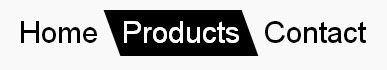
nav ul {
  padding: 0;
  display: flex;
  list-style: none;
}
nav li {
  transition: background 0.3s, color 0.3s;
  transform: skew(20deg); /* SKEW */
}

nav li a {
  display: block; /* block or inline-block is needed */
  text-decoration: none;
  padding: 5px 10px;
  font: 30px/1 sans-serif;
  transform: skew(-20deg); /* UNSKEW */
  color: inherit;
}

nav li.active,
nav li:hover {
  background: #000;
  color: #fff;
}
<nav>
<ul>
<li><a href="#">Home</a></li>
<li class="active"><a href="#">Products</a></li>
<li><a href="#">Contact</a></li>
</ul>
</nav>How to flatten the bottom of a skewed container?
I would use the ::before psuedo element. I couldn't figure out how to get the ::before element to go under the main one, so you lose a little space, but it's not too bad.
Using ::before horribly failed. Plus, there is some oddities with using transform which can be seen if you just put a background color on the element and use a sufficiently wide screen.
So, rather than fight with that, I would just use an SVG to give you that slant you want. There was an odd space between the svg and div, so I used positioning to get around that.
You can play with the values to get the slant how you like, but be advised that it will vary based on the screen width.
#footer {

  position:relative;

  overflow:hidden;

}

svg {

  width: 100%;

  fill: green;

  max-height: 50px;

  position:absolute;

  top:0;

}

#footerContent {

  margin-top:49px;

  height: 100px;

  background: orange;

}
<div id="footer">
<svg viewBox="0 0 100 20" preserveAspectRatio="none">
<polygon points="0,20 100,20 100,0" />
</svg>
<div id="footerContent"></div>
</div>CSS skewed rectangle goes outside container
Thanks to @neallred I've found a solution using trigonometry rules.
The red box should set its width to its 100% minus its height multiplicated by the tangent of the degrees used in the skew transformation. So:
width: 100% - height * tan(35).
In my snippet I wanted to use fewer literals as possible so I forced the red box's text to stay in a single line and in this way I obtained the exact height of the box as 1em + vertical_padding and rewriting the above formula as 100% - (1em + vertical_padding) * 0.700208, forcing the line-height: 1em before.
.container {

  padding: 20px;

  outline: 1px solid black;

  display: inline-block;

}

.red-box {

  background-color: red;

  color: white;

  padding: 10px;

  margin-bottom: 10px;

  transform: skew(-35deg);

  transform-origin: bottom left;


  box-sizing: border-box;

  width: calc(100% - (1em + 20px) * 0.700208);

}

.red-box > div {

  padding: 0 10px;

  transform: skew(35deg);


  white-space: nowrap;

  text-overflow: ellipses;

  overflow: hidden;

  line-height: 1em;

}
<div class="container">
<div class="red-box">
<div>PARKS AND GARDENS IN LONDON</div>
</div>
<img src="https://www.vivilondra.it/images/vivilondra/images2/regents-park-top.jpg" />
</div>CSS: Is there a way to use the transform skew property on a specific div without affecting child elements?
You can negate the skewing on the child element
#skew-left p {
    transform: skewX(-45deg);
}
Reposition them afterwards as necessary.
Skew div with pure CSS and allow image to fill skewed area
You could basicly, skew links and then unskew img.
overflow:hidden will need to be used to cover the whole screen/link.
example
body {margin:0;}

div {

  overflow:hidden;

}

nav {

  display:flex;

  height:100vh;

  margin:0 -10vw

}

nav a {

  flex:1;

  height:100%;

  transform:skew(-15deg);

  overflow:hidden;

}

nav a + a {

  margin-left:3vh;

}

nav a img {

  width:140%;

  height:100%;

  display:block;

  /* optionnal */

  /*object-fit: cover;

  object-position:center center;*/

  transform:skew(15deg);

  margin:0 -20%; /* in relation with width */

}
<div>
<nav>
<a href=""><img src="http://www.intrawallpaper.com/static/images/desktop-backgrounds-8656-8993-hd-wallpapers_js7gwWA.jpg"></a>
<a href=""><img src="https://images.wallpaperscraft.com/image/pool_skyscraper_hotel_124522_1600x1200.jpg"></a>
<a href=""><img src="https://wallpaperscraft.com/image/dark_background_colorful_paint_47176_300x188.jpg"></a>
</nav>
</div>How to Slant/Skew only the bottom of the div
Give your <img> the opposite skew of your div by adding transform : skewY(2deg);. This will only skew the bottom of your image.
CSS
img {
  -webkit-transform: skewY(2deg);
  -moz-transform: skewY(2deg);
  -ms-transform: skewY(2deg);
  -o-transform: skewY(2deg);
  transform: skewY(2deg);
}
Result
JSFiddle
Related Topics
CSS How to Print a Table with Background Color (Without Print Settings Changes)
Use a Space or Greater Than Sign > in CSS Selector
Bootstrap 3 Changing Div Order on Small Screens Only
Webkit Text Aliasing Gets Weird During CSS3 Animations
Use Initial Width for Element Not Working in Ie
Remove Borders Around HTML Input
Use Transition on ::-Webkit-Scrollbar
CSS Flexbox Vertically/Horizontally Center Image Without Explicitely Defining Parent Height
How to Create Zebra Stripes on HTML Table Without Using JavaScript and Even/Odd Classes Generation
How to Colorize a White Png Image with CSS Only
CSS 62.5% Why Do Developers Use It
Multiple Classes in CSS Selector
CSS Negative Z-Index: What Does It Mean
CSS Fixed Position with Auto Margin
How to Make CSS Animation to Play Every 10 Seconds
Background:None VS Background:Transparent What Is the Difference