Twitter Bootstrap - borders
If you look at Twitter's own container-app.html demo on GitHub, you'll get some ideas on using borders with their grid.
For example, here's the extracted part of the building blocks to their 940-pixel wide 16-column grid system:
.row {
    zoom: 1;
    margin-left: -20px;
}

.row > [class*="span"] {
    display: inline;
    float: left;
    margin-left: 20px;
}

.span4 {
    width: 220px;
}
To allow for borders on specific elements, they added embedded CSS to the page that reduces matching classes by enough amount to account for the border(s).
For example, to allow for the left border on the sidebar, they added this CSS in the <head> after the the main <link href="../bootstrap.css" rel="stylesheet">.
.content .span4 {
    margin-left: 0;
    padding-left: 19px;
    border-left: 1px solid #eee;
}
You'll see they've reduced padding-left by 1px to allow for the addition of the new left border. Since this rule appears later in the source order, it overrides any previous or external declarations.
I'd argue this isn't exactly the most robust or elegant approach, but it illustrates the most basic example.
Twitter Bootstrap's Element Border Color
Go to http://getbootstrap.com/customize/, look for @input-border-focus, enter your desired color code, scroll down and click "Compile and Download".
twitter bootstrap border title
Based on your html, this is the outcome in chrome:
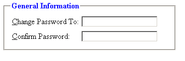
You could simply control the border on the fieldset:
fieldset{
   border:1px solid #cccc;
}
Please note though, the positioning of the legend "General Information" is a computed style but it could be overridden.
"Fieldsets and Legends"
How to adjust the border according to the input group?
I have used outline property for all inputs and button and it worked.
outline: 6px solid rgba(0,0,0,0.5);
now check, alpha.dubaiexporters.com
Twitter BootStrap - Border Pushing Contents Down
This has already been answered (couldn't find the question though)
You have to set borders to an inside element, not the spans themselves, because they are too tightly width'ed.
Another solution is to change the box-sizing to border-box. But this is css v3.
Update
Here are several examples, my best guess is the 3rd or 2nd solution.
Demo (jsfiddle)
Full screen demo (jsfiddle)
Demo responsive (jsfiddle)
Solution 1 : inners
As such, will not respond well to responsive (needs @media rules to set the border depending on stacking)
<div class="row">
    <div class="span3">
        <div class="inner"></div>
    </div>
    <div class="span6">
        <div class="inner"></div>
    </div>
    <div class="span3">
        <div class="inner"></div>
    </div>
</div>
.row > [class*="span"]:first-child > .inner {
    border-left: 5px solid red;
}
.row > [class*="span"]:last-child > .inner {
    border-right: 5px solid red;
}
Solution 2 : fluid
As such, will respond well to responsive
<div class="row-fluid">
    <div class="inner-fluid clearfix">
        <div class="span3"></div>
        <div class="span6"></div>
        <div class="span3"></div>
    </div>
</div>
.row-fluid > .inner-fluid {
    border: 5px none green;
    border-left-style: solid;
    border-right-style: solid;
}
Solution 3 : box-sizing
As such, will not respond well to responsive (needs @media rules to set the border depending on stacking)
<div class="row foo">
        <div class="span3"></div>
        <div class="span6"></div>
        <div class="span3"></div>
</div>
.foo [class*="span"] {
  -webkit-box-sizing: border-box;
     -moz-box-sizing: border-box;
      -ms-box-sizing: border-box;
          box-sizing: border-box;
}

.foo.row > [class*="span"]:first-child {
    border-left: 5px solid orange;
}
.foo.row > [class*="span"]:last-child {
    border-right: 5px solid orange;
}
I hope you'll find your size.
Twitter Bootstrap Navbar with Transition Border - Background Color is not over the whole active Item
I commented line in your snippet:
nav.navbar ul.navbar-nav a {
    text-decoration: none;
    position: relative;
    /* display: inline-block; */
}
With that line, you overrode this bootstrap rule:
.nav > li > a {
    position: relative;
    display: block;
    padding: 10px 15px;
}
You have ran in problem of CSS specificity.
Here is corrected snippet:
/* Navbar */

.navbar-fixed-top{

    top: 80px;

}

.navbar-default{ /* assigning the top bar to the entire navbar div element */

    background-color: #4F4F4F;

}

nav.navbar {

    box-shadow: 0 0 2px 0 #ccc;

}

nav.navbar a {

    color: #FF7D36;

}

nav.navbar ul.navbar-nav a {

    color: #FF7D36;

    border-style: solid;

    border-width: 0 0 2px 0;

    border-color: #000;

}

nav.navbar ul.navbar-nav a:hover,

nav.navbar ul.navbar-nav a:visited,

nav.navbar ul.navbar-nav a:focus,

nav.navbar ul.navbar-nav a:active {

    background: #000;

}

nav.navbar ul.navbar-nav a {

    text-decoration: none;

    position: relative;

    /* display: inline-block; */

}

nav.navbar ul.navbar-nav a::after {

    content: '';

    width: 80%;

    position: absolute;

    top: 100%;

    left: 10%;

    height: 2px;

    background-color: #FF7D36;

    transform: scaleX(0);

    transition: transform .35s ease;

}

nav.navbar ul.navbar-nav a:hover::after {

    transform: scaleX(1);

}
<!DOCTYPE html>
<html>
<head>
<meta charset="utf-8">
<meta http-equiv="X-UA-Compatible" content="IE=edge">
<meta name="viewport" content="width=device-width, initial-scale=1">
<title>Basic Bootstrap Template</title>
<link rel="stylesheet" href="https://maxcdn.bootstrapcdn.com/bootstrap/3.3.7/css/bootstrap.min.css" integrity="sha384-BVYiiSIFeK1dGmJRAkycuHAHRg32OmUcww7on3RYdg4Va+PmSTsz/K68vbdEjh4u" crossorigin="anonymous">
<!-- Optional Bootstrap theme -->
<link rel="stylesheet" href="https://maxcdn.bootstrapcdn.com/bootstrap/3.3.7/css/bootstrap-theme.min.css" integrity="sha384-rHyoN1iRsVXV4nD0JutlnGaslCJuC7uwjduW9SVrLvRYooPp2bWYgmgJQIXwl/Sp" crossorigin="anonymous">
</head>
<body>
<nav class="navbar navbar-inverse navbar-fixed-top">
<div class="container">
<div class="navbar-header">
<button type="button" class="navbar-toggle collapsed" data-toggle="collapse" data-target="#navbar" aria-expanded="false" aria-controls="navbar">
<span class="sr-only">Navigation ein-/ausblenden</span>
<span class="icon-bar"></span>
<span class="icon-bar"></span>
<span class="icon-bar"></span>
</button>
<a class="navbar-brand" href="#">Projekt-Titel</a>
</div>
<div id="navbar" class="collapse navbar-collapse">
<ul class="nav navbar-nav">
<li class="active"><a href="#">Start</a></li>
<li><a href="#ueber">Über</a></li>
<li><a href="#kontakt">Kontakt</a></li>
</ul>
</div><!--/.nav-collapse -->
</div>
</nav>
<script src="https://ajax.googleapis.com/ajax/libs/jquery/1.12.4/jquery.min.js"></script>
<script src="https://maxcdn.bootstrapcdn.com/bootstrap/3.3.7/js/bootstrap.min.js" integrity="sha384-Tc5IQib027qvyjSMfHjOMaLkfuWVxZxUPnCJA7l2mCWNIpG9mGCD8wGNIcPD7Txa" crossorigin="anonymous"></script>
</body>
</html> Bootstrap 4 border utilities
No, there are no classes in Bootstrap 4 for border width or style.
You can simply add something like:
.border-3 {
    border-width:3px !important;
}
https://codeply.com/go/ktnEeWExvh
NOTE: !important is needed in this case because Bootstrap also uses !important in many of the utility classes like border-*.
Multiple borders using CSS
Here is a way to do it with lines:
.box {
  display: inline-block;
  position: relative;
  padding: 1rem 5rem;
  border: 2px solid gray;
  margin: 2rem 5rem;
  color: gray;
  font-family: Sans-serif;
  font-weight: bold;
  cursor: pointer;
}
.box > span {
  content: '';
  position: absolute;
  height: 25%;
  left: 0;
  top: 0;
  width: 100%;
}
.box > span:nth-child(2) {
  top: 50%;
}
.box > span:nth-child(3) {
  top: 100%;
}
.box > span:nth-child(3):after {
  display: none;
}
.box > span:before, .box > span:after {
  content: '';
  position: absolute;
  width: 2rem;
  height: 2px;
  background: gray;
  border-radius: 2px;
  right: 100%;
  top: -1px;
  transform: rotate(45deg);
  transform-origin: 100% 0%;
  transition: transform 200ms ease-in-out;
}
.box > span:after {
  top: 100%;
}
.box:hover > span:before, .box:hover > span:after {
  transform: rotate(0deg);
}
<div class="box">
Solid
<span></span>
<span></span>
<span></span>
</div>Related Topics
Two Divs Split with Diagonal Line - CSS
Css: Disable Font Ligatures in All Browsers
How to Change CSS Class for the Inputfield and Label When Validation Fails
Vertically Center Image on Page and Maintain Aspect Ratio on Resize
In CSS Grid Why Is 1Fr+9Fr Not Behaving the Same as 10Fr in Small Screen Sizes
Scale HTML5 Video and Break Aspect Ratio to Fill Whole Site
Responsive Design with Media Query:Screen Size
Using CSS to Transition the Fill Property of an Svg Path on Hover
Css3 Columns - Force Non Breaking/Splitting Element
Rails: How to Set a Background Image in Rails from CSS
Remove Borders Around HTML Input
Can't Change CSS Style in Angularjs
How to Apply CSS on All Buttons Which Are Present in That Page
How to Animate Flexbox Inserts & Removes