CSS Flexbox: difference between align-items and align-content
As described in 6. Flex Lines,
Flex items in a flex container are laid out and aligned
within flex lines, hypothetical containers used for grouping and
alignment by the layout algorithm. A flex container can be either
single-line or multi-line, depending on the flex-wrap
property
Then, you can set different alignments:
The
justify-contentproperty applies to all flex containers, and sets the alignment of the flex items along the main axis of each flex line.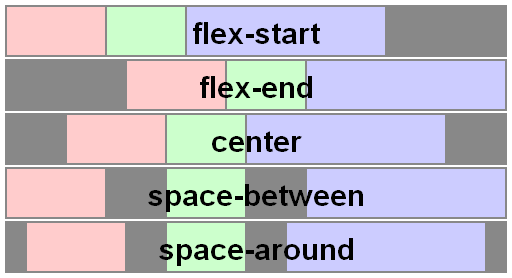
The
align-itemsproperty applies to all flex containers, and sets the default alignment of the flex items along the cross axis of each flex line. Thealign-selfapplies to all flex items, allows this default alignment to be overridden for individual flex items.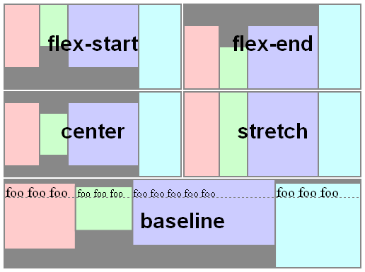
The
align-contentproperty only applies to multi-line flex containers, and aligns the flex lines within the flex container when there is extra space in the cross-axis.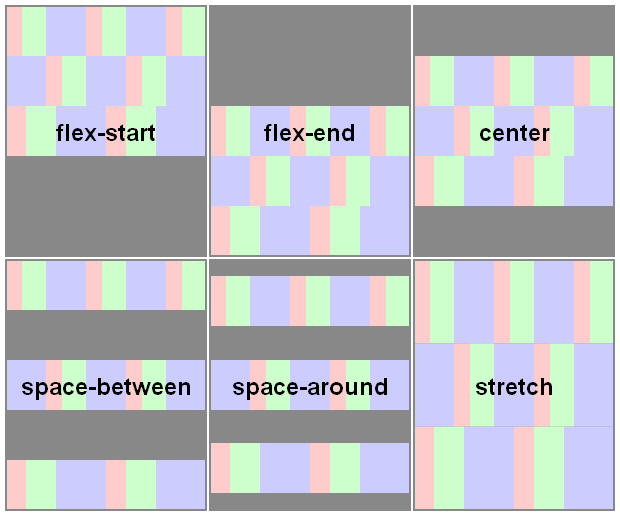
Here you have a snippet to play:
var form = document.forms[0], flex = document.getElementById('flex');form.addEventListener('change', function() { flex.style.flexDirection = form.elements.fd.value; flex.style.justifyContent = form.elements.jc.value; flex.style.alignItems = form.elements.ai.value; flex.style.alignContent = form.elements.ac.value;});ul { display: flex; flex-flow: row wrap; padding: 0; list-style: none;}li { padding: 0 15px;}label { display: block;}#flex { display: flex; flex-wrap: wrap; height: 240px; width: 240px; border: 1px solid #000; background: yellow;}#flex > div { min-width: 60px; min-height: 60px; border: 1px solid #000; background: blue; display: flex; justify-content: center; align-items: center; color: #fff;}#flex > .big { font-size: 1.5em; min-width: 70px; min-height: 70px;}<form> <ul> <li>flex-direction <label><input type="radio" name="fd" value="row" checked /> row</label> <label><input type="radio" name="fd" value="row-reverse" /> row-reverse</label> <label><input type="radio" name="fd" value="column" /> column</label> <label><input type="radio" name="fd" value="column-reverse" /> column-reverse</label> </li> <li>justify-content <label><input type="radio" name="jc" value="flex-start" checked /> flex-start</label> <label><input type="radio" name="jc" value="flex-end" /> flex-end</label> <label><input type="radio" name="jc" value="center" /> center</label> <label><input type="radio" name="jc" value="space-between" /> space-between</label> <label><input type="radio" name="jc" value="space-around" /> space-around</label> </li> <li>align-items <label><input type="radio" name="ai" value="flex-start" /> flex-start</label> <label><input type="radio" name="ai" value="flex-end" /> flex-end</label> <label><input type="radio" name="ai" value="center" /> center</label> <label><input type="radio" name="ai" value="baseline" /> baseline</label> <label><input type="radio" name="ai" value="stretch" checked /> stretch</label> </li> <li>align-content <label><input type="radio" name="ac" value="flex-start" /> flex-start</label> <label><input type="radio" name="ac" value="flex-end" /> flex-end</label> <label><input type="radio" name="ac" value="center" /> center</label> <label><input type="radio" name="ac" value="space-between" /> space-between</label> <label><input type="radio" name="ac" value="space-around" /> space-around</label> <label><input type="radio" name="ac" value="stretch" checked /> stretch</label> </li> </ul></form><div id="flex"> <div>1</div> <div class="big">2</div> <div>3</div> <div>4</div> <div class="big">5</div> <div>6</div></div>What is the difference between align-items vs. align-content in Grid Layout?
Let's start with clarifying the terminology:
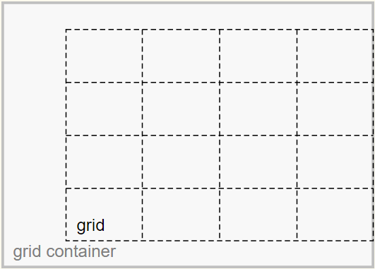
Grid Container
The grid container is the overall container for the grid and grid items. It establishes the grid formatting context (as opposed to another formatting context, such as flex or block).
Grid
The grid is a group of intersecting vertical and horizontal lines that divides the grid container’s space into grid areas, which are boxes that contain grid items.
Grid Items
Grid items are boxes in a grid container that represent in-flow content (i.e., content that is not absolutely positioned).
Here's an illustration from the W3C:
The justify-content and align-content properties align the grid.
The justify-self, justify-items, align-self and align-items properties align the grid items.
With regard to the problem described in your question:
My confusion revolves around the claim made by the author that the "
-content" set are there because: "Sometimes the total size of your grid might be less than the size of its grid container"
Well, you can see in the illustration that the grid is smaller than the grid container.
As a result, there is space remaining and the container is able to distribute this space to vertically center (align-content: center) and right-align (justify-content: end) the grid.
The extra space could also allow the grid to be spaced apart with values such as space-around, space-between and space-evenly.
However, if the grid size equaled the container size, then there would be no free space, and align-content / justify-content would have no effect.
Here's more from the spec:
10.3. Row-axis Alignment: the
justify-selfandjustify-items
propertiesGrid items can be aligned in the inline dimension by using the
justify-selfproperty on the grid item orjustify-itemsproperty
on the grid container.10.4. Column-axis Alignment: the
align-selfandalign-items
propertiesGrid items can also be aligned in the block dimension (perpendicular
to the inline dimension) by using thealign-selfproperty on the
grid item oralign-itemsproperty on the grid container.10.5. Aligning the Grid: the
justify-contentandalign-content
propertiesIf the grid’s outer edges do not correspond to the grid container’s
content edges (for example, if no columns are flex-sized), the grid
tracks are aligned within the content box according to the
justify-contentandalign-contentproperties on the grid
container.(emphasis added)
Align-content center not working, but align-self center working
No need to apply the property to the header , Just include align-items: center; instead of align-content:center to the CSS and it will work perfectly.
Related Topics
How to Remove Space (Margin) Above HTML Header
Force Sidebar Height 100% Using CSS (With a Sticky Bottom Image)
Detect Different Device Platforms Using CSS
Chrome:How to Turn Off User Agent Stylesheet Settings
How to Make an Inset Drop Shadow in Svg
Change Parent Div on Input[Type=Checkbox]:Checked with CSS
How Should You Prefix Transform Properties in CSS3 Animations
How to Get a React Component's Size (Height/Width) Before Render
Align Two Inline-Blocks Left and Right on Same Line
How to Add a Margin to a Table Row <Tr>
CSS Transition Between Left -> Right and Top -> Bottom Positions
CSS Focus Not Working in Safari and Chrome
Using Modulus in CSS Calc Function