Android Material Design Button Styles
You can use the
Material Component library.
Add the dependency to your build.gradle:
dependencies { implementation ‘com.google.android.material:material:1.3.0’ }
Then add the MaterialButton to your layout:
<com.google.android.material.button.MaterialButton
        style="@style/Widget.MaterialComponents.Button.OutlinedButton"
        android:layout_width="wrap_content"
        android:layout_height="wrap_content"
        android:text="@string/app_name"
        app:strokeColor="@color/colorAccent"
        app:strokeWidth="6dp"
        app:layout_constraintStart_toStartOf="parent"
        app:shapeAppearance="@style/MyShapeAppearance"
   />
You can check the full documentation here and API here.
To change the background color you have 2 options.
- Using the
backgroundTintattribute.
Something like:
<style name="MyButtonStyle"
 parent="Widget.MaterialComponents.Button">
    <item name="backgroundTint">@color/button_selector</item>
    //..
</style>
- It will be the best option in my opinion. If you want to override some theme attributes from a default style then you can use new
materialThemeOverlayattribute.
Something like:
<style name="MyButtonStyle"
 parent="Widget.MaterialComponents.Button">
   <item name=“materialThemeOverlay”>@style/GreenButtonThemeOverlay</item>
</style>

<style name="GreenButtonThemeOverlay">
  <!-- For filled buttons, your theme's colorPrimary provides the default background color of the component -->
  <item name="colorPrimary">@color/green</item>
</style>
The option#2 requires at least the version 1.1.0.
You can use one of these styles:
- Filled Button (default):
style="@style/Widget.MaterialComponents.Button - Text Button:
style="@style/Widget.MaterialComponents.Button.TextButton" - OutlinedButton:
style="@style/Widget.MaterialComponents.Button.OutlinedButton"
OLD Support Library:
With the new Support Library 28.0.0, the Design Library now contains the MaterialButton.
You can add this button to our layout file with:
<android.support.design.button.MaterialButton
    android:layout_width="wrap_content"
    android:layout_height="wrap_content"
    android:text="YOUR TEXT"
    android:textSize="18sp"
    app:icon="@drawable/ic_android_white_24dp" />
By default this class will use the accent colour of your theme for the buttons filled background colour along with white for the buttons text colour.
You can customize the button with these attributes:
app:rippleColor: The colour to be used for the button ripple effectapp:backgroundTint: Used to apply a tint to the background of the button. If you wish to change the background color of the button, use this attribute instead of background.app:strokeColor: The color to be used for the button strokeapp:strokeWidth: The width to be used for the button strokeapp:cornerRadius: Used to define the radius used for the corners of the button
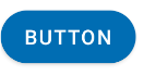
Material design button with border
You can also use the Material Components for Android.
Add the dependency to your build.gradle:
dependencies { implementation 'com.google.android.material:material:1.3.0' }
In this case you can use the MaterialButton in your layout file:
<com.google.android.material.button.MaterialButton
   ....
   style="@style/Widget.MaterialComponents.Button.OutlinedButton"
   app:cornerRadius=".."
   app:strokeColor="@color/colorPrimary"/>
Apply the style @style/Widget.MaterialComponents.Button.OutlinedButton.
In your case use the app:cornerRadius attribute to change the size of corner radius. This will round off the corners with specified dimensions.
Use te attribute app:strokeColor and app:strokeWidth to change the color and the width of the border.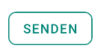
You can also customize the corners using ShapeApperance (it requires version 1.1.0)
<style name="MyButton" parent="Widget.MaterialComponents.Button.OutlinedButton">
    <item name="shapeAppearanceOverlay">@style/MyShapeAppearance</item>
</style>
<style name="MyShapeAppearance" parent="">
    <item name="cornerFamilyTopLeft">rounded</item>
    <item name="cornerFamilyBottomLeft">rounded</item>
    <item name="cornerFamilyTopRight">cut</item>
    <item name="cornerFamilyBottomRight">cut</item>
    <item name="cornerSize">8dp</item>
</style>
The official doc is here and all the android specs here.
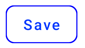
With jetpack compose you can use the OutlinedButton and the border attribute:
    OutlinedButton(
        onClick = { },
        border = BorderStroke(1.dp, Color.Blue),
        shape = RoundedCornerShape(8.dp)
    ) {
        Text(text = "Save")
    }
OLD (support library)
With the new Support Library 28.0.0, the Design Library now contains the Material Button.
You can add this button to our layout file with:
<android.support.design.button.MaterialButton
    android:layout_width="wrap_content"
    android:layout_height="wrap_content"
    android:text="XXXX"
    android:textSize="18sp"
    app:icon="@drawable/ic_android_white_24dp" />
You can customize the button with these attributes:
app:backgroundTint: Used to apply a tint to the background of the button. If you wish to change the background color of the button, use this attribute instead of background.app:strokeColor: The color to be used for the button strokeapp:strokeWidth: The width to be used for the button stroke
Also
com.google.android.material.button.MaterialButton OutlinedButton style in Android
use app:backgroundTint="@color/white" to your MaterialButton
How to make buttons rounded with Material Design Theming?
Just use the app:shapeAppearanceOverlay attribute in the layout.
<com.google.android.material.button.MaterialButton
        app:shapeAppearanceOverlay="@style/buttomShape"
        .../>
with:
  <style name="buttomShape">
    <item name="cornerFamily">rounded</item>
    <item name="cornerSize">50%</item>
  </style>
The only way to apply it to all buttons is to define custom styles for all the button styles as you are just doing. Something like:
  <style name="...." parent="Widget.MaterialComponents.Button">
    <item name="shapeAppearance">@style/buttomShape</item>
  </style>

  <style name="..."  parent="Widget.MaterialComponents.Button.TextButton">
    <item name="shapeAppearance">@style/buttomShape</item>
  </style>
How to Override material design statepressed in for Android Button
You can use just the app:backgroundTint attribute:
     <com.google.android.material.button.MaterialButton
          app:backgroundTint="@color/custom_button_selector"
          ../>
with:
<selector xmlns:android="http://schemas.android.com/apk/res/android">
    <item android:color="@color/red600" android:state_pressed="true"/>
    <item android:color="?attr/colorPrimary" android:state_enabled="true"/>
    <item android:alpha="0.12" android:color="?attr/colorOnSurface"/>
</selector>
Normal state:
Pressed state:
Android Stroke Around Material Button from Style
After looking at the sources I suppose that you should remove 'android:' qualifiers as the new material parameters were not available in the original styles.
See: https://github.com/material-components/material-components-android/blob/master/lib/java/com/google/android/material/button/res/values/styles.xml#L73
Circular Progress Indicator inside Buttons, Android Material design
One of the ways this can be achieved is to create a Layout where you'll have a container and place both the button and the CircularProgressIndicator
    <FrameLayout
        android:layout_width="match_parent"
        android:layout_height="@dimen/some_height"
        android:background="#00000000"
        android:layout_marginRight="@dimen/margin_right"
        android:layout_marginLeft="@dimen/margin_left">

        <Button
            android:id="@+id/btn_download"
            android:layout_width="match_parent"
            android:layout_height="@dimen/some_height"
            android:text="Download"
            android:layout_gravity="center"
            android:visibility="visible"
            android:textColor="#FFFFFF"/>


    <com.google.android.material.progressindicator.CircularProgressIndicator
            android:id="@+id/progress"
            android:layout_width="wrap_content"
            android:layout_height="wrap_content" />

    </FrameLayout>
Then you would just toggle the visibility of the progress bar and remove the text.
Another way is to use custom animation drawable. You would then add this to your button as a drawableStart or drawableEnd with some positioning, or perhaps even as a background.
3rd option would be, as per: https://stackoverflow.com/a/65180647/13187710
BTW, in the xml code above, you can substitute Button with MaterialButton.
Related Topics
Location of SQLite Database on the Device
Error:Execution Failed for Task ':App:Transformclasseswithdexfordebug'
What Does "Program Type Already Present" Mean
Lollipop:Draw Behind Statusbar with Its Color Set to Transparent
Android - Camera Preview Is Sideways
How to Add New Contacts in Android
Set Android Shape Color Programmatically
Force "Portrait" Orientation Mode
Android Get Real Path by Uri.Getpath()
Receiving Package Install and Uninstall Events
Show Image View from File Path