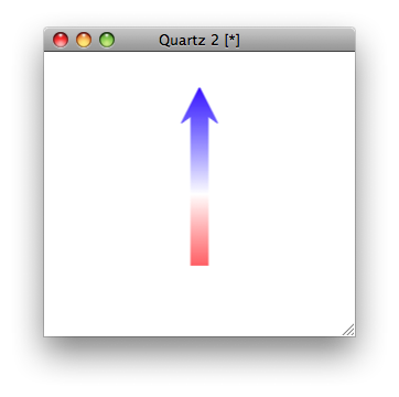
create an arrow with gradient color
Try this,
library(grid)

png("mask.png")
grid.polygon(c(-0.06, 0.06, 0.06, 0.15, 0, -0.15, -0.06),
             c(-5, -5, 2.5, 2, 5, 2, 2.5), gp=gpar(fill="black"),
             def="native",
             vp=viewport(xs=c(-0.15, 0.15), ys=c(-5, 5)))
dev.off()

library(png)
m <- readPNG("mask.png", native=FALSE)
mask <- matrix(rgb(m[,,1],m[,,2],m[,,3]),
               nrow=nrow(m))

rmat <- matrix(rgb(colorRamp(c("blue","white","red"))(seq(0,1,length=nrow(m))), maxColorValue=255),
               nrow=nrow(m), ncol=ncol(m))
rmat[mask == "#FFFFFF"] <- NA
grid.newpage()
grid.raster(rmat)
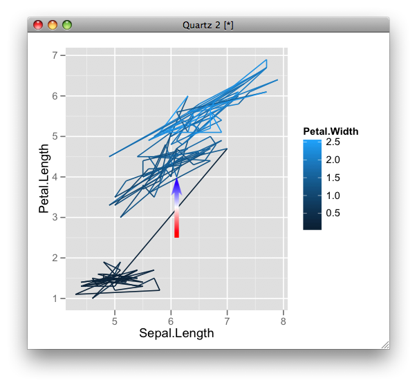
Edit: you can reuse it in a plot, e.g.
library(ggplot2)
ggplot(iris) + geom_path(aes(Sepal.Length, Petal.Length, colour = Petal.Width)) +
  guides(colour = guide_colourbar()) +
  annotation_custom(rasterGrob(rmat, width=unit(1,"npc"), height=unit(1, "npc")),
                    x = 6, xmax=6.2, y=2.5, ymax=4)
Apply gradient colors on multiple arrows generated by geom_segment() or geom_link()
It looks like you need to place your color parameter inside of your aes()
library(ggforce)
library(ggpubr)

arrows <- data.frame(
                stringsAsFactors = FALSE,
                x1 = rep(c(0), 4),
                y1 = rep(c(0), 4),
                x2 = c(0.03547301, 0.10231616, 0.10231616, 0.08409951
                       ),
                y2 = c(-0.122964349, 0.467737581, 0.009871989, 0.005768529)
)

p <- ggplot(data = arrows, aes(x = x1, y = y1, xend = x2, yend = y2, color=abs(x2))) +
  geom_link(arrow = grid::arrow(length = grid::unit(0.2, 'cm')))
p + ggpubr::gradient_color(c("#00AFBB", "#E7B800", "#FC4E07"))

Rounded arrow shape with gradient fill
Caution: This is not quite the way you had in mind to achieve this, but in my opinion this is probably the simplest way to achieve it without resorting to SVG or images or complex angle calculations in gradients. Rotating pseudo-elements etc will cause the other side to mismatch because you have a curved side on the right.
The shape is achieved by using two pseudo-elements which are about half the size of the parent (.rect), skewing them in opposite directions and then positioning them exactly one below the other. The other skewed side (left hand side) is hidden from view by positioning it inside the parent rectangle using the left property of the pseudo-elements.
The required gradient is assigned to both the parent and the pseudo-elements. For the parent the full gradient is applied as required whereas for the pseudo-elements it is split exactly in half between the the :before and :after elements to make it look as a gradual progression.
Since the :before and :after pseudo-elements are effectively children of the main element, a hover on them effectively means an hover on the parent also.
The span contains the text and is positioned with a higher z-index for it to be above the pseudo-elements and thereby be visible.
body { color: white; font-family: Impact, fantasy; font-size: 40px; line-height: 100px; text-align: center;}.rect { height: 100px; width: 225px; position: relative; border-radius: 20px 0px 0px 20px; background: -webkit-gradient(linear, 0 0, 0 100%, from(#949DA0), to(#545D60)); background: -webkit-linear-gradient(#949DA0, #545D60); background: -moz-linear-gradient(#949DA0, #545D60); background: -o-linear-gradient(#949DA0, #545D60); background: linear-gradient(#949DA0, #545D60);}.rect span { position: relative; z-index: 2;}.rect:before { background: #545D60; content: ""; position: absolute; top: 0px; left: 42px; height: 51%; width: 100%; border-radius: 0px 10px 6px 0px; background: -webkit-gradient(linear, 0 0, 0 100%, from(#949DA0), to(#747D80)); background: -webkit-linear-gradient(#949DA0, #747D80); background: -moz-linear-gradient(#949DA0, #747D80); background: -o-linear-gradient(#949DA0, #747D80); background: linear-gradient(#949DA0, #747D80); -webkit-transform: skew(45deg); -moz-transform: skew(45deg); transform: skew(45deg);}.rect:after { background: #545D60; content: ""; position: absolute; bottom: 0px; left: 42px; height: 51%; width: 100%; border-radius: 0px 6px 10px 0px; background: -webkit-gradient(linear, 0 0, 0 100%, from(#747D80), to(#545D60)); background: -webkit-linear-gradient(#747D80, #545D60); background: -moz-linear-gradient(#747D80, #545D60); background: -o-linear-gradient(#747D80, #545D60); background: linear-gradient(#747D80, #545D60); -webkit-transform: skew(-45deg); -moz-transform: skew(-45deg); transform: skew(-45deg);}.rect:hover { background: -webkit-gradient(linear, 0 0, 0 100%, from(#545D60), to(#949DA0)); background: -webkit-linear-gradient(#545D60, #949DA0); background: -moz-linear-gradient(#545D60, #949DA0); background: -o-linear-gradient(#545D60, #949DA0); background: linear-gradient(#545D60, #949DA0);}.rect:hover:before { background: -webkit-gradient(linear, 0 0, 0 100%, from(#545D60), to(#747D80)); background: -webkit-linear-gradient(#545D60, #747D80); background: -moz-linear-gradient(#545D60, #747D80); background: -o-linear-gradient(#545D60, #747D80); background: linear-gradient(#545D60, #747D80);}.rect:hover:after { background: -webkit-gradient(linear, 0 0, 0 100%, from(#747D80), to(#949DA0)); background: -webkit-linear-gradient(#747D80, #949DA0); background: -moz-linear-gradient(#747D80, #949DA0); background: -o-linear-gradient(#747D80, #949DA0); background: linear-gradient(#747D80, #949DA0);}<div class="rect"><span>NEXT</span></div>CSS Gradient double-arrow shape with gradient background
I would do it in 3 steps:
- create a normal rectangular element with a background gradient (e.g. from orange to red)
- create a pseudo element
::beforewith a background color, the gradient is starting with (e.g. orange) - create a pseudo element
::afterwith a background color, the gradient is ending with (e.g. red)
Now you just need to position the pseudo elements properly and use the border property to create the triangle shape:
div {  position: relative;  display: inline-block;  text-transform: uppercase;  color: white;  height: 3em;  min-width: 10em;  line-height: 3em;  font-family: Arial;  font-size: 1.5em;  font-weight: bold;  text-align: center;  background: linear-gradient(to right, orange, red);  padding: 0 1em;  margin: 0 1em;}
div::before,div::after {  content: '';  position: absolute;  height: 0;  width: 0;  border-top: 1.5em solid transparent;  border-bottom: 1.5em solid transparent;}
div::before {  left: -1em;  border-right: 1em solid orange;}
div::after { right: -1em; border-left: 1em solid red;}<div>Exemple</div>CSS Arrow with Gradient
There are several techniques that can give you this result. In a future, probably the best one would be clipping. You could also go to border images, but right now the support is also weak for gradient images.
In the meanwhile, you can get this to work in all modern browser with transforms, and adjusting the result a little bit by hand
CSS
.left-arrow:after {
  left: -18px;
  top: 40px;
  content: " ";
  height: 36px;
  width: 65px;
  position: absolute;
  pointer-events: none;
  background: linear-gradient(-32deg, #ec0000 0%, #730909 100%);
  -webkit-transform: rotate(74deg) skewX(56deg);
  -webkit-transform-origin: left bottom;
  transform: rotate(74deg) skewX(56deg);
  transform-origin: left bottom;
}
demo
How to create a gradient css with an arrow down connected to a container
You can use css clip-path, but the browser support is not that great.
.gradient{ height: 300px; background: rgb(0,105,173); background: linear-gradient(45deg, rgba(0,105,173,1) 0%, rgba(34,84,132,1) 100%); display: flex; justify-content: space-around; align-items: center; /* Clip-path */ /* clip-path: polygon(0% 0%, 100% 0%, 100% calc(100% - 30px), 60% calc(100% - 30px), 50% 100%, 40% calc(100% - 30px), 0% calc(100% - 30px)); padding-bottom: 30px; */ /* Fixed-width arrow */ clip-path: polygon(0% 0%, 100% 0%, 100% calc(100% - 30px), calc(50% + 40px) calc(100% - 30px), 50% 100%, calc(50% - 40px) calc(100% - 30px), 0% calc(100% - 30px));}<div id="app" class="gradient"> <h1 class="display-1 my-5">Lorem Ipsum</h1></div>Related Topics
Accessing Parent Namespace Inside a Shiny Module
Use Dplyr to Concatenate a Column
Control Font Thickness Without Changing Font Size
How to Print a Variable Inside a for Loop to the Console in Real Time as the Loop Is Running
Are Data Tables with More Than 2^31 Rows Supported in R with the Data Table Package Yet
Read CSV with Two Headers into a Data.Frame
Subset Dataframe Based on Posixct Date and Time Greater Than Datetime Using Dplyr
Knitr Compile Problems with Rstudio (Windows)
Count Total Missing Values by Group
How to Use Random Forests in R with Missing Values
Plot a Character Vector Against a Numeric Vector in R
Ggplot Bar Plot Side by Side Using Two Variables
How to Use With/Within Inside a Function
How to Add Legend to Geom_Smooth in Ggplot in R
Replacing Negative Values in a Model (System of Odes) with Zero