How to access screen display’s DPI settings via javascript?
Firstly, to help with the possible (and very common) confusion with the term DPI (dots per inch):
DPI isn't exactly a part of "display settings". It's (mis)used in two different contexts:
- The native pixels per inch of a display (or video). It determines how small the pixels are. You can have the same 1024x768 resolution on both a 14" laptop screen and a 17" LCD monitor. The former would roughly be 1280/14 = 91 DPI and the latter would roughly be 1280/17 = 75 DPI. The DPI of a screen is immutable; it can't be changed with display settings. More...
- The dots per inch painted on paper during printing. This is the number of side-by-side dots a printer/photocopier/fax machine can imprint within an inch of paper. Most printers can be set to print at a lower DPI, by just printing each dot as two, four, etc. dots. More...
When printing an image, there are many things that affect the final dimensions of the image on paper:
- The dimensions of the source image -- this is the amount of pixels or data there is.
- The DPI of the source image. This value determines how the dimensions should be interpreted when printing the image.
- If the source image doesn't have embedded DPI information (a JPEG can have one, a GIF never does), the program that's being used may have settings to specify a DPI. This could be an image viewer/editor or even a web browser.
- The zoom factor that's typically specified in a print dialog.
- The current DPI setting of the printer.
- The physical (max) DPI of the printer.
The bottom line is, the image that you're printing will effectively get resampled (reduced or enlarged) to match the final DPI that's used in the print process. Any of the parties involed may be causing this (the program, the print driver, the printer).
Now, coming back to your question. No, you can't determine the DPI of the screen, because it's not in software domain. It's a hardware domain term, describing how large a monitor a user could afford to buy. Update: I initially wrote this answer back in 2009, with my understanding of the current technologies. As @thure pointed out, you can now (since 2012?) use the window.matchMedia function to determine the DPI of the screen.
If you're trying to achieve precision in printing an HTML layout, as others have suggested, your CSS should use print dimensions like em, pt or pc instead of px. However, the final outcome might still depend on the browser using. If converting your HTML to PDF (or generating PDF from scratch) is an option for you, printing a PDF would give you the truest WYSIWYG both on screen and paper.
- Misunderstandings about dpi
- DPI, PPI, Pixels - Facts and Fallacies
How to detect the screen DPI using JavaScript
<div id='testdiv' style='height: 1in; left: -100%; position: absolute; top: -100%; width: 1in;'></div>
<script type='text/javascript'>
    dpi_x = document.getElementById('testdiv').offsetWidth;
    dpi_y = document.getElementById('testdiv').offsetHeight;
</script>
Then you can use JQuery to send dpi_x and dpi_y this to to your server
http://jsfiddle.net/sxfv3/
How to detect the screen resolution with JavaScript?
original answer
Yes.
window.screen.availHeight
window.screen.availWidth
update 2017-11-10
From Tsunamis in the comments:
To get the native resolution of i.e. a mobile device you have to multiply with the device pixel ratio:
window.screen.width * window.devicePixelRatioandwindow.screen.height * window.devicePixelRatio. This will also work on desktops, which will have a ratio of 1.
And from Ben in another answer:
In vanilla JavaScript, this will give you the AVAILABLE width/height:
window.screen.availHeight
window.screen.availWidth
For the absolute width/height, use:
window.screen.height
window.screen.width
Detect scale settings (dpi) with JavaScript or CSS
Try accessing window.devicePixelRatio variable.
The Window property devicePixelRatio returns the ratio of the resolution in physical pixels to the resolution in CSS pixels for the current display device. This value could also be interpreted as the ratio of pixel sizes: the size of one CSS pixel to the size of one physical pixel. In simpler terms, this tells the browser how many of the screen's actual pixels should be used to draw a single CSS pixel.
More info about it: https://developer.mozilla.org/en-US/docs/Web/API/Window/devicePixelRatio
You could also use CSS resolution for this, more about this here: https://developer.mozilla.org/en-US/docs/Web/CSS/@media/resolution
@media (resolution: 150dpi) {
  p {
    color: red;
  }
}
get device PPI in javascript
Running a native application directly on top of the operating system is the only surefire way to acquire the physical characteristics of the client monitor stored in the EDID. No mainstream browser engine currently offers this information through any web API and will likely not in the foreseeable future.
However there are several ways to approximate the density to varying levels of accuracy.
All modern browsers give hints to the pixel density via attributes like devicePixelRatio, deviceXDPI which basically tell you how much zoom the client has going on (versus 1.0x Operating System default zoom). If you're targeting only a few devices like the Apple line then you might be able to tell which one is which, although Apple doesn't leave a scrap of a clue to discern a iPad mini from a regular iPad.
Another alternative is using device databases or proprietary software that analyze the client's "user agent string" to achieve a hit-or-miss guess of the device and then looking up the DPI associated with that device if it exists in their big database. Expensive proprietary systems might have higher accuracy by leveraging complex data mining algorithms but regardless any system like this would need constant manual updating and will still remain open to client manipulation since they can just change their user agent string ("view this website in desktop mode")
It's really an unfortunate situation not having this information available. I've spent countless hours researching ANY POSSIBLE WAY to make a PPI aware Web Application.
Maybe one day someone will be able to convince the folks at WebKit or Mozilla or Microsoft to allow people to create PPI aware Web apps for augmented reality and such... Sigh
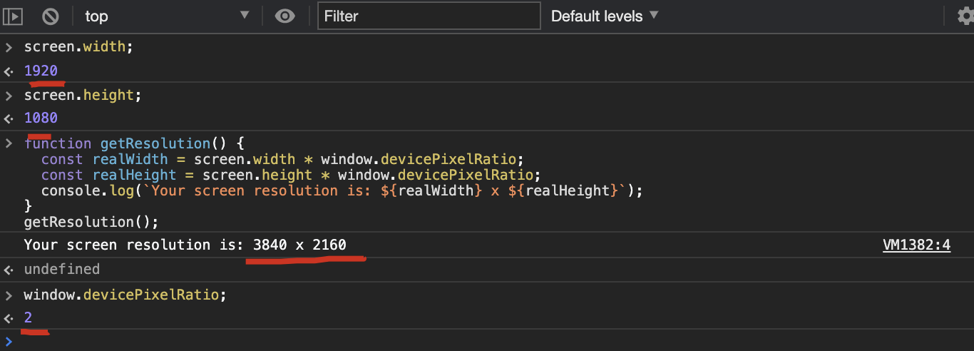
How to get the real screen size(screen resolution) by using js
Screen Resolution ≠ Window width
most os changing screen dpi so screen.width mostly return screen size with os dpi for for example my screen resolution is 1920x1080 and windows defult dpi is 125 so js screen.width return 1600px
use this:
function getResolution() {
  const realWidth = window.screen.width * window.devicePixelRatio;
  const realHeight = window.screen.height * window.devicePixelRatio;
  console.log(`Your screen resolution is: ${realWidth} x ${realHeight}`);
}

// test
getResolution();
// Your screen resolution is: 3840 x 2160
jQuery detect DPI change
I have just tried with my second monitor having a different resolution.
When I move the browser from the first to second screen and back I have to resize the browser so your approach is correct:
var width = screen.width;var height = screen.height;
$(window).on('resize', function(e) {  if (screen.width !== width || screen.height !== height) {    width = screen.width;    height = screen.height;        console.log('resolution changed!');  }});
Programmatically determine DPI via the browser?
If you're doing this in javascript/mootools, CSS units are your friend. You can specify sizes in inches or centimeters, or even points (1/72 of an inch). If you absolutely need DPI for whatever reason even though you can specify sizes in those units, simply size the "resizable" div you are using to a known size and calculate from the translated pixel size.
Edit:
Unfortunately, the CSS units of
points, cm, and in are not physically
correct. They are only relatively
correct. This was the first thing I
tried until I realized it wasn't
working and checked the CSS spec.. to
my dismay. – Brandon Pelfrey
That's a good point; browsers tend to fake it by assuming a default DPI (I think 72 or 96) and going with that.
Well, if you need precision sizing like you're asking for, you're out of luck. You'll never be able to get it without being able to read both the current resolution of the monitor the browser is on and the "viewable screen area" of that monitor. Ain't no way you're gonna get that via Javascript.
I suggest that you make the default assumption that browsers do and size according to the CSS units. You can then allow your users to "adjust the sizing" using the method you mentioned, but only if it's necessary. Do this with on a separate page with the DPI calculation stored as part of the users session or as a cookie.
Alternatively, once Microsoft fixes this bug, you could use Silverlight's "device independent units" for accurate scaling.
Related Topics
Best Way to Delete "Column" from Multidimensional Array
Connecting to Websocket with PHP Client
How to Protect HTML Form from Spammers
Laravel Orm from Self Referencing Table Get N Level Hierarchy JSON
$_File Upload Large File Gives Error 1 Even Though Upload_Max_Size Is Bigger Than the File Size
How to Escape String from PHP for JavaScript
What Is Difference of Developing a Website in MVC and 3-Tier or N-Tier Architecture
How to Use PHP In_Array with Associative Array
Enabling Cors in Codeigniter ( Restserver by @Chriskacerguis )
PHP - Create Simple Animated Gif from Two Jpeg Images
How to Upload Multiple Image in Laravel
How to Send an Email Using PHP at Windows Azure
How to Create a Fluent Query Interface
File_Exists() Returns False, But the File Does Exist
Can PHP Asynchronously Use Sockets
Laravel 5.2: the Process Class Relies on Proc_Open, Which Is Not Available on Your PHP Installation