JavaFX - Border radius - Background color
You need to add the radius property as well to define the background fill. Otherwise it will asume a zero value, as shown in your picture.
You can check the CSS specs here.
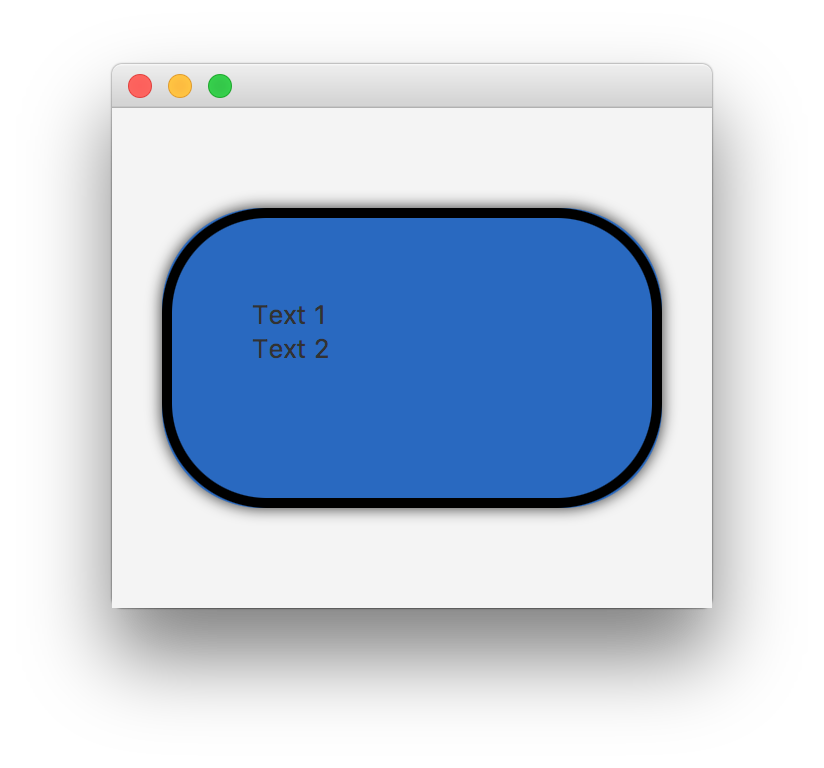
You just need to add the -fx-background-radius property:
.payload {
    -fx-hgap: 20px;
    -fx-padding: 40px;

    -fx-background-color: #2969c0;
    -fx-background-radius: 50px;

    -fx-border-radius: 50px;
    -fx-border-width: 5px;
    -fx-border-color: black;
    -fx-effect: dropshadow(three-pass-box, rgba(0, 0, 0, 0.8), 10, 0, 0, 0);
}
JavaFX: How not to fill background outside the rounded borders of a Label within a ScrollingPane
Thanks @sillyfly for pointing out -
I've forgotten to add -fx-background-radius: 15 in the CSS!
JavaFX: background overflow on button's border
It seems there are some rounding errors for ...-radius styles.
You can hide background under the border by using insets:
-fx-background-insets: 5px;
Border-radius in JavaFX CSS not working on containers
Do not use borders. Css background instead.
Load the sample to SceneBuilder to get the idea.
<?xml version="1.0" encoding="UTF-8"?>

<?import javafx.scene.effect.DropShadow?>
<?import javafx.scene.layout.StackPane?>

<StackPane maxHeight="-Infinity" maxWidth="-Infinity" minHeight="-Infinity" minWidth="-Infinity" prefHeight="400.0" prefWidth="600.0" style="-fx-background-color: silver;" xmlns="http://javafx.com/javafx/8" xmlns:fx="http://javafx.com/fxml/1">
   <children>
      <StackPane maxHeight="-Infinity" maxWidth="-Infinity" minHeight="-Infinity" minWidth="-Infinity" prefHeight="200.0" prefWidth="300.0" style="-fx-background-color: purple, blue; -fx-background-radius: 8, 0; -fx-background-insets: 0, 4;">
         <effect>
            <DropShadow />
         </effect>
      </StackPane>
   </children>
</StackPane>
does JavaFX css have a way to stop background color getting over the border edges?
As described in the JavaFX CSS Reference Guide, overflow is not supported.
JavaFX CSS does not support CSS layout properties such as float, position, overflow, and width. However, the CSS padding and margins properties are supported on some JavaFX scene graph objects. All other aspects of layout are handled programmatically in JavaFX code. In addition, CSS support for HTML-specific elements such as Tables are not supported since there is no equivalent construct in JavaFX.
However, to solve the rounded-background issue you can use -fx-background-radius along with -fx-border-radius. They should be the same value. You can find it here in the reference guide.
Here's an example of a bootstrap-like card that I think you are trying to make. You would use -fx-background-radius: <top-left> <top-right> <bottom-right> <bottom-left>; which would be -fx-background-radius: 10 10 0 0;

public class Card extends StackPane {
    public BorderPane border = new BorderPane();
    public StackPane header = new StackPane(), content = new StackPane();
    public Card() {
        setAlignment(Pos.CENTER);
        getChildren().add(border);
        border.setTop(header);
        border.setCenter(content);
        border.setStyle("-fx-border-color: cornflowerblue; -fx-border-radius: 10; ");
        header.setStyle("-fx-background-color: derive(cornflowerblue, 70%); -fx-background-radius: 10 10 0 0; ");
        header.setMinWidth(100);
        header.setMinHeight(80);
        content.setMinWidth(100);
        content.setMinHeight(100);
    }

    public BorderPane getCard() {
        return border;
    }

    public StackPane getHeader() {
        return header;
    }

    public StackPane getContent() {
        return content;
    }
}

public void start(Stage stage) throws Exception {
    Card card = new Card();
    card.setPadding(new Insets(10,10,10,10));

    GridPane grid = new GridPane();
    grid.setVgap(10); grid.setHgap(10);
    grid.setAlignment(Pos.CENTER);
    grid.addRow(0, new Label("Username"), new TextField());
    grid.addRow(1, new Label("Password"), new PasswordField());
    grid.addRow(2, new Button("Submit"));
    card.getContent().getChildren().add(grid);

    Label title = new Label("Card Example");
    title.setFont(Font.font("Tahoma", FontWeight.SEMI_BOLD, 36));
    card.getHeader().getChildren().add(title);

    StackPane stack = new StackPane();
    stack.setAlignment(Pos.CENTER);
    stack.getChildren().add(card);

    Scene scene = new Scene(stack, 500, 300);
    stage.setTitle("Boostrap-like Card Example");
    stage.setScene(scene);
    stage.show();
}
fx-background-radius and -fx-background-insets in JavaFX
These 2 properties are documented in the linked document, but I'd prefer using the latest version: JavaFX CSS Reference: Region
Those 2 properties are used to create the background of the Button; they are used as the constuctor parameters for the BackgroundFill constructors (4 BackgroundFills will be used for the background since 0 0 0 0, 0, 1, 2 contains 4 sets of insets).
-fx-background-insets
This specifies the distance from the Button's bounds where the background should be drawn. E.g. if you have a button positioned at x=50, y=150, width=200, height=100 and use insets 10 20 30 40 the region used for the background is x=50+40=90, y=150+10=160, width=200-20-40=140, height=100-10-30=60.
-fx-background-radius
The background is drawn as a rounded rectangle. This is the radius of the corners. In this case 0 means the bachground will be drawn as a non-rounded rectangle.
Why -fx-border-color reset border radius of TextField?
The default stylesheet applies borders to text fields (and almost all other controls) by using "nested backgrounds" instead of borders.
Some of the settings for the TextInputControl from the default stylesheet are:
-fx-background-color: linear-gradient(to bottom, derive(-fx-text-box-border, -10%), -fx-text-box-border),
    linear-gradient(from 0px 0px to 0px 5px, derive(-fx-control-inner-background, -9%), -fx-control-inner-background);
-fx-background-insets: 0, 1;
-fx-background-radius: 3, 2;
This basically sets two background colors (both defined by a linear gradient), one (the "outer" one) with a color based on -fx-text-box-border, and the other with a color based on -fx-control-inner-background. The "outer" background is outside the "inner" background because they have insets of 0 and 1, respectively; the curved edge to the resulting apparent border is created by having radii of 3 and 2 for each background, respectively.
This is, anecdotally at least, far more efficient than using actual borders in the CSS, so this choice of technique is for performance reasons.
So to preserve the radius for the border, you can use the same technique, and just override the two background colors:
.validation-error {
    -fx-background-color: #DBB1B1, #FFF0F0 ;
 }
Note that you can also just replace the "looked-up-colors", which would also preserve the subtle linear gradients being used:
.validation-error {
    -fx-text-box-border: #DBB1B1 ;
    -fx-control-inner-background: #FFF0F0 ;
  }
For highlighting when focused, the default uses colors named -fx-focus-color and -fx-faint-focus-color: so in the latter version you would probably want to redefine those too:
.validation-error {
    -fx-text-box-border: #DBB1B1 ;
    -fx-control-inner-background: #FFF0F0 ;
    -fx-focus-color: #FF2020 ;
    -fx-faint-focus-color: #FF202020 ;
  }
Related Topics
Absolute Positioning Graphic JPAnel Inside Jframe Blocked by Blank Sections
Use of Initializers VS Constructors in Java
Javafx - How to Create a Thin Menubar
Duplicated Entries in Listview
How to Parse Date from Gmt Timezone to Ist Timezone and Vice Versa in Android
Failed to Import New Gradle Project: Failed to Find Build Tools Revision *.0.0
How to Hash a String in Android
How to Properly Use Backwards Compatible Vector Drawable with the Latest Android Support Library
Android Change Material Elevation Shadow Color
Android: Realm + Retrofit 2 + Gson
How to Call Launch() More Than Once in Java
Creating Runnable Jar with Gradle
How to Set -Fx-Max-Width to Use_Pref_Size in Javafx CSS
Understand Arraylist Indexoutofboundsexception in Android
Send Sms Until It Is Successful
Create Pdu for Android That Works with Smsmessage.Createfrompdu() (Gsm 3Gpp)