How can I implement PageView in SwiftUI?
iOS 15+
In iOS 15 a new TabViewStyle was introduced: CarouselTabViewStyle (watchOS only).
Also, we can now set styles more easily:
.tabViewStyle(.page)
iOS 14+
There is now a native equivalent of UIPageViewController in SwiftUI 2 / iOS 14.
To create a paged view, add the .tabViewStyle modifier to TabView and pass PageTabViewStyle.
@main
struct TestApp: App {
    var body: some Scene {
        WindowGroup {
            TabView {
                FirstView()
                SecondView()
                ThirdView()
            }
            .tabViewStyle(PageTabViewStyle())
        }
    }
}
You can also control how the paging dots are displayed:
// hide paging dots
.tabViewStyle(PageTabViewStyle(indexDisplayMode: .never))
You can find a more detailed explanation in this link:
- How to create scrolling pages of content using tabViewStyle()
Vertical variant
TabView {
    Group {
        FirstView()
        SecondView()
        ThirdView()
    }
    .rotationEffect(Angle(degrees: -90))
}
.tabViewStyle(PageTabViewStyle(indexDisplayMode: .never))
.rotationEffect(Angle(degrees: 90))
Custom component
If you're tired of passing tabViewStyle every time you can create your own PageView:
Note: TabView selection in iOS 14.0 worked differently and that's why I used two Binding properties: selectionInternal and selectionExternal. As of iOS 14.3 it seems to be working with just one Binding. However, you can still access the original code from the revision history.
struct PageView: View where SelectionValue: Hashable, Content: View {
    @Binding private var selection: SelectionValue
    private let indexDisplayMode: PageTabViewStyle.IndexDisplayMode
    private let indexBackgroundDisplayMode: PageIndexViewStyle.BackgroundDisplayMode
    private let content: () -> Content

    init(
        selection: Binding,
        indexDisplayMode: PageTabViewStyle.IndexDisplayMode = .automatic,
        indexBackgroundDisplayMode: PageIndexViewStyle.BackgroundDisplayMode = .automatic,
        @ViewBuilder content: @escaping () -> Content
    ) {
        self._selection = selection
        self.indexDisplayMode = indexDisplayMode
        self.indexBackgroundDisplayMode = indexBackgroundDisplayMode
        self.content = content
    }

    var body: some View {
        TabView(selection: $selection) {
            content()
        }
        .tabViewStyle(PageTabViewStyle(indexDisplayMode: indexDisplayMode))
        .indexViewStyle(PageIndexViewStyle(backgroundDisplayMode: indexBackgroundDisplayMode))
    }
}

extension PageView where SelectionValue == Int {
    init(
        indexDisplayMode: PageTabViewStyle.IndexDisplayMode = .automatic,
        indexBackgroundDisplayMode: PageIndexViewStyle.BackgroundDisplayMode = .automatic,
        @ViewBuilder content: @escaping () -> Content
    ) {
        self._selection = .constant(0)
        self.indexDisplayMode = indexDisplayMode
        self.indexBackgroundDisplayMode = indexBackgroundDisplayMode
        self.content = content
    }
}
Now you have a default PageView:
PageView {
    FirstView()
    SecondView()
    ThirdView()
}
which can be customised:
PageView(indexDisplayMode: .always, indexBackgroundDisplayMode: .always) { ... }
or provided with a selection:
struct ContentView: View {
    @State var selection = 1

    var body: some View {
        VStack {
            Text("Selection: \(selection)")
            PageView(selection: $selection, indexBackgroundDisplayMode: .always) {
                ForEach(0 ..< 3, id: \.self) {
                    Text("Page \($0)")
                        .tag($0)
                }
            }
        }
    }
}
SwiftUI + UIPageViewController, multiple view types
You can wrap your pages in AnyView:
PageView(pages: [
            AnyView(Color.red),
            AnyView(Color.blue),
            AnyView(Text("Hi"))
])
SwiftUI - PageView - Pass in different Views
Try using type erasure by casting every view to AnyView:
var pageViewViewArray: [AnyView] = [AnyView(TestView()), AnyView(AnotherView()), AnyView(DifferentView())]
Documentation here, and an example of using it here.
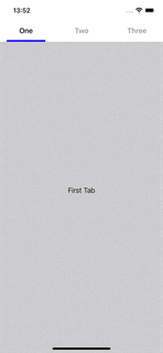
How do I add a sliding header to my Page View in Swift UI
You can put your own buttons above the TabView, that change the selected page:
struct ContentView: View {

    @State private var selectedTab = 1

    var body: some View {
        VStack(spacing: 0) {

            HStack {
                tabButton(title: "One", tag: 1)
                tabButton(title: "Two", tag: 2)
                tabButton(title: "Three", tag: 3)
            }
            .padding(.top)
            .font(.headline)

            TabView(selection: $selectedTab) {
                Text("First Tab").tag(1)
                Text("Second Tab").tag(2)
                Text("Third Tab").tag(3)
            }
            .tabViewStyle(PageTabViewStyle(indexDisplayMode: .never))
            .background(.gray.opacity(0.5))
        }
    }

    func tabButton(title: String, tag: Int) -> some View {
        VStack {
            Button(title) { withAnimation { selectedTab = tag } }
            .frame(maxWidth: .infinity)
            .foregroundColor(selectedTab == tag ? .primary : .secondary)

            Color(selectedTab == tag ? .blue : .clear)
                .frame(height: 4)
                .padding(.horizontal)
        }
    }
}
SwiftUI send action from a page to the PageViewController
OK, I figured it out. Not intuitive at first, I have to say. Coming from traditional event based programming, it's quite a different way of thinking
I used a @State variable in the main instance of the view.
I used @Binding variables to deal with the state both upstream (ViewControllers, Controls) and downstream (subviews). So, for example, I used a variable to tell the dataSource of the UIPageViewController if or not to return a view controller before/after the current one.
For the dismissing the modally presented controller I used
@Environment(\.presentationMode) var presentationMode

...

func dismiss() {
  self.presentationMode.wrapptedValue.dismiss()
}
Similarly,
...
@Binding var currentPage: int
...

Button(action: next) { Text("Next Page") }
...

...
func next() {
    currentPage += 1
}
There were a few caveats in deciding how to nest the views and what variables to pick for the bindings, but it is clear to me now. The biggest problem was ultimately where the "source of truth" should be anchored. It turned out, right in the "middle", i.e. below the controller and above the particular views.
Hope this is useful for others looking for something similar.
Related Topics
Changing Vc Issue in Swift. How to Pass Data Between Views in Tab Bar Controller
What Is the '' Is or the ':' at the Equation When Coding in Swift
Prevent Segue in Prepareforsegue Method
Setting Direction for Uiswipegesturerecognizer
Using Multiple Storyboards in iOS
iOS 7 - Difference Between Viewdidload and Viewdidappear
In Swift, Array [String] Slicing Return Type Doesn't Seem to Be [String]
iOS 7 Sprite Kit Freeing Up Memory
Undefined Symbols for Architecture X86_64 on Xcode 6.1
How to Recognize Which Pin Was Tapped
How to Rotate Text for Uibutton and Uilabel in Objective-C
An App Id with Identifier '' Is Not Available. Please Enter a Different String
Xcode Beta 6 iOS 8: Simulator Not Working
With Auto Layout, How to Make a Uiimageview's Size Dynamic Depending on the Image