How to change inactive icon/text color on tab bar?
In every first ViewController for each TabBar:
- (void)viewDidLoad
{
    [super viewDidLoad];

    // changing the unselected image color, you should change the selected image
    // color if you want them to be different
    self.tabBarItem.selectedImage = [[UIImage imageNamed:@"yourImage_selectedImage"]
    imageWithRenderingMode:UIImageRenderingModeAlwaysOriginal];

    self.tabBarItem.image = [[UIImage imageNamed:@"yourImage_image"]
    imageWithRenderingMode:UIImageRenderingModeAlwaysOriginal];
}
The clue of this code is 'UIImageRenderingModeAlwaysOriginal':
Rendering Modes by Apple Documentation:
UIImageRenderingModeAutomatic,          // Use the default rendering mode for the context where the image is used
UIImageRenderingModeAlwaysOriginal,     // Always draw the original image, without treating it as a template
UIImageRenderingModeAlwaysTemplate,     // Always draw the image as a template image, ignoring its color information
To change text color:
In AppDelegate:
- (BOOL)application:(UIApplication *)application didFinishLaunchingWithOptions:(NSDictionary *)launchOptions
{
    // Add this if you only want to change Selected Image color
    // and/or selected image text
    [[UITabBar appearance] setTintColor:[UIColor redColor]];

    // Add this code to change StateNormal text Color,
    [UITabBarItem.appearance setTitleTextAttributes:
    @{NSForegroundColorAttributeName : [UIColor greenColor]}
    forState:UIControlStateNormal];

    // then if StateSelected should be different, you should add this code
    [UITabBarItem.appearance setTitleTextAttributes:
    @{NSForegroundColorAttributeName : [UIColor purpleColor]}
    forState:UIControlStateSelected];

    return YES;
}
How to change color of tab's icon in selected and unselected state in flutter?
As per the directions given by Britannio, I have solved my problem but I want to share my solution so that it can help others. I am confused about one thing that I have to call setState() with empty body which is not recommended so if any one have a better solution then please comment. I'll update it.
     TabController _tabController;

     @override
     void initState() {
       super.initState();
      _tabController = new TabController(vsync: this, length: 3);
      _tabController.addListener(_handleTabSelection);
     }

     void _handleTabSelection() {
        setState(() {
         });
     }

     TabBar(
            controller: _tabController,
            indicatorColor: Colors.grey,
            labelColor: Colors.black,
            unselectedLabelColor: Colors.grey,
            tabs: [
              Tab(
                  text: 'Sale',
                  icon: Icon(Icons.directions_car,
                      color: _tabController.index == 0
                          ? Colors.black
                          : Colors.grey)),
              Tab(
                  text: 'Latest',
                  icon: Icon(Icons.directions_transit,
                      color: _tabController.index == 1
                          ? Colors.black
                          : Colors.grey)),
              Tab(
                  text: 'Popular',
                  icon: Icon(Icons.directions_bike,
                      color: _tabController.index == 2
                          ? Colors.black
                          : Colors.grey)),
            ],
          )
change inactive color of the tab item
I will post what I did to get what i want to achieve.This might also help biggener's like me in the future.
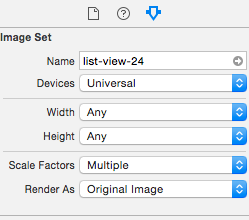
First I have created two images for each icon
Home Icon,Friends Icon and Search Icon each has white and green color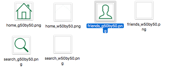
Then clicking Assets.xcassets file to add New Image Set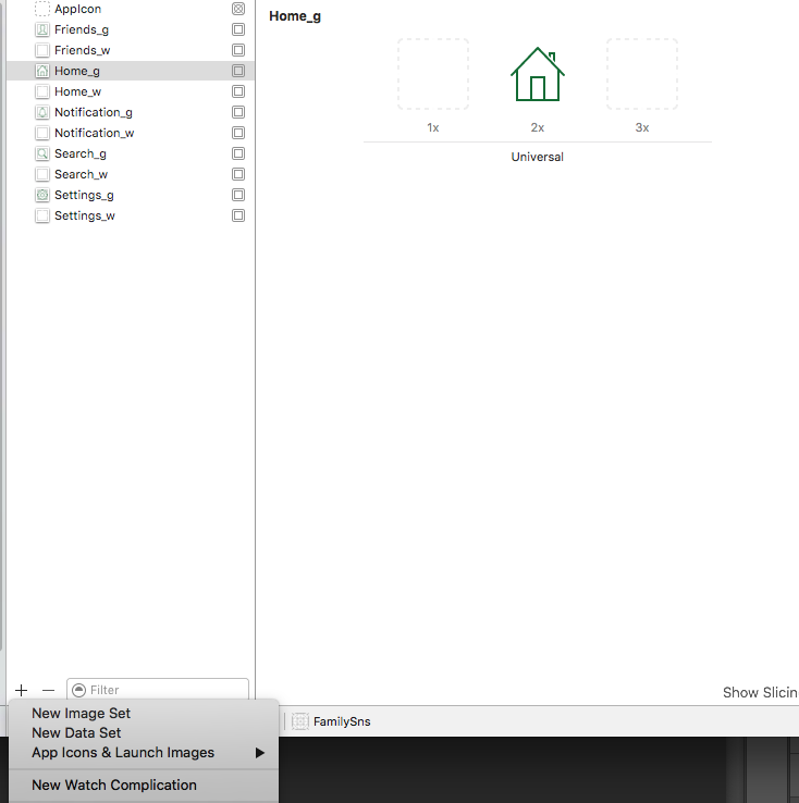
Making it sure that the green icons Render As is set to Original Image since this will be the inactive color icon of our tab bar.Here is a sample screen shots for the sample attribute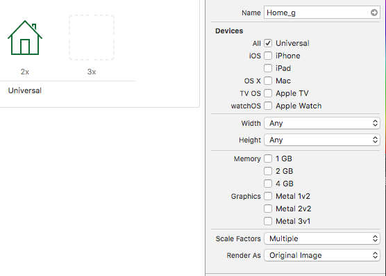
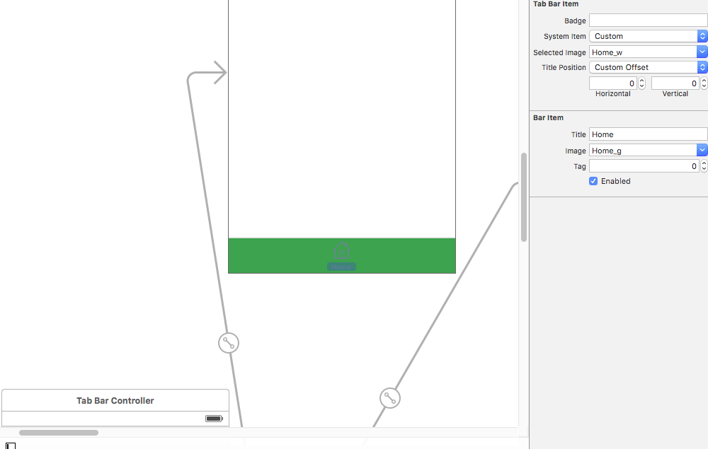
By setting the Home Item tab bar Icon. Please Note
System Item => Custom
Selected Image => Home_w//Name of the home white icon
Title => Home
Image=> Home_g//Name of the Inactive tabbar item in my case are sets to green icons
finally overriding Title Color of our tab bar items in AppDelegate.swift.Please note i have used UIColor_Hex_Swift for hex UIColor.
func application(application: UIApplication, didFinishLaunchingWithOptions launchOptions: [NSObject: AnyObject]?) -> Bool {
    // Override point for customization after application launch.

    let color:UIColor =  UIColor(rgba: "#026a34") //UIColor(hexString:"026a34")

    UITabBarItem.appearance().setTitleTextAttributes([NSForegroundColorAttributeName: color], forState: .Normal)

    // then if StateSelected should be different, you should add this code
    UITabBarItem.appearance().setTitleTextAttributes([NSForegroundColorAttributeName: UIColor.whiteColor()], forState: .Selected)

    return true
}
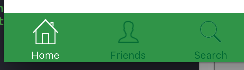
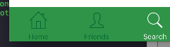
Out put(White ones are the selected Image and green ones are the inactive image)

TabBar icon color when tab is selected
To change the selected tab color, you just need to add this to TabBar :
labelColor: Colors.
unselectedLabelColor: Colors.white,
Full code:
DefaultTabController(
      length: 2,
      child: Scaffold(
        appBar: AppBar(
          bottom: TabBar(
            labelColor: Colors.deepOrange,
            unselectedLabelColor: Colors.white,
            tabs: <Tab>[
              Tab(
                child: Row(
                  children: <Widget>[
                    Text("Select", textAlign: TextAlign.start),
                    SizedBox(
                      width: 24.0,
                    ),
                    Icon(
                      Icons.arrow_drop_down,
                      color: Colors.blue.shade400,
                    ),
                  ],
                ),
              ),
            ],
          ),
        ),
        body: Center(
          child: Container(
            child: Text("This is a page blahblah"),
          ),
        ),
      ),
    )
EDIT:
If u want to only change the icon color, then add color to Text and remove the color from the Icon in Tab, Code:
DefaultTabController(
      length: 2,
      child: Scaffold(
        appBar: AppBar(
          bottom: TabBar(
            labelColor: Colors.deepOrange,
            unselectedLabelColor: Colors.white,
            tabs: <Tab>[
              Tab(
                child: Row(
                  children: <Widget>[
                    Text("Select", textAlign: TextAlign.start, style: TextStyle(color: Colors.white),),
                    SizedBox(
                      width: 24.0,
                    ),
                    Icon(
                      Icons.arrow_drop_down,
                    ),
                  ],
                ),
              ),
              Tab(
                child: Row(
                  children: <Widget>[
                    Text("Select", textAlign: TextAlign.start, style: TextStyle(color: Colors.white),),
                    SizedBox(
                      width: 24.0,
                    ),
                    Icon(
                      Icons.arrow_drop_down,

                    ),
                  ],
                ),
              ),
            ],
          ),
        ),
        body: Center(
          child: Container(
            child: Text("This is a page blahblah"),
          ),
        ),
      ),
    )
EDIT #2
Now , This code changes the Icon color, but leaves the text color change as default (You can customize the change for color of text like the icon color). Code:
import 'package:flutter/material.dart';

class FirstPage extends StatefulWidget {
  @override
  _FirstPageState createState() => _FirstPageState();
}

class _FirstPageState extends State<FirstPage> {
  int _currentIndex = 0;
  @override
  Widget build(BuildContext context) {
    return DefaultTabController(
      length: 2,
      child: Scaffold(
        appBar: AppBar(
          bottom: TabBar(
            onTap: (index){
              setState(() {
               _currentIndex = index;
              });
            },

            tabs: <Tab>[
              Tab(
                child: Row(
                  children: <Widget>[
                    Text("Select", textAlign: TextAlign.start,),
                    SizedBox(
                      width: 24.0,
                    ),
                    Icon(
                      Icons.arrow_drop_down,
                      color: _currentIndex == 0 ? Colors.deepOrange : Colors.white54
                    ),
                  ],
                ),
              ),
              Tab(
                child: Row(
                  children: <Widget>[
                    Text("Select", textAlign: TextAlign.start,),
                    SizedBox(
                      width: 24.0,
                    ),
                    Icon(
                      Icons.arrow_drop_down,
                      color: _currentIndex == 1 ? Colors.deepOrange : Colors.white54,
                    ),
                  ],
                ),
              ),
            ],
          ),
        ),
        body: Center(
          child: Container(
            child: Text("This is a page blahblah"),
          ),
        ),
      ),
    );
  }
}
Changing tab bar item image and text color iOS
From UITabBarItem class docs:
By default, the actual unselected and selected images are
automatically created from the alpha values in the source images. To
prevent system coloring, provide images with
UIImageRenderingModeAlwaysOriginal.
The clue is not whether you use UIImageRenderingModeAlwaysOriginal, the important thing is when to use it.
To prevent the grey color for unselected items, you will just need to prevent the system colouring for the unselected image. Here is how to do this:
var firstViewController:UIViewController = UIViewController()
// The following statement is what you need
var customTabBarItem:UITabBarItem = UITabBarItem(title: nil, image: UIImage(named: "YOUR_IMAGE_NAME")?.imageWithRenderingMode(UIImageRenderingMode.AlwaysOriginal), selectedImage: UIImage(named: "YOUR_IMAGE_NAME"))
firstViewController.tabBarItem = customTabBarItem
As you can see, I asked iOS to apply the original color (white, yellow, red, whatever) of the image ONLY for the UNSELECTED state, and leave the image as it is for the SELECTED state.
Also, you may need to add a tint color for the tab bar in order to apply a different color for the SELECTED state (instead of the default iOS blue color). As per your screenshot above, you are applying white color for the selected state:
self.tabBar.tintColor = UIColor.whiteColor()
EDIT:
how to change tint colour of an icon in tab bar with react native
You can change your code with below
const TabNavigator = createBottomTabNavigator({
  Home: {
    screen: HomeScreen,
    navigationOptions: {
      title:  'Home',
      tabBarIcon: ({ focused }) => (
        <Icon
          name={Platform.OS === 'ios' ? 'ios-home' : 'md-home'}
          size={25}
          color={focused ? 'white' : 'black'}
        />
      ),
    },
  },
  Listen: {
    screen: MainScreen,
    navigationOptions: {
      title:  'Listen',
      tabBarIcon: ({ focused }) => (
        <FontAwesome
          name="microphone"
          size={25}
          color={focused ? 'white' : 'black'}
        />
      ),
    },
  },
  Events: {
    screen: EventScreen,
    navigationOptions: {
      title:  'Events',
      tabBarIcon: ({ focused }) => (
        <Icon
          name={Platform.OS === 'ios' ? 'ios-calendar' : 'md-calendar'}
          size={25}
          color={focused ? 'white' : 'black'}
        />
      ),
    },
  },
  About: {
    screen: AboutScreen,
    navigationOptions: {
      title:  'About',
      tabBarIcon: ({ focused }) => (
        <Icon
          name={Platform.OS === 'ios' ? 'ios-information-circle-outline' : 'md-information-circle-outline'}
          size={25}
          color={focused ? 'white' : 'black'}
        />
      ),
    },
  }
},
{
  initialRouteName: 'Home',
  tabBarOptions: {
      labelPosition: 'below-icon',
      activeTintColor: '#E8AA65',
      inactiveTintColor: '#58585A',
      fontSize: 50,
      style: {
        height: 50,
        backgroundColor: '#3B3B3B',
       }
    },
  });
Related Topics
Creating Custom Info Window in Swift with the Google Maps iOS Sdk
How to Password Protect Writing to Nfc Ntag216 Tag on iOS 13 Using Nfc Core
Push Notification Not Receiving in Background iOS
How to Load an Uiimage into a Swiftui Image Asynchronously
How to Make a Button Continually Call a Function When Held Down (Spritekit)
Optional Binding with Try? and As? Still Produces an Optional Type
Open Phone Settings Programmatically in iOS9
Performance Testing in Swift Using Tdd
Uibutton Image for Normal State in Collectionview Cell Repeats Itself Every Four Cells
Swift - Which Types to Use? Nsstring or String
How to Center a Popoverview in Swift
Swift Doesn't Convert Objective-C Nserror** to Throws
Ios6 Udid - What Advantages Does Identifierforvendor Have Over Identifierforadvertising