Invert CSS font-color depending on background-color
There is a CSS property called mix-blend-mode, but it's not supported by IE. I recommend using pseudo elements. If you like to support IE6 and IE7 you can also use two DIVs instead of pseudo elements.
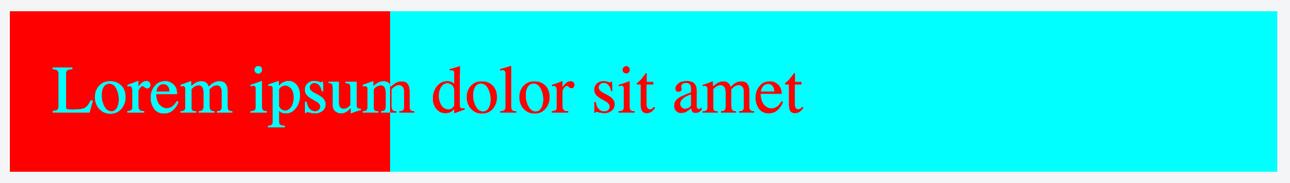
.inverted-bar {    position: relative;}
.inverted-bar:before,.inverted-bar:after {    padding: 10px 0;    text-indent: 10px;    position: absolute;    white-space: nowrap;    overflow: hidden;    content: attr(data-content);}
.inverted-bar:before {    background-color: aqua;    color: red;    width: 100%;}
.inverted-bar:after {    background-color: red;    color: aqua;    width: 20%;}
<div class="inverted-bar" data-content="Lorem ipsum dolor sit amet"></div>How to invert text color according to what's behind it? (not only background)
I thought mix-blend-mode: difference; would do just that. ✌️
#bg {
  background-image:url(https://thumbs.dreamstime.com/b/beautiful-multicolored-bokeh-lights-holiday-glitter-background-christmas-new-year-birthday-celebration-high-resolution-image-133585052.jpg);
}
#test {
  font-size:20vw;
  color:#FFF;
  mix-blend-mode: difference;
}
<div id="bg">
<div id="test">testing</div>
</div>invert text color based on background in css
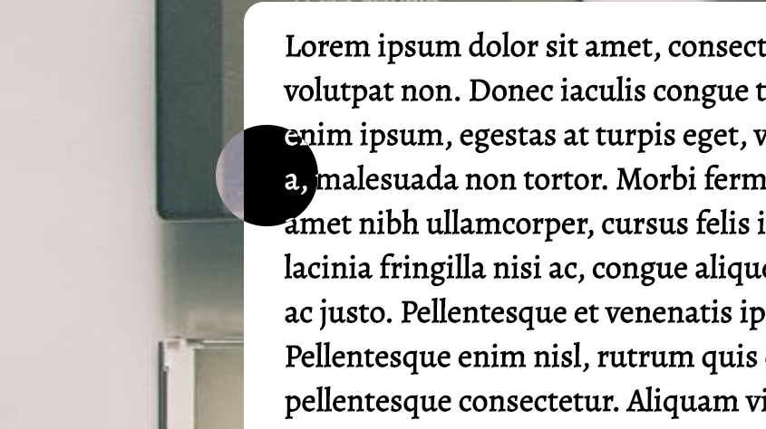
You could also apply this styling to the element you'd like to invert the colors of:
filter: invert(1);
mix-blend-mode: difference;
It especially works if you need to base the difference on a child or a element further away, not a parent or a close element.
I used it with a custom cursor (the black circle), which made it contrast nicely with the elements behind. Sample pen here: https://codepen.io/m3t4lch7/pen/VwwOKNd
Setting text color to inverted background color
div {
  background: linear-gradient(to right, #fff, #000);
  width: 100vh;
  height: 50vh;
}

span {
  font-size: 30vh;
  mix-blend-mode: difference;
  filter: invert(1);
}
<div>
<span>Test</span>
</div>Inverting text color depending on video background
Try replacing color: black with color: white: 
Big credit to the original codepen.
How to invert stroke text color depending on background
One idea is to duplicate the text and use CSS variable to define the color so you can easily change them in one place. I used clip-path to hide half of one text and show the other half:
body {  margin: 0;  --c1:#510035;  --c2:#E8E8E8;}body:hover {  --c1:red;  --c2:blue;}
h1 {  font-size: 4.7em;  text-transform: uppercase;  margin: 0;}.first {  background:var(--c1);  -webkit-text-stroke: 3px var(--c2);}
.second {  background:var(--c2);  -webkit-text-stroke: 3px var(--c1);  clip-path:polygon(0% 0%, 50% 0%, 50% 100%,0% 100%);}
.lp-header {  position:absolute;  top:0;  left:0;  right:0;  min-height:100vh;  box-sizing:border-box;  color: transparent;  z-index: 1;  padding: 50px;  text-align: center;  transition:0.5s;}
<h1 class="lp-header first">left or right</h1><h1 class="lp-header second">left or right</h1>Invert colored text related background
You can avoid clip-path by using linear-gradient as background and the mix-blend-mode will work perfectly:
#text {  width: 150px;  height: 150px;  z-index: 1;}
#text {  text-align: center;  background: linear-gradient(to top right, black 50%, orange 51%);}
#text h1 {  margin: 0;  line-height: 150px;  mix-blend-mode: difference;  color: #fff;}
<div id="text"> <h1>TEXT</h1></div>CSS Custom text color based on background
You can try using inverted colors and re-inverting the whole thing with a CSS filter like so:
body {
  margin: 0;
}

#sf-coming-up {
  filter: invert(1);
  height: 100vh;
}

.blob {
  position: absolute;
  top: 15%;
  right: 15%;
  z-index: -1;
  width: 70%;
  height: 70%;
  border-radius: 25% 75% 25% 50% / 75% 25% 50% 25%;
  background: springgreen;
}

.title {
  padding: 25vh 0 0 12.5vh;
  color: springgreen;
  mix-blend-mode: difference;
}
<div id="sf-coming-up">
<div class="title">Binnenkort in ons theater</div>
<div class="blob"></div>
</div>Invert font color based on centered background image - CSS
https://jsfiddle.net/ja63f2zb/
HTML:
<div class="box">
    Lorem ipsum.
    <span>Lorem ipsum.</span>
</div>
CSS:
.box {
    width: 200px;
    margin: 200px auto;
    height: 400px;
    background-color: #CCC;
    font-size: 8em;
    position: relative;
}
.box span {
    position: absolute;
    top: 0;
    bottom: 0;
    right: 0;
    left: 0;
    overflow: hidden;
    color: #FFF;
}
.box, .box span {
    display: -webkit-flex;
    display: -moz-flex;
    display: -ms-flex;
    display: -o-flex;
    display: flex;
    -ms-align-items: center;
    align-items: center;
    justify-content: center;
    white-space: nowrap;
}
Just don't forget about accessibility
<div class="box">
    Lorem ipsum.
    <span aria-hidden="true">Lorem ipsum.</span>
</div>
Related Topics
How to Create Your Own HTML Tag in Html5
How to Make a Whole Row in a Table Clickable as a Link
Html Encoding Issues - "Â" Character Showing Up Instead of "&Nbsp;"
How to Use Jsf+Facelets With HTML 4/5
Putting ≪Div≫ Inside ≪P≫ Is Adding an Extra ≪P≫
What Is Href="#" and Why Is It Used
Set the Table Column Width Constant Regardless of the Amount of Text in Its Cells
How to Create a Circle With Links on Border Side
Trouble With Content Security Policy
Use Images Instead of Radio Buttons
How to Scale the Content of an Iframe
Ie7 Does Not Understand Display: Inline-Block
Height: 100% or Min-Height: 100% For HTML and Body Elements
Styling Part of the Option Text
How to Copy Contents of One Canvas to Another Canvas Locally