How to apply CSS page-break to print a table with lots of rows?
You can use the following:
<style type="text/css">
   table { page-break-inside:auto }
   tr    { page-break-inside:avoid; page-break-after:auto }
</style>
Refer the W3C's CSS Print Profile specification for details.
And also refer the Salesforce developer forums.
How to deal with page breaks when printing a large HTML table
<!DOCTYPE HTML>
<html>
<head>
<meta http-equiv="Content-Type" content="text/html; charset=UTF-8">
<title>Test</title>
<style type="text/css">
    table { page-break-inside:auto }
    tr    { page-break-inside:avoid; page-break-after:auto }
    thead { display:table-header-group }
    tfoot { display:table-footer-group }
</style>
</head>
<body>
    <table>
        <thead>
            <tr><th>heading</th></tr>
        </thead>
        <tfoot>
            <tr><td>notes</td></tr>
        </tfoot>
        <tbody>
        <tr>
            <td>x</td>
        </tr>
        <tr>
            <td>x</td>
        </tr>
        <!-- 500 more rows -->
        <tr>
            <td>x</td>
        </tr>
    </tbody>
    </table>
</body>
</html>
Page break before table row
I found a solution based on this answer and some experimentation, I have no idea why it works:
<tr>
    <td>
        <div></div>
        <div style="page-break-before:always"></div>
All of the following are important:
- No page break styling on the
tr. - The cell must contain at least two divs.
- Any div except the first must be
page-break-before:always.
If the cell only contains one div it doesn't work. Unlike in that answer, clear:both does not seem to matter, nor does the third div.
I was unable to find a working solution that did not involve adding divs to the tr (e.g. with pseudo-elements).
So this is what I'm doing for now, although I wouldn't mind somebody explaining what's going on here or, more importantly, why the solution in the original linked question (display:block; page-break-before:always; on the tr) did not work for me.
Table with print media css is breaking at an offset position
I think you have relatively positioned table and it has been shifted down by height equal to menu bar height.
For example, put below code in separate html file and try to print it. You'll see similar effect.
<!DOCTYPE html>

<head>

  <style>
    :root {
      --menu-height: 200px;
    }

    @media print {
     table { page-break-after:auto }
     tr    { page-break-inside:avoid; page-break-after:auto }
     td    { page-break-inside:avoid; page-break-after:auto }
     thead { display:table-header-group }
     tfoot { display:table-footer-group }

     table.listing tbody {
        border: 15px solid red;
     }

     table.listing tbody.display td {
        color: red;
     }
   }

    td,
    th {
      border: 1px solid gray;
      height: 2cm;
    }

    table {
      position: relative;      /* <-- position shifted table */
      top: var(--menu-height); /* <-- shifted down by menu height */

      border-collapse: collapse;
      border: 10px solid red
    }

    .menu-bar {
      position: absolute;      /* <-- floating menubar */
      top: 0px;
      width: 300px;
      height: var(--menu-height);
      background-color: bisque;

    }
  </style>
</head>

<body>
  <div class="menu-bar">
    <h5>Herd Report</h5>
    <p>mountain goat</p>
  </div>


  <table>
    <tr>
      <th>asd</th>
      <th>bbbb</th>
      <th>bcccc</th>
      <th>dddd</th>
      <th>eee</th>
      <th>ff ff</th>
      <th>ggg </th>
      <th>hhh h</th>
    </tr>
    <tr><td>1</td><td></td><td></td><td></td><td></td><td></td><td></td><td></td></tr>
    <tr><td>2</td><td></td><td></td><td></td><td></td><td></td><td></td><td></td></tr>
    <tr><td>3</td><td></td><td></td><td></td><td></td><td></td><td></td><td></td></tr>
    <tr><td>4</td><td></td><td></td><td></td><td></td><td></td><td></td><td></td></tr>
    <tr><td>5</td><td></td><td></td><td></td><td></td><td></td><td></td><td></td></tr>
    <tr><td>6</td><td></td><td></td><td></td><td></td><td></td><td></td><td></td></tr>
    <tr><td>7</td><td></td><td></td><td></td><td></td><td></td><td></td><td></td></tr>
    <tr><td>8</td><td></td><td></td><td></td><td></td><td></td><td></td><td></td></tr>
    <tr><td>9</td><td></td><td></td><td></td><td></td><td></td><td></td><td>c</td></tr>
    <tr><td>0</td><td></td><td></td><td></td><td></td><td></td><td></td><td></td></tr>
    <tr><td>11</td><td></td><td></td><td></td><td></td><td></td><td></td><td></td></tr>
    <tr><td>12</td><td></td><td></td><td></td><td></td><td></td><td></td><td></td></tr>
    <tr><td>13</td><td></td><td></td><td></td><td></td><td></td><td></td><td></td></tr>
    <tr><td>14</td><td>5</td><td></td><td></td><td></td><td></td><td></td><td></td>
    </tr>
  </table>
</body>

</html>
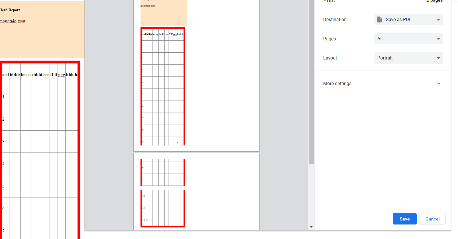
In above example the table is positioned relative. This is what the CSS standard say about position:relative:
relative
The element is positioned according to the normal flow of the document, and then offset relative to itself based on the values of top, right, bottom, and left. The offset does not affect the position of any other elements; thus, the space given for the element in the page layout is the same as if position were static.
For more info refer: https://developer.mozilla.org/en-US/docs/Web/CSS/position
If you play with the demo in the documentation, you'll notice that position relative reserves the spot and space on the page but the element is moved relative to that spot. So while printing the table browser considers element's static position, at top left in our case, and splits rows accordingly. But due to relative positioning table is shifted down and breaks at unwanted spots.
To fix the positioning you need to add following CSS rules at the end of style sheet.
    @media print {
     .menu-bar{
       position: static;
     }
     table{
       position: static;
     }
   }
What we are saying here is if media is print then position menubar and table statically.
You might have a lot and complex styling in your project but you may need to style the entire document separately for print media.
Allow page breaks inside tr and td elements
According to the specs, the page-break-inside property applies to block elements although user agents could apply it to other elements:
User Agents must apply these properties to block-level elements in the normal flow of the root element. User agents may also apply these properties to other elements, e.g., 'table-row' elements.
So one possibility (that may not be ideal) would be to change the display of the rows when printing so they are display: block instead of the default display: table-row. Something like this (this is too generic, you may need to make it more specific):
@media print {
    tr {
        page-break-inside: initial;
        display: block;
    }
}
I tested and it works fine on Chrome and Safari, but doesn't seem to work on Firefox:
Applying page-break-before to a table row (tr)
Inside <head>, set this style in your CSS stylesheet
<head>
    <style>
        @media print {
            tr.page-break  { display: block; page-break-before: always; }
        }
    </style>
</head>
That way, it will produce a page break during printing right before this table row.
<tr class="page-break">
</tr>
Related Topics
How to Set Subject/Content of Email Using Mailto:
How to Write a CSS Selector Selecting Elements Not Having a Certain Class or Attribute
A Space Between Inline-Block List Items
Css Display an Image Resized and Cropped
Are Iframes Considered 'Bad Practice'
How to Center Elements on the Last Row in CSS Grid
Is It Wrong to Change a Block Element to Inline With CSS If It Contains Another Block Element
How to Vertically Center a Container in Bootstrap
Margin-Top Push Outer Div Down
Responsively Change Div Size Keeping Aspect Ratio
How to Add a New Line in Textarea Element
Multiple Lines of Input in ≪Input Type="Text" /≫
Properly Sizing and Aligning the Flex Item(S) on the Last Row
How to Make a Curved Edge Hexagon by Using Css
How to Create a Template in Html
Ie9 Float With Overflow:Hidden and Table Width 100% Not Displaying Properly