How to create a circle with links on border side
The key to creating a circle with segments is to find points along the circle which would be used in the SVG path elements as coordinates. Finding points on a circle can be done easily using trigonometric equations if we know the angles.
X Coordinate of point = Radius of the circle * Cos(Angle in Radians) + X Coordinate of center point
Y Coordinate of point = Radius of the circle * Sin(Angle in Radians) + Y Coordinate of center point
Angle in Radians = Angle in Degrees * Math.PI / 180
The angles depend on the no. of segments that we have to create. The generic formula is (360 / no. of segments). So to create a circle with 6 segments, the angle covered by each of the segment would be 60 degrees. The first segment would cover from 0 to 60 degrees, second from 60 to 120 degrees and so on.
Demo of Circle with 6 Segments:
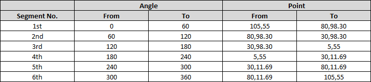
Below table shows how the points are calculated for a circle with 6 segments (where radius of circle is 50, center point is 55,55):
Once the points are calculated, coding the path itself is simple. The path should start and end at the center point (which is 50,50), from the center point, we should first draw a line to From Point and from there draw an arc to the To Point. Below is how a sample path would look like:
<path d='M55,55 L105,55 A50,50 0 0,1 80,98.30z' />
svg {
  height: 220px;
  width: 220px;
}
path {
  fill: transparent;
  stroke: black;
}
<svg viewBox='0 0 110 110'>
<path d='M55,55 L105,55 A50,50 0 0,1 80,98.30z' />
<path d='M55,55 L80,98.30 A50,50 0 0,1 30,98.30z' />
<path d='M55,55 L30,98.30 A50,50 0 0,1 5,55z' />
<path d='M55,55 L5,55 A50,50 0 0,1 30,11.69z' />
<path d='M55,55 L30,11.69 A50,50 0 0,1 80,11.69z' />
<path d='M55,55 L80,11.69 A50,50 0 0,1 105,55z' />
</svg>Css circle with border that is hollow inside?
You can use poiner-events: none to delegate clicks and hovers to covered elements.
This works for all major browsers and for IE since version 11.
.inner-circle{ display: inline-block; width: 50px; height: 50px; border-radius: 50%; border-style: solid; border-width: 2px; border-color: blue; background-color: rgba(0, 0, 0, 0); position: absolute; top:0; left:0; pointer-events:none;}<input type="checkbox" /><span class="inner-circle"></span>How to make a horizontal border with circles on each end
pseudo-elements!
div {
    border-bottom: 2px solid black;
    padding-bottom: 15px;
    position: relative;
}

div:before,
div:after {
    position: absolute;
    bottom: -6px;
    left: 0;
    height: 10px;
    width: 10px;
    background: black;
    content: "";
    border-radius: 5px;
}

div:after {
    right: 0;
    left: auto;
}
Fiddle: http://jsfiddle.net/GVb59/
How to draw a circle sector in CSS?
CSS and Multiple Background Gradients
Rather than trying to draw the green portion, you could draw the white portions instead:
pie {
    border-radius: 50%;
    background-color: green;
}

.ten {
    background-image:
        /* 10% = 126deg = 90 + ( 360 * .1 ) */
        linear-gradient(126deg, transparent 50%, white 50%),
        linear-gradient(90deg, white 50%, transparent 50%);
}
pie {
  width: 5em;
  height: 5em;
  display: block;
  border-radius: 50%;
  background-color: green;
  border: 2px solid green;
  float: left;
  margin: 1em;
}

.ten {
  background-image: linear-gradient(126deg, transparent 50%, white 50%), linear-gradient(90deg, white 50%, transparent 50%);
}

.twentyfive {
  background-image: linear-gradient(180deg, transparent 50%, white 50%), linear-gradient(90deg, white 50%, transparent 50%);
}

.fifty {
  background-image: linear-gradient(90deg, white 50%, transparent 50%);
}


/* Slices greater than 50% require first gradient
   to be transparent -> green */

.seventyfive {
  background-image: linear-gradient(180deg, transparent 50%, green 50%), linear-gradient(90deg, white 50%, transparent 50%);
}

.onehundred {
  background-image: none;
}
<pie class="ten"></pie>
<pie class="twentyfive"></pie>
<pie class="fifty"></pie>
<pie class="seventyfive"></pie>
<pie class="onehundred"></pie>Create a perfect circle with CSS
In order to achieve a perfectly round shape you'll need to have perfect square to begin with. So, for instance, your button will need to have dimensions like width: 32px; height: 32px. To turn a square into a circle you'll have to apply a border radius of 50% e.g. border-radius: 50%.
How to draw a circle with text in the middle?
Setting a line-height the same value as the height of the div will show one line of text vertically centered. In this example the height and line-height are 500px.
Example
JSFiddle
.circle {
width: 500px;
height: 500px;
line-height: 500px;
border-radius: 50%;
font-size: 50px;
color: #fff;
text-align: center;
background: #000
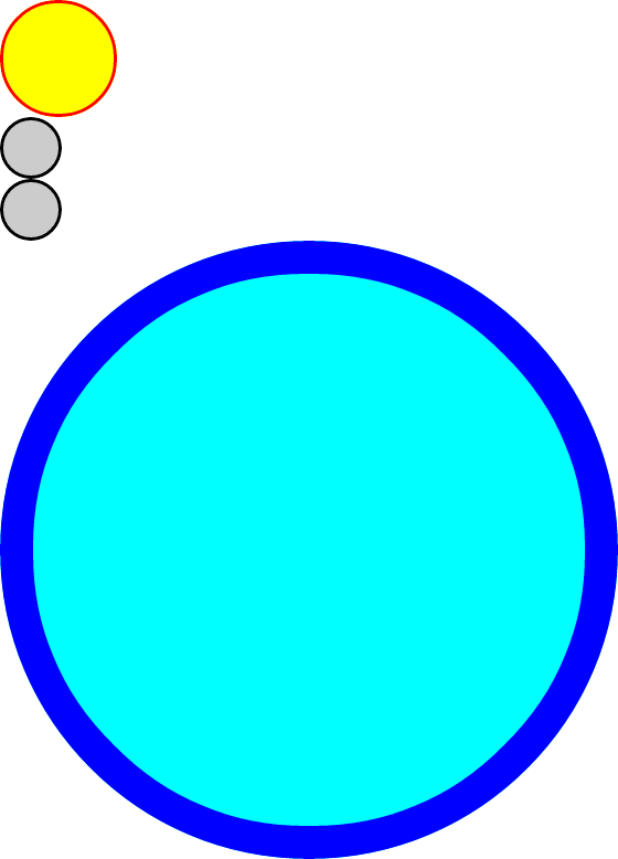
}<div class="circle">Hello I am A Circle</div>Easier way to create circle div than using an image?
Here's a demo: http://jsfiddle.net/thirtydot/JJytE/1170/
CSS:
.circleBase {
    border-radius: 50%;
    behavior: url(PIE.htc); /* remove if you don't care about IE8 */
}

.type1 {
    width: 100px;
    height: 100px;
    background: yellow;
    border: 3px solid red;
}
.type2 {
    width: 50px;
    height: 50px;
    background: #ccc;
    border: 3px solid #000;
}
.type3 {
    width: 500px;
    height: 500px;
    background: aqua;
    border: 30px solid blue;
}
HTML:
<div class="circleBase type1"></div>

<div class="circleBase type2"></div><div class="circleBase type2"></div>

<div class="circleBase type3"></div>
To make this work in IE8 and older, you must download and use CSS3 PIE. My demo above won't work in IE8, but that's only because jsFiddle doesn't host PIE.htc.
My demo looks like this:
How to use CSS to surround a number with a circle?
Here's a demo on JSFiddle and a snippet:
.numberCircle {    border-radius: 50%;    width: 36px;    height: 36px;    padding: 8px;
    background: #fff;    border: 2px solid #666;    color: #666;    text-align: center;
    font: 32px Arial, sans-serif;}
<div class="numberCircle">30</div>Related Topics
What's the Difference Between ≪B≫ and ≪Strong≫, ≪I≫ and ≪Em≫
How to Add a New Line in Textarea Element
Why Does Position:Relative; Appear to Change the Z-Index
Is ≪Img≫ Element Block Level or Inline Level
How to Center a Button Within a Div
Why Is Form Enctype=Multipart/Form-Data Required When Uploading a File
Limit Scope of External CSS to Only a Specific Element
Override Browser Form-Filling and Input Highlighting With Html/Css
Twitter Bootstrap 3 Sticky Footer
How to Create a Template in Html
Get the Value in an Input Text Box
Html Encoding Issues - "Â" Character Showing Up Instead of "&Nbsp;"
How to Remove the Arrow from a Select Element in Firefox
Positions Fixed Doesn't Work When Using -Webkit-Transform
How to Make This Arrow in CSS Only
Why Do Absolute Elements Stack Up on Each Other Instead of Stacking One After the Other