How to display text, a dotted line then more text spanning the width of the page?
I'd suggest that, perhaps, a ul would be one option:
<ul>
    <li><span class="definition">Name:</span><span class="defined">Engineer</span></li>
    <li><span class="definition">Factory location:</span><span class="defined">not invoice address</span></li>
</ul>
CSS:
ul li {
    border-bottom: 2px dotted #ccc;
}

span.defined {
    float: right;
}

span.defined:before {
    content: "(";
}

span.defined:after {
    content: ")";
}
JS Fiddle demo.
Edited to correct the CSS. And the HTML. Oops.
Edited in response to @Leigh's (accurate) comment:
This isn't doing what the OP asked for? This just gives a dotted underline (FF 3.5), not dots between the two pieces of text.
I've adjusted the CSS a little to hide the dotted border under the spans:
ul li {
    border-bottom: 2px dotted #ccc;
    line-height: 2em;
    text-align: right;
    clear: both;
    margin: 0.5em 0 0 0;
}

span.definition {
    float: left;
}

span.defined:before {
    content: "(";
}

span.defined:after {
    content: ")";
}

span {
    display: inline-block;
    border: 2px solid #fff;
    padding: 0;
    margin: 0 0 -2px 0;
}
Admittedly this is only tested in Chrome 8, and Firefox 3.6, Ubuntu 10.10.
Updated JS Fiddle demo.
How can I show dots ( ... ) in a span with hidden overflow?
For this you can use text-overflow: ellipsis; property. Write like this
span {

    display: inline-block;

    width: 180px;

    white-space: nowrap;

    overflow: hidden !important;

    text-overflow: ellipsis;

}
<span>Lorem Ipsum is simply dummy text of the printing and typesetting industry. Lorem Ipsum has been the industry's standard dummy text ever since the 1500s, when an unknown printer took a galley of type and scrambled it to make a type specimen book</span>Working on dotted line span and I can't figure out how to make it same line
Maybe something like this: http://jsfiddle.net/dwCmg/1
Not exactly what you hoped for (different markup), but it seems to work well on all major browsers. The idea is basically to use tables:
HTML:
<div class='definition'>
    <span class='name'>Phone</span>
    <span class='dots'></span>
    <span class='value'>123-4567</span>
</div>
CSS:
.definition {display:table; width:480px;}
.definition > span {display:table-cell; white-space:nowrap;}
.definition > span.dots {width:100%; background: url(http://galeon.sourceforge.net/twiki/pub/TWiki/TWikiDocGraphics/dot_lr.gif) repeat-x 0 180%;}
How to increase space between dotted border dots
This trick works for both horizontal and vertical borders:
/*Horizontal*/
background-image: linear-gradient(to right, black 33%, rgba(255,255,255,0) 0%);
background-position: bottom;
background-size: 3px 1px;
background-repeat: repeat-x;

/*Vertical*/
background-image: linear-gradient(black 33%, rgba(255,255,255,0) 0%);
background-position: right;
background-size: 1px 3px;
background-repeat: repeat-y;
You can adjust the size with background-size and the proportion with the linear-gradient percentages. In this example I have a dotted line of 1px dots and 2px spacing.
This way you can have multiple dotted borders too using multiple backgrounds.
Try it in this JSFiddle or take a look at the code snippet example:
div {

  padding: 10px 50px;

}

.dotted {

  border-top: 1px #333 dotted;

}

.dotted-gradient {

  background-image: linear-gradient(to right, #333 40%, rgba(255, 255, 255, 0) 20%);

  background-position: top;

  background-size: 3px 1px;

  background-repeat: repeat-x;

}

.dotted-spaced {

  background-image: linear-gradient(to right, #333 10%, rgba(255, 255, 255, 0) 0%);

  background-position: top;

  background-size: 10px 1px;

  background-repeat: repeat-x;

}

.left {

  float: left;

  padding: 40px 10px;

  background-color: #F0F0DA;

}

.left.dotted {

  border-left: 1px #333 dotted;

  border-top: none;

}

.left.dotted-gradient {

  background-image: linear-gradient(to bottom, #333 40%, rgba(255, 255, 255, 0) 20%);

  background-position: left;

  background-size: 1px 3px;

  background-repeat: repeat-y;

}

.left.dotted-spaced {

  background-image: linear-gradient(to bottom, #333 10%, rgba(255, 255, 255, 0) 0%);

  background-position: left;

  background-size: 1px 10px;

  background-repeat: repeat-y;

}
<div>no
<br>border</div>
<div class='dotted'>dotted
<br>border</div>
<div class='dotted-gradient'>dotted
<br>with gradient</div>
<div class='dotted-spaced'>dotted
<br>spaced</div>
<div class='left'>no
<br>border</div>
<div class='dotted left'>dotted
<br>border</div>
<div class='dotted-gradient left'>dotted
<br>with gradient</div>
<div class='dotted-spaced left'>dotted
<br>spaced</div>How to create both-sided dotted line around a title?
This solution is adapted from this answer : Line separator under text and transparent background
The dotted line will stay verticaly centered according to the height of the text (font-size, multiple lines) and adapt to the width of the text :
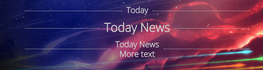
@import url(http://fonts.googleapis.com/css?family=Open+Sans:300);

body{

    background-image: url(http://fr.playstation.com/media/5ZfqPjVF/BigSkyInfinity_Hero_EN.JPG);

    background-repeat:no-repeat;

    background-size:100% auto;

    font-family: 'Open Sans', sans-serif;

}

.divider{

    color:#ccc;

    width:70%;

    margin:20px auto;

    overflow:hidden;

    text-align:center;

    line-height:1.2em;

}

.divider:before, .divider:after{

    content:"";

    vertical-align:middle;

    display:inline-block;

    width:50%;

    border-bottom:2px dotted #ccc;

    margin:0 2% 0 -55%;

}

.divider:after{

    margin:0 -55% 0 2%;

}

h1:nth-child(2){

    font-size:3em;

}

span{

  display:inline-block;

  vertical-align:middle;

  }
<h1 class="divider">Today</h1>
<h1 class="divider">Today News</h1>
<h1 class="divider"><span>Today News<br/>More text<span></h1>CSS - Create a custom dotted line out divs
This is the only solution without using background-image or border-image encoded in base64 or using external files.
https://jsfiddle.net/3r6xsr0m/
html:
<div class="line"></div>
css:
.line:before {
    content: "..................................................................................................";
    display: block;
    font-size: 60px;
    font-family: Georgia;
    color: #aaa;
    max-width: 100%;
    overflow: hidden;
}
Dots may differ depending of browser font rendering algorithm.
Related Topics
How to Save the Content in Uiwebview for Faster Loading on Next Launch
How to Prevent Chrome from Changing Font When Autofilling Username/Password
How to Add Background Image for Input Type="Button"
How to Create a Slanted Background with CSS
Making a Custom Input Text Type
Change the Z Index of Flash Content
Bootstrap 4 - Fullscreen Mobile Navbar
How to Append Leading Zero's to an Ordered Number List? (01 or 001 as Opposed to Just 1)
Why Does Width Apply to a Button with Display Inline
CSS Selector for Empty or Whitespace
Grails: Displaying Created Image in Gsp
How to Add a Background Image on Top of a Previous Background Image
How to Select an Element That Has an Id Which Begins with a Digit
External Style Sheets, Specifying Absolute or Relative Paths