how to make a frosted glass effect?
here is a codepen to it
https://codepen.io/Person2356/pen/ZEvZMKE?editors=1100
the divs with the container and card are what will make it work
html
<body>
<div class="container">
    <div class="card">
        <p><b>hello people </b></p>
    </div>
</div>
How to create a frosted glass effect using CSS?
CSS
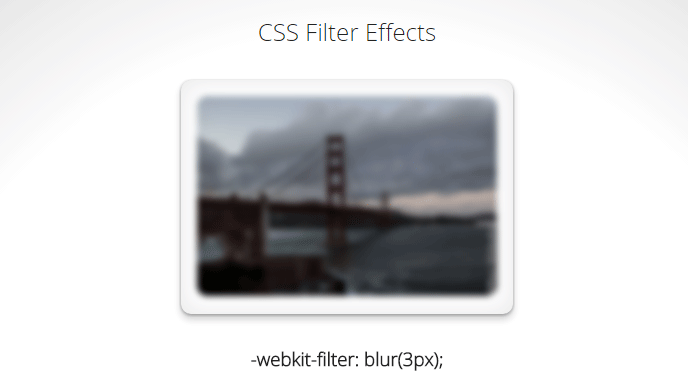
CSS 3 has a blur filter (only webkit at the moment Nov 2014):
-webkit-filter: blur(3px); /*chrome (android), safari (ios), opera*/
IE 4-9 supports a non-standard filter
filter:progid:DXImageTransform.Microsoft.Blur(PixelRadius='3')
See some nice demo for the blur and other filters here.
For future reference here is the compatibility table for CSS filter. Firefox seems to be getting the feature in v35+ while even IE11 does not seem to have any compatibility.
SVG
An alternative is using svg (safe for basically IE9 and up):
filter: url(blur.svg#blur);
SVG:
<svg version="1.1" xmlns="http://www.w3.org/2000/svg">
   <filter id="blur">
       <feGaussianBlur stdDeviation="3" />
   </filter>
</svg>
jsFiddle Demo
Javascript
You will achieve the highest browser compatibility with javascript, but usually the slowest performance and added complexity to your js.
- http://www.blurjs.com/ (jquery plugin, canvas solution so IE9+, FF, Chrome support)
- http://nbartlomiej.github.io/foggy/ (jquery plugin IE8+, FF,Chrome support)
CSS Frosted glass look without backdrop-filter but including radial-gradient
Use CSS variable to store the image and be able to add your gradient:
body {
  --img: url(https://images.unsplash.com/photo-1544306094-e2dcf9479da3);
  background: var(--img) center/cover fixed no-repeat;
  display: grid;
  place-items:center;
  height: 120vh;
}

.container {
  width: 30rem;
  height: 20rem;
  box-shadow: 0 0 1rem 0 rgba(0, 0, 0, .2);
  border-radius: 5px;
  position: relative;
  z-index: 1;
  overflow: hidden;
}

.container:before {
  content: "";
  position: absolute;
  background:
      radial-gradient(transparent, red), /* your background here */
      var(--img) center/cover fixed no-repeat;
  z-index: -1;
  inset:0;
  box-shadow: inset 0 0 2000px rgba(255, 255, 255, .5);
  filter: blur(10px);
  margin: -20px;
}
<div class="container"></div>How to apply frosted glass to multiple elements
For someone who wants to know the answer right away, here is my code snippet which work for my case.
body {  background: url(https://source.unsplash.com/IvfoDk30JnI/1500x1000) no-repeat center center fixed;  background-color: #F8F8F8;  -webkit-background-size: cover;  -moz-background-size: cover;  -o-background-size: cover;  background-size: cover;}
.container-fluid {  max-width: 1000px;}
.navbar-default {  background-color: #fff;}
.post {  color: white;  padding: 15px;  -webkit-box-shadow: 0px 3px 4px 0px rgba(0, 0, 0, 0.03);  -moz-box-shadow: 0px 3px 4px 0px rgba(0, 0, 0, 0.03);  box-shadow: 0px 3px 4px 0px rgba(0, 0, 0, 0.03);}
.blur_box {  z-index: 0;  position: relative;  overflow: hidden;}
.blur_box:before {  content: "";  position: absolute;  width: 300%;  height: 300%;  left: -100%;  top: -100%;  background: url(https://source.unsplash.com/IvfoDk30JnI/1500x1000) no-repeat center center fixed;  filter: blur(20px);  z-index: -2;}
.col-xs-12,.col-sm-6,.col-md-4 {  margin-bottom: 20px;}
<link href="https://maxcdn.bootstrapcdn.com/bootstrap/3.3.7/css/bootstrap.min.css" rel="stylesheet" /><script src="https://ajax.googleapis.com/ajax/libs/jquery/2.1.1/jquery.min.js"></script><script src="https://maxcdn.bootstrapcdn.com/bootstrap/3.3.7/js/bootstrap.min.js"></script>
<div class="container-fluid"> <div class="row"> <div class="col-xs-12 col-sm-6 col-md-4"> <div class="blur_box"> <div class="post"> <h1>Lorem ipsum dolor.</h1> <p>Lorem ipsum dolor sit amet, consectetur adipisicing elit. Error officiis dolore ipsum similique!</p> </div> </div> </div>
<div class="col-xs-12 col-sm-6 col-md-4"> <div class="blur_box"> <div class="post"> <h1>Expedita et, totam.</h1> <p>Eaque quibusdam non veritatis nihil soluta animi repellendus rerum at alias provident, numquam sed. </p> </div> </div> </div> <div class="col-xs-12 col-sm-6 col-md-4"> <div class="blur_box"> <div class="post"> <h1>Voluptatum, odit, ipsam.</h1> <p>Debitis esse minus ad, ex a perspiciatis sunt numquam ullam reiciendis sed similique amet nulla natus quos voluptas, itaque. A dolores asperiores fuga ratione, illum quas quo, doloremque provident repudiandae.</p> </div> </div> </div>
</div>How to get a background frosted glass effect without using background image
there you go.
just see the result.
in fact i suggesting to keep the modal next to the contents that you want to be blurred instead of keep it inside the contents.
body, html {  height: 100%;  margin: 0;  font-family: Arial, Helvetica, sans-serif;}
* {  box-sizing: border-box;}
.bg-image {  filter: blur(8px);  -webkit-filter: blur(8px);  width: 100%;  height: 100%;   }
.bg-text {  background-color: rgb(0,0,0); /* Fallback color */  background-color: rgba(0,0,0, 0.4); /* Black w/opacity/see-through */  color: white;  font-weight: bold;  border: 3px solid #f1f1f1;  position: absolute;  top: 50%;  left: 50%;  transform: translate(-50%, -50%);  z-index: 2;  width: 80%;  padding: 20px;  text-align: center;}
<!DOCTYPE html><html><head><meta name="viewport" content="width=device-width, initial-scale=1"></head><body>
<div class="bg-image">asdaidnasijbadkjhvbafvjhabdf vkjhabdfvk ahjbdfkv hjbfdkv s</div>
<div class="bg-text"> <p>Lorem ipsum dolor sit amet, consectetur adipisicing elit. Veniam sit dolores nam tempore dolore dicta quae fugiat assumenda, obcaecati, quibusdam. Officiis autem perspiciatis pariatur, beatae possimus, nulla nobis adipisci ipsum.</p></div>
</body></html>Frosted glass effect using CSS for h2/h3 background area
I just googled "frosted glass effect" and the second result looked promising: https://css-tricks.com/frosting-glass-css-filters/. It links to codepen: http://codepen.io/adobe/pen/40cd4258f2d72a60f37a5e2f47124b7e
They use a blurred image for the blurry effect. Depending on the browsers you need to support you can use the CSS property filter instead. That way you only need to load the image you want to apply your effect to and not a second with the applied effect.
I made a fiddle for you: https://jsfiddle.net/hwvpch0u/1/
Basically it's mostly all about the following CSS:
.mycontainer {
    background-image: url('<my-image>');
    background-size: cover;
}
.mycontainer .glass {
    /* all the properties for the "stand out" container */
}
.mycontainer .glass::before {
    /*background-image: url('<my-blurry-image');*/ /* see: http://caniuse.com/#search=filter */
    background-image: url('<my-iamge>');
    -webkit-filter: blur(8px); /* blur only of original image is used instead of blurry */
    filter: blur(8px); /* blur only of original image is used instead of blurry */
    background-size: cover;
    opacity: 0.4;
}
In your additionally added screenshot, I cannot see a blur effect. So if you don't need that, you can just apply an background-color having an alpha channel to the "frosted" container above the image, like:
.mycontainer .glass {
    background-color: rgba(255, 255, 255, 0.5);
}
Is there a commonly supported way to make a skewed frosted glass effect in CSS/SVG?
You can consider skew transform without the need of clip-path. here is a basic example where the trick is to specify the correct value of background-position to create the illusion of one image.
.box {  height:300px;  background-image:url(https://picsum.photos/600/800?image=1069);  background-position:left center;  background-size:cover;  position:relative;  overflow:hidden;}.skew,.skew::before{  position:absolute;  top:0;  left:0;  right:0;  bottom:0;  transform-origin:top left;  transform:skewY(30deg);  overflow:hidden;  background-image:inherit;  background-position:inherit;  background-size:0 0;}.skew::before {  content:"";  transform:skewY(-30deg);  filter:blur(10px);  background-size:cover;}
/*to illustrate the separation*/.skew {  border-top:1px solid;}/**/.container {  position:relative;  z-index:1;  margin-top:150px;  padding-left:50px;}
body { margin:0;}
<div class="box"> <div class="skew"></div> <div class="container"> <h1>some text</h1> <p>Lorem ipsum</p> </div></div>
<div class="box" style="background-image:url(https://picsum.photos/600/800?image=3)"> <div class="skew"></div> <div class="container"> <h1>some text</h1> <p>Lorem ipsum</p> </div></div>Create a Frosted glass effect for Image overlay on Web background
First I would put a div on top of that image. This can be achieved by doing something like this
<div class="box">
<img src="yourimage.jpg" />
<div class="top-layer"></div>
</div>

.box{
  position: relative;
}
.top-layer{
  position: absolute;
  top: 0; left: 0;
}
The easiest and most efficient way would probably be creating semi transparent png imitating frosted glass using gimp or photoshop and setting it as background for .top-layer.
If you don't want to use another image and want pure css solution then you should experiment with .top-layer style properties. Try using multiple backgrounds of linear and radial gradients (mixture of white, light blue and transparency), opacity and multiple box shadows.
Those designs should be of some help:
http://dev.opera.com/articles/view/beautiful-ui-styling-with-css3-text-shadow-box-shadow-and-border-radius/
Especially "A certain phone home screen" and "Box 3: They call me Mr. Glass".
Related Topics
Equal Width Columns in CSS Grid
CSS - Inline Elements Ignoring Line-Height
How to Use a Grammar with The HTML 5 Speech Input API
Prevent a Child Element from Overflowing Its Parent in Flexbox
Getting Youtube.Com to Load in Iframe
CSS Way to Horizontally Align Table
Maintain Image Aspect Ratio in Carousel
Xpath to Select Between Two HTML Comments Is Not Working
PHP Mail() - How to Put an HTML Link in an Email
Youtube Video Header Background
Why Does "Position: Absolute; Left: 0; Right: 0; Width: Xypx; Margin: 0 Auto" Actually Center
How to Make Firefox Auto-Refresh on File Change