How to make a sticky footer using CSS?
Following a clean method implemented from an online source no longer available (dead link), the minimum code you should need for your page would be (note - probably best to use #bottom-footer instead of footer #bottom-footer for the selection of your footer - that could be part of the issue):
html {
    position: relative;
    min-height: 100%;
}
body {
    margin: 0 0 100px; /* bottom = footer height */
}
#bottom-footer {
    position: absolute;
    left: 0;
    bottom: 0;
    height: 100px;
    width: 100%;
}
Sticky footer not working correctly with sidebar
You can remove width from footer and add right: 0.
footer {
    bottom: 0;
    margin-left: inherit;
    height: 100px;
    left: 0;
    position: absolute;
    background-color: lightgrey;
    right: 0;
}
Sticky footer is hiding content at the bottom of my website
This is because your content is displayed behind your sticky bar.
You need your container (ie what contain your informations) to have a margin-bottom so it won't display informations behind your sticky content.
So let's say your layout look kind of like this :
<body>
 <div class="container">

   THE CONTENT OF YOUR HTML PAGE

 </div>
 <div class="sticky-footer">
      YOUR STICKY FOOTER, let's say it take 20px as height
 </div>
</body>
You will need to do something like :
.container {
   margin-bottom: 20px; (i.e. the size of you sticky content)
}
Sticky footer bootstrap 4
For different screens you will need to use media queries This will allow you define at each size of your screen how the footer will look.
http://getbootstrap.com/docs/4.0/examples/sticky-footer-navbar/ Is what you need by the looks of things
Look at the code I've provided jsfiddle
<footer class="footer">
  <!-- <div class="container-fluid"> -->
  <nav>
    <li><a href="https://www.facebook.com/lucas.stahl.75">
        <i class="fa fa-facebook"></i>
    </a></li>
    <li><a href="https://twitter.com/LucasStahl11">
        <i class="fa fa-twitter"></i>
    </a></li>

    <li><a href="https://www.linkedin.com/in/lucasstahl">
        <i class="fa fa-linkedin"></i>
        </a></li>
    <li><a href="https://lucasstahl.wordpress.com/">
        <i class="fa fa-wordpress"></i>
        </a></li>

    <li id="copyRight">@Copyright 2018 www.lucasstahl.com</li>
  </nav>
  <!-- </div> -->
</footer>
CSS
  .footer {
    position: absolute;
    bottom: 0;
    width: 100%;
    height: 60px;
    line-height: 60px;
    background-color: yellow;
  }

  nav {
    display: flex;
    list-style: none;
  }
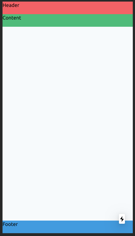
Tailwindcss: fixed/sticky footer on the bottom
<div class="flex flex-col h-screen justify-between">
  <header class="h-10 bg-red-500">Header</header>
  <main class="mb-auto h-10 bg-green-500">Content</main>
  <footer class="h-10 bg-blue-500">Footer</footer>
</div>
Class justify-between is not required, but I would leave him (for other case).
So, play with h-screen and mb-auto classes.
And you get this UI:
How can I have a sticky footer with my CSS Grid layout?
Here is a CSS Grid solution, but it's far better using a class for the target.
Using grid-areas this will be very straight forward:
html, body {
    margin: 0;
    height: 100%;
}
body {
    display: grid;
    grid-gap: 10px;
    grid-template-columns: 1fr;
    grid-template-areas: "nav" "main" "footer";
    grid-template-rows: 100px 1fr 80px;
}
nav {
    background-color: #7E57C2;
    grid-area: nav;
}
main {
    background-color: #F8BBD0;
    grid-area: main;
}
footer {
    background-color: #7E57C2;
    grid-area: footer;
}
<body>
<nav>Some navigation buttons</nav>
<main>The content</main>
<footer>Copyrights and stuff</footer>
</body>Related Topics
How to Fill 100% of Remaining Height
How to Hide/Show a Div When a Button Is Clicked
How to Print a Portion of an HTML Page
How to Tell Browsers to Honor The Jpeg Exif Orientation
Vertical Align Text in Block Element
How to Create a Wavy Shape CSS
Draw Triangle in Corner of Div
How Is HTML5 Webstorage Data Physically Stored
HTML5 Canvas - Fill Circle with Image
HTML5 Audio Not Working on Firefox
Create Line Numbers on Pre with CSS Only
Table Overflowing Outside of Div
How to Add The Text "On" and "Off" to Toggle Button
Bootstrap Full-Width Text-Input Within Inline-Form
File Opens Instead of Downloading in Internet Explorer in a Href Link