How to align caption underneath image
I would set up the code this way:
<figure>
    <img src='http://placehold.it/200x200' alt='missing' />
    <figcaption>Album name goes here
        <br>Year goes here
        <br>artist name goes here</figcaption>
</figure>
and apply the following CSS:
figure {
    display: inline-block;
    border: 1px dotted gray;
    margin: 20px; /* adjust as needed */
}
figure img {
    vertical-align: top;
}
figure figcaption {
    border: 1px dotted blue;
    text-align: center;
}
Because each figure is an inline-block, you can basically repeat the unit three times per row, either adding a <br> after the every third one, or wrapping three in a block element, or using a CSS3 nth-of-type(3n) selector to add a line break or similar.
Use text-align: center on figcaption to align the test to the center.
See demo at: http://jsfiddle.net/audetwebdesign/4njG8/
The results look like this (for a wide enough screen):
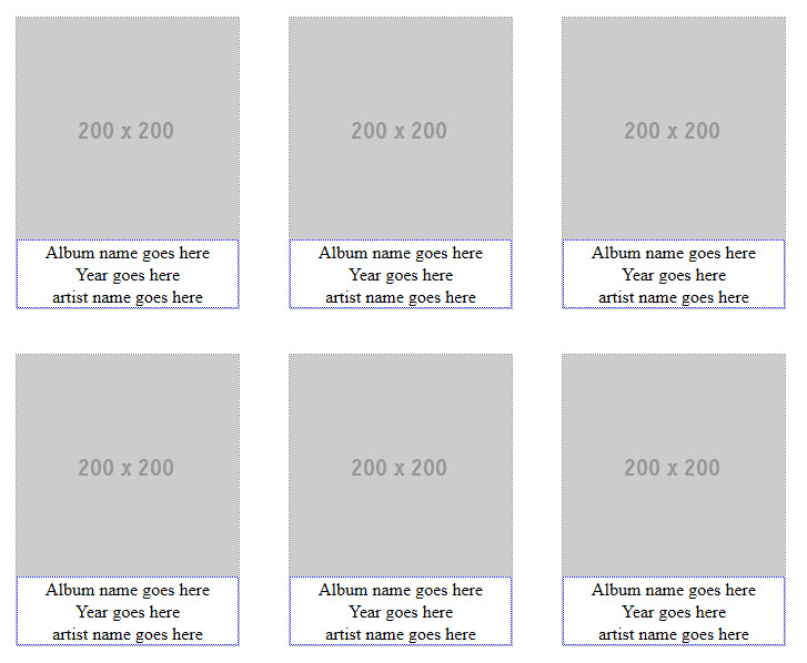
image caption left aligned under centered image
I would use <figure> and <figcaption> with a tiny bit of display: table to get the effect you want.
See this Example
HTML: center image caption relative to image?
If you really mean relative to the image, make the caption element as wide as the image, then center the text. To be able to set a width on the caption element it needs to be a block element, so I changed it from to :
<div style="align: left; text-align:center;">
    <img src="white.jpg" height="31px" width="200px" />
    <div class="caption">Some caption text</div>
</div>

.caption {
    width: 200px;
    text-align: center;
}
You might set the width with inline CSS if that is easier.
<div style="align: left; text-align:center;">
    <img src="white.jpg" height="31px" width="200px" />
    <div class="caption" style="width: 200px">Some caption text</div>
</div>

.caption {
    text-align: center;
}
Centering and aligning width of figcaption tag on image in figure tag
Original Solution
figure .image {
    width: 100%;
}

figure {
    text-align: center;
    display: table;
    max-width: 30%; /* demo; set some amount (px or %) if you can */
    margin: 10px auto; /* not needed unless you want centered */
}
The key is to set some kind of max-width for the img on the figure element if you can, then it will keep both it and the text constrained.
See an example fiddle.
If You are Programmatically Reading the Width
First, this <figure width="{{story.pic.width_field}}"> should be this <figure style="width: {{story.pic.width_field}};">.
Second, do only this css (nothing else needed for img or figcaption; see fiddle):
figure {
    text-align: center;
    margin: 10px auto; /* not needed unless you want centered */
}
Really small images with long text are still going to have issues, as this fiddle shows. To make it at least look clean, you might check for some minimum size of the img and if it too small (say, 100px), then instead of setting width on the figure set min-width to the img size and set a max-width to your threshold of 100px like this fiddle shows.
Center a caption under an image in bootstrap column
Use the Bootstrap center-block class..
<div class="caption center-block">Test</div>
http://codeply.com/go/UD1wOD7iLW
How to position figcaption under the image
remove float: left from img and figcaption tag. instead use float for aside and as per width, use it on aside
https://jsfiddle.net/Ls6coLb7/3/ here is the updated fiddle
align 2 images side by side and make their caption underneath them
Here's an updated solution, though not the most elegant, but I tried to keep as much of your original markup and css as possible. I also added a media query for smaller screens. This solution uses static widths in order to have some parity between the two photos....I don't think using img is ever going to give you the desired result.
Make sure to run 'full page'...there is a media query in there that will stack images in smaller viewports.
 .container {
            display: inline-flex;
        }

        @media (max-width: 900px) {
            .container {
                display: flex;
                flex-direction: column;
            }
        }

        #img-div1 {
            background: white;
            margin: 0 24px;
            background-image: url("https://www.wearethemighty.com/app/uploads/legacy/assets.rbl.ms/17317425/origin.jpg");
            background-size: cover;
            width: 550px;
            height: 300px;
        }

        #img-div2 {
            background: white;
            margin: 0 24px;
            background-image: url("https://arc-anglerfish-arc2-prod-advancelocal.s3.amazonaws.com/public/MIE5YDG625EFNGPHMVLSL3JDKM.jpg");
            background-size: cover;
            width: 550px;
            height: 300px;
        }

        #img-caption {
            margin: 10px 0 5px 0;
            text-align: center;
        }

        @media (max-width: 460px) {
            #img-caption {
                font-size: 1.4rem;
            }
        }
<!DOCTYPE html>
<html>
<head>
<meta charset="UTF-8">
<meta name="viewport"
content="width=device-width, initial-scale=1.0, maximum-scale=1.0, user-scalable=no, shrink-to-fit=no" />
</head>
<body>
<div class="container">
<figure>
<div id="img-div1">
</div>
<div id="img-caption">
A drawing for Sadam husain represents the period of his reign.
</div>
</figure>
<figure>
<div id="img-div2">
</div>
<div id="img-caption">
Sadam husain inside the court.
</div>
</figure>
</div>
</body>
</html>Related Topics
Change Navbar Breakpoint in Bootstrap 3.3.2
Equal Height Flexbox Columns in Chrome
How to Give The Col-Md-1.5 in Bootstrap
Web Link to Specific Whatsapp Contact
How to Center a Checkbox in a Table Cell
Why Does Angularjs Ng-View Not Work Locally
Is There a Web Service for Converting HTML to Pdf
Why Do HTML Entity Names with Dec < 255 Not Require Semicolon
How to Control The Width of Select Tag
How to Allow Text to Wrap Inside a Word If Necessary
How to Add an Offsetted Outline to a CSS Shape
How to Center a Navigation Bar with CSS or HTML
How to Display HTML Tags as Text
How to Force Horizontal Scrolling in an HTML List Using CSS
Why Does Display:Block Not Stretch Buttons or Input Elements