CSS: Workaround to backdrop-filter?
As of Chrome M76, backdrop-filter is now shipped, unprefixed, and without a needed flag.
https://web.dev/backdrop-filter/
NOTE: (since this answer keeps getting downvoted because Mozilla hasn’t yet shipped it): this feature is available in Safari, Chrome, and Edge, but not yet in Firefox. Mozilla is planning to ship it very soon, but hasn’t yet. So this answer doesn’t contain a “workaround” but simply more information about which browsers require a workaround. Which still seems like useful information.
Why backdrop filter in Firefox don't work?
Its not supported by default https://caniuse.com/css-backdrop-filter
However you can activate it manually.
Navigate to about:config and set it to true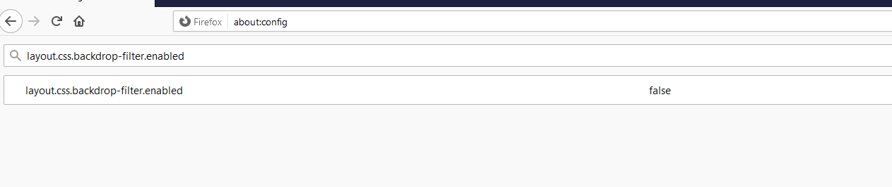
Backdrop-filter doesn't work on Safari (most of the times)
This is a redraw/repaint bug. I've had similar, where the backdrop filter doesn't display until you trigger a redraw by editing something in the devtools for example.
For my use case, I waited until transitionend before triggering a repaint
setTimeout(() => {
  el.style.display = "table";
  el.offsetHeight;
  el.style.display = "block";
});
There are other methods of course for triggering it, but that should point you in the right direction.
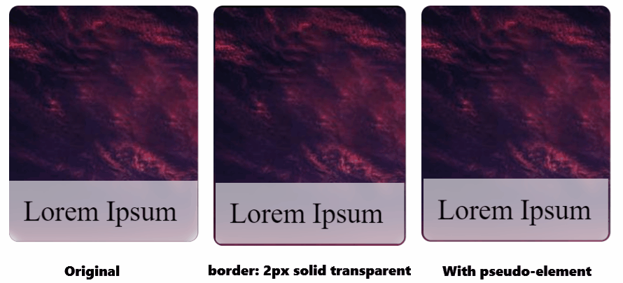
Flickering backdrop filter blur on scaling
You can try to using border: 2px solid transparent; for the entire card, this will prevent flickering, but you will get a border instead of a flickering effect. If you try to change the color of the border, you will get back a flikering effect.
Another way, more complicated, you will need to add a pseudo-element to the card-details class, then move backdrop-filter, background-color to the pseudo-element.
UPDATED
It also works with padding: 2px instead of border: 2px solid transparent;
body {
  display: flex;
  justify-content: center;
  gap: 1rem;
}

.card,
.card2,
.card3 {
  width: 200px;
  height: 250px;
  border-radius: 10px;
  display: flex;
  flex-direction: column;
  justify-content: flex-end;
  overflow: hidden;
  background-image: url('https://cdn.pixabay.com/photo/2015/04/23/22/00/tree-736885__480.jpg');
  /* margin: 25px; */
  transition: transform 0.5s;
  will-change: transform;
}

.card2 {
  border: 2px solid transparent; /* trick */
}

.card:hover,
.card2:hover,
.card3:hover {
  transform: scale(1.05);
}

.card-details {
  background-color: rgb(255 255 255/60%);
  backdrop-filter: blur(5px);
  padding: 15px;
  font-size: 30px;
}

.card-details3 {
  padding: 15px;
  border-radius: 0 0 8px 8px;
  border: 2px solid transparent; /* trick */
  font-size: 30px;
  position: relative;
}

.card-details3::after {
  content: '';
  position: absolute;
  inset: 0;
  background-color: rgb(255 255 255/60%);
  backdrop-filter: blur(5px);
  border-radius: inherit;
  z-index: -1;
}
<div class="card">
<div class="card-details">Lorem Ipsum</div>
</div>
<div class="card2">
<div class="card-details">Lorem Ipsum</div>
</div>
<div class="card3">
<div class="card-details3">Lorem Ipsum</div>
</div>Related Topics
Internet Explorer 11 Disable "Display Intranet Sites in Compatibility View" via Meta Tag Not Working
How to Get the Collection of Model State Errors in ASP.NET MVC
How to Increase a Scrollbar's Width Using CSS
All Widths Set to Width of Widest Element
How to Use Use Text as the Background with CSS
Remove Background Arrow from Date Input in Google Chrome V20
Form and File Upload with HTMLservice and App Script Not Working
Webgl: Prevent Color Buffer from Being Cleared
Low Latency (< 2S) Live Video Streaming HTML5 Solutions
Is It Bad to Use Uppercase Letters for HTML Tags
Css: Workaround to Backdrop-Filter
Add Hyperlink to Textblock Wpf
Using Z-Index to Get Div Above Another Div
Exclude Menu Item from the Collapse of Bootstrap 3 Navbar
Gmail Blocking Small Embedded Inline Images in Email Template