CSS horizontal scroll
You can use display:inline-block with white-space:nowrap. Write like this:
.scrolls {
    overflow-x: scroll;
    overflow-y: hidden;
    height: 80px;
    white-space:nowrap;
}
.imageDiv img {
    box-shadow: 1px 1px 10px #999;
    margin: 2px;
    max-height: 50px;
    cursor: pointer;
    display:inline-block;
    *display:inline;/* For IE7*/
    *zoom:1;/* For IE7*/
    vertical-align:top;
 }
Check this http://jsfiddle.net/YbrX3/
Horizontal scroll css?
Just set your width to auto:
#myWorkContent{
    width: auto;
    height:210px;
    border: 13px solid #bed5cd;
    overflow-x: scroll;
    overflow-y: hidden;
    white-space: nowrap;
}
This way your div can be as wide as possible, so you can add as many kitty images as possible ;3
Your div's width will expand based on the child elements it contains.
jsFiddle
Horizontal scrolling in mobile view in html/css
Try adding flex none to the divs so that their size is preserved and a media query where you want desktop to start.
.images {
    display: flex;
    align-items:center;
    background-color: #eee;
    padding: 1rem;
    overflow-x: scroll;
}

.images > div {
    flex: none;
    max-width: 100%;
    padding-left: 15px;
    padding-right: 15px;
}

.images img {
    max-width:100%;
    width: 100%;
}

@media (min-width: 960px) {

  .images {
     overflow-x: visible;
  }

  .images > div {
    flex-basis: 0;
    flex-grow: 1;
   }
}
horizontal scroll cutting items off
Answer is very simple. You can not scroll to the left past the beginning of the page. Y-axis scrolling begins at 0 and goes on to the end of the content, if you add more content it goes further, but if you move content up with lets say top: -5000px scrolling area will not be expanded, everything below 0 just gets cut off. Same with X-axis, everything on the left below 0 gets cut off.
Your main div has justify-content: center; style which puts your layout div always in the center, no matter how big it is. When main div is smaller then layout div, since layout has min-width: 1000px; it puts it to the center and as result everything on the left gets cut off.
Main div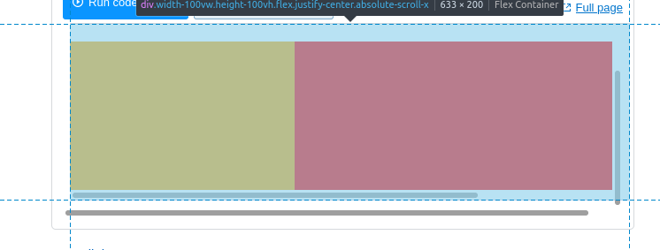
Layout div (centered)
Bigger than Main div. Extends to the right and left, since it is centered, but everything to the left can not be reached with scrolling. Scrolling does not go below 0.
Left side element
Is actually correct size, but looks smaller because can not be accessed via scrolling.
In your case everything can be fixed by just removing justify-center from main div.
CSS show horizontal scroll bars?
As stated in the comments, OSX hides scrollbars by default.
There are a few CSS options which explicitly work for osX/Chrome in order to handle ScrollBar behaviour/appearance:
.frame::-webkit-scrollbar {
    -webkit-appearance: none;
}

.frame::-webkit-scrollbar:horizontal {
    height: 11px;
}

.frame::-webkit-scrollbar-thumb {
    border-radius: 8px;
    border: 2px solid white;
    background-color: rgba(0, 0, 0, .5);
}
.frame::-webkit-scrollbar-track {
    background-color: #fff;
    border-radius: 8px;
}
JsFiddle: https://jsfiddle.net/peanut/zvskLcef/
Horizontally scrolling cards with a sticky card
Add an overflow to the wrapper/container class (<div class="d-flex flex-row flex-nowrap bg-warning">).
.d-flex.flex-row.flex-nowrap.bg-warning {
    overflow: auto;
}
You can find other options here.
How remove the horizontal scroll bar in tailwind css?
I'm currently experimenting as well with the scroll snap feature and tailwindcss in general. I got rid of the scroll bar with adding an additional CSS class as I haven't found yet the corresponding tailwind class.
/* Hide scrollbar for Chrome, Safari and Opera */
.container-snap::-webkit-scrollbar {
    display: none;
}

/* Hide scrollbar for IE, Edge and Firefox */
.container-snap {
    -ms-overflow-style: none; /* IE and Edge */
    scrollbar-width: none; /* Firefox */
}
So with regard to your code the scroll bar will dissappear when you add the .container-snap class to the ul element:
<div class="relative mt-32">
<h1 class="text-5xl font-extrabold tracking-tight text-center underline capitalize decoration-emerald-400">Get away this winter</h1>
<ul class="container-snap mt-10 pb-8 px-[50vw] w-full flex gap-8 snap-x overflow-x-auto self-center">

    <li class="snap-center">
        <div class="relative flex-shrink-0 max-w-[95vw] overflow-hidden rounded-3xl">
            <img src="https://images.unsplash.com/photo-1542144612-1b3641ec3459?ixlib=rb-1.2.1&ixid=MnwxMjA3fDB8MHxleHBsb3JlLWZlZWR8NHx8fGVufDB8fHx8&auto=format&fit=crop&w=500&q=60" alt="" class="absolute inset-0 object-cover object-bottom w-full h-full " />
            <div class="absolute inset-0 w-full h-full bg-gradient-to-br from-black/75"></div>

            <div class=" relative h-96 w-[768px] p-12 flex flex-col justify-between items-start">
                <div>
                    <p class="font-medium text-stone-50">Destination</p>
                    <h2 class="w-2/3 mt-3 text-3xl font-semibold tracking-tight text-white">amit deka</h2>
                </div>

                <a href="#" class="px-4 py-3 text-sm font-medium bg-white rounded-lg text-slate-900"> browse</a>
            </div>
        </div>
    </li>

    <li></li>*4 times
</ul>
Related Topics
How to Embed a Swf File in an HTML Page
Correct Way to Use Modernizr to Detect Ie
Input With Display:Block Is Not a Block, Why Not
Html5Shiv VS Dean Edwards IE7-Js VS Modernizr - Which to Choose
How to Get a Specific Number Child Using CSS
Is HTML Considered a Programming Language
Is It Considered Bad Practice to Use Absolute Positioning
How to Hide Columns in HTML Table
Set Date Input Field's Max Date to Today
How to Change the Default Index Page in Apache
HTML + CSS: Ordered List Without the Period
Conditional HTML Attributes Using Razor MVC3
Bootstrap: Add Margin/Padding Space Between Columns
How to Add an Element After Another Element
Why Does Chrome Incorrectly Determine Page Is in a Different Language and Offer to Translate