CSS shape with inset curve and transparent background
You can use a pseudo element with border-radius and background-shadows to create the curve and enable a transparent background for the curve.
Output :
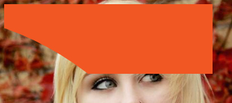
#shape {  width: 300px; height: 100px;  position: relative;  overflow: hidden;}
#shape:before {  content: '';  position: absolute;  top: 10%; right: 0;  width: 300%;  padding-bottom: 300%;  border-radius: 100%;  background: none;  box-shadow: 10px -10px 5px 300px #F15723;  z-index: -1;}
body{background:url(https://farm9.staticflickr.com/8461/8048823381_0fbc2d8efb.jpg);background-size:cover;}
<div id="shape"></div>How can I create an inset curved background that works with a background gradient and overlapping transparent shapes?
Here is how I would attempt it. It will probably take a bit of finessing to make it work for your site, but hopefully you can see the technique I used.
Basically you are using divs as the background to content and translating them to overlay. Then putting any content in a container that you can change the z-index on to bring above everything else. The curve itself is just a border-radius of 50% and skewed wider than tall. Then the content's parent div has the gradient color background.
I do like the simplicity of Temani's solution though.
/* top ellipse */.top {  border-radius: 50%;  width: 150%;  height: 200px;  transform: translate(-15%, 20%);  background: white;}
/* content's parent container */.mid {  padding: 4rem;  background: linear-gradient(-20deg, #3adecf, #3ae3c5);}
.content {  position: relative;  z-index: 20;  color: white;  font-size: 30px;}
/* bottom ellipse */.bottom {  border-radius: 50%;  width: 200%;  height: 200px;  transform: translate(-25%, -20%);  background: white;}
.all {  overflow-y: hidden;  position: relative;}
.t-circle {  background: #00ccdd;  position: absolute;  top: 5%;  right: -200px;  z-index: 10;  width: 400px;  height: 400px;  border-radius: 50%;  opacity: 0.2;  pointer-events: none;}
<div class="all"> <div class="top">Top</div> <div class="mid"> <div class="content"> Lorem ipsum dolor sit amet, consectetur adipiscing elit. Quisque sapien mauris, efficitur in nisi vel, gravida mollis urna. Praesent ac sem vitae neque pretium ultricies. Vestibulum id mattis neque. Nullam ultricies neque eget metus volutpat, et tempus magna commodo. Phasellus accumsan lacus nibh, at commodo elit pellentesque at. Morbi iaculis bibendum massa, sit amet accumsan felis ullamcorper a. Praesent luctus odio vel tortor finibus feugiat. Sed luctus finibus nisl, in pellentesque orci efficitur ut. Curabitur suscipit elementum aliquam. Sed vel convallis urna. <br><br> Phasellus porttitor blandit ornare. Orci varius natoque penatibus et magnis dis parturient montes, nascetur ridiculus mus. Etiam elementum rhoncus diam ac rhoncus. Nunc sed lorem porttitor, placerat sem vitae, bibendum nunc. Ut dolor mi, condimentum vitae leo in, suscipit maximus risus. Morbi consequat dui eros, sit amet dapibus urna porta tempor. Fusce mollis a velit nec auctor. Donec semper elementum feugiat. Pellentesque habitant morbi tristique senectus et netus et malesuada fames ac turpis egestas. Pellentesque vel turpis pellentesque, ultricies metus blandit, interdum nibh. Duis malesuada dolor lacus, quis tempor erat elementum in. Pellentesque at consequat nisl. Vestibulum vel urna nec ipsum interdum pellentesque id nec magna. Mauris eu lectus posuere, aliquet justo id, pharetra nisl. </div> </div> <div class="bottom">bottom</div> <div class="t-circle"></div></div>How to make this rounded shape with css
You can try :before or :after pseudo element and box-shadow as shown below.
body {  background: #007aff;  padding: 40px;  margin: 0;}.box {  position: relative;  overflow: hidden;  height: 100px;  width: 100px;}
.box:before {  box-shadow: 0 0 0 100px #fff;  position: absolute;  border-radius: 100%;  margin-left: -60px;  height: 200px;  content: '';  width: 120px;  left: 50%;  bottom: 0;}
<div class="box"></div>How do I make top and bottom of a section curved inwards instead of outwards using html and css with an image in as the background?
You can use the same path and rotate it by 180 degrees, then absolutely position it on the bottom of the section. To make sure the elements heights fits I had to add an explicit heights on the section element.
section {
    margin: 60px 0;
    height: 400px;
    position: relative;
}
#statistics {
  background: url(https://codropspz-tympanus.netdna-ssl.com/codrops/wp-content/uploads/2015/01/blend-mode-example-screenshot.png);
  background-size: cover;
  background-attachment: fixed;
  background-position: center;
}
#bigHalfCircleCandyBottom {
  transform: rotate(180deg);
  position: absolute;
  bottom: 0;
  left: 0;
}
<section id="statistics" data-dir="up" class="statistics-section text-white parallax">
<svg id="bigHalfCircleCandy" version="1.1" width="100%" height="100" viewBox="0 0 100 100" preserveAspectRatio="none" style="fill:#ffffff;padding:0;">
<path d="M0 0 C55 180 100 0 100 0 Z"></path>
</svg>
<svg id="bigHalfCircleCandyBottom" version="1.1" width="100%" height="100" viewBox="0 0 100 100" preserveAspectRatio="none" style="fill:#ffffff;padding:0;">
<path d="M0 0 C55 180 100 0 100 0 Z"></path>
</svg>
</section>How to shape a div corner in css
You can hack using multiple elements like this:
.d1 {  width: 100px;  height: 100px;  background-color: #00f;}
.wrapper {  width: 100px;  height: 20px;  background-color: #fff;  margin-top: -20px;}
.d2 {  width: 100%;  height: 100%;  border-radius: 50%;  background-color: #00f;}
.wrapper2 {  width: 100px;  height: 10px;  background-color: #00f;  margin-top: -20px;  position: absolute;}
<div class="d1"></div><div class="wrapper"> <div class="d2"></div></div><div class="wrapper2"></div>Make hexagon shape with border, rounded corners and transparent background
Hexagon with rounded corners are complex shapes to create and I usually recommend using SVG for creating them. The need for a transparent background makes it even more better suited for SVG. With SVG you can get better control over the shape, its curves etc and you don't have to add a lot of extra (unnecessary) elements to your markup also.
All that is needed for creating this shape with SVG is to use a single path element along with a few L (line) and A (arc) commands. The L (line) command basically draws a line from point 1 to point 2 whereas the A (arc) command draws an arc of the specified radius (the first two values immediately following the A command).
You can read more about the SVG path element and its commands in this MDN tutorial.
svg {  height: 200px;  width: 240px;}path {  stroke: #777;  fill: none;}
body {  background: black;}
<svg viewBox='0 0 120 100'> <path d='M38,2 L82,2 A12,12 0 0,1 94,10 L112,44 A12,12 0 0,1 112,56 L94,90 A12,12 0 0,1 82,98 L38,98 A12,12 0 0,1 26,90 L8,56 A12,12 0 0,1 8,44 L26,10 A12,12 0 0,1 38,2' /></svg>How to create that background on my page with css
try this
.yourtag {

 background: radial-gradient(circle at 91% 50%, transparent 35%, red 15px);

}
fiddle - https://jsfiddle.net/p0ctco0m/1/
Inset border-radius shape in CSS?
I have created a little something. There is probably a better solution, but maybe this helps.
jsFiddle
CSS:
.bubble {
    width: 200px;
    height: 30px;
}

.bubble .content {
    background: #00f;
    height: 100%;
    border-top-left-radius: 10px;
    border-bottom-left-radius: 10px;
    margin-right: 20px;
}

.bubble .blue,
.bubble .white,
.bubble .white .innerwhite {
    width: 10px;
    height: 100%;
    float: right;
}

.bubble .blue {
    background: #00f;
    border-top-right-radius: 10px;
}

.bubble .white {
    background: #00f;
}

.bubble .white .innerwhite {
    background: #fff;
    border-bottom-left-radius: 10px;
}
HTML:
<div class="bubble">
    <div class="white">
        <div class="innerwhite"></div>
    </div>
    <div class="blue"></div>
    <div class="content"></div>
</div>
Related Topics
:Before &&: After Pseudo Elements Not Showing Firefox
Valid Order for Attributes of Input Type Tag
CSS Align Images and Text on Same Line
Purpose of The Crossorigin Attribute...
How to Semantically Provide a Caption, Title or Label for a List in HTML
How to Create Curved & Overlapping Menu Tabs in CSS
Vertically Align Div (No Tables)
"Attribute Name Not Allowed on Element Div at This Point"
How to Nest Form Tags in Other Form Tags
Change Text Color If Background Image Is Not White
How to Make Clickable Anchor in Contenteditable Div
Display: Flex Not Working on Internet Explorer
Gradient Colors in Internet Explorer
Bootstrap Row Class Contains Margin-Left and Margin-Right Which Creates Problems
Download Attribute with a File Name Not Working
Why Is Chrome Showing a "Please Fill Out This Field" Tooltip on Empty Fields