Detecting whether there's overflow or not WITHOUT javascript
100% height solution
Here's a version of this solution for 100% height - so when content tries to take up more than the whole page, you get a "more..." link. This works fine in all browsers.
http://jsfiddle.net/nottrobin/u3Wda/1/
I've used JavaScript only for the "Add another row" control - for demo purpoes. There is no JavaScript used in the actual solution.
Caveat:
- Since the height of the user's browser is variable, there is no way to ensure that lines won't appear cut in half at the point of the "more" link, or that the "more" link will be completely visible.
Original solution
Make the container element overflow: hidden and give it a max-height. Then put your "more" link inside that container element, with position: absolute so it's just inside that max-height. Now the "more" link won't be shown unless the content inside the container pushes the container to its max-height.
If you're careful with your line-heights then you should be able to prevent any lines from being chopped in half.
Example:
Just enough text: http://jsfiddle.net/nottrobin/MrAKv/17/
Too much text: http://jsfiddle.net/nottrobin/MrAKv/16/
The shorter version will only work in browsers that support max-height:
http://caniuse.com/#search=max-height
If you need IE6 support, use this slightly less succinct solution:
http://jsfiddle.net/nottrobin/MrAKv/18/
(Disclaimer - only tested in Google Chrome)
HTML text-overflow ellipsis detection
Once upon a time I needed to do this, and the only cross-browser reliable solution I came across was hack job. I'm not the biggest fan of solutions like this, but it certainly produces the correct result time and time again.
The idea is that you clone the element, remove any bounding width, and test if the cloned element is wider than the original. If so, you know it's going to have been truncated.
For example, using jQuery:
var $element = $('#element-to-test');
var $c = $element
           .clone()
           .css({display: 'inline', width: 'auto', visibility: 'hidden'})
           .appendTo('body');

if( $c.width() > $element.width() ) {
    // text was truncated.
    // do what you need to do
}

$c.remove();
I made a jsFiddle to demonstrate this, http://jsfiddle.net/cgzW8/2/
You could even create your own custom pseudo-selector for jQuery:
$.expr[':'].truncated = function(obj) {
  var $this = $(obj);
  var $c = $this
             .clone()
             .css({display: 'inline', width: 'auto', visibility: 'hidden'})
             .appendTo('body');

  var c_width = $c.width();
  $c.remove();

  if ( c_width > $this.width() )
    return true;
  else
    return false;
};
Then use it to find elements
$truncated_elements = $('.my-selector:truncated');
Demo: http://jsfiddle.net/cgzW8/293/
Hopefully this helps, hacky as it is.
CSS Check If Element Is Overflowing Then Animate Back And Forth
Although a max width is set it is not being taken up on the smaller text - notice the widths of both examples are the same.
This snippet gives both the div and the h3 a position so that the widths are taken up and the div is set to have width fit-content (it will still obey the max-width).
The animation needs to take into account both the width of the container and the width of the text. It therefore uses left positioning and transition. For the shorter text they balance out so there is no movement. For the longer text the amount of movement is just the extra length of the text compared to the container.
.animated {
  position: relative;
  white-space: nowrap;
  max-width: 200px;
  overflow: hidden;
  background: #0c0c0c;
  display: inline-block;
  width: fit-content;
  position: relative;
}

.text-animated {
  color: #fff;
  animation: backAndForth 5s linear infinite;
  display: inline-block;
  position: relative;
}

@keyframes backAndForth {
  0% {
    transform: translateX(0);
    left(0);
  }
  10% {
    transform: translateX(0);
    left: 0;
  }
  45% {
    transform: translateX(calc(-100%));
    left: 100%;
  }
  55% {
    transform: translateX(calc(-100%));
    left: 100%;
  }
  90% {
    transform: translateX(0);
    left: 0;
  }
  100% {
    transform: translateX(0);
    left: 0;
  }
}
<div class="animated">
<h3 class="text-animated">
Some Short Text
</h3>
</div>
<span>Must be fixed</span>
<br><br><br>
<div class="animated">
<h3 class="text-animated">
Some Long And Bigger Text To Animate
</h3>
</div>
<span>Must be Animated to view all text</span>Text overflow ellipsis on two lines
I'm not sure if you have seen this article, but Chris Coyier's excellent CSS-Tricks.com posted a link to this a while back and it's a pure CSS solution that accomplishes exactly what you seek.
(Click to View on CodePen)
html,
body,
p {
  margin: 0;
  padding: 0;
  font-family: sans-serif;
}

.ellipsis {
  overflow: hidden;
  height: 200px;
  line-height: 25px;
  margin: 20px;
  border: 5px solid #AAA;
}

.ellipsis:before {
  content: "";
  float: left;
  width: 5px;
  height: 200px;
}

.ellipsis>*:first-child {
  float: right;
  width: 100%;
  margin-left: -5px;
}

.ellipsis:after {
  content: "\02026";
  box-sizing: content-box;
  -webkit-box-sizing: content-box;
  -moz-box-sizing: content-box;
  float: right;
  position: relative;
  top: -25px;
  left: 100%;
  width: 3em;
  margin-left: -3em;
  padding-right: 5px;
  text-align: right;
  background-size: 100% 100%;
  /* 512x1 image,gradient for IE9. Transparent at 0% -> white at 50% -> white at 100%.*/
  background-image: url(data:image/png;base64,iVBORw0KGgoAAAANSUhEUgAAAgAAAAABCAMAAACfZeZEAAAABGdBTUEAALGPC/xhBQAAAwBQTFRF////////////////////////////////////////////////////////////////////////////////////////////////////////////////////////////////////////////////////////////////////////////////////////////////////////////////////////////////////////////////////////////////////////////////////////////////////////////////////////////////////////////////////////////////////////////////////////////////////////////////////////////////////////////////////////////////////////////////////////////////////////////////////////////AAAA////////////////////////////////////////////////////////////////////////////////////////////////////////////////////////////////////////////////////////////////////////////////////////////////////////////////////////////////////////////////////////////////////////////////////////////////////////////////////////////////////////////////////////////////////////////////////////////////////////////////////////////////////////////////////////////////////////////////////////////////////////////////////////////////wDWRdwAAAP90Uk5TgsRjMZXhS30YrvDUP3Emow1YibnM9+ggOZxrBtpRRo94gxItwLOoX/vsHdA2yGgL8+TdKUK8VFufmHSGgAQWJNc9tk+rb5KMCA8aM0iwpWV6dwP9+fXuFerm3yMs0jDOysY8wr5FTldeoWKabgEJ8RATG+IeIdsn2NUqLjQ3OgBDumC3SbRMsVKsValZplydZpZpbJOQco2KdYeEe36BDAL8/vgHBfr2CvTyDu8R7esU6RcZ5ecc4+Af3iLcJSjZ1ivT0S/PMs3LNck4x8U7wz7Bv0G9RLtHuEq1TbJQr1OtVqqnWqRdoqBhnmSbZ5mXapRtcJGOc4t2eYiFfH9AS7qYlgAAARlJREFUKM9jqK9fEGS7VNrDI2+F/nyB1Z4Fa5UKN4TbbeLY7FW0Tatkp3jp7mj7vXzl+4yrDsYoVx+JYz7mXXNSp/a0RN25JMcLPP8umzRcTZW77tNyk63tdprzXdmO+2ZdD9MFe56Y9z3LUG96mcX02n/CW71JH6Qmf8px/cw77ZvVzB+BCj8D5vxhn/vXZh6D4uzf1rN+Cc347j79q/zUL25TPrJMfG/5LvuNZP8rixeZz/mf+vU+Vut+5NL5gPOeb/sd1dZbTs03hBuvmV5JuaRyMfk849nEM7qnEk6IHI8/qn049hB35QGHiv0yZXuMdkXtYC3ebrglcqvYxoj1muvC1nDlrzJYGbpcdHHIMo2FwYv+j3QAAOBSfkZYITwUAAAAAElFTkSuQmCC);
  background: -webkit-gradient(linear, left top, right top, from(rgba(255, 255, 255, 0)), to(white), color-stop(50%, white));
  background: -moz-linear-gradient(to right, rgba(255, 255, 255, 0), white 50%, white);
  background: -o-linear-gradient(to right, rgba(255, 255, 255, 0), white 50%, white);
  background: -ms-linear-gradient(to right, rgba(255, 255, 255, 0), white 50%, white);
  background: linear-gradient(to right, rgba(255, 255, 255, 0), white 50%, white);
}
<div class="ellipsis">
<div>
<p>
Call me Ishmael. Some years ago – never mind how long precisely – having little or no money in my purse, and nothing particular to interest me on shore, I thought I would sail about a little and see the watery part of the world. It is a way I have of
driving off the spleen, and regulating the circulation. Whenever I find myself growing grim about the mouth; whenever it is a damp, drizzly November in my soul; whenever I find myself involuntarily pausing before coffin warehouses, and bringing
up the rear of every funeral I meet; and especially whenever my hypos get such an upper hand of me, that it requires a strong moral principle to prevent me from deliberately stepping into the street, and methodically knocking people's hats off –
then, I account it high time to get to sea as soon as I can.
</p>
</div>
</div>Text overflow '...' in article summary
I am not sure if you can set 'ellipsis' (or similar) at the end of text in box with fixed height, but here is a great looking solution for your problem..
Create new element with (for example):
position: absolute;
bottom: 0;
left: 0;
width: 100%;
height: 2rem;
box-sizing: border-box;
background-image: linear-gradient(rgba(255,255,255,.1),white 75%);
and put it inside of 'description' element. Also, don't forget to set position: relative; for your description element.
Here is a working fiddle.. hope it will help you:
https://jsfiddle.net/hmyqrmzs/
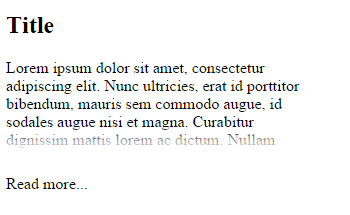
Screenshot example:
CSS text-overflow in a table cell?
To clip text with an ellipsis when it overflows a table cell, you will need to set the max-width CSS property on each td class for the overflow to work. No extra layout div elements are required:
td
{
 max-width: 100px;
 overflow: hidden;
 text-overflow: ellipsis;
 white-space: nowrap;
}
For responsive layouts; use the max-width CSS property to specify the effective minimum width of the column, or just use max-width: 0; for unlimited flexibility. Also, the containing table will need a specific width, typically width: 100%;, and the columns will typically have their width set as percentage of the total width
table {width: 100%;}
td
{
 max-width: 0;
 overflow: hidden;
 text-overflow: ellipsis;
 white-space: nowrap;
}
td.column_a {width: 30%;}
td.column_b {width: 70%;}
Historical: For IE 9 (or less) you need to have this in your HTML, to fix an IE-specific rendering issue
<!--[if IE]>
<style>
table {table-layout: fixed; width: 100px;}
</style>
<![endif]-->
Related Topics
Text-Align Justify Not Working
Keep Box-Shadow Direction Consistent While Rotating
How to Reuse HTML Like a Template on Multiple Pages
Chrome Bug with Colspan and Border
Floated Child Elements: Overflow:Hidden or Clear:Both
HTML Forms - Are Name and Id Required
HTML5 Drag and Drop Images from a Toolbar to a Canvas
Break Long Word in Table Cell with Percentage Widths
How to Center a Checkbox in a Table Cell
Cutting Image Diagonally with CSS
Unicode Character as Bullet for List-Item in CSS
Pseudo Elements Breaking Justify-Content: Space-Between in Flexbox Layout
Height of Textarea Does Not Match The Rows in Firefox
Iframe 100% Height Inside Body with Padding
Why Is My .Sticky-Top Class Not Working in Bootstrap 4
Google Chrome Version 40 Srcset Attribute Problems