Pseudo elements breaking justify-content: space-between in flexbox layout
Short Answer
In CSS, there is currently no 100% reliable way to prevent pseudo-elements from impacting the justify-content: space-between calculation.
Explanation
::before and ::after pseudo elements on a flex container become flex items.
From the spec:
4. Flex Items
Each in-flow child of a flex container becomes a flex item.
In other words, each child of a flex container that is in the normal flow (i.e., not absolutely positioned), is considered a flex item.
Most, if not all, browsers interpret this to include pseudo-elements. The ::before pseudo is the first flex item. The ::after item is the last.
Here is further confirmation of this rendering behavior from Firefox documentation:
In-flow
::afterand::beforepseudo-elements are now flex
items
(bug 867454).
One possible solution to your problem is to remove the pseudo-elements from the normal flow with absolute positioning. However, this method may not work in all browsers:
- Absolutely positioned flex item is not removed from normal flow in Firefox & IE11
See my answer here for illustrations of pseudo elements messing up justify-content:
- justify-content: space-between failing to align elements as expected
justify-content: space-between failing to align elements as expected
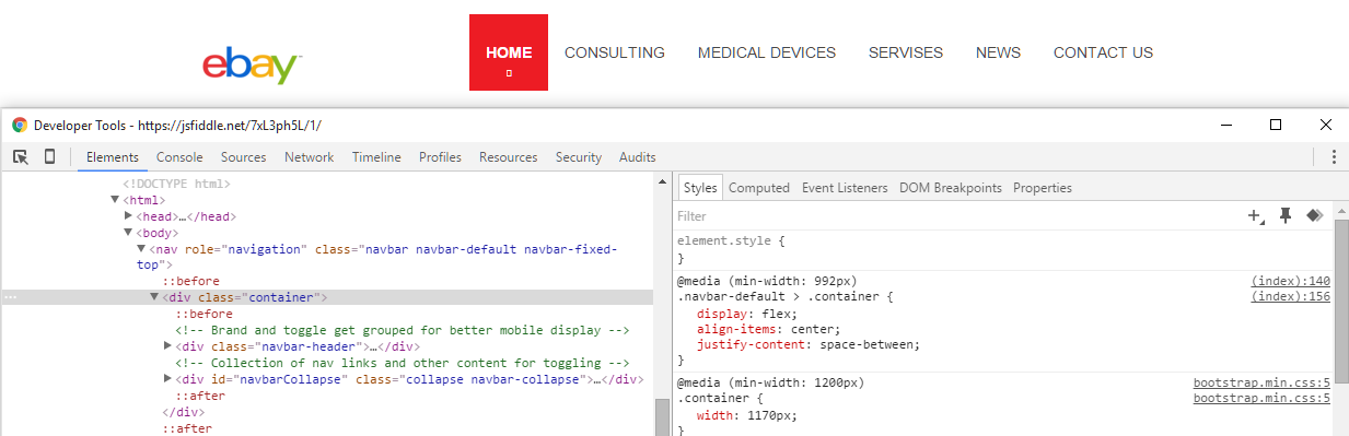
The problem is a conflict with the Bootstrap stylesheet, which places pseudo-elements in your flex container. This causes space-between to calculate multiple flex items as opposed to just two.
Here's your flex container:
The logo and nav menu are aligned with justify-content: space-between, but are not positioned at opposite edges. The alignment looks more like space-around.
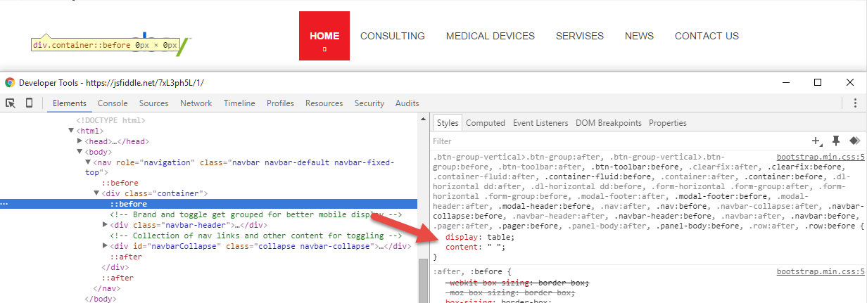
Here's Bootstrap's ::before and ::after pseudo-elements (or pseudo-flex items):
As noted in Firefox documentation:
In-flow
::afterand::beforepseudo-elements are flex items.
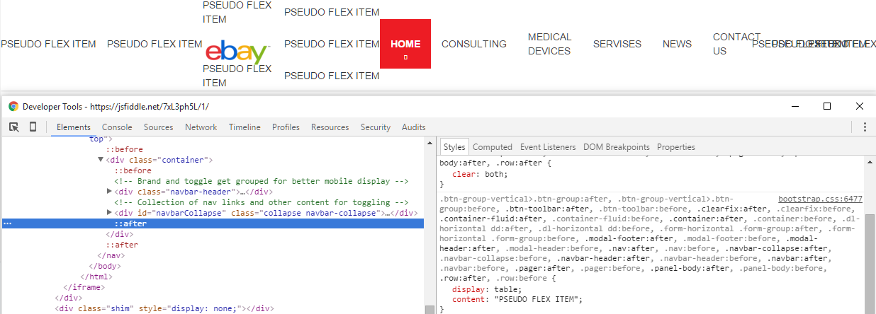
Let's put some content in the pseudos:
Like shining a black light in a motel room, you see a lot of stuff you wish wasn't there.
Remove (or override) the pseudo-elements and your problem is gone:

More details about flex containers and pseudo-elements:
- Pseudo elements breaking justify-content: space-between in flexbox layout
- Properly sizing and aligning the flex item(s) on the last row
- Methods for Aligning Flex Items along the Main Axis (see Box #81)
How can I prevent the ::before pseudo element from affecting my flex layout?
You can update your pseudo element, like this:
nav ul li.internal-nav.selected a:before,
nav ul li.internal-nav a:hover:before {
  content: '> ';
  position: absolute;
  left: -1rem;
  color: red;
}

nav ul li.internal-nav.selected a:before {
  opacity: .6;
}
Run code snippet and open it on fullpage to see changes.
Also you can check it here (Codepen.io)
header {
  margin-block-start: 3em;
  padding-bottom: 0.67rem;
  padding-left: 5%;
  padding-right: 5%;
  display: flex;
  flex-direction: row;
  flex-wrap: wrap;
}

nav {
  margin-left: auto;
}

nav ul {
  list-style: none;
  display: flex;
  flex-direction: column;
  padding-inline-start: 0;
  padding-left: 1em;
}

nav ul li {
  text-align: right;
  font-size: x-large;
}

nav ul li a:hover {
  color: red;
}

nav ul li.internal-nav a {
  position: relative;
}

nav ul li.internal-nav.selected a:before,
nav ul li.internal-nav a:hover:before {
  content: '> ';
  position: absolute;
  left: -1rem;
  color: red;
}

nav ul li.internal-nav.selected a:before {
  opacity: .6;
}

h1 {
  color: rgba(0, 0, 0, 0.6);
  font-size: 5em;
}

.profile-photo3 {
  position: relative;
  flex: 1;
  min-width: 20rem;
  background-color: blue;
  clip-path: polygon(70% 0%, 100% 50%, 70% 100%, 0% 70%, 20% 15%);
}

.profile-photo3 img {
  width: 100%;
  mix-blend-mode: screen;
}
<head>
<script src="https://cpwebassets.codepen.io/assets/editor/iframe/iframeConsoleRunner-d0f3648046d2aaca07bd0037b9e061a26c74a8a999b75672ad6a638cca641472.js"></script>
<script src="https://cpwebassets.codepen.io/assets/editor/iframe/iframeRefreshCSS-4793b73c6332f7f14a9b6bba5d5e62748e9d1bd0b5c52d7af6376f3d1c625d7e.js"></script>
<script src="https://cpwebassets.codepen.io/assets/editor/iframe/iframeRuntimeErrors-4f205f2c14e769b448bcf477de2938c681660d5038bc464e3700256713ebe261.js"></script>
</head>
<body>
<header>
<h1>Dogs :)</h1>
<div class="profile-photo3"><img src="https://images.dog.ceo/breeds/collie-border/n02106166_2345.jpg"></div>
<nav>
<ul>
<li class="internal-nav"><a href="#">About Dogs</a></li>
<li class="internal-nav selected"><a href="#">My Fav Dogs</a></li>
<li class="internal-nav"><a href="#">Dog Facts</a></li>
</ul>
</nav>
</header>
<script src="https://cpwebassets.codepen.io/assets/common/stopExecutionOnTimeout-1b93190375e9ccc259df3a57c1abc0e64599724ae30d7ea4c6877eb615f89387.js"></script>
<script src="https://cdpn.io/cp/internal/boomboom/pen.js?key=pen.js-f2136278-4370-4b42-10b9-cde5fe228f8b" crossorigin=""></script>
</body>How to specify line breaks in a multi-line flexbox layout?
The simplest and most reliable solution is inserting flex items at the right places. If they are wide enough (width: 100%), they will force a line break.
.container {
  background: tomato;
  display: flex;
  flex-flow: row wrap;
  align-content: space-between;
  justify-content: space-between;
}
.item {
  width: 100px;
  background: gold;
  height: 100px;
  border: 1px solid black;
  font-size: 30px;
  line-height: 100px;
  text-align: center;
  margin: 10px
}
.item:nth-child(4n - 1) {
  background: silver;
}
.line-break {
  width: 100%;
}
<div class="container">
<div class="item">1</div>
<div class="item">2</div>
<div class="item">3</div>
<div class="line-break"></div>
<div class="item">4</div>
<div class="item">5</div>
<div class="item">6</div>
<div class="line-break"></div>
<div class="item">7</div>
<div class="item">8</div>
<div class="item">9</div>
<div class="line-break"></div>
<div class="item">10</div>
</div>Breaks the flexbox layout when I wrapped the divs with a
just change the div to a <a> like this
.container{
  position: absolute;
  left:0;
  top: 0;
  width:100%;
  height: 30px;
}

.flex_container{
  display: flex;
  justify-content: space-around;
}

.box{
  background: silver;
  width: 25%;
  display: flex;
  justify-content: center;
  align-items: center;
  border: 1px solid black;
}
<header>
<div class="container flex_container">
<a href="#" class="box">link1</a>
<a href="#" class="box">link2</a>
<a href="#" class="box">link3</a>
<a href="#" class="box">link4</a>
</div>
</header>flex justify-content:space-between not working
Add .textwidget::before, .textwidget::after { content: none; }. You have content: "" added in line 1341 for this element and it breaks flex. Or just remove .textwidget::before, .textwidget::after from line 1341 ;)
Other ways to justify-content: space-between?
You may use margin instead align-items and/or justify-content.
example:
not sure you looked for space-between or space-around, so i put both margin alternative
div div {  box-sizing: border-box;  border: solid;}
.cards-list {  display: flex;  flex-direction: row;  flex-wrap: wrap;  align-items: flex-start;/* will not spray the entire row */}
.cards-list .card-item {  margin-bottom: 15px;  flex-basis: 49%;  padding: 30px 45px;  margin: 0 auto 15px;}
.cards-list .card-item-small {  flex-basis: 25%;}
div div:before {  content: attr(class);}
.cards-list.bis .card-item {  margin: 0 0 15px;  /* reset for demo*/  color: darkblue;}
.cards-list.bis .card-item:nth-child(2n) {  margin-left: auto;}
<div class="cards-list"> <div class="card-item"></div> <div class="card-item"></div> <div class="card-item-small"></div> <div class="card-item-small"></div> <div class="card-item-small"></div> <div class="card-item-small"></div></div><hr><div class="cards-list"> <div class="card-item-small"></div> <div class="card-item-small"></div> <div class="card-item"></div></div><hr><div class="cards-list bis"> <div class="card-item"></div> <div class="card-item"></div> <div class="card-item"></div> <div class="card-item"></div></div>Why does space-around allow flex items to overflow on the left side?
Since the container is limited in width and you want overflowing flex items to be accessed via horizontal scrolling, why use justify-content: space-around?
Try justify-content: flex-start:
Revised Codepen
To understand why overflowing flex items may be inaccessible via scroll, see this answer.
If you're interested in a Javascript workaround for the original code, see this post:
- When centering horizontally, li's get cut off
Related Topics
Bootstrap Dropdown Clipped by Overflow:Hidden Container, How to Change The Container
Controlling The Size of an Image Within a CSS Grid Layout
How to Link to a <Div> on Another Page
How to Remove This Horizontal Scrollbar in Bootstrap 3
Facebook Share Doesn't Show My Description or My Thumbnail
How to Semantically Add Heading to a List
Svg Line Markers Not Updating When Line Moves in Ie10
How to Change Font in Ipython Notebook
What Is Difference Between <Pre> and <Code> HTML Tag
Remove HTML Scrollbars But Allow Mousewheel Scrolling
How to Align a Label and a Textarea
How Does a Multiple Select List Work with Model Binding in ASP.NET Mvc
Prevent Ligatures in Safari (Mavericks/iOS7) via CSS
Controlling Spacing Between Table Cells